The District
Cambridge
ABOUT
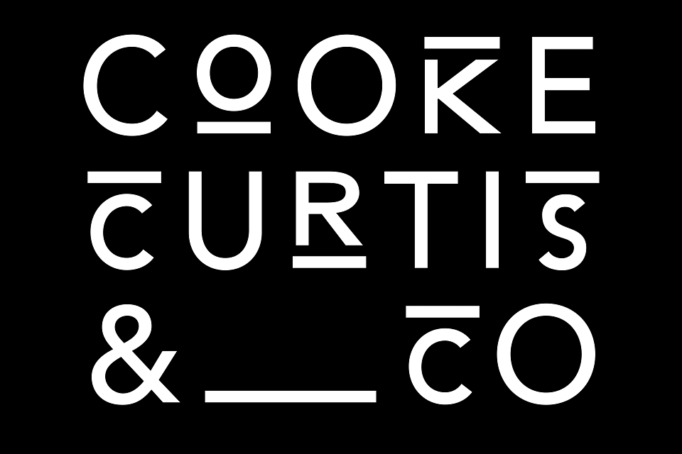
Cooke Curtis & Co. is a new estate agency that wants to make an impact with a brand that is very fresh and stands out in the sector, while still holding onto the heritage of its founders who bring over 30 years of experience.
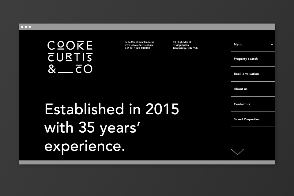
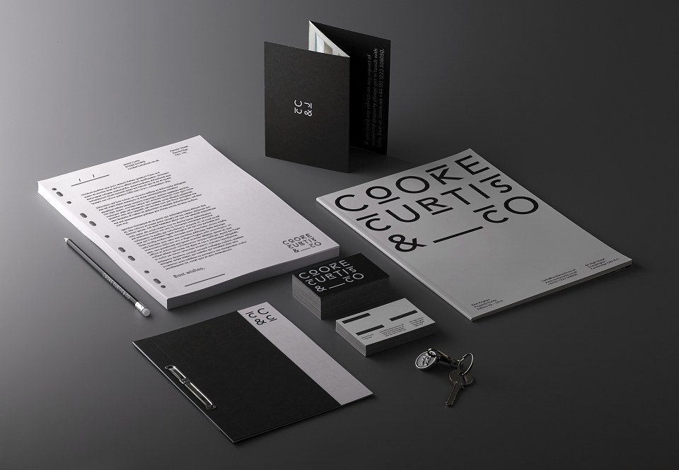
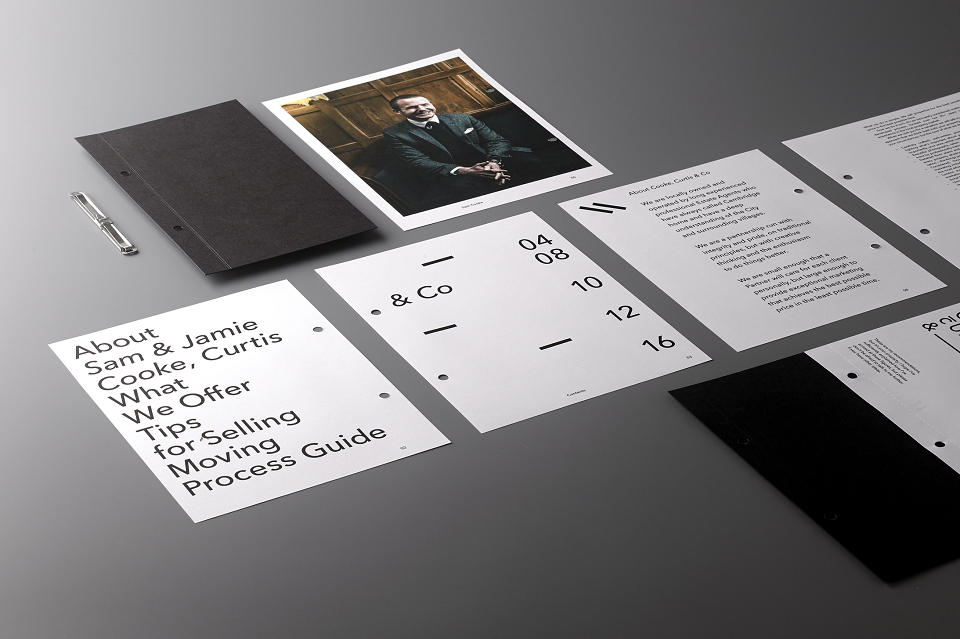
The District was tasked with creating a brand identity that would work across a range of printed and digital media, from letterheads, business cards and a website to 'for sale' signs, key fobs and vehicle graphics. What we delivered is a comprehensive visual language that became a brand asset in its own right.
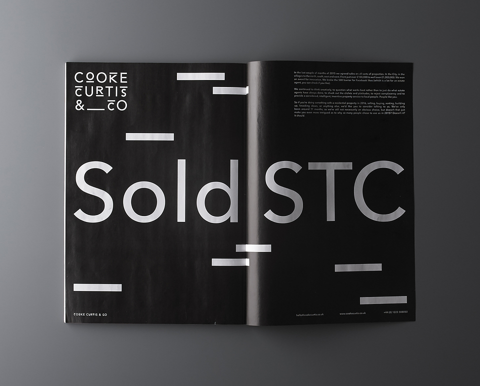
The Cooke Curtis & Co. identity alludes subtly to brickwork, using pared back typography and negative space to communicate the plain speaking approach of the client which cuts through an industry fraught with hyperbole. The consistency of the brand language and the high quality of the materials used carry a lot that’s implicit about the company’s rejection of cliché. The monochrome colour scheme projects boldness and confidence which are strong associations for the estate agency service.
The brand has been embraced by customers and, in less a year of being founded, Cooke Curtis & Co. won the Cambridge News Property Award for Innovation. The judges commented that a big part of the decision was based on the freshness and difference of how the brand is marketed.
MADEIT CREDITS


Annual 2016 ShortlistBranding design for Cooke Curtis & Co.Branding
Project featured: on 7th February 2016