Mark Richardson
Creative Director
ABOUT
Transforming PLC is a group of companies, offering services in the social care sector, providing support to people with learning disabilities and/or Autism to achieve a greater quality of life and progress their levels of independence. They appointed design studio Superfried to develop the branding strategy for three key health organisations within the group.
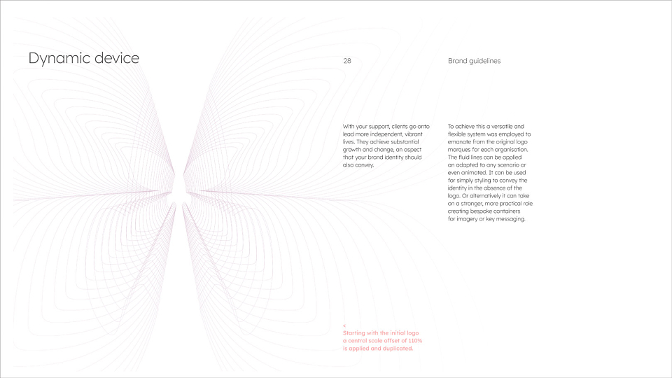
Not only did the brand identity need to resonate with two distinct audiences – clients and commissioning partners– it was essential that the branding system also represented three separate connected bodies within the organisation. Each provided a sequential stage within the level of support required.
Consequently, I looked for a concept based on a commonly known process where progression + growth takes place. Nature was an obvious starting point that led to the three distinct stages of metamorphosis of butterflies –
Caterpillar | Chrysalis | Butterfly
The analogy was a good fit, but the butterfly is widely used so would require careful consideration to retain standout. Names were considered to navigate around existing brands –
Nurture | Transform | Ascend
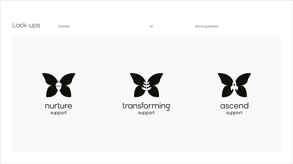
Moving onto visual representation, the most logical starting point was the butterfly. As mentioned, this has been heavily used, so it was essential to find a unique approach. Initial directions were logical and minimal with three circles representing the organisations combining to form a geometric representation of the butterfly. However, this felt too cold, clinical and corporate.
Moving to more conventional, organic forms, a butterfly container was styled with separate patterns to represent the three stages. This had potential, but the complexity may have been problematic for screen representation on smaller mobile devices.
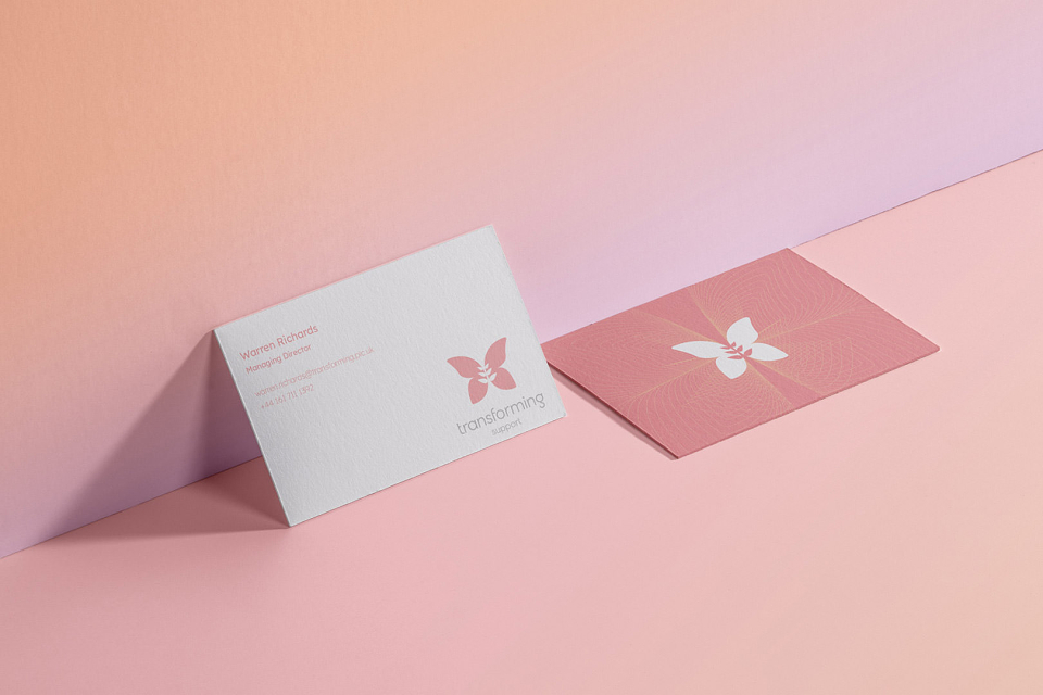
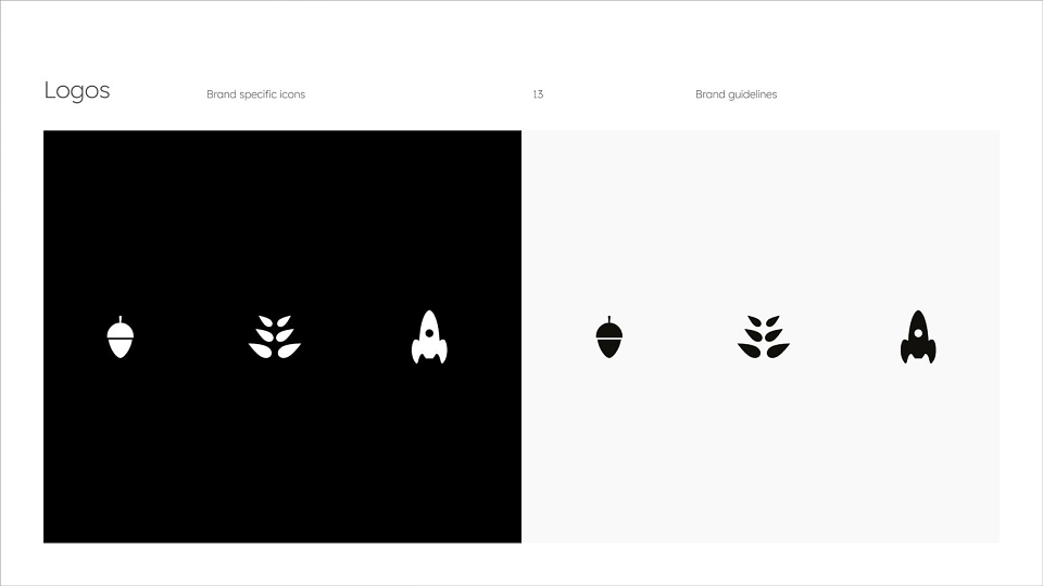
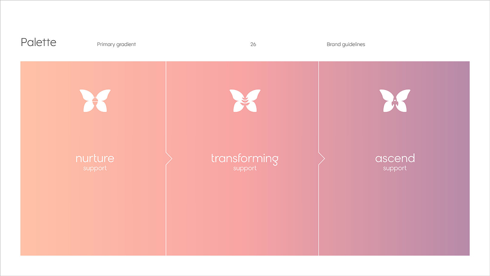
The final approach was to maintain the same butterfly marque, but create distinction in each case via a change in colour and inclusion of a secondary symbol via negative space. The enclosed icon would connect directly with the specific stage within the process as follows:
Nurture – Acorn
Transforming – Plant
Ascend – Rocket
These provided a unique element to create distinction and standout.
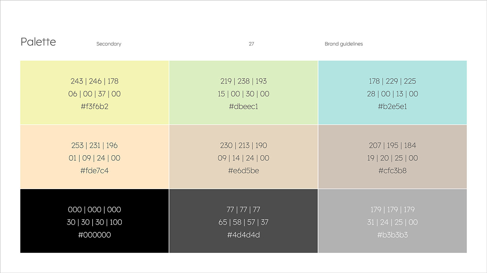
Moving onto the colour palette, once again I returned to the process. Could the colours help to represent the progression – for example – Red / Amber / Green. This logic appealed, but for those with autism, certain colours and vibrant shades can be triggers. Muted tones and particular colour ranges can help to create a calmer environment. During the research, it was found that –
– Muted pinks / purples
– Muted greens / blues
were generally preferred and that strong yellows and reds should be avoided. With this in mind, a muted palette was researched. Rather than 3 very distinct colours from the previous traffic light strategy, there may still be a way to use the palette to represent the progression and literally connect the organisations. This was achieved via the selection of three sequential colours to form a gradient, each shade stronger than the previous.
Looking to typography, in addition to the bespoke logotypes developed, they required a simple font option that would be available to all staff across three organisations for general + marketing use. Consequently, Google fonts were their preferred route. After researching the options available a perfect fit was found – Lexend – originally designed with dyslexia and struggling readers in mind to reduce visual stress and improve reading performance.
The brand identity system was subsequently tested before rollout, visuals and guidelines showed.
MADEIT CREDITS


Annual 2022 ShortlistBranding for healthBranding
Annual 2016 JudgeTypography
Project featured: on 23rd June 2022
Contributor:
Invite
x3
Mark Richardson has been a Contributor since 28th May 2019.