Craig
Creative Director
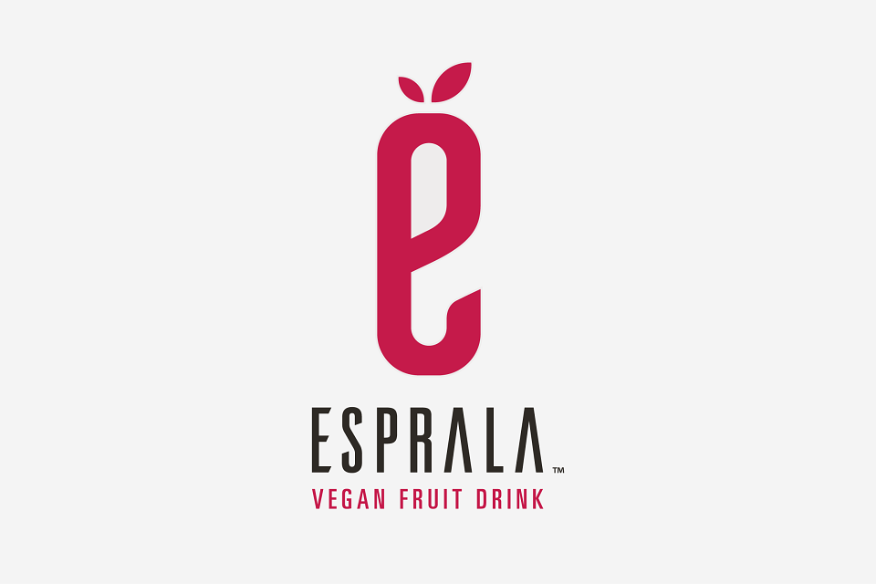
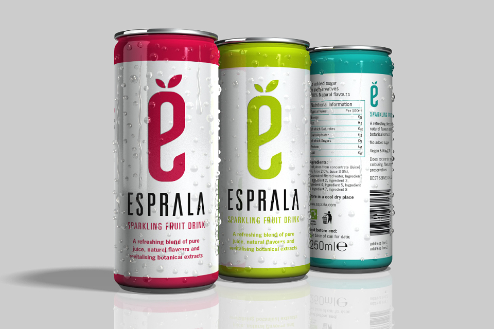
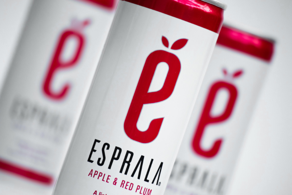
ABOUT
Esprala needed an identity for their new brand and product, a vegan fruit drink, one that would stand out on a shelf full of competing brands. It had to be simple, striking and contemporary. I focused the design on the 'e' of esprala, using leaves above the 'e' to emphasise the fruit based nature of the drink, and communicate the healthy living message they wanted to convey. I used a very bold, minimalistic design, with the logo set against a white can, with red flashes top and bottom to really help it stand out. When I see it on the shelves, I think we achieved what we set out to do.