


Approaching their 20th anniversary, we were tasked with grabbing attention and reflecting the charity's primary activity of prevention through intelligence.
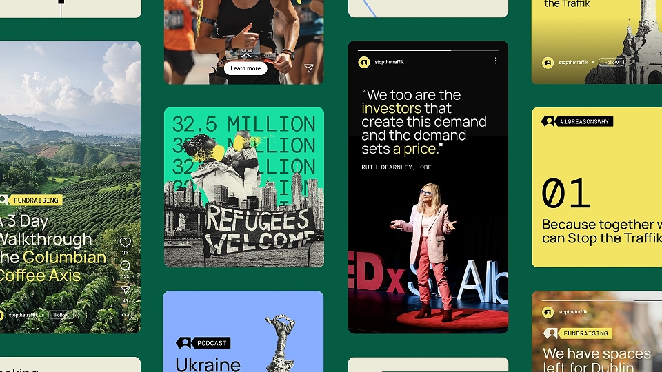
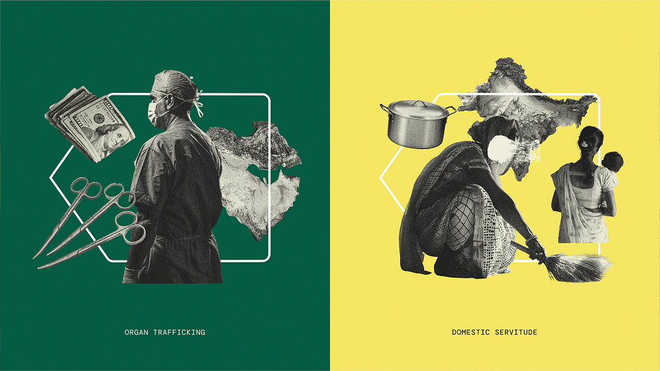
So, we set about creating a new visual identity that plays with the ubiquitous arrow symbol and pairs it with bold typography and distinctive collage-style illustrations.
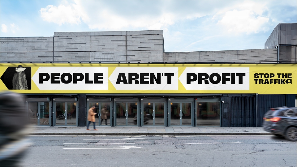
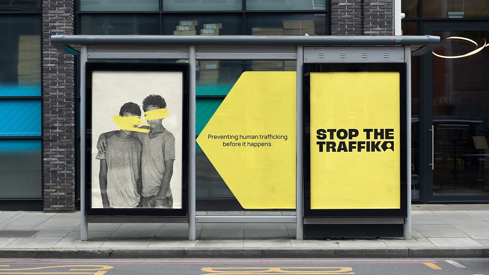
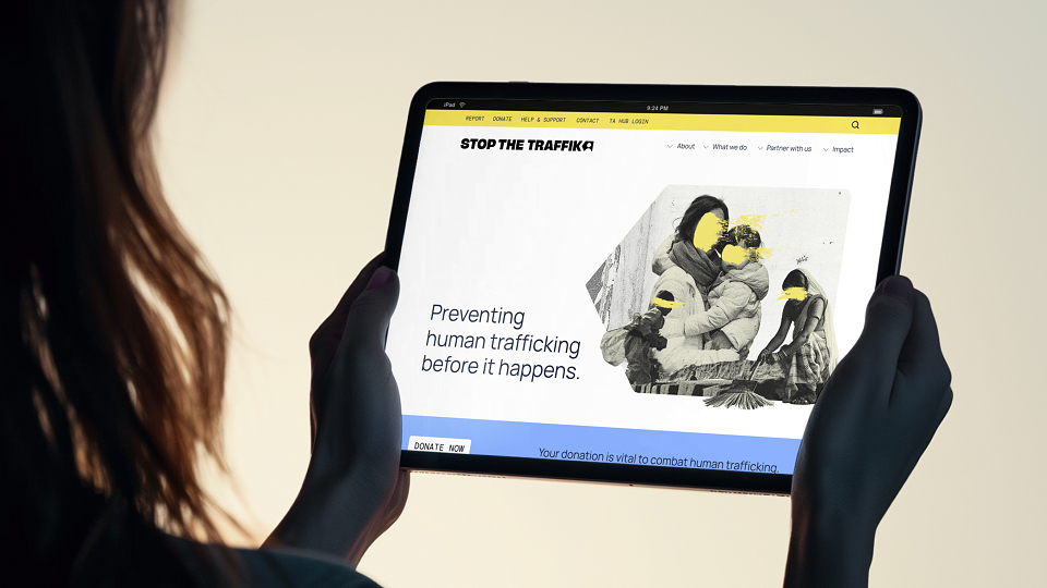
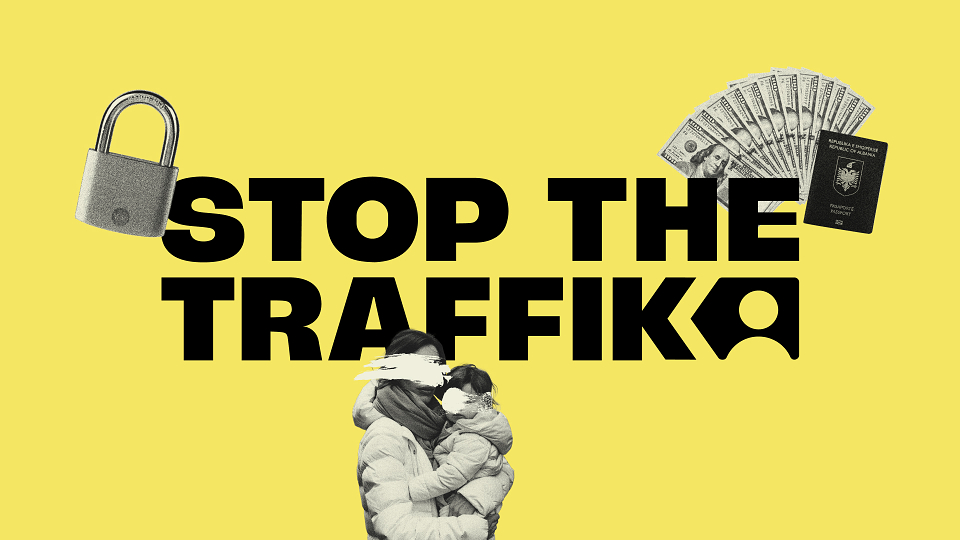
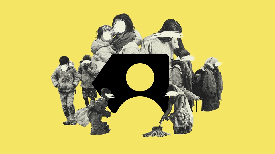
In this rebrand, we created the STOP ARROW - straying from the common upward or forward direction arrows used in branding, the Stop Arrow points backwards providing a memorable distinction to a common visual trope by focusing on the ‘before’, not the ‘after’. The symbol combines with an immersive visual toolkit including a modern typographic voice, refreshed colour palette and a human-centred collage-style illustration attitude – allowing the organisation to tackle even the most complicated or sensitive subject matter distinctively.
Fold7 has been a Contributor since 7th January 2020.