Steve Wignall
Senior designer
ABOUT
Tim Powell is the mastermind behind Fairground, with 35 years experience within the organic and natural foods industry. Since retiring Tim had the idea of creating his own fruit and nut bar. The concept took hold and Tim set about coming up with his very own fruit and nut bar containing only ingredients that were certified both organic and fair trade.
The bars are gluten and dairy free, but the key USP Tim wanted to focus on was the fact that the bars were organic and fair trade. As far as we are aware, the bars are the only products on the market that can claim 100% on both counts, and they are issue's Tim is very keen to support.
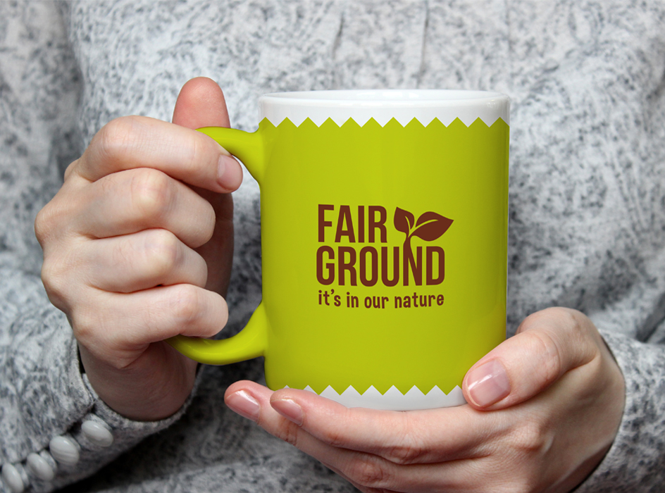
The words 'Fair and Ground' were chosen to simply represent what the bars stood for. A mind mapping process was put into action to work out the connections of both the words and found that it filtered back to 'fairly traded' and naturally ground organic products.
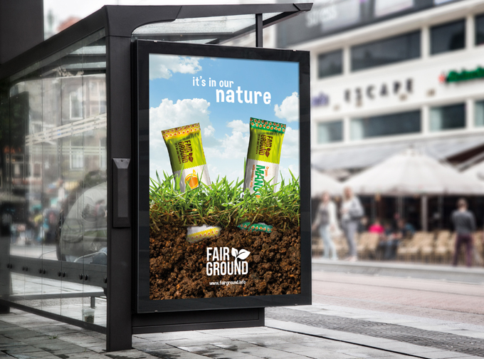
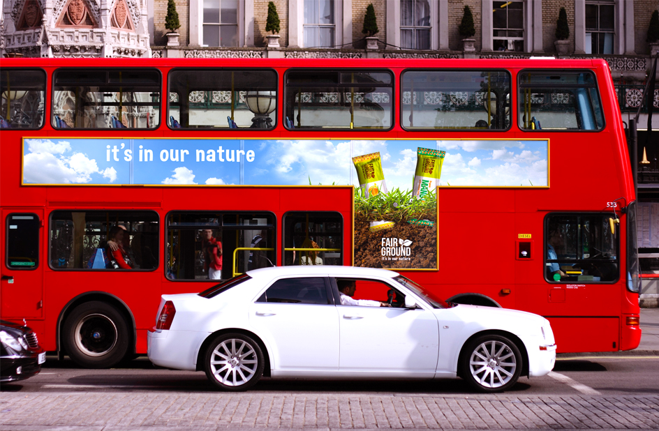
A strategy was put in place to make sure people understood the connection between the logo identity which filtered into the packaging and marketing campaign. In terms of the packaging by showing the bars growing from the grassroots implied that this was a natural product that had all the connotations of being organic.
I created a strapline 'It's in our nature' which is simple, effective and ties in nicely with the brand identity.
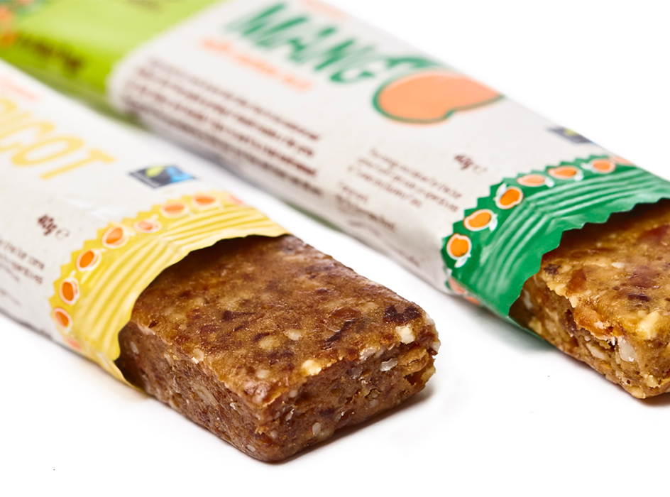
The snack bars come in 2 tasty varieties; organic apricot with almonds, sourced from a farmers’ association in the Gilgit-Baltistan region of Pakistan; and organic mango with cashew nuts, sourced from rural cooperatives in Burkina Faso, West Africa. Fairtrade has a positive impact on the farmers and the communities who benefit from various sustainable, developmental and educational projects.
The packaging included 'minimal' fruit illustrations created by myself that worked with the typography and carefully placed to represent the flavour of the bar. So, for example, the 'A' for Apricot was replaced with a minimal illustration of the fruit and so on...
The typography had to reflect the organic nature of the product. It was important to source fonts that were in keeping but also legible at such small sizes when it comes to packaging design. Challenges regarding the amount of copy required to fit onto the packaging of the bar certainly wasn't an easy task to deal with. The overall brand identity needed space to breathe and not overcrowd and complicate the packaging design.
The products are currently being marketed and introduced into independent organic stores and cafes in and around the London area. I personally have no forecast of sales at the moment.
Tim Powell was pleased and certainly felt I followed the brief in regards to the brand identity and packaging design of 'Fairground' and is looking forwarding to taking this to wholesalers in the near future.
MADEIT CREDITS


Annual 2018 ShortlistFairground - Branding and packaging designPackaging
Project featured: on 19th May 2017