SomeOne
London,
ABOUT
Simmons & Simmons is a world-class international legal practice.
They employ over 1,500 people in 21 offices located in major business and financial centres throughout Europe, the Middle East and Asia. The partnership has been working on highly complex legal matters for businesses since 1896.
Simmons needed to unify the Partnership around a single view to provide smarter solutions to clients worldwide. In addition, the firm wanted to open a deeper conversation around their more collaborative approach to tackling very complex legal matters.
A PARTNERSHIP THAT REMEMBERS IT’S A PARTNERSHIP
Most partnerships have forgotten what being partners means’ was a phrase we heard many times throughout the initial research phase of the project.
Most law firms are constructed along partnership lines, but have — over time — become more like a series of fiefdoms than a cohesive and connected group of like-minded individuals. Simmons has a sector-wide reputation as a more approachable, balanced and smart legal counsel.
This ability to work easily in teams, as part of clients’ organisations — and within their own, signalled a clear differentiator from many firms. This is a partnership that makes the most of collaboration.
AN INTERNATIONAL CONVERSATION
Change is often seen as something to worry about. So to ensure everything works as part of a change programme, we recommend regular and rigorous conversations with all involved. Here we consulted with the entire partnership — in person. We met, interviewed, filmed & held workshops with clients and staff throughout the process.
Working in Amsterdam, Paris, Prague, Hong Kong and London we recognised a real hunger for a brand born from digital beginnings, made to move and adapt to a broad spectrum of clients and demands.
It was time to develop a visual and verbal depiction of a brand that could help the partnership open conversations surrounding their approach and why it provides smarter solutions.
A SECTOR UNDERSERVED BY COMMERCIAL CREATIVITY
Many legal firms may be practising some of the most progressive techniques in law, but the branding tells a story of a sector languishing in outdated and cumbersome methods of communication and branding.
With little to inspire on our doorstep, we looked outside of legal firms for a better way to engage audiences in a new conversation about an old but rare truth: collaboration & partnership.
The legal projects Simmons & Simmons tackle are too complex, too big & too important to be attempted alone. Their collaborative and connected mindset means they can tackle the most challenging projects with greater confidence than the competition — we sought to amplify this position in the new branding.
FINDING THE ULTIMATE STRATEGIC METAPHOR FOR COLLABORATION
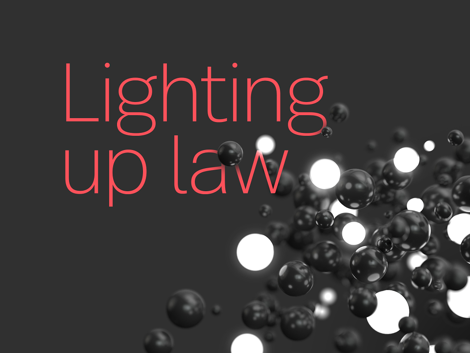
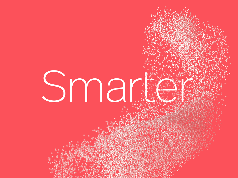
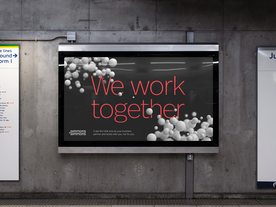
Of all the examples of natural collaboration, few resonated as immediately as the extraordinary patterns, shapes and movements made by shoals and murmurations.
Fish, animals & birds have all found ways to work as one unit. Of particular interest was the way birds can self organise to the point of seemingly impossible levels of co-ordination. When tested, the comparison to murmurations immediately opened the lines of communication.
The murmurations were custom made with state-of-the-art computer graphic systems. Allowing the way they move, their speed and how close they work together to be entirely controllable — just like working with teams at Simmons.
Further disruptive thinking came in the form of a radical new colour system that flew in the face of the traditional dark blues that seem to have ended up as the default for so many law firms.
The new colour work was extensively tested so it remained clear to read online, and coherently applied through the global offices.
Finding a way to demonstrate our work ethos, culture, and appetite for change was always an important part of the brand work. Our new creative reflects these perfectly and will only strengthen our reputation as a great place to work and great people to work with.
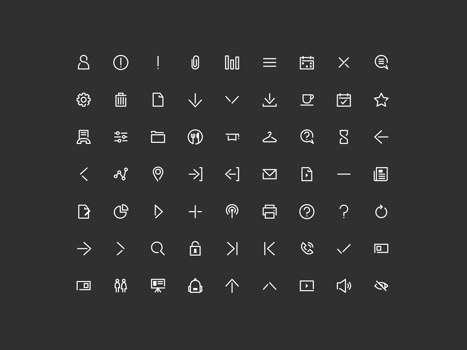
INTELLIGENT TYPOGRAPHY
A contemporary and immediately useful typographic playbook took documents out of the dark ages and led to the development of a new, highly legible word mark built for the digital age.
The confusing ampersand was replaced with a globally understood plus.
The word mark was recut and made able to flex and adapt to any type of application internationally, from mobile to tablet to laptop to desktop and through to large scale applications like events and advertising.
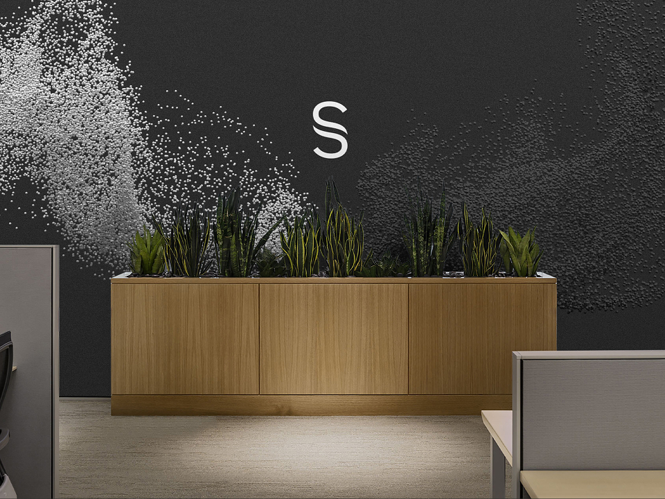
THE PERFECT §YMBOL
In the search for a logo that worked intelligently for the partnership, we looked at many options but uncovered a symbol that not only fitted the brand name effortlessly, it comes free with every computer sold on the planet.
The Section Mark ‘§’ is a unique character used in legal documents. It’s made of two letter ‘s’ that intertwine in partnership. (Quite possibly the perfect symbol for a company made of two words that begin with ‘s’ and are based on partnership.)
As if that was not enough, the section sign ‘§’ is itself sometimes a symbol of the justice system, in much the same way as the Rod of Asclepius is used to represent medicine.
THE POWER OF MANY PARTS
With the assets established, we set about designing all the primary branded communications and items required to connect the messages across all channels.
The murmurations have been rendered in UltraHD to enable almost endless ‘zoom and crop’ opportunities.
Some of the particles are illuminated, some metallic, some transparent… The different properties have been included to enable the brand imagery to elegantly illustrate key points, such as the new graduate recruitment work that sets out to find and highlight students from universities around the world to join Simmons.
THE RESULTS
The new branding lays the foundations for better conversations with clients — opening up the ideas of collaboration and what it means to truly be partners in projects. It has rapidly united the firm, with a strong strategic common endeavour, and given Simmons a new way to communicate internally and externally.
It’s immediately helping them recruit, retain, and respect the outstanding people needed to tackle some of the planet’s biggest legal problems.
–
“This is an exciting change to our brand and reflects what has been happening behind the scenes for a long time. It’s about consistently working smarter and providing the best possible service to our clients.
It’s also about embracing change, technology and innovation. I think the new visual identity will act as a constant reminder to us all of those priorities.”
JEREMY HOYLAND, MANAGING PARTNER, SIMMONS & SIMMONS.
MADEIT CREDITS


Annual 2020 ShortlistSimmons & Simmons — The smarter law firmCopywriting
Project featured: on 25th November 2019
Contributor:
Invite
x3
SomeOne has been a Contributor since 25th November 2015.