Brand42
London
ABOUT
Concept
BARE wanted to reposition its brand to stand out in a competitive dating app marketplace. BARE’s key difference was their unique ‘reveal’ feature which enabled users to reveal as little or as much of their photo as they wanted. For this reason, their existing positioning oscillated between being the ‘No. 1 Body Confidence App’ and the only app for sexting, ‘Your Body, Your Rules.’ It was unclear and didn’t necessarily reflect what singles wanted from a dating app in 2020.
Our priority was to develop a clear positioning for BARE identifying a single reason to download. Research showed that nearly 1 in 3 women and 1 in 2 men use dating apps to find casual hook-ups, but existing offerings either overwhelmingly catered to singles looking for love or the other extreme, looking for sex. There was no mainstream dating app for people who wanted to keep their options open.
Execution
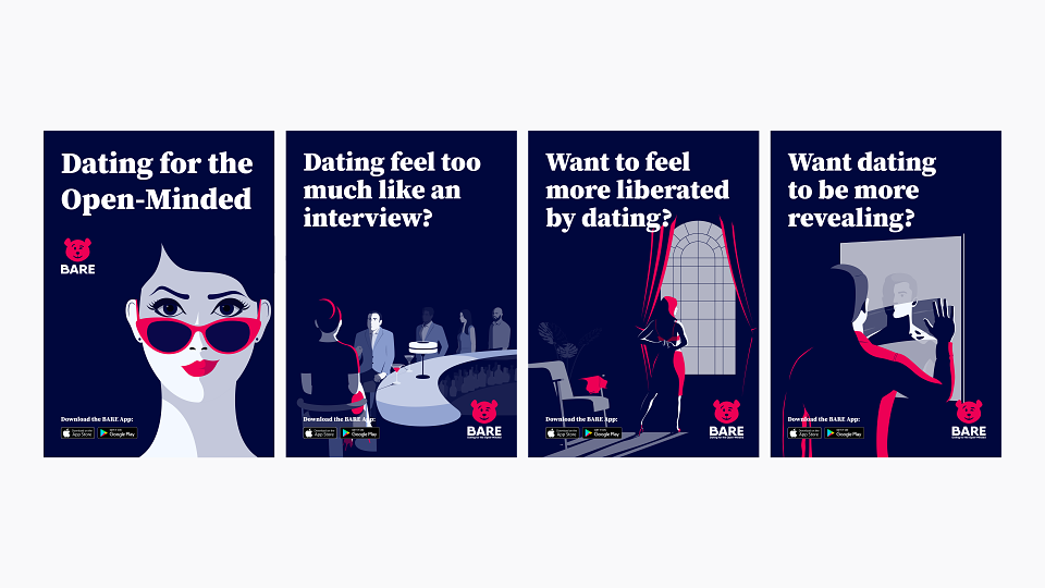
We developed three propositions which we tested amongst 1,000 UK users of dating apps with a heavy skew in favour of women. It was important to understand how we could get women to buy-in to BARE as “where women are, men will follow” (with dating apps). The proposition - BARE: Dating for the Open-Minded, really resonated amongst the sample as it spoke to the fact that daters wanted to be treated as adults. COVID-19 also affected singles’ attitudes, 60% of those surveyed said they had become more open-minded and 1 in 2, more open to sexting.
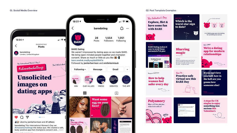
The proposition was supported by sophisticated illustrations, each with a different scenario relying on the power of innuendo. We applied a 60s style treatment throughout as a subtle nod to a time of sexual liberation and experimentation. We switched the colour palette, moving away from the existing dominant black which had an aggressive overtone to a more inviting dark blue which in colour psychology portrays a sense of trust - key to users and the success of the app.
When we tested the new proposition and creative treatment amongst our sample, 3 out of 4 females found it to be fairly or very appealing; resulting in nearly 2 in 3 women considering signing up to BARE.
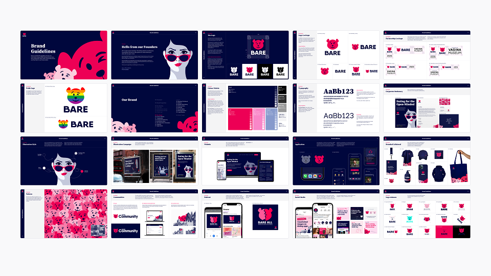
We also updated BARE’s logo, removing elements associated with danger, such as crosses for eyes, replacing these with a playful wink to compliment BARE’s cheeky positioning. We introduced a new typeface with irregularities to acknowledge the complex nature of human relationships.
Results
Before our repositioning, app take-up by women was very low, less than 10%. Within a month of re-launch, BARE’s downloads were showing a 40:60 male/female split. In comparison, Tinder for example has a ratio of 9:1 in favour of male users.
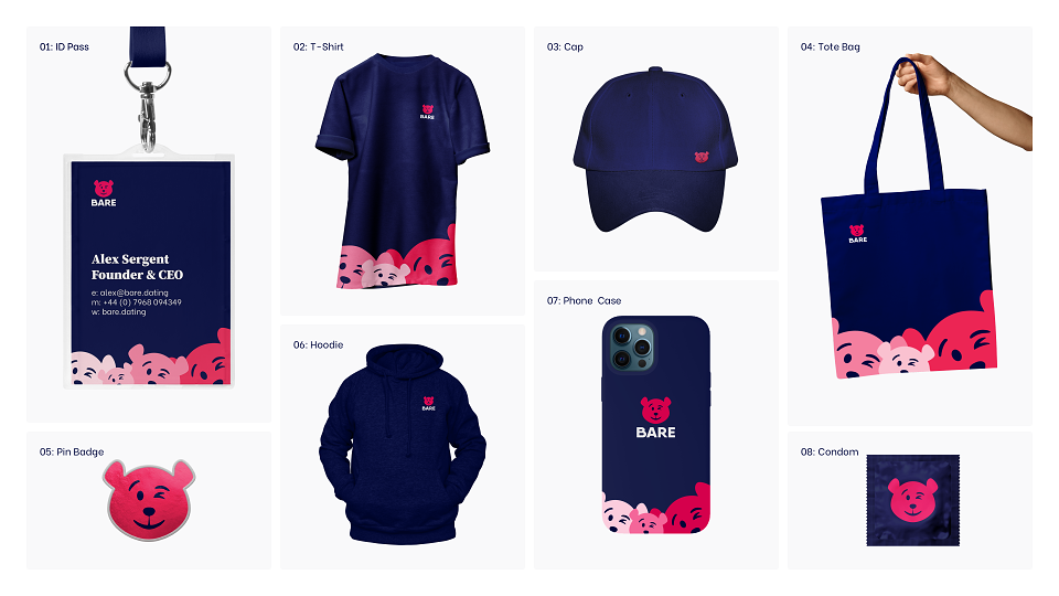
BARE’s new position has given the brand confidence to explore more risque content, promotions and communications - enabling it to quickly gain the attention of users and the press, something the brand’s former confused positioning didn’t allow. BARE now provides open-minded UK singles with a safe space where they can explore, reveal and experiment.
MADEIT CREDITS
-

BARE DatingClient
-
Olivia O'TooleStrategist -

Brand42 -

Lucas ClayDesigner -

Jamie HarrisonProject Manager -

Adge Gittinscreative director -
Ena CosicProject Manager
Annual 2021 ShortlistBARE Dating RebrandBranding
Project featured: on 14th June 2021
Contributor:
Invite
x3
Brand42 has been a Contributor since 25th November 2015.