Design Bridge and Partners
London
ABOUT
For modern consumers, sex is fluid. It’s self-expression. It’s a connection – between yourself and other people, mind as well as body. Free from outdated rules and limitations, it’s an act of empowerment. Meanwhile, the wellness industry is stuck blushing on the side-lines; brands aren’t keeping up, and packaging plays to cheeky stereotypes, toxic hypermasculinity and ‘family planning’ in saccharine pastel shades.
Even the world’s #1 condom brand was struggling to reflect real experience. And consumers knew it - across major markets, Durex was falling from favour. The challenge the brand faced, like many of its counterparts, was how to keep up with the current zeitgeist surrounding the sexual revolution that this decade is facing, and how to stand out from the competition, post pandemic, as people search for a physical connection.
Having fought against sexual taboo since 1929, we knew the brand was uniquely placed to once again transform the category it created – this time not just through innovation, but by championing the modern realities of sex through brand expression. It’s time for another new era of real sex, real intimacy, real desires. Changing the conversation, and giving consumers confidence to explore, experiment and enjoy on their own terms.
We worked with Durex to evolve a self-assured, expressive and fluid brand identity, celebrating safe, inclusive sex in all its forms. Retaining the trusted assets of the brand’s past, and making it meaningful and relevant for the future.
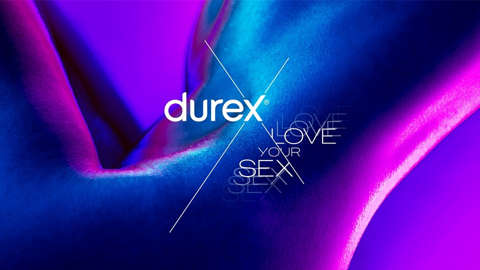
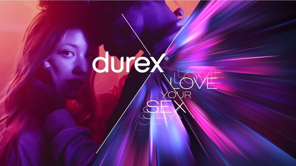
Boldly breaking out of the historical lozenge shape that had defined the brand for the last decade, the revitalised logo frees itself from its own limitations and restrictions. By heroing the ‘X’, a symbol of sexual intersectionality and connectivity, the new logo creates space for the brand to tell diverse stories of connection and giving consumers the confidence to be their true sexual selves.
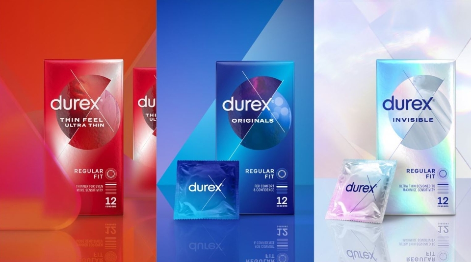
The colour palette is injected with a sensorial energy inspired by the nightclubs of London – the brand’s home. The unmistakable Durex blue is elevated to a sensorial stage and blends with this vibrant new colour spectrum, reflective of the range of human experience and defining new category codes, reinforced across every touchpoint. Our bespoke font, One Night Sans, remains, with a distinctive typographic ‘judder’ for headlines and the brand sign off.
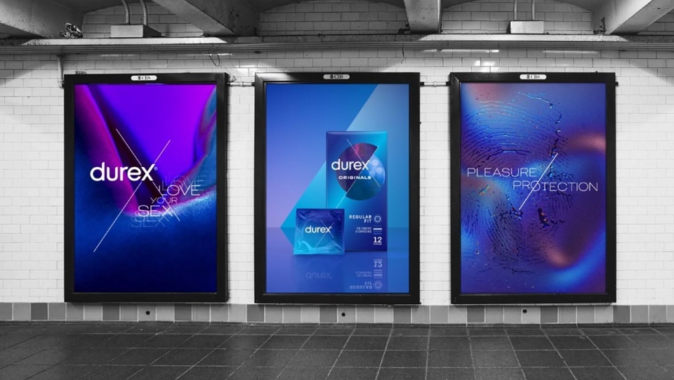
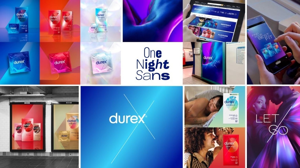
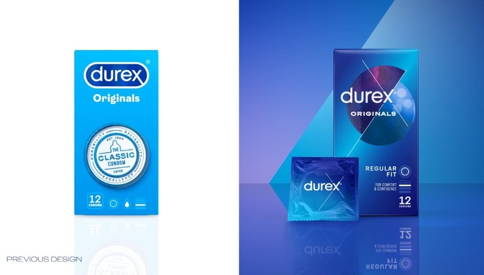
To bring the dynamism of the brand to life and further dramatize the sense of fluidity and self-expression, we created custom motion graphics for use across communications. And to truly reimagine a simplified and consumer centric portfolio, the new design system, which was rolled out across condoms, lubricants, and sex toys, optimized navigation across tiers, SKUs and sizes, empowering consumers in their decision making and tackling shelf shame.
Colourful, modern, and full of purpose, Durex’s new visual identity moves from an embarrassing hygiene product and into the lifestyle of consumers, making space for diverse stories of connection, and standing firm as an ally empowering sexual confidence and freedom.
Claire Robertshaw: Executive Creative Director
Andrew Hirst: Design Director
Lisa Napier: Senior Designer
Charlotte Barres: Senior Designer
Laura Wright: Production Manager
Ryan O’Shea: freelance Artworker
Marko Hoedl, Implementation Director
Julia Thompson: Production Project Manager
Jea Hyun: Senior Designer
Gan Lin: Junior CGI artist
James Morgan: Motion Director
Will Meighan: Motion Designer
Jess Schulz: Client Manager
Grace McKeown: Client Manager
Bridget Ashley: Client Business Director
Stef Gilmore: Strategy Director
Rachel Darivoff: Associate Strategy Director
Ed Mitchell: Group Brand Experience Director
Norval Denton: Senior Digital Producer
David Helps: Group Innovation Director
Emma Follett: CCO
Yvonne Eng-Hall: Design Director
Emma Godfrey: Client Business Director
MADEIT CREDITS
-

DurexClient
-
Charlotte BarresSenior Designer -
Emma GodfreyClient Business Director -
Gan LinJunior CGI artist -
Jea HyunSenior Designer -
Julia ThompsonProduction Project Manager -
Norval DentonSenior Digital Producer -
Ryan O’SheaFreelance Artworker -
Stefanie GilmoreStrategy Director -

Design Bridge and Partners -

Jess SchulzClient Manager -
Ed MitchellGroup Brand Experience Director -
Claire RobertshawECD -
James MorganMotion Director -
Andrew HirstDesign Director -

David HelpsGroup Innovation Director -

Rachel DarivoffAssociate Strategy Director -

Emma FollettChief Creative Officer -
Bridget AshleyClient Business Director -

Gan LinCGI Artist -
Yvonne Eng-HallDesign Director -
Grace McKeownClient Manager -
Lisa NapierSenior Designer -
Will MeighanMotion Designer -
Laura WrightProduction Manager
Annual 2022 BronzeDurex's new visual identityPackaging
Annual 2022 People's ChoiceDurex's new visual identityPackaging
Annual 2022 ShortlistDurex's new visual identityBranding
Contributor:
Invite
x3
Design Bridge and Partners has been a Contributor since 25th November 2015.