Pearlfisher
London
ABOUT
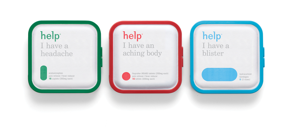
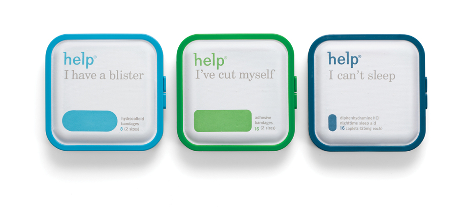
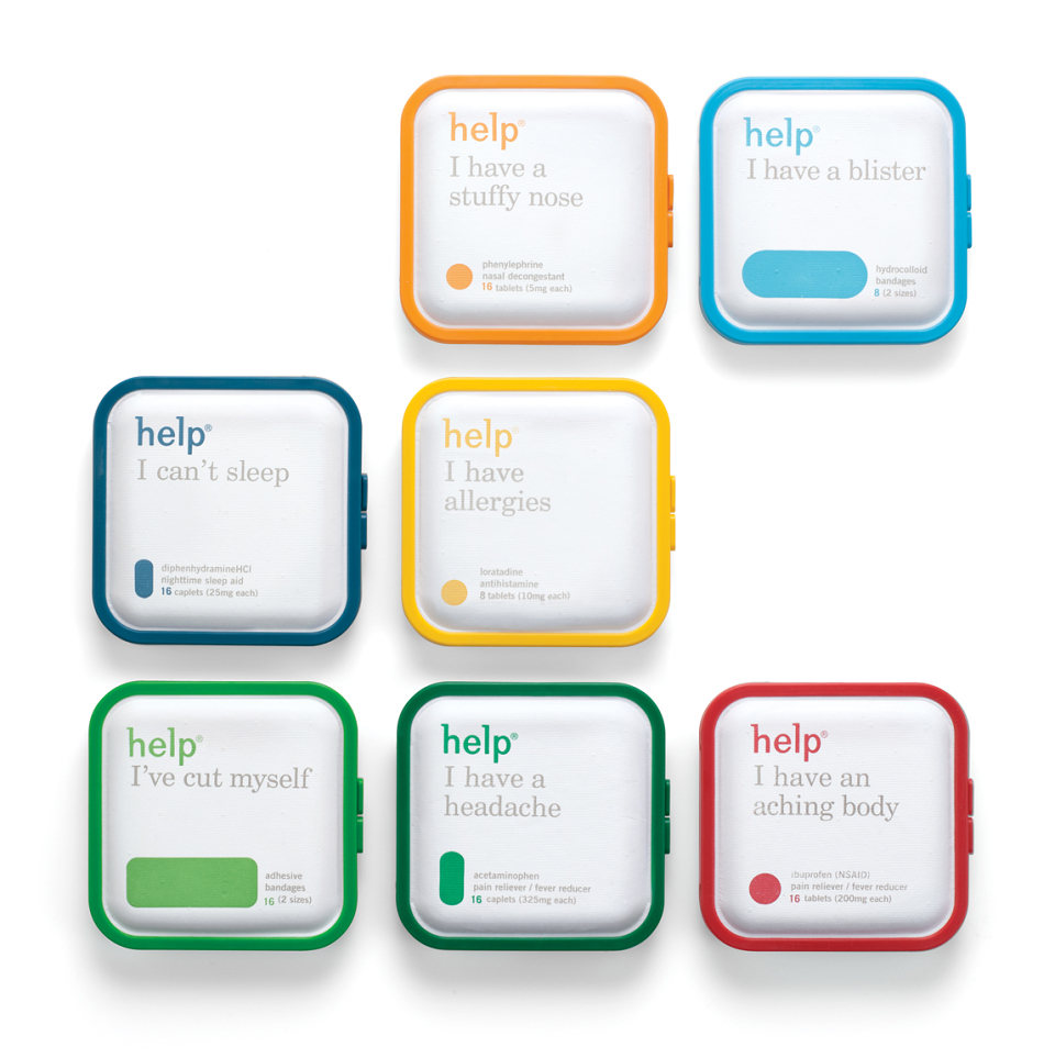
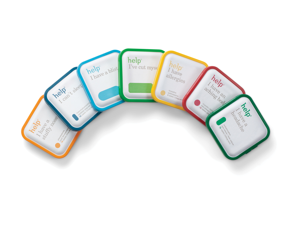
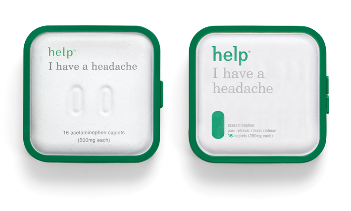
Help Remedies needed some…well, you know, to refresh their current packaging and introduce new variants to the portfolio. Our Design studio refined the existing identity, colour-coding the embossed pill shape to visually strengthen the brand architecture, improving stand-out and immediacy of recognition. The evolution dials up the brand’s equities, creating a powerful secondary language to be used across further touch-points and communications.
With a redesign that resulted in a sales increase of 1000% , Nathan Frank, Founder of Help Remedies, had this to say about our work, “Pearlfisher has done a great job in enhancing our identity so that it communicates everything we have to say without spelling it out, literally.”
AWARDS
DBA Design Effectiveness Award
Gold American Packaging Design Award