Mengdi Wang
Visual Artist
ABOUT
This is not a client-based project, but a reimagination of an existing brand.
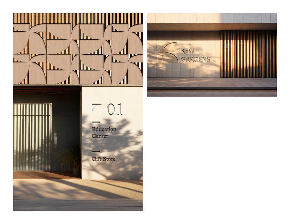
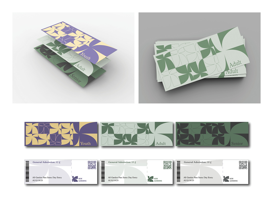
We are proud to unveil the reimagined identity of the Royal Botanic Gardens, KewŌĆöa harmonious blend of heritage, sustainability, and modern design.
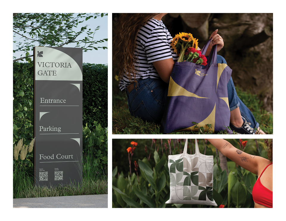
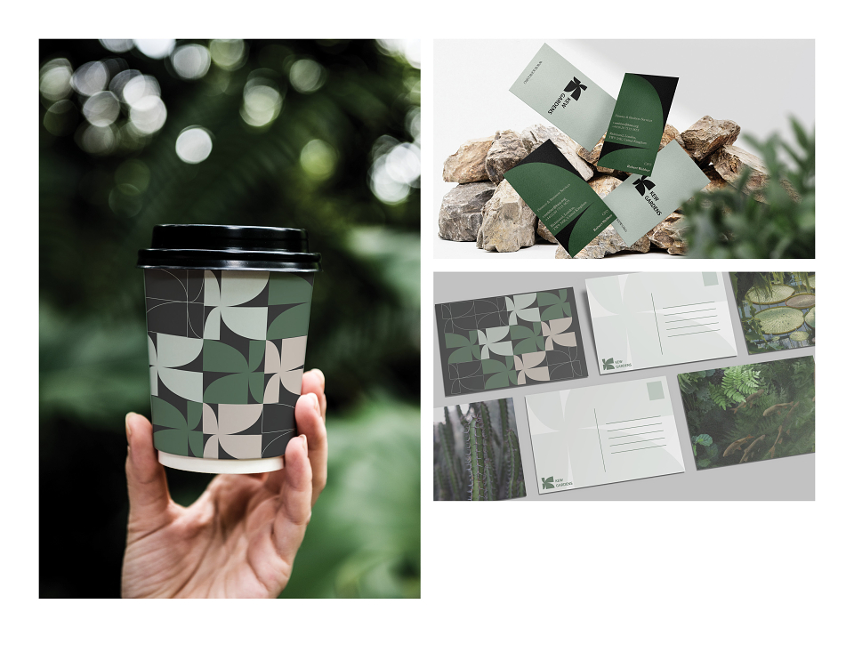
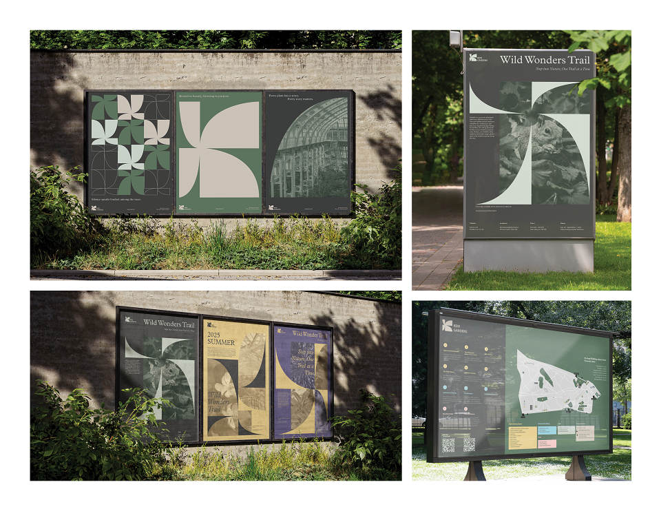
At the heart of this rebranding is a distinctive letter ŌĆ£K,ŌĆØ thoughtfully crafted to intertwine the elegance of botanical forms with contemporary aesthetics. The stylized ŌĆ£KŌĆØ incorporates leaf motifs, symbolizing Kew's enduring commitment to plant science and conservation.
Our new color palette features a refined greyish green, reflecting our dedication to environmental stewardship and aligning with KewŌĆÖs sustainability goals, including the ambition to become Climate Positive by 2030.
This refreshed visual identity not only honors Kew's rich legacy but also positions us for a future focused on ecological responsibility and innovation.
We invite you to explore this new chapter with us, as we continue to inspire and educate through the beauty and science of plants.
MADEIT CREDITS
-

Yizhi ZhangVisual Designer -

Mengdi WangVisual Artist
Annual 2025 ShortlistKew Gardens - Visual IdentitySelf Initiated
Project featured: on 13th July 2025
Contributor:
Invite
x3
Mengdi Wang has been a Contributor since 25th November 2015.