


Rebrands have a reputation problem. Partly because “rebrand” so often still gets used as a polite euphemism for “we’re bored” or “we’ve made a strategic mess and need a cleaner story.” Partly because too many rebrands are treated like a logo delivery rather than a business change. And partly because there’s a special kind of corporate delusion that says a new identity can fix a product, a culture, and a pricing model in one go, like Helvetica as a healing crystal. The reality is that a strong rebranding strategy in marketing lives or dies on the unglamorous parts of the rebranding process: the diagnosis, the decision-making, the system design, tzhe rollout, and the governance. If any of those are missing, you do not have a rebrand. You have a new logo and an old set of problems wearing a fancy new robe.
A successful rebrand is not a prettier mark. It’s a coherent shift in how a business presents itself, behaves, and gets chosen, translated into a brand system that can survive real-world touchpoints. You feel it in the product, the service, the tone of voice, the way the sales team talks, the way the website actually works, the way the packaging looks on a shelf, and the way the organisation makes decisions when nobody is watching.
This article is the practical version: from logo to launch, with a timeline you can actually use, a clear decision route for refresh vs rebrand, a deep dive into design thinking and rollout, and a handful of rebranding examples that show what “visual identity evolution” looks like when it’s done with intent, and when it’s done with a little more courage than comfort. It also includes a step-by-step rebranding strategy template you can follow, plus a rebranding checklist to keep the work honest from strategy to launch.
When to Refresh vs When to Rebrand

Swerve Represents
Let’s start with the question everyone pretends isn’t political: do you need a brand refresh or a full rebrand?
Most companies reach for “rebrand” because it feels decisive. But market leaders tend to do the opposite. They treat change like surgery: do the minimum that fixes the problem, unless the diagnosis demands something bigger.
Here’s the simplest way to separate the two.
A refresh is usually right when the strategy is broadly sound, but the brand system has aged: it doesn’t work well digitally, the design has drifted, the messaging is inconsistent, or the identity no longer reflects how the business actually behaves. Refreshes keep the core meaning and equity, then modernise the expression. Think: you are not changing what the brand means, you are upgrading how clearly and consistently it shows up.
A rebrand is needed when the meaning is wrong or no longer credible. You’re changing category, audience, business model, or proposition, or the brand has become so stretched that nobody can clearly explain what it stands for. Rebrands involve sharper choices, clearer trade-offs, and often changes to architecture, naming, tone, and experience. In other words: the business is changing what it wants to be chosen for, and the existing brand is now an obstacle rather than an asset.
How do you know if you need a rebrand?
If you want a quick internal “sanity check,” ask three questions and don’t let anyone answer with adjectives:
- Do customers understand what the business does and why it’s different, without help?
- Does the current identity system work across every major touchpoint (digital, product, social, sales, environments)?
- Are you changing who you’re for or what you’re promising in a way that makes the old brand meaning misleading?
If you answered “yes, yes, no,” you probably need a refresh. If you answered “no” to the first or third, you’re edging into rebrand territory.
This is also where the old frame of reference / parity / difference thinking earns its keep. If your category frame has changed or your differentiation is no longer ownable, you’re not polishing, you’re repositioning. And if you’re repositioning, a refresh that only updates visuals will feel like you’re whispering while the business is trying to move house.
The Rebrand Timeline That Doesn’t Collapse in Week Three
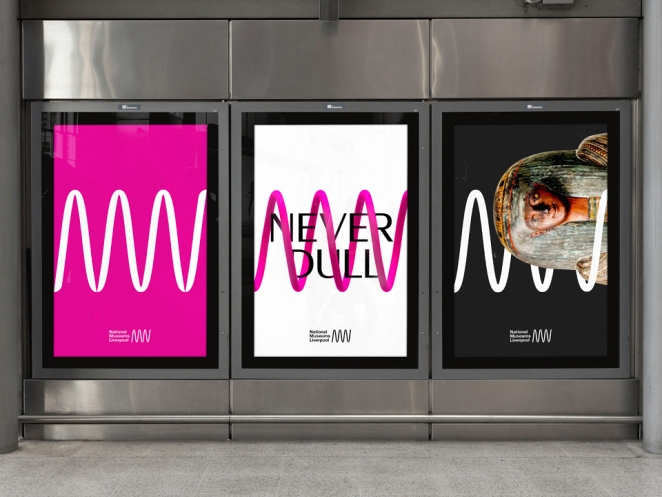
SomeOne
Most rebrands fail in the same boring way: someone plans for the “creative bit” and forgets the “organisation bit.”
So it helps to frame rebrands in phases you can schedule, resource, and govern. The timings vary wildly depending on size and complexity, but the sequencing holds up. This is the spine of the rebranding process: it keeps the project from becoming a series of exciting meetings followed by six months of silent chaos.
Phase 0: The pre-brief reality check (1 to 3 weeks)
Before anyone writes a brief or hires a studio, you need a brutally honest diagnosis. This is where you determine whether the problem is brand, product, go-to-market, or all of the above.
This phase is mostly conversations and evidence: customer research, performance data, competitive analysis, brand tracking, stakeholder interviews, sales call patterns, support ticket themes. The goal is to stop the organisation buying a new story to avoid fixing the old reality.
A useful output at the end of Phase 0 is a one-page “what must be true” statement. Not brand fluff, actual operational truths. For example:
- “If we say we’re premium, the product experience and onboarding must feel premium.”
- “If we position around simplicity, our pricing and plan structure must get simpler, not more enterprise-y.”
- “If we say we’re high-touch, customer support cannot remain a ticketing black hole.”
This phase is also where the “logo as therapy” tendency gets challenged. If the business is bleeding trust because the product is inconsistent, a new identity won’t stop the bleeding. It will just make it easier to spot the blood.
Phase 1: Strategy and positioning (3 to 8 weeks)
This is the part too many teams try to skip because it doesn’t look like a logo yet.
In this phase you define the backbone: audience, category frame, proposition, differentiation, proof points, tone, brand principles, and the “we are not for…” boundaries that create focus. These boundaries matter because a rebrand without trade-offs is usually just a prettier version of the same ambiguity.
If you want a crisp lesson on why this matters, look at companies whose visual changes were successful because the strategic spine was clear, and those where the visuals became a substitute for a missing spine.
Take Mastercard. When it updated its identity, the work leaned into simplification and digital optimisation while keeping the recognisable equity of the interlocking circles. That is not just design taste. That is a strategic choice to modernise without losing trust in a category that is basically made of trust. That is strategy made visible.
Phase 2: Concept and system design (6 to 12 weeks)
Now the design work earns its fee. But not as “logo exploration.” As a system build.
A serious rebrand is a set of interlocking decisions: mark, wordmark, typography, colour, layout logic, iconography, motion rules, photography or illustration approach, tone of voice, and UI patterns, ideally designed to scale across real contexts.
This is where design thinking becomes practical. Designers are not there to decorate a strategy deck. They are there to turn strategic intent into a living system that behaves consistently.
A good case study here is Slack’s rebrand. Slack’s old “hashtag” mark famously broke in certain contexts (colour, scaling, reproduction). The updated identity was designed to be more consistent and functional across use cases, not just prettier.
That’s the kind of unglamorous brand problem that can quietly cost you: inconsistency at scale becomes confusion, and confusion becomes friction. And friction is expensive.
Phase 3: Prototyping and touchpoint testing (3 to 6 weeks)
This is the phase that separates rebrands that look good in Keynote from rebrands that survive the world.
You prototype the system in the places that matter: website templates, app UI, social formats, pitch decks, packaging, product UI, signage, email, recruitment, motion. You test for accessibility and legibility. You stress-test colour and contrast. You check what happens when the system is used by non-designers (because it will be).
If you’re a brand marketer, this is where you stop future chaos. If you’re an agency, this is where you earn trust by being the adult in the room.
Phase 4: Internal adoption and operational roll-out (4 to 12 weeks, overlapping)
Internal adoption is the part everybody underestimates because it’s not “creative.” It’s change management.
A rebrand lands internally when people understand three things: why it’s happening, what it means for their work, and how to use it without fear.
This is also where brand guidelines shouldn’t be “a PDF nobody opens.” They should be tools. Living, searchable, built for real workflows. When guidelines are unusable, people don’t follow them. They improvise. Improvisation becomes drift. Drift becomes a brand that looks like five departments arguing in public.
Dropbox is instructive here, because its rebrand wasn’t just a colour palette and a typeface flex. It was tied to an ambition: expanding perception beyond “file storage” toward a more creative, expressive brand world. Over time, you can also see how systems evolve as businesses grow and need scalability, which creates an inevitable tension between expressive and structured. That tension is not a failure. It is a reality you govern.
How do you communicate a rebrand internally?
Start with plain language and a practical promise:
- Why: the business reason, said like a human, not like a deck.
- What changes: what teams will do differently, what is easier, what is now expected.
- How to use it: templates, examples, “do this / don’t do that,” access to assets.
- Who helps: champions, reviewers, a place to ask questions without getting judged.
If internal comms is only a big reveal and a clap, adoption will be cosmetic. People will smile, then keep doing what they have always done, except now with the wrong logo in the corner.
Phase 5: External launch (2 to 6 weeks)
This is where everyone finally notices. But if you’ve done the work properly, the “launch” is more like a controlled reveal than a big-bang surprise.
The best launches explain the rationale simply, show the system in action, and demonstrate proof. They don’t over-intellectualise. They don’t pretend it’s a revolution if it’s a refresh. They don’t hide behind “we’re a new chapter” language while changing nothing meaningful.
And crucially: they choose a launch sequence. You don’t have to update every asset on day one. Sometimes the cleanest approach is staged: digital first, then product, then environments, then everything else.
Phase 6: Post-launch governance and iteration (ongoing)
A rebrand isn’t finished at launch. It’s finished when governance stops drift.
You need owners. You need a design system mindset. You need approval workflows that don’t turn into bottlenecks. You need a way to measure whether the new brand is improving what it was meant to improve.
And you need to accept that the first year is iteration. Good brands keep the spine and refine the expression.
A Practical Rebranding Strategy Template (Step-by-Step Framework)
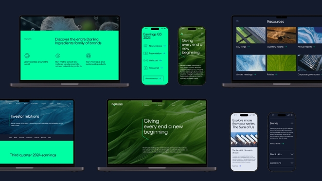
Huge
A lot of teams ask for a “template” because they are trying to reduce risk. Sensible. A rebranding strategy template is not a replacement for judgement, but it does stop the project becoming a personality contest.
Here is a usable, step-by-step template that maps cleanly to the phases above. Treat it as the operational core of your rebranding strategy in marketing.
Step 1: Define the problem (not the output)
Write a one-page diagnosis: what is broken, where it shows up, what it costs, and what is not broken. Be specific. If the problem is “customers don’t understand what we do,” say that. If it is “we’re losing in enterprise because we don’t feel credible,” say that. Do not write “our brand feels tired.” That is not a problem. That is a mood.
Step 2: Agree what must stay true (equity + non-negotiables)
List the equities you cannot afford to torch: visual cues, tone signatures, category permissions, trust markers, product truths. This is how you keep the rebrand from turning into an internal reinvention fantasy.
Step 3: Make the strategic choices (positioning + boundaries)
Lock audience, category frame, proposition, difference, proof. Then write the “we are not for…” list. This is where you trade breadth for clarity. If nobody is slightly uncomfortable, you probably haven’t chosen hard enough.
Step 4: Translate strategy into principles (creative + experience rules)
Turn the strategy into usable rules:
- What the brand should sound like
- What it should look like
- What it should never do
- What “good” looks like in key touchpoints (web, sales, product, support)
Principles are the bridge between “strategy deck” and “work that ships.”
Step 5: Design the system (not just the logo)
Build the identity system with real touchpoints in mind. If the system cannot be used quickly and consistently, it will not scale. If it does not scale, it will not survive.
Step 6: Prototype early, test often
Stress-test in the contexts that matter. Design does not fail in the studio. It fails in the weird edge cases: tiny mobile headers, dark-mode UI, cheap print, partner co-branding, PowerPoint abuse, and the moment someone copies and pastes the logo into a Word doc.
Step 7: Plan adoption like a product launch
Build internal kits, training, templates, and a clear “how we do brand now” workflow. Make it easy to do the right thing. If doing it right is slow and painful, people will do it wrong quickly.
Step 8: Launch in a sequence, then govern
Choose a sensible rollout order, then assign owners and review processes. Ship, learn, iterate. The system is alive now. Treat it that way.
That is the template. It is not glamorous. It is effective. Most “rebrand drama” happens when teams skip steps and try to solve strategic uncertainty with mood boards.
The Complete Rebranding Checklist (From Strategy to Launch)
WithFeeling
A timeline is only useful if it is scannable. Here’s the rebranding checklist version that you can actually pin to the wall and use to stop the project drifting into chaos.
If you’re considering a refresh, you should be able to complete:
- A quick equity audit (what must stay recognisable)
- A touchpoint audit (where the current system fails)
- A system update plan (type, colour, layout, digital performance)
- A rollout plan focused on consistency (templates, rules, training)
If you’re considering a rebrand, add:
- Positioning work that includes hard trade-offs (audience, category, proposition)
- Proof-point planning (what changes in product, service, experience)
- Architecture and naming decisions (if needed)
- Internal adoption programme (training, tools, champions)
- Governance model (how the system is protected and scaled)
If you can’t articulate the proof points, you’re not ready to rebrand. You’re ready to brainstorm.
The Design Thinking Bit: What “Good Process” Really Looks Like
Design thinking gets abused as a corporate word for “a workshop happened.” In rebranding, it’s only useful if it produces decisions.
At its best, design thinking means three behaviours:
First, empathy that is evidence-based. Not “we think people feel…” but “we have data, interviews, behavioural signals, and friction points.”
Second, iterative prototyping. Systems are built, tested, refined. Not designed once and shipped like a sculpture.
Third, synthesis into principles. The brand needs usable rules, otherwise everyone makes it up as they go.
The brands that manage this well tend to treat identity as a product. They build it, test it, version it, and govern it.
Which brings up a point worth saying plainly: the best brand systems are not the ones with the most “concept.” They are the ones that are easiest to use well. Ease is not the enemy of creativity. Ease is what lets creativity scale without collapsing into inconsistency.
Rollout Strategy: Where Rebrands Go to Die Quietly
If you want to know whether a rebrand will succeed, don’t ask to see the logo. Ask to see the rollout plan.
Rollout is where internal politics, operational complexity, and budget reality show up. And it’s where the gap between “brand” and “business” becomes obvious.
A rollout plan should answer:
- What changes first, and why?
- What’s the minimum launch set that makes the brand feel real?
- Who owns the system post-launch?
- How do non-designers create on-brand work quickly?
- How do we avoid half-updated brand chaos for six months?
This is also why supplier choice matters. Not because “web” is special, but because digital touchpoints are often the first and most visible proof of change. If the website says “new era” but behaves like the old one, customers will believe the behaviour.
Internal and External Adoption: The Difference Between “New Look” and “New Belief”
Internal adoption is not a comms email. It’s a belief shift.
If people don’t understand the why, they’ll treat the rebrand as a costume. If they don’t have tools, they’ll improvise. If they don’t feel included, they’ll quietly resent it. None of this shows up in the launch film. It shows up later, in the quality of execution and the speed at which the system decays.
The strongest internal adoption programmes do a few things consistently:
- They narrate the business reason in plain language.
- They show how the new system makes work easier, not harder.
- They train teams with real templates and real examples.
- They appoint champions who can answer questions and protect consistency.
Externally, adoption is about repetition and coherence. Customers don’t learn a new brand in one cinematic film. They learn it through consistent cues across every interaction.
Rebranding Examples That Worked (And Why)
Let’s look at a handful of rebranding examples, not as “copy this aesthetic,” but as lessons in strategic intent, system design, and rollout.
Mastercard: simplifying a global mark without losing trust
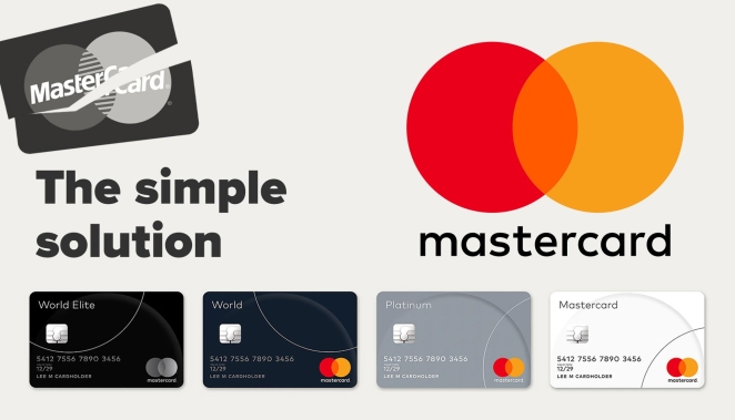
Mastercard is a brilliant example of a brand that understood what it could change and what it couldn’t.
The interlocking circles are one of the most recognisable equities in modern commerce. The update leaned into simplicity and digital functionality while preserving that equity, and later moved toward using the symbol without the wordmark in select contexts, a confidence move that only works when recognition is high.
Lesson: if you own an iconic asset, the job is not to reinvent it. The job is to make it work everywhere modern life demands it work, without getting designer fingerprints all over it.
Slack: fixing a logo that couldn’t behave
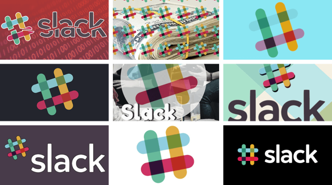
Slack’s rebrand is often discussed because people had opinions about the logo. The more important point was functional: the old mark was hard to reproduce consistently, especially across colours and contexts. The new identity was designed to behave more reliably at scale.
Lesson: sometimes the rebrand is not about freshness. It is about operational consistency. Operational consistency is a brand advantage because it reduces friction and confusion.
Dropbox: expanding meaning beyond utility

Dropbox’s evolution shows what happens when a brand tries to stretch perception. The rebrand aimed to expand the brand beyond “file storage” into a more creative, expressive world.
The more interesting reality is what happens later: systems evolve as businesses expand their product suite and need scalability. Structure increases. Expressive “spark” can get diluted unless it’s actively protected. That is not a critique. That is physics.
Lesson: identity systems are living things. If you want them to stay expressive, you need governance that protects the expressive bits, not just the safe bits.
What Brands Should Demand From a Rebrand Partner
Dawn Creative
If you’re commissioning a rebrand, don’t just buy taste. Buy process and accountability.
You want a partner who will:
- Push for strategic clarity before jumping into visuals
- Prototype across touchpoints early
- Design a system, not a logo
- Build guidelines that function as tools
- Plan rollout and adoption as core deliverables
- Help you govern the system post-launch
If you’re delivering rebrands as an agency, this is also where you stop selling “creativity” and start selling reduced risk. Brands are not paying for a nice mark. They’re paying to avoid confusion, inconsistency, and wasted spend.
What Creative Businesses Should Protect During Delivery
i2i Art Inc.
Here’s the honest bit: rebrands will try to eat your margins if you let them.
Successful delivery depends on:
- A tight scope for strategy and a separate scope for system build
- Clear decision points and who signs off at each one
- Controlled rounds (the infinite exploration trap kills projects)
- Early touchpoint prototyping (so surprises show up while you can still fix them)
- Asset production planning (because the system is only real when it’s implemented)
The best rebrand projects are not the ones where everyone feels endlessly inspired. They’re the ones where decisions happen quickly because the positioning is clear and the process is respected.
The Last Mile: How to Know the Rebrand Actually Worked
I Am Female*
A rebrand “worked” if it improved the things it was meant to improve.
That might mean:
- clearer customer understanding
- higher consideration
- better conversion
- stronger premium perception
- improved recruitment
- better internal alignment
- less design drift and faster content production
- a brand system that scales
It’s worth agreeing upfront what success looks like, because otherwise the only metric becomes “people on LinkedIn said it’s nice,” which is not a business strategy.
How do you successfully rebrand a company?
By aligning reality first, then expression. Build the strategic spine, design a system that works in real contexts, train the organisation to use it, and govern it post-launch so it does not drift back into entropy. Anything else is theatre.
A Business Change Made Visible
If you’re a brand marketer planning a rebrand, the single best move you can make early is to get input from people who’ve shipped these systems in the real world: strategists, brand designers, design systems people, UX leads, copy leads, and rollout operators. If you’re a creative business, the best move is to package your rebrand capability properly: case studies that show business impact, not just aesthetics, and a process that reduces risk.
Either way, the point is the same: a rebrand is a business change made visible. Treat it like a logo project and you’ll get a logo result. Treat it like a system, and you give yourself a chance of shipping something that actually sticks.
If you want to do the second version (the one that sticks), Creativepool’s network is built for the messy middle: finding the right specialists, agencies, and collaborators to take a rebrand from concept to rollout without losing quality, or sanity.
And that, really, is the journey: not from “logo to launch,” but from decision to adoption. Which is why the best rebranding strategy in marketing is the one that respects the full rebranding process, uses a real rebranding strategy template to force decisions, learns from credible rebranding examples, and relies on a practical rebranding checklist so the brand system survives contact with the real world, not just the approval meeting.