
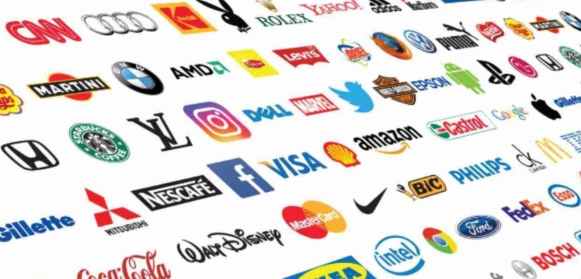

What makes a great logo? Is it a piece of graphic design work that finds the perfect middle ground between form and function? Or is it something that transcends the artform itself to become something iconic in its own right? For me, a great logo has always been a piece of literal iconography that speaks louder than the brand name itself. A great logo is at once its own entity and something which somehow sums up everything about the attached brand in a series of lines, curves and colours.
It's a tall order. So, when looking back through the history of iconic logos, I decided to take a slightly different approach. You’ve probably already ran through the usual suspects in your mind’s eye by now (cough Nike) but if you look past the billion-dollar enterprises and the legendary brands with close to a hundred years of history under their belts, you’ll find the logos that work so well not because of what they represent but how they make us feel.
My list foregoes the obvious logos for the ones that I feel say as much about the artform itself as they do about the brands, movements and ideas they represent. If you disagree, feel free to argue with me in the comments below!
London Underground Roundel (1912–1917)
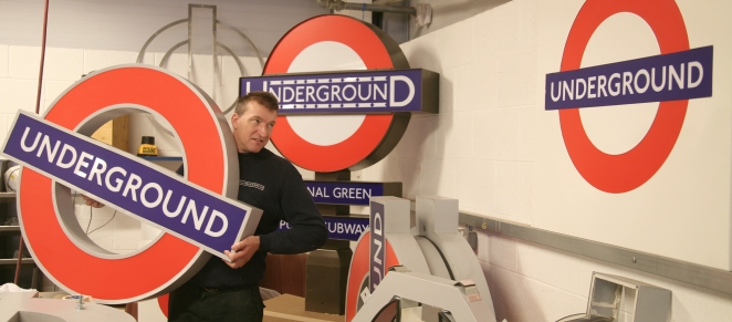
Designer: Initially Frank Pick (Underground Electric Railway Company); refined by calligrapher Edward Johnston and later by graphic designer Hans Schleger.
Why it matters: The roundel (a red circle bisected by a blue bar) began as simple signage to help passengers identify stations and evolved into a symbol of London itself. A Fast Company history of the logo notes that the roundel’s power lies in its abstraction and its ability to transcend transport to become a “visual metonym for London”. Its simplicity made it an instantly recognisable symbol not just for the Tube but for a city and its culture.
IBM “8‑bar” (1972)
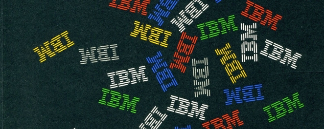
Designer: Paul Rand.
Why it matters: When IBM needed a more contemporary mark, legendary designer Paul Rand created a striped version of the company’s existing block logo. IBM notes that the eight horizontal bars represent “speed and dynamism” and have remained unchanged since 1972. The mark is considered one of the company’s most valuable assets and has even travelled to the Moon.
National Geographic Yellow Rectangle (1888)
Designer: The Society’s founders.
Why it matters: The magazine’s yellow frame has appeared on every cover since 1888 and symbolises a window on the world. Design historian Cameron Christie notes that the frame has needed virtually no change and acts as a doorway to exploration, working harder than the logotype itself. The simple rectangle conveys adventure, curiosity and a love of photography.
NASA “worm” (1975, revived 2020)
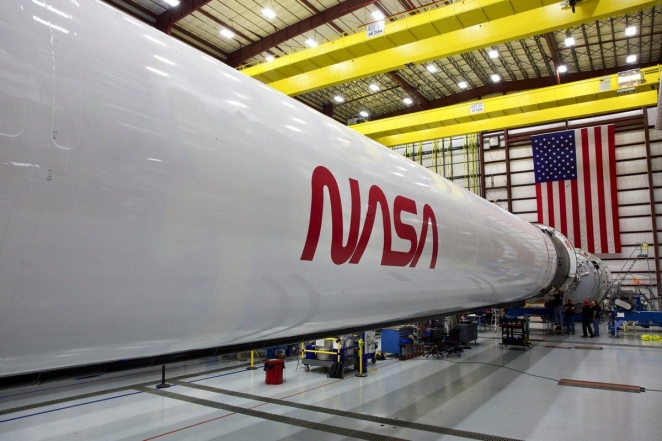
Designer: Richard Danne and Bruce Blackburn.
Why it matters: Seeking a more modern identity, NASA introduced a sleek red wordmark nicknamed the “worm” in 1975. The logotype won design awards and was praised by President Reagan for its simplicity and innovation. Designer Richard Danne described it as a timeless design that speaks of technology. Though replaced in 1992 by the traditional “meatball,” the worm returned in 2020, proving its enduring appeal.
I ♥ NY (1977)
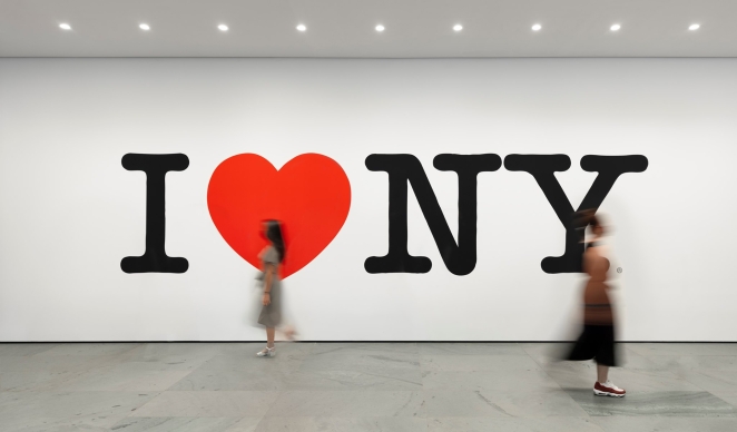
Designer: Milton Glaser.
Why it matters: Commissioned to boost New York tourism during a period of crime and financial crisis, Milton Glaser’s design was sketched during a taxi ride. He replaced his initial typography with the now‑familiar red heart and stacked letters, taking inspiration from lovers’ initials carved on tree trunks. The simple motif captured a complex sense of place and became an instant cultural phenomenon.
Recycling Symbol (1970)

Designer: Gary Anderson.
Why it matters: The universal three‑arrow recycling symbol was created by 22‑year‑old architecture student Gary Anderson for a contest at the 1970 International Design Conference in Aspen. Anderson drew inspiration from environmental protests and the Möbius strip; his design was chosen because it could be reproduced at any size. The Container Corporation placed the symbol in the public domain, hoping to encourage recycling awareness.
Smiley Face (1963)
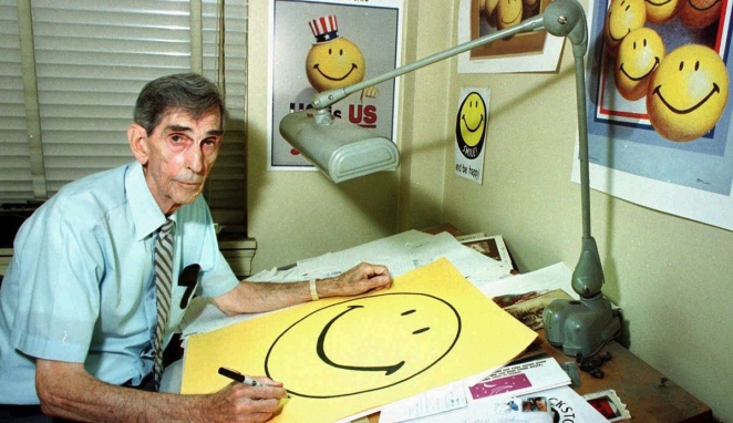
Designer: Harvey Ball.
Why it matters: Tasked with boosting employee morale, graphic artist Harvey Ball drew a simple yellow smiley face with off‑centre eyes and a crooked grin. He was paid US$45 and finished the design in less than ten minutes. The image became a global shorthand for happiness, though Ball never trademarked it. Its meaning shifted across decades (from peace and love to rave culture and emoji) but its simplicity remains timeless.
Peace Symbol (1958)
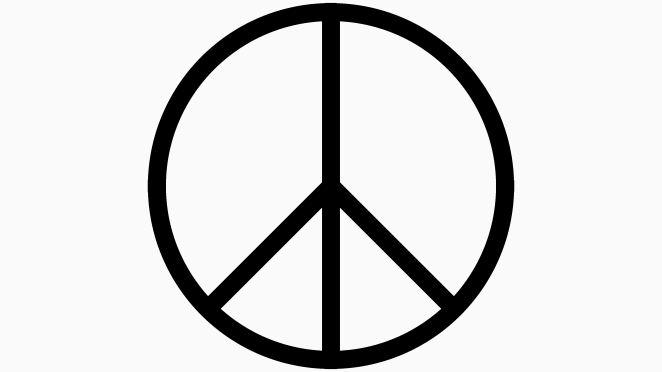
Designer: Gerald Holtom.
Why it matters: Created for Britain’s Campaign for Nuclear Disarmament, the peace symbol combines the semaphore letters for “N” and “D” (nuclear disarmament). Holtom also saw in the design a figure in despair with arms outstretched downward. Introduced during a 1958 anti‑nuclear march, the symbol quickly became a universal sign of peace and hope. It has never been copyrighted and remains free for anyone to use.
Olympic Rings (1913)
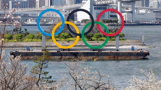
Designer: Pierre de Coubertin.
Why it matters: The founder of the modern Olympics designed five interlocking rings representing athletes from the five inhabited regions of the world (Australia, Africa, the Americas, Europe and Asia). The rings symbolise unity and were first displayed at the 1920 Antwerp Games. Their colours (blue, yellow, black, green and red on a white background) were chosen so every national flag contains at least one of the hues.
Penguin Books (1935)
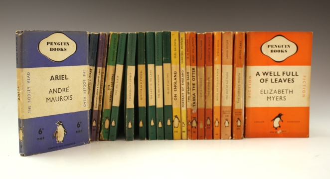
Designer: Edward Young (with later refinements by Jan Tschichold).
Why it matters: Publisher Allen Lane needed an appealing name and mark for his new paperback line. A secretary suggested “Penguin,” and Lane sent 21‑year‑old office junior Edward Young to sketch penguins at London Zoo. Young’s drawing became a simple, instantly recognisable logo that conveyed quality. In 1946, typographer Jan Tschichold redrew the bird and introduced a rigorous design system that lasted for decades.
Metro‑Goldwyn‑Mayer Lion (1924)
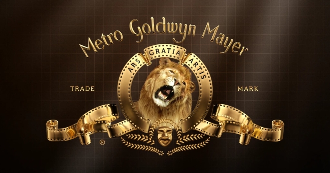
Designer: Howard Dietz (for Goldwyn Pictures, later MGM).
Why it matters: Advertising executive Howard Dietz created the roaring lion trademark in 1916 for Goldwyn Pictures as a tribute to his alma mater, Columbia University’s athletic team (the Lions). He added the Latin motto “Ars Gratia Artis” (“Art for art’s sake”) framing the lion. The logo evolved as live lions (Slats, Jackie, etc.) were filmed for successive titles, creating one of cinema’s most enduring opening sequences.
Unilever “U” (2004)
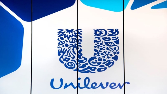
Designer: Wolff Olins.
Why it matters: Unilever replaced its industrial wordmark with a mosaic‑style “U” formed from 25 icons representing the company’s products and values. The company explained that the new logo “tells the story of Unilever and vitality,” bringing together symbols such as DNA (bioscience), a bee (hard work and biodiversity), hair (beauty) and a spoon (nutrition). The intricate mark reflects the company’s commitment to sustainable living and stands out in the corporate landscape.
Starbucks Siren (1971–2011)
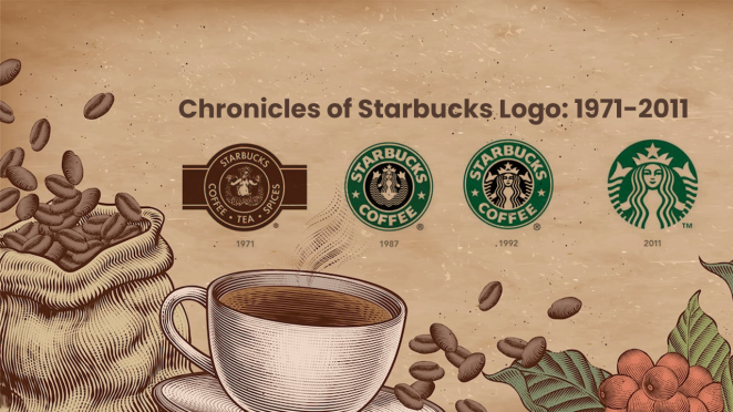
Designer: Terry Heckler (Heckler Bowker).
Why it matters: Seeking a maritime motif that reflected Seattle’s seafaring roots, corporate artist Terry Hecklerdiscovered a twin‑tailed siren in a 16th‑century marine book. The siren’s alluring image was chosen as the emblem of Starbucks, symbolising the seductive appeal of coffee. Over the years the logo evolved from the original brown, bare‑breasted siren to the green‑and‑white version introduced in 1987, then simplified in 1992, and finally stripped of the wordmark in 2011 when the siren alone was deemed globally recognisable.
Chanel Double‑C (1925)
Designer: Gabrielle “Coco” Chanel.
Why it matters: Fashion house Chanel’s emblem consists of two interlocking Cs, one facing forward, one backward. The logo first appeared in 1925, and it is widely accepted that Coco Chanel designed it herself to represent her initials. Later theories suggest the motif may also honour her lover Arthur “Boy” Capel. or draw on aristocratic monograms and Art Deco style. The French marque notes that Chanel designed the interlocking Cs in 1925 as homage to the geometric stained‑glass windows of the Aubazine monastery where she spent her youth. The simple design has remained virtually unchanged for a century, symbolising elegance, refinement and the revolutionary spirit of the designer.
Audi Four Rings (1932)
Designer: Auto Union (combined logos of Audi, DKW, Horch and Wanderer).
Why it matters: In 1932 four German car makers (Audi, DKW, Horch and Wanderer) merged to form Auto Union AG. The new company adopted a badge of four interlocking rings to represent the unity of these brands, with each ring symbolising one of the four founding companies. Audi’s history site notes that each brand continued to serve its own market segment, but the four rings emphasised their collective strength. Today the rings remain unchanged and have become an elegant symbol of engineering precision and teamwork.
MTV (1981)
Designer: Manhattan Design (Pat Gorman, Frank Olinsky, Patti Rogoff) under creative director Fred Seibert.
Why it matters: When music television launched in 1981, the channel needed a logo as rebellious as its programming. The design team created a hulking 3D “M” with a graffiti‑sprayed “TV” on its side, making it feel like a piece of street art. The logotype was intentionally flexible so that colour, texture and patterns could be changed to reflect the music and youth culture. Designer Patti Rogoff drew the blocky “M” while Frank Olinsky spray‑painted the “TV,” allowing the logo to morph without losing its shape. This mutability made MTV’s mark a symbol of creative freedom.
Stella Artois (1366)
Designer: Unknown; based on the brewery’s heritage and updated over centuries.
Why it matters: The Stella Artois logo combines several historical elements. The ornate cartouche reflects the Flemish architecture of the original 14th‑century Den Hoorn brewery in Leuven, which used a horn as its sign from its inception in 1366. Brewer Sébastien Artois purchased Den Hoorn in 1717, and in 1926 the brewery released a special Christmas beer named “Stella” (Latin for “star”). The star was added to the logo to commemorate this Christmas ale, while the horn continues to reference Den Hoorn (“the Horn”) The logo also bears the date “Anno 1366,” underlining the brand’s long history. This blend of horn, star and cartouche gives the beer an artisanal heritage.
Beavertown Brewery (2011)
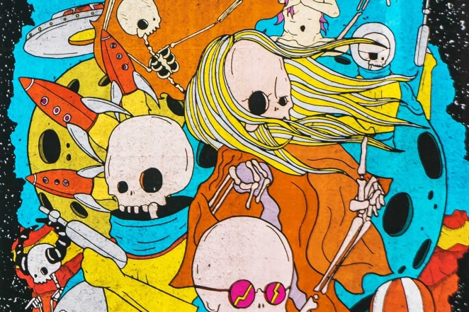
Designer: Nick Dwyer.
Why it matters: London‑based Beavertown Brewery built its brand around bold illustrations rather than a conventional logo. Creative director Nick Dwyer explains that the identity is built on “spacemen, skeletons, skulls and weird shit exploding”. with surreal drawings influenced by graphic novels and cartoons. Dwyer’s artwork, initially created for the brewery’s Gamma Ray pale ale, set the tone for the entire product range; recurring characters (spacemen, skeletons and monsters) appear across labels, creating a consistent universe. This illustrative approach shows how craft beer brands can use storytelling in place of a traditional mark.
Tour de France (2002)
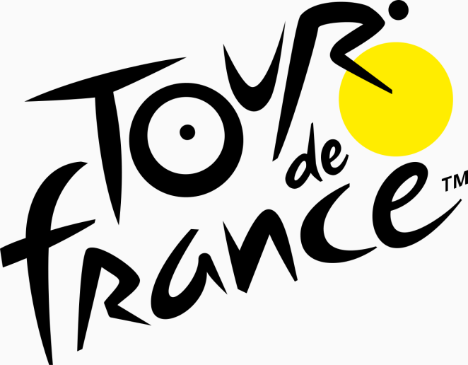
Designer: Joël Guenoun.
Why it matters: To celebrate the centenary of cycling’s most famous race, French designer Joël Guenoun created a dynamic logo in 2002 (officially adopted in 2003). The playful brush‑script lettering hides a cyclist within the word “Tour”: the “O,” “U” and “R” form two wheels and a rider, while a yellow circle symbolises both the sun and the winner’s yellow jersey. A companion article notes that the raised word “France” suggests a hill, emphasising the race’s mountainous challenges. This clever integration of imagery and typography captures the spirit of the Tour in a single mark.
Ferrari Prancing Horse (1932/1947)
Designer: Derived from Francesco Baracca’s emblem; refined by engraver Eligio Gerosa under Enzo Ferrari.
Why it matters: The prancing horse started as the personal emblem of First World War flying ace Francesco Baracca, who painted a black stallion on his aircraft. After Enzo Ferrari won a race in 1923, he met Baracca’s parents; Countess Paolina urged him to use the horse on his cars for good luck. Ferrari first applied the emblem to an Alfa Romeo racing car in 1932, but it wasn’t until 1947 that the first Ferrari‑branded car, the 125 S, left the factory with the prancing horse on a yellow shield. The yellow background honours Ferrari’s hometown of Modena, and the initials “S F” stand for Scuderia Ferrari. The official history notes that Enzo instructed engraver Eligio Gerosa to make the horse face left and progressively slim and elegant. This emblem has become synonymous with speed, passion and Italian heritage.
McDonald’s Golden Arches (1952–1968)
Designer: Architect Stanley Meston (building design); logo refined by Jim Schindler.
Why it matters: The golden arches began as architecture. In 1952 the McDonald brothers hired architect Stanley Meston to design a roadside restaurant that would catch the eye of passing motorists. Meston’s final design featured two 25‑foot yellow arches rising from the ground and crossing the roof, forming an “M” when viewed from a certain angle. The brothers insisted on a golden colour to maximise visibility. When Ray Kroc expanded the chain, head of engineering Jim Schindler faced the challenge of turning this three‑dimensional architecture into a universal symbol. In 1961 he photographed the arches from various angles and drew a simplified, overlapping ‘M’ that maintained the essence of the structure. Early versions even included the restaurant’s roofline, but by 1968 the logo was pared back to the standalone arches. The arches have since become one of the world’s most recognised symbols and are more widely recognised than many religious icons.
Apple (1977)
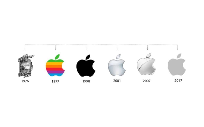
Designer: Rob Janoff (Regis McKenna advertising agency).
Why it matters: When Apple needed a more polished identity, art director Rob Janoff created a rainbow‑striped apple with a bite taken out of it. Janoff has explained that he added the bite to make sure people recognised the shape as an apple rather than another round fruit. The coloured stripes highlighted the Apple II’s ability to display colour and were intended to make computers feel friendly and approachable. Although later versions dropped the rainbow, the bitten apple has become one of the most beloved and instantly recognisable symbols in tech.
Mitsubishi Three Diamonds (1870s)
Designer: Yataro Iwasaki.
Why it matters: The Mitsubishi conglomerate was founded by Yataro Iwasaki in the 1870s. Iwasaki combined two family emblems to create the company’s three‑diamond mark. The word “Mitsubishi” itself fuses mitsu (meaning “three”) and hishi (meaning “water chestnut,” a term used for a rhombus or diamond). The emblem reflects the three‑leaf crest of the Tosa Clan, Iwasaki’s first employer, and the three stacked rhombuses of the Iwasaki family crest. This simple geometric mark has endured for over a century and symbolises quality and reliability for the group companies.
Boots Scroll (late 19th century)
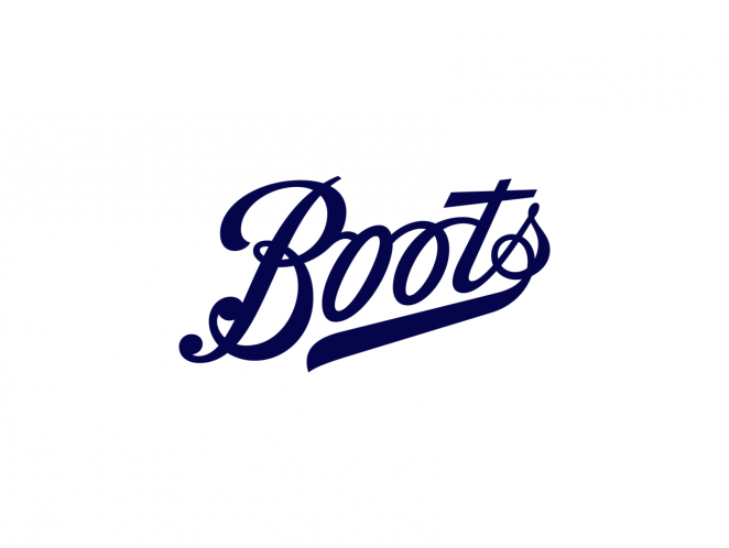
Designer: Believed to be Jack Hunt (Boots Shopfitting Department).
Why it matters: British health and beauty retailer Boots has used a distinctive cursive wordmark for nearly 140 years. Building historian Matthew White explains that the Boots scroll – a flowing signature with a pennant on the “t” and an underline from the “s” – is thought to have been devised in the late 19th century by signwriter Jack Hunt in the company’s shopfitting department. The design was standardised and registered as a trademark in 1924. Later variations added an oval background or included the words “The” and “Chemists,” but the basic script has remained remarkably consistent. Its enduring familiarity underscores the power of a simple, hand‑drawn logotype.
Another Opinion
Simon Manchipp, Founding Partner @ SomeOne
"For me it's the recycling symbol, the Wi-Fi icon and the Bluetooth rune. The heart emoji—twelve pixels across, yet understood in twelve billion ways. These didn’t win awards. They became oxygen. The real greats stopped being seen as design. They became infrastructure.
Uncomfortable truth: the recycling symbol lets people feel smug about a broken system. Wi-Fi signals more surveillance than freedom. The heart emoji has cheapened the word “love” to a tap. The best logos aren’t necessarily good. They’re just unavoidable."
Why these logos matter and why they work
Because truly great logos do more than decorate packaging, they act as visual shorthand for everything a company stands for. Drawing on insights from branding experts, we can see that the most enduring marks share a handful of qualities:
- Instant recognition and trust: A strong logo becomes memorable quickly; the golden arches or green siren are instantly recognised without reading the name. Recognition brings trust and makes a brand accessible, and people assume a well‑crafted logo represents a stable, professional company.
- Differentiation in crowded markets: Unique logos set a company apart, whereas overused templates make brands disappear. Originality and appropriateness help customers remember and distinguish one brand from another.
- Emotional connection: Colour and symbols evoke feelings; a logo can conjure calm or excitement and build loyalty. Emotional marks, particularly in sports, provoke strong attachments and memories.
- Versatility and scalability: A timeless logo must look good on billboards, websites and tiny app icons. Simple, scalable designs maintain quality and brand consistency across platforms.
- Memorability and simplicity: Memorable logos are easy to describe – “the bitten apple,” “the golden arches” or “the swoosh” – and include a unique twist without being overly complex. Simplicity ensures the design remains clear and adaptable as trends change.
- Long‑term efficiency: Timeless logos save money by avoiding costly rebrands; they can be refined rather than replaced.
Across industries and eras, the logos above utilise these qualities in abundance and underline how a successful mark need not necessarily be loud or complex. Instead, it should tell a story, embody the brand’s values and evoke an emotional response. Each of these symbols shows how thoughtful design can transcend time and function to become true iconography.