Laura Pantaleone
Creative Director & Designer
ABOUT
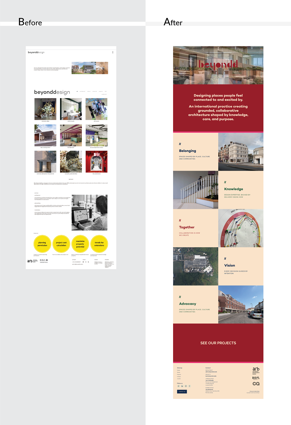
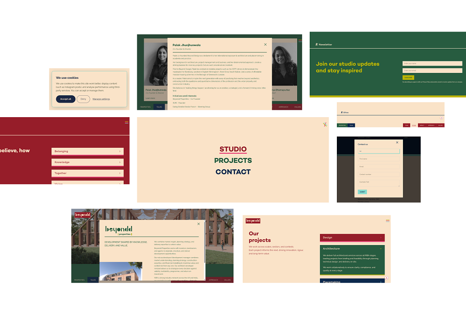
We were approached by the architecture firm Beyond Design, who were looking for a new creative partner to finalise their identity for their fifth anniversary. The brief was clear: develop a memorable, cohesive visual system that reflected their evolved tone of voice and core values, and redesign their website to be more user friendly and genuinely attractive to their audience. They liked our approach. No trends, just great design, made from years of expertise, built to be unique, personal and timeless to this studio alone.
CONCEPT AND CHALLENGES
Beyond Design operates across three branches: Design, Properties, and Talks. The website needed to lead with Design, while laying the groundwork for the others to grow into. That meant building a graphic language flexible enough to hold multiple identities without fragmenting the brand. The system also needed to go beyond the website, producing something recognisable and versatile enough to bring consistency and focus to every graphic asset across channels.
One more thing mattered just as much as the look and feel. The team needed to be able to update projects, team pages and blog posts themselves. To do that we had to build templates that would always work beautifully, no matter what content or copy the team uploaded. The client requested Webflow, a platform known for its powerful and easy to use CMS dashboard, and we adapted and actually enjoyed digging in.
There was also a tight deadline. The project had experienced some delays in the first phase of the branding, but everything needed to be in place before MIPIM 2026, one of the most prominent events in the international property and architecture calendar. We worked at some intensity to make sure Beyond Design could walk in with their new identity ready to shine.
EXECUTION
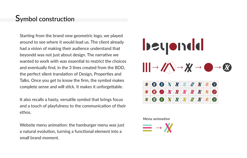
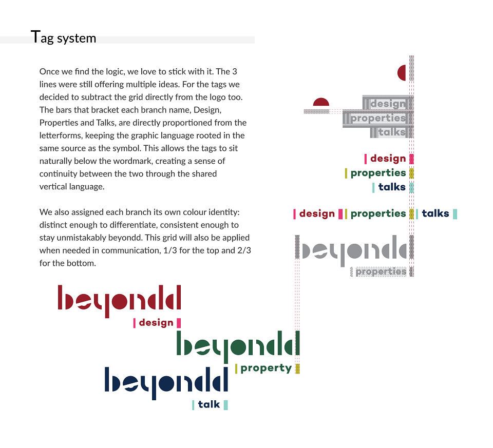
We started with the letterforms. Rather than imposing a new graphic system from outside, we extracted one from within. Taking the vertical strokes of the b and double d in the beyondd wordmark, we created a single symbol that references all three branches of the business simultaneously. It can stand alone or be contained, recognisable at scale, considered up close.
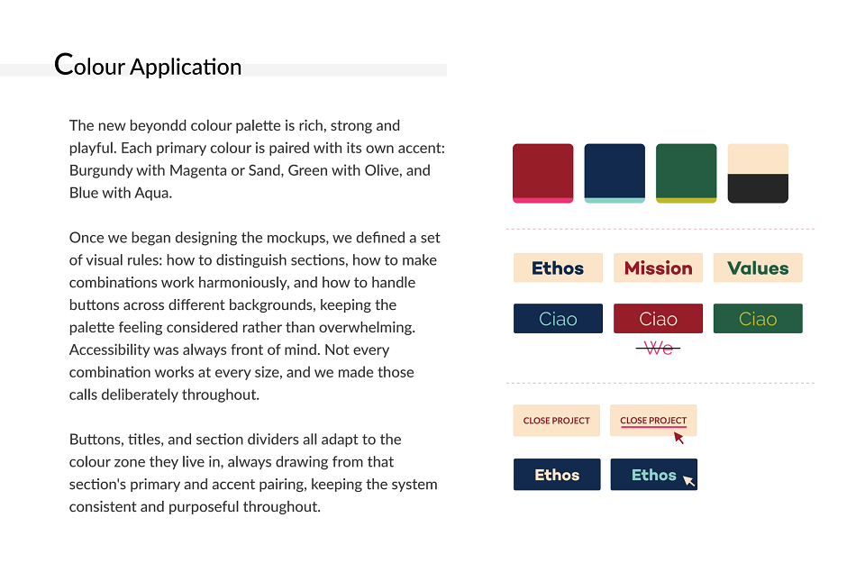
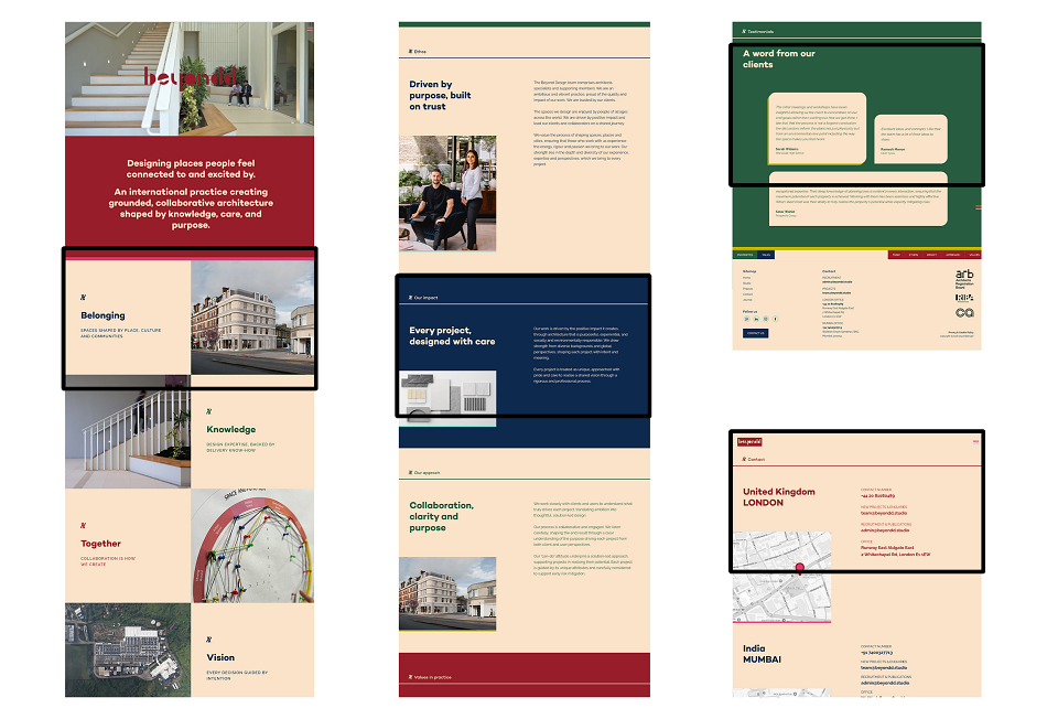
From that single source, we built the entire visual language: the branch tag system, the colour zoning, the navigation behaviour, and the interaction details. Each branch carries its own colour identity. Distinct enough to differentiate. Consistent enough to hold together.
With the visual system in place, we moved into the website.
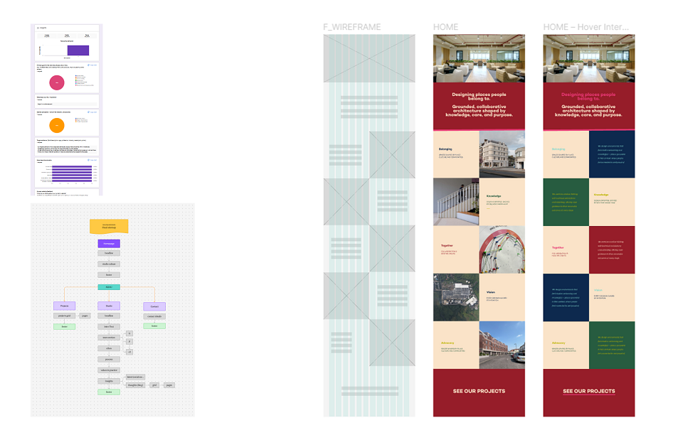
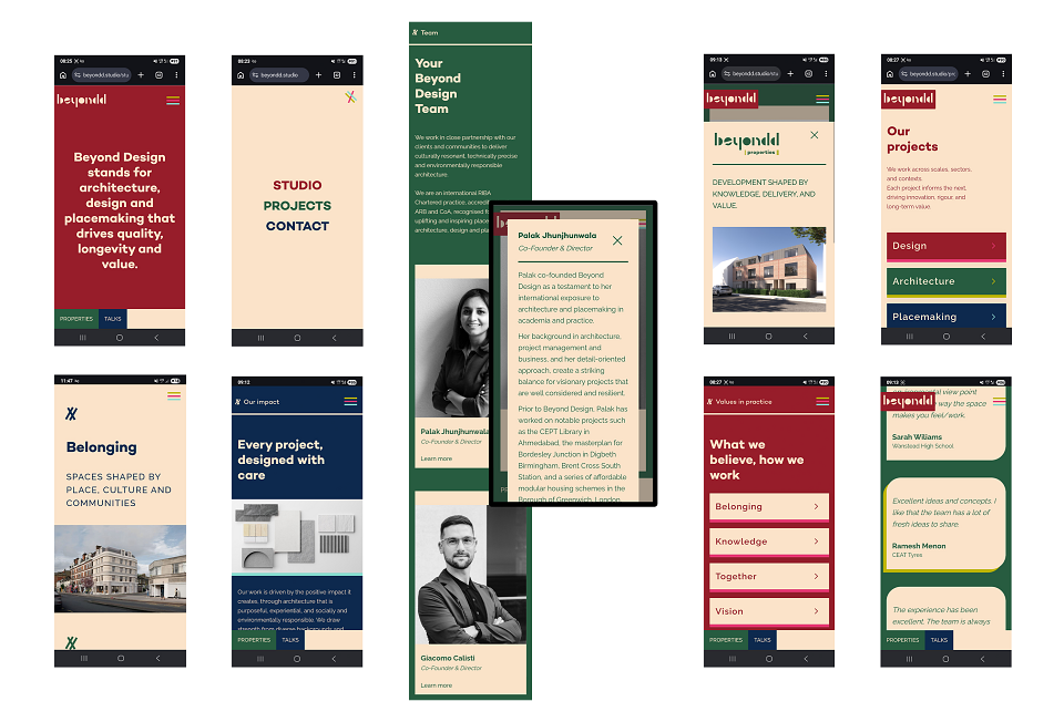
Three navigation paths, Studio, Projects and Contact, replace a structure that previously asked too much of the visitor. The homepage leads with a manifesto, placing values and purpose before credentials and services. It sets the tone immediately and does not apologise for it.
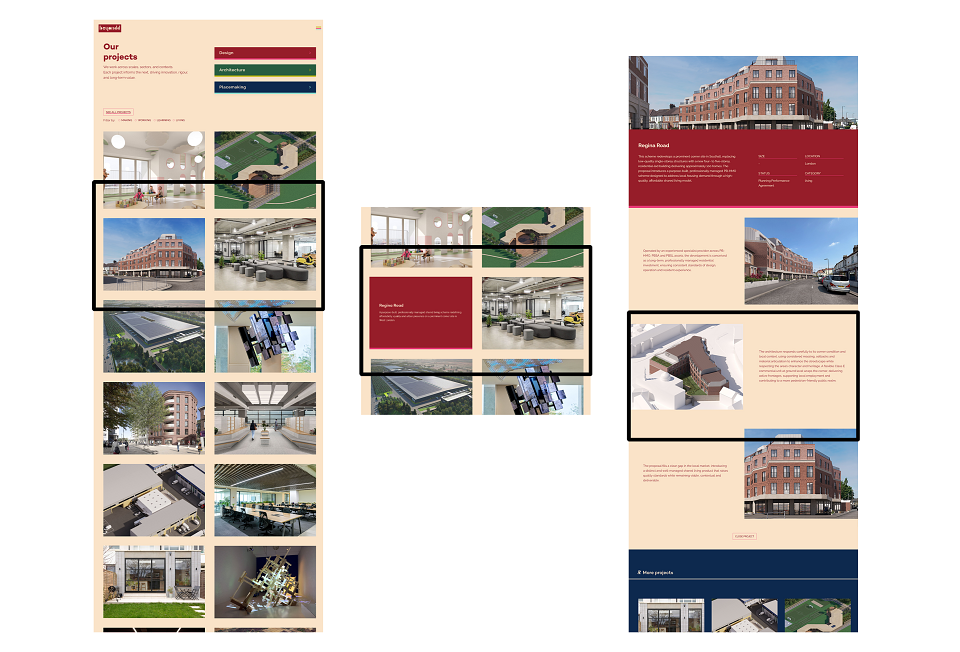
The Projects section was designed around a clean modular grid, consistent enough to maintain visual quality regardless of who is updating it. The system does the design thinking so the client does not have to.
Subtle animations add energy throughout, playful without being distracting. The site works across desktop, tablet and mobile, with every breakpoint feeling considered rather than just functional.
RESULTS
It delivered on every front. Creatively, technically and commercially.
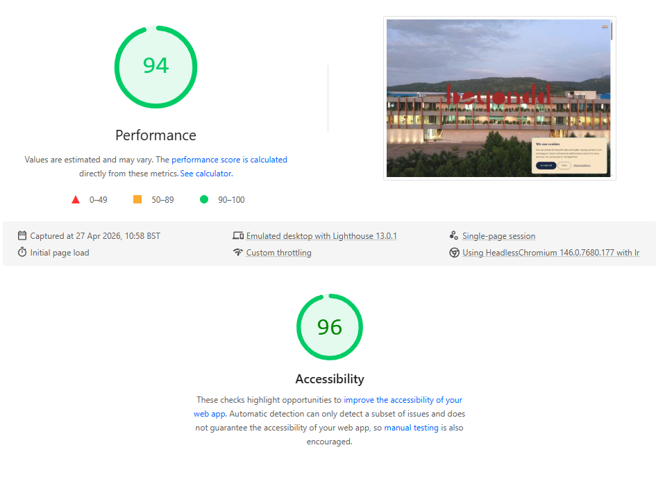
The site launched in time for MIPIM 2026. At handover it scored 94 for Performance and 96 for Accessibility, a satisfying reflection of the same care put into the visual design.
The Beyond Design team now runs the site themselves, uploading projects and updating content via the CMS dashboard, supported by training sessions and video guides we produced as part of the handover.
Early response to the rebrand has been consistently positive, with clients and audiences noting a real shift in how the studio comes across. The symbol is already out in the world, applied across social media through visual guidelines and templates we prepared, and supported by consultancy to their social media manager to keep it consistent and effective.
The visual system is ready for what comes next. When Beyond Properties and Beyond Talks are ready to grow, the foundation is already there.
MADEIT CREDITS
-

Laura PantaleoneCreative Director and Webflow Developer
Annual 2026 ShortlistBeyond Design: Website Redesign and Visual Identity SystemWeb