
HIFOR is a new initiative of WCS (Wildlife Conservation Society), which aims to attract investment for the ongoing conservation of high integrity tropical forests and the ecosystem services they provide.
They needed a brand which would bring to life the abundant potential of tropical forests – and contextualise the many benefits they bring for people and planet.
Climate and biodiversity intertwined
Typically, the worlds of climate and biodiversity (and the financial mechanisms that support them) have been seen as separate. The HIFOR methodology recognises they are intertwined and seeks to bring them together within a ‘HIFOR unit’, representing a hectare of high integrity tropical forest.
Our strategy centred around showcasing the multiple benefits of tropical forests. The climate regulation, biodiversity preservation and social impact. All stacked within a single investment opportunity.
We worked with the HIFOR team to bring this proposition to life, in a simple way, that audiences would intuitively understand.
Core principles
To execute the idea in a way that would resonate with audiences and bring the HIFOR vision to life, three key insights acted as our springboard:
A single investment, multiple benefits. We wanted the brand to reflect the different benefits associated with tropical forests, available through one straightforward investment.
The complexity of nature, but the simplicity of engaging with HIFOR. Tropical Forests are some of the most complex ecosystems on earth. We sought to capture this, whilst making the message as simple and easy to understand as possible.
Scientific leadership, on the ground action. WCS have decades of experience working on the ground with local communities in tropical forests. We wanted the brand to reflect this balance of scientific expertise and real-life experience.
Introducing… A kaleidoscope of opportunity
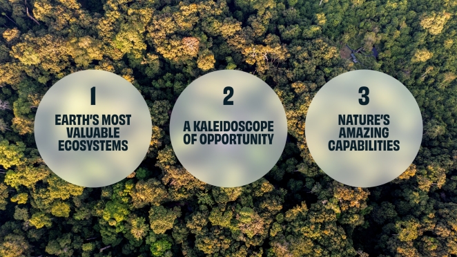
Our early design exploration started with three initial creative territories: 1. Earth’s most valuable ecosystems, 2. A kaleidoscope of opportunity, and 3. Nature’s amazing capabilities. Each of these creative territories was unique with its own distinct look and feel and how we start our brand development projects.
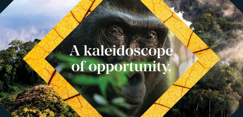
The challenge was to create a dynamic design system that was simple and flexible, yet complex enough to showcase the multiple benefits that HIFOR represents. Environmental benefits across climate, biodiversity and community. The kaleidoscope of opportunity territory offered the perfect framing device for showing the coming together of these benefits. And the unique opportunity that investment presents.
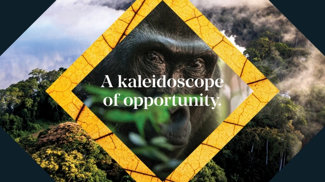
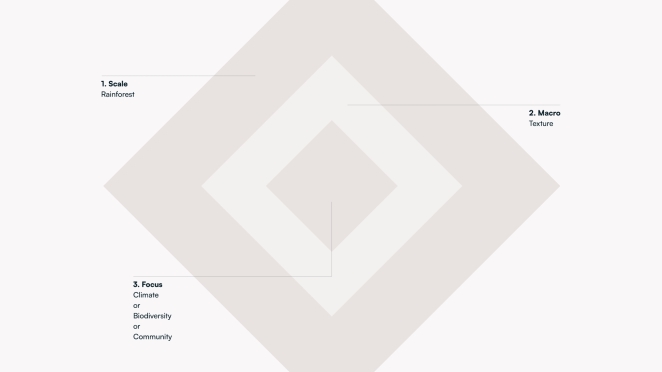
We wanted our kaleidoscope creative idea to ripple through each of the key design elements of the HIFOR brand. Everything from the logo through to motion graphics.
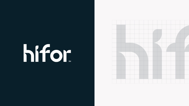
Crafted using a grid, the bespoke logo was inspired by the free-flowing nature of the rainforests. With subtle nods to growth using leaf like shapes and elements inspired by our kaleidoscope.
These kaleidoscopic design cues can also be seen in our motion language and video work with effects such as water ripples and directional growth. The shapes can flex between circular (a ripple in water, demonstrating the ripple effect of investment) or triangular diamonds (representing growth).
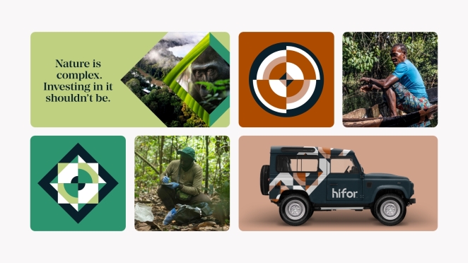
Photography is a key part of the brand, showcasing close-up visuals of the forest with sweeping aerial shots. This is combined with shots of the local community and animals, capturing both the intimate and expansive essence of these ecosystems.
Colour selection was an integral part of the branding process. The earthy, natural colour tones used throughout the HIFOR brand provide a link back to the rainforest environment and local communities. The colours are instantly recognisable and help make the connection between the HIFOR ecosystem.
To further elevate the brand, we introduced a timeless wedge serif headline font. This perfectly complements the HIFOR kaleidoscope with its sharp geometric shapes and angles.
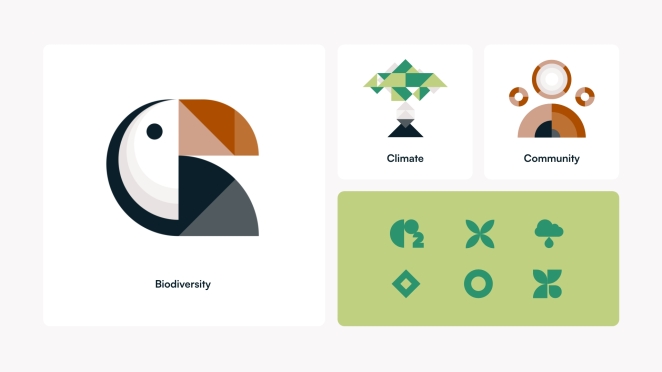
To complete the brand and to further highlight the key benefits of the HIFOR initiative, we developed an icon design system using shapes from our kaleidoscopes. These were split into two tiers, hero benefit illustration making use of dynamic shapes and colours and a more simplified icon set to communicate key information.