

In a world awash with facelifts and basic logo rejigs, a handful of brands have turned the act of reimagining themselves into an art form over the last 25 years. Whether by embracing bold new visual languages or rewriting their own origin stories, these companies bet big on transformation and won.
Today, I’m zooming in on 12 standouts and unpack how they rewrote their brand DNA, who steered the ship, and why audiences couldn’t help but sit up and take notice.
Channel 4
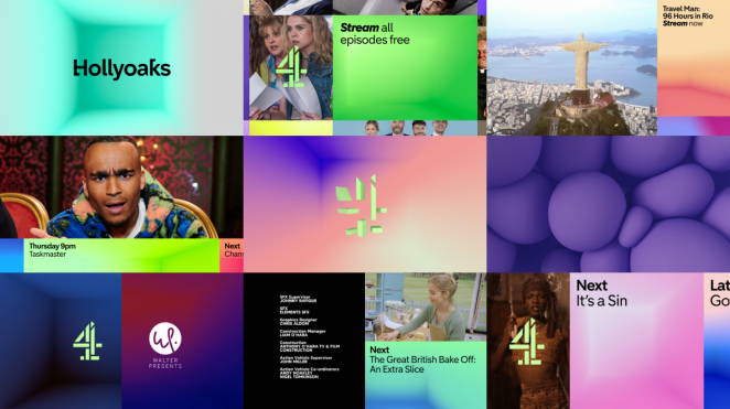
Channel 4 began life in 1982 as British TV’s much-needed maverick, with its iconic fragmented “4” logo signifying an Altogether Different approach. By the 2010s that logo had become a beloved but aging relic, so Channel 4 enlisted creative duos to stir the blocks back together. In 2015, DBLG and SQUA unveiled a surprising new identity built for an age of diversity and risk-taking.
They literally smashed the “4” into movable blocks (a visual metaphor for Channel 4’s pledge to celebrate difference) and introduced a friendly custom font. More recently (2022/23), in-house 4creative and Pentagram returned to the “4” itself, reassembling the pieces into a single monolithic logo while refreshing the color palette and typeface.
The campaign, grounded in the “Altogether Different” mantra, won high praise on the creative circuit. It won awards and even the Design Museum singled it out as a design of the year. The result was a nimble, modern Channel 4 identity that feels as vibrant and unpredictable as the shows themselves.
Lego
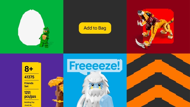
Lego has always been associated with play and imagination, but around 2024 the 90-year-old Danish icon decided its visuals needed a serious creative boost. Working quietly for two years with global design firm Interbrand and its in-house team (OLA), Lego mined its archive and pumped the new identity full of youthful energy.
Gone is any tired, flat logo tweak – instead the new system looks like a comic-book built from bricks. Speech bubbles, vibrant building-block patterns and “action frame” panel layouts now burst across packaging and websites. Even the wordmark got a facelift: a custom rounded typeface inspired by classic LEGO lettering. The playfulness is intentional – Lego explicitly tailored the style to resonate with kids still learning to read.
As Lego’s design team explained, the goal was to “tell stories” through every touchpoint, reinforcing Lego’s mission to be a “global force for learning through play”. The rebrand has been warmly received in the design press for marrying nostalgia with a fresh, fun aesthetic – a true match for the brand’s creative DNA.
Škoda
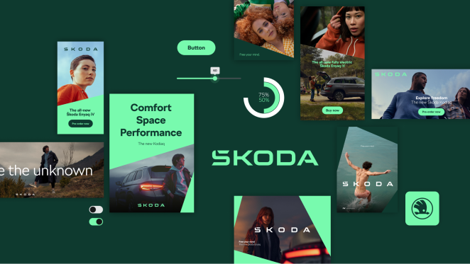
Škoda’s overhaul was less about flash and more about keeping pace with the future. The Czech carmaker, once the butt of plenty of jokes, quietly revealed a new identity in 2022 as part of its “Next Level” strategy towards electrification and digitalization.
Designers stripped away the old 3D chrome lettering in favor of a flat, all-caps “ŠKODA” wordmark with a built-in accent on the S, stressing symmetry and simplicity. Two distinct greens (an elegant emerald and a zippy electric lime) were added to the palette to signal Škoda’s eco-friendly ambitions. The famous winged arrow logo didn’t disappear, but it’s now two-dimensional and quieter, used more sparingly to let the name shine.
The effect is cleaner and more digital-first; reviewers noted that the new logo is designed to stand out in apps and on small screens, not just on car badges. In short, Škoda’s new look is a subtle but strategic modernization – a nod to its heritage via the “Š” accent and green color, but with a sharply modern confidence designed to appeal to younger, tech-savvy drivers.
Converse
By the turn of the millennium, Converse’s star had dimmed. The iconic sneaker maker that once outfitted basketball courts and rock stages was nearly bankrupt when a new ownership group sparked a creative revival. Seattle agency Sandstrom Partners was tapped to reignite Converse’s spirit, and their strategy was simple: embrace Converse’s roots. They zeroed in on the Chuck Taylor All Star – the brand’s most enduring symbol – and a rebellious, counter-culture vibe in all the new materials.
The identity overhaul spanned beyond a logo refresh (which remained classic All-Star branding) into packaging, hang tags and brand books that leaned hard into Americana and subculture aesthetics. Within two years of launching the new look, Converse was “back in the black” – so much so that Nike swooped in and acquired the company in 2003. In other words, the people’s shoe got its swagger back.
The rebrand was widely credited with turning Converse from a dusty heritage label into a youth-cool icon once more by “building a fashion brand in the world of sneakers” while staying true to its past.
LG
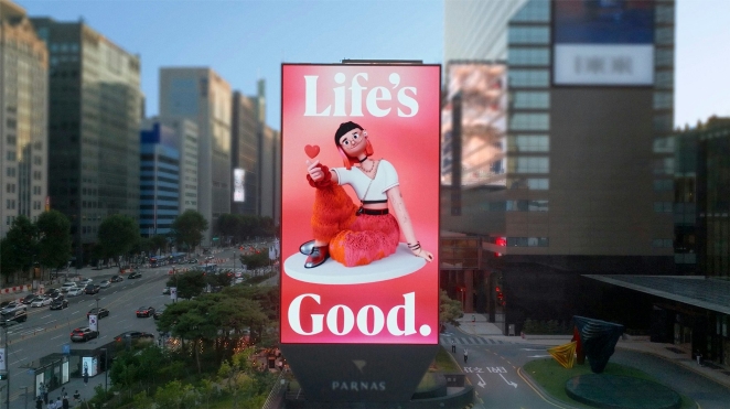
Electronics giant LG also took a bold step away from its more staid past. In 2023 the company rolled out a new brand strategy and look aimed at millennials and Gen Z – think an electronics brand that smiles back. The core idea (titled “Emotionally Intelligent Design” by consultants at Wolff Olins) was to humanize tech. The familiar LG circle-face logo didn’t vanish, but it got new tricks: in digital apps and ads it can now wink, nod or spin – a winking greeting or rhythmic jiggle to surprise and delight users.
LG also revived playful Korean cultural cues (the finger-heart gesture) and even modernized its old Goldstar emblem into a new logotype, all within a unified system. Meanwhile, the brand colors went brighter – a fresh “Active Red” variant and lively gradients complement the classic red.
The sleek custom typeface for “Life’s Good” infuses product names and packaging with subtle product-inspired shapes. Internally, executives praised the makeover as making the brand feel “iconic” to young people again. Indeed, early data suggests the refresh paid off: LG reports rising engagement and even lit up landmarks worldwide on launch day.
Accenture
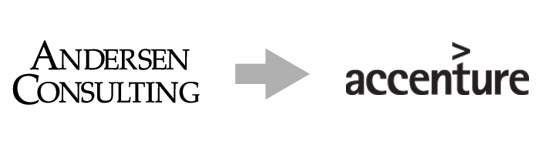
“Accenture” might sound like a made-up Silicon Valley start-up, and in fact it was. In 2000 Andersen Consulting was ordered to drop the Andersen name, so it scrambled to reframe its $10bn consultancy business with a new image. Working with Landor, they ran an epic internal “BrandStorming” contest to find a name and identity fast.
The winning choice – “Accenture” (accent on ACC) – was coined by an Andersen partner and came to symbolize a focus on the future. In just 147 days the company rolled out the new name globally, complete with a bold new logo: all-caps “Accenture” with a bright red ‘>’ attached at the end to suggest forward momentum. The refresh also brought the tagline “High Performance. Delivered,” framing Accenture as a builder of the new economy.
The launch stormed the press (the Guardian famously noted the $100m rebranding tab and the odd new moniker) and even earned jokes in the trade press. But the overhaul succeeded in severing ties with Arthur Andersen’s baggage and uniting 70,000 employees under a single, modern identity. In short, Accenture’s entire genesis was a branding pivot, and it set the stage for the firm’s explosive growth in the 21st century.
Stella Artois

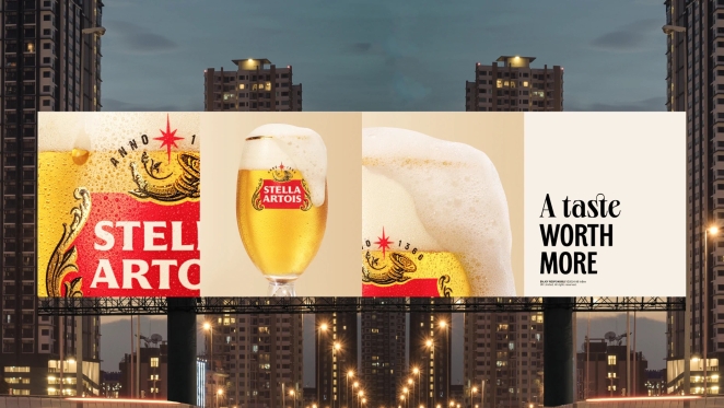
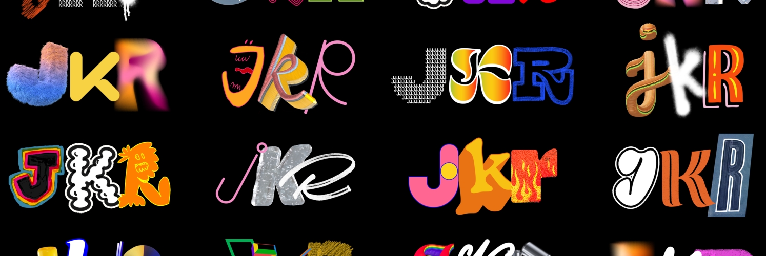
Stella Artois’s story is a roller coaster of image overhauls. Once famous for its cheeky “Reassuringly Expensive” ads, by the 2000s Stella had garnered a reputation as a poster-child for binge-drinking – even a derogatory nickname. The wake-up came around 2007, when agency Jones Knowles Ritchie (JKR) overhauled Stella into a more premium, heritage-driven brand.
They proudly reinstated the full “Stella Artois” name on cans, emphasized its Belgian roots, and dropped rowdy marketing for polished, cinema-inspired campaigns. Fast-forward to 2023, JKR was back again to fine-tune the look. This time they framed Stella as a lifestyle fashion brand. A new “brand world” was crafted around “moments of beauty at the table,” complete with elegant black-and-white photography and a modernized logo.
The ornate old cartouche was simplified into a sleeker badge, and fresh graphic elements (new motifs, lighter typography) made the beer feel both classic and current. In effect, Stella’s reinvention has been about injecting contemporary confidence into its pedigree: one foot in old-world craftsmanship, the other in today’s stylish pub scene. As JKR’s client put it, the result is “elevated but more relevant and modern,” helping Stella reach new fans while reminding everyone of its storied past.
Tiffany & Co
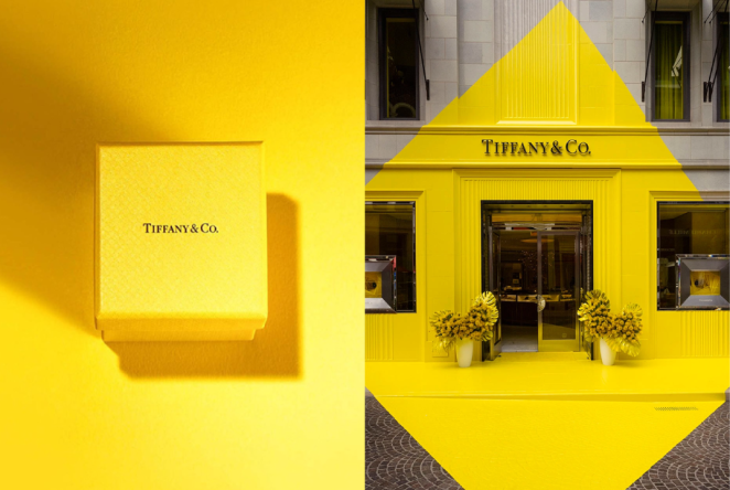
When LVMH bought Tiffany in 2021, the iconic jeweller’s paint-by-numbers luxury image was due for an overhaul. The new strategy: speak to Gen Z. Tiffany flipped its couture script with a juggernaut marketing push dubbed “Not Your Mother’s Tiffany.”
Ads featured Beyoncé and Jay‑Z, Hailey Bieber, even a bold Supreme collaboration, all set to affirm that Tiffany no longer only means pearls and ritzy dinner parties. The familiar robin’s-egg blue itself became toyed with – for a moment Tiffany even joked that its new signature colour was canary yellow, provoking a social-media stir (later admitting it was a prank to draw attention). Naturally, fans had opinions.
The switch to streetwear ambassadors and casual product shots earned cheers from younger consumers and snipes from traditionalists who saw it as “tarnishing” Tiffany’s heritage. But LVMH’s gamble seems to be paying off: sales jumped and the supreme hype-collab sold out instantly. In short, Tiffany’s recent rebrand is a high-risk fusion of classic luxury with pop culture swagger – a deliberate break from history designed to make the house shine for a new generation.
Old Spice
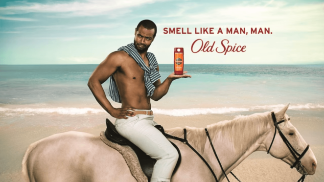
Old Spice used to smell like… grandpa. By 2010 P&G knew the men’s grooming line needed a shock. Enter Wieden+Kennedy with the single craziest bathroom mirror monologue of the century. Based on the insight that “60% of body wash purchases are made by women,” W+K devised the über-confident Isaiah Mustafa character to address women about their men.
Debuting during the Super Bowl as “The Man Your Man Could Smell Like,” the spot was a deadpan tour-de-force — one continuous tracking shot of macho one-liners about white horses and waterfalls. It blew up online overnight. W+K immediately followed with a lightning-fast “response” campaign: videos answering fan questions in real time, sending brand engagement into the stratosphere.
The results were undeniable: Old Spice’s sales skyrocketed (body-wash sales more than doubled) and the campaign became an instant cultural reference. In short, Old Spice’s rebrand wasn’t about redesigning logos or labels, but about redefining its personality with humor. The cheeky new voice turned a stodgy soap brand into a viral phenomenon, proving that sometimes rebranding is simply a matter of “smelling” totally different.
Apple
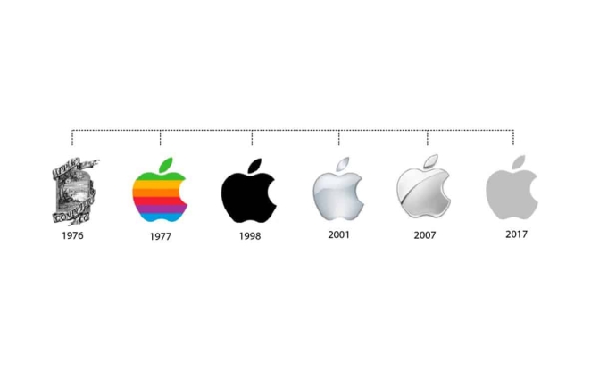
When Steve Jobs returned to Apple at the start of the century, the company was floundering and even its logo felt tired. One of his first acts was to kill off the proposed “We’re back” slogan – Jobs quipped that “Apple wasn’t back yet”. He instead doubled down on Apple’s rebel heritage with the now-legendary “Think different” campaign.
Led by TBWA ChiatDay’s Rob Siltanen and Lee Clow (with Jobs steering the creative), the campaign featured black-and-white images of visionaries like Einstein and Gandhi set only against the simple white Apple logo. The message was clear: Apple was joining the ranks of “the crazy ones,” celebrating outsiders who change the world. This refocusing on emotion and idealism (rather than tech specs) re-energized Apple’s identity.
It wasn’t a mere cosmetic tweak; it was a narrative pivot – Apple was no longer just selling computers, it was selling inspiration. The ad tagline and new minimalist logotype helped rebuild Apple’s brand cachet, setting the stage for the iMac, iPod and beyond. In hindsight, “Think Different” stands as one of the most influential rebranding moves of the century, a rallying cry that heralded Apple’s comeback.
Burberry
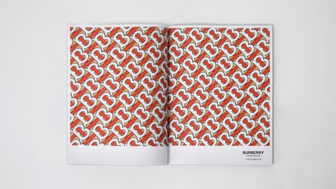
Burberry’s 2018 rebrand was arguably its most radical shake-up. After decades of heritage plaids and a classic serif logotype, the luxury label under new creative chief Riccardo Tisci ripped up the brand manual. They hired English designer Peter Saville to redraw everything. The famous equestrian knight logo was retired. In its place, an all-uppercase, geometric sans-serif “BURBERRY” wordmark and a repeating “TB” monogram (referencing founder Thomas Burberry) arrived on crisp white backgrounds.
The monogram comes in bold orange now, far from the old plaid browns. It’s clean, almost Bauhaus—very modern, very digital. The result is divisive. Some critics hailed it as a fresh, tech-savvy overhaul; others fired back that the new lettering looks worryingly similar to rival brands and that Burberry has abandoned its British heritage “wholesale”.
On social media the hashtag #Blahburry even began trending. But supporters argue it pushed Burberry upmarket into the “fast luxury” aesthetic, making it feel new again. Regardless, this rebrand showed Burberry was unafraid to jettison tradition in pursuit of reinvention – a high-wire gamble for a house built on history.
Pepsi
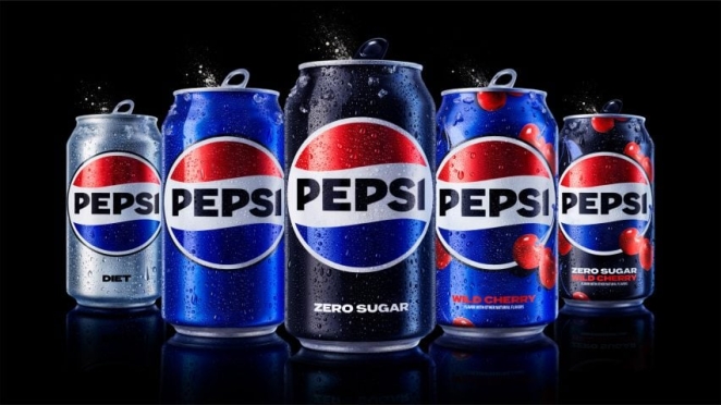
Pepsi’s 2023 makeover was billed as the first logo update in 14 years, timed for its 125th anniversary. PepsiCo’s in-house design team, led by chief designer Mauro Porcini, decided to make the brand feel both “timely and timeless”. The classic red-white-blue globe logo survives but now merges more fluidly with a custom modern wordmark.
A new brighter “electric” blue replaces the last sky-blue, and black was added to the palette to spotlight Pepsi Zero Sugar. In packaging and ads, Pepsi introduced a dynamic red-white-blue “pulse” shape behind the globe – an animation-friendly swoosh that signals energy. The overall effect is bolder and more tech-conscious while still definitely Pepsi. Early press coverage (TODAY, Fast Company) christened it “an iconic brand’s next era,” praising how it nods to Pepsi’s past even as it looks forward.
Consumers have remarked that the new Pepsi feels both nostalgically retro (a bit like the 1970s logo) and unapologetically contemporary. In short, the updated Pepsi identity weaves the brand’s refreshingly brash personality into every can and screen, reinforcing Pepsi’s promise of unabashed pop-culture fun.
Marvel
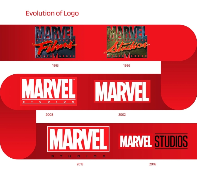
Marvel’s “rebrand” has been less about renaming and more about creating a spectacular opening for its films. By 2016 the Marvel Cinematic Universe was booming, and Marvel Studios wanted its logo to feel every bit as epic as its blockbusters. Enter Perception, a creative studio asked to rebuild the Marvel Studios logo animation from scratch.
Kevin Feige’s brief was crystal clear: the new sequence had to literally contain the characters and stories of Marvel inside the logo. Perception built on the old “flipping pages” logo motif (a nod to the comics) and morphed it into a living collage. As the words “MARVEL STUDIOS” come together on screen, fans can spot snippets of classic comic art, concept paintings, script pages and key scenes from the movies. It’s a logo reel that feels like a mini-chronicle of the entire Marvel saga. When the new intro debuted at CinemaCon, fans immediately noticed how each reveal – Thor’s hammer, Iron Man’s mask, Wakanda landscapes – tied into the respective film.
The reception has been glowing: by weaving beloved characters into the brand logo, Marvel’s identity now truly is its universe. This cinematic branding shift underlines Marvel’s massive cultural impact – the audience doesn’t just watch a Marvel film, they enter the Marvel brand itself.
Another Opinion
Simon Manchipp, Founding Partner at SomeOne
The unsung rebrand of the century? Cookie consent. The EU turned the internet into a bureaucratic car crash. Every website uglier. Every user more annoyed. Design by Kafka. The best rebrands don’t just change a logo. They change what a company is allowed to be. Which is why Gap’s 2010 logo lasted six days. The internet wanted a museum piece, not a new idea. Rebrand too far and you find out quickly: the crowd’s nostalgia is louder than your strategy.
Finding Your Next Creative Agency or Individual at Creativepool
Paul Reynolds
If these rebrands prove anything, it’s that a bold idea (executed with precision and clarity) can transform not just a company’s image, but its entire trajectory. The right positioning, the right identity, and the right creative team can turn a fading legacy into a forward-facing powerhouse. Which is exactly where Creativepool comes in.
Whether you’re looking to collaborate with a brand strategist who understands how to define purpose, a designer with a feel for timeless identity systems, or an agency capable of reshaping public perception across every touchpoint, you’ll find them here. Creativepool is home to thousands of strategists, branding designers, typographers, motion specialists and creative thinkers—the people who make transformation possible and impactful.
There are three simple ways to bring the sharpest minds in branding and design into your next project.
1. Search and Contact
If you already know the type of creative expertise you need—perhaps a studio specialising in luxury rebrands, or a strategist who’s led global repositioning work—you can search Creativepool’s talent network directly.
Browse portfolios, case studies, and team bios using tailored filters. Creativepool’s ranking tools highlight the most established professionals across categories, from top design studios to award-winning consultants. Once you’ve found a partner that aligns with your vision, message them directly to get started.
This route is ideal if you prefer to curate your own shortlist and take a more hands-on approach to shaping your creative process.
2. Post a Studiogig
Need a specialist quickly? Post a studiogig. It’s the fastest way to connect with freelancers and consultants who understand the nuances of brand evolution—from identity rollouts and packaging redesigns to naming and tone-of-voice development.
Your brief is distributed to the most relevant professionals in the Creativepool network, and you’ll receive responses directly. It takes just a few minutes to post, and we handle the distribution behind the scenes.
It’s a fast, efficient way to find the right fit—especially when time or internal resources are tight.
3. Post a Job
If you’re hiring for a permanent role—say, a senior branding designer, in-house strategist or head of brand—posting a job listing is the way to go.
Creativepool checks and approves all listings, sends targeted alerts to qualified members, and hosts your job on the main Jobs Board viewed by thousands of top-tier professionals daily. Applicants apply directly, giving you full control over the next step.
No recruiters, no intermediaries—just a streamlined path to the best people in brand and design.
Hiring a Creative Agency Through Creativepool
Simon Manchipp
If your project calls for an end-to-end rebrand (from strategy and naming through to rollout and visual execution) you’ll want a full-service agency. Creativepool makes it easy to connect with agencies and studios that specialise in brand transformation.
Start by deciding whether you want to search for an agency or post a brief.
Find an Agency
Use Creativepool's agency search tools to explore profiles, portfolios and case studies. Assess their sector experience, creative style and client approach to ensure alignment with your brand’s direction.
Post a Brief
If you’re open to proposals, simply post a brief outlining your objectives, timelines, and budget. Agencies that align with your needs will respond with tailored proposals, and you choose who to move forward with.
Need Help?
If you’d like support navigating your talent search or agency brief, Creativepool’s dedicated team of ex-industry professionals is here to help. Whether you’re building an in-house brand team, refreshing your identity or launching a global repositioning, we’ll help you shape your brief, define your filters and connect with the right people quickly and efficiently.
Chat with us live on where you post your job and gig or reach out on our Contact Us page.