
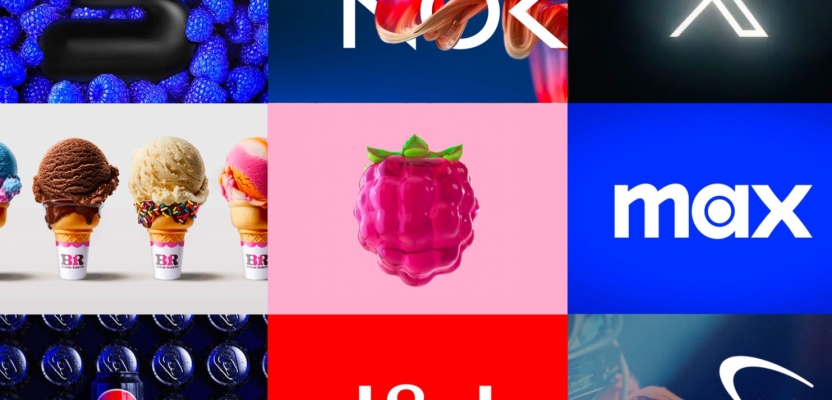

Rebranding is one of the riskiest moves a company can make. Get it right, and you can redefine your brand for a new era. Get it wrong, and you alienate your most loyal fans.
A new logo or slogan isn’t enough. When brands treat rebranding like a wardrobe change (purely cosmetic) they miss the point. To resonate, rebrands need to align with business strategy and cultural relevance.
I spoke with two experts, Gianni Tozzi, Global Chief Creative Officer at Futurebrand, and Celeste Cheong, Managing Director at Elmwood Singapore to dive deep into who nailed it, who stumbled, and what it all means for the future of branding.
Disruption with Depth: What Makes a Rebrand Work
More Than Just a Makeover
Gianni makes it clear: a rebrand needs more than a fresh coat of paint. The most effective transformations are strategic to the core—reflecting shifts in purpose, business goals, and cultural context. The worst? They’re surface-level, disconnected from the brand’s true identity. And consumers know the difference.
Walking the Line Between Bold and Believable
Disruption can spark interest, but push too far, and you risk backlash. The key is balance: design changes should support a broader evolution. When visual updates are tethered to a clear narrative and business pivot, disruption feels exciting, not confusing.

A great example comes from Old Spice. As Celeste notes, “In 2010, Old Spice transformed from a dated relic into one of the most culturally disruptive men's grooming brands of the past decade.”
In a category crowded with hyper-masculine and clinical tropes, it broke through with bold red packaging, surreal humour, and scent names like “Swagger” and “Bearglove.” Its “The Man Your Man Could Smell Like” campaign didn’t just sell body wash—it sold identity and cultural cachet. This was design and tone working in perfect sync with the rise of digital media and influencer culture. It’s a benchmark for how legacy brands can punch above their weight.
When Rebrands Go Off the Rails
Pretty Little Thing’s "Quiet Luxury" Misstep
In 2025, Pretty Little Thing (PLT) tried to leave its neon pink, party-girl roots behind in favour of "quiet luxury." Burgundy replaced bubblegum. Flashy was out; minimalist was in. PLT wiped its Instagram, ditched meme culture, and rolled out visuals more aligned with “old money” than Gen Z.

But the pivot landed flat because, as Gianni warns, “Disruption alone is not transformation.” PLT’s audience was confused. Many felt abandoned. Sales plummeted in the U.S. (from £177.5M to £67.5M) and backlash mounted when the brand also tightened its returns policy. The rebrand lacked a strategic foundation. Instead of evolution, it felt like a costume change. And consumers weren’t buying it.
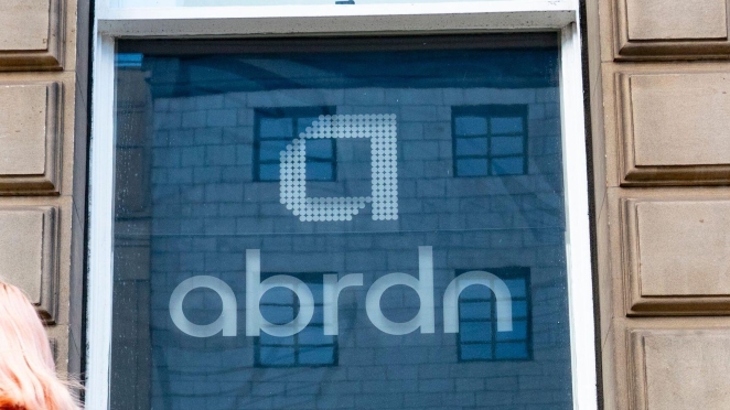
Abrdn: A Name Change with No Story
Aberdeen Standard Life’s rebrand to “abrdn” was supposed to feel modern and agile. Instead, it felt incomplete. The vowelless name confused consumers and became internet fodder. Internally, it may have symbolized digital reinvention, but externally, it came off as a gimmick.
The metrics told the story: sentiment nosedived. Just four years later, in 2025, the company reverted to “Aberdeen,” calling the rebrand “a distraction.” As Gianni puts it, brand decisions that are "too bold, fast, and disconnected" leave stakeholders asking: what does this brand even stand for?
Another example comes from the wellness space. Athletic Greens’ rebrand to “AG1” traded distinctiveness for sterility. As Celeste points out, it once stood out with intuitive naming and ritual-led storytelling.
But the new biotech-inspired aesthetic blends into a sea of sameness. “While the cleaner look aims to convey elevated science and credibility,” she explains, “it sacrifices personality for polish.” In contrast to Old Spice’s charisma and coherence, AG1 feels like it’s conforming to the category rather than redefining it.
When Rebrands Strike Gold
KIA’s Sustainable Turnaround
KIA’s “Movement That Inspires” campaign was more than a logo change—it was a manifesto. Ditching “Motors” from its name, KIA signalled a pivot from carmaker to sustainable mobility innovator. Backed by Plan S, a sweeping strategy to launch 11 EVs and purpose-built vehicles, the rebrand matched words with action.
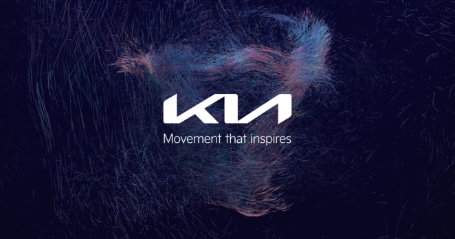
The visual overhaul came with fireworks—literally. KIA launched its new logo via 300 synchronized drones. But more importantly, the refreshed identity was embedded into product design, brand philosophy, and customer experience. It was disruption with depth—and it worked.
Air India’s Cultural Reawakening
Air India’s rebrand was a story of national pride told through design. The airline rolled out a new look centred on “The Vista”—a stylized jharokha window that blends heritage with ambition. Deep red, aubergine, and gold rooted the brand in Indian identity while signalling a global outlook.

More than a livery change, it was a total transformation. From redesigned cabins to revamped apps, every touchpoint reflected the rebrand. Air India paired visual refresh with real investment: $70B in aircraft, service upgrades, and cultural training. As CEO Campbell Wilson said, this wasn’t just a new look. It was a new era.
Lessons for Brand Leaders
Tie Design to Strategy
Rebrands should reflect real shifts in vision and business direction. KIA didn’t just change its font—it redefined its future. Air India didn’t just modernize its look—it modernized its operations. When visuals echo strategy, the rebrand becomes a powerful statement.
Respect the Past, But Move Forward
Nostalgia has power—but it’s not a strategy. Smart rebrands pay homage to heritage while embracing evolution. KIA balanced futurism with familiarity. Air India honoured cultural motifs while positioning itself for the global stage.
Don’t Fake the Funk
A rebrand that isn’t rooted in real change will fall flat. PLT and Abrdn prove that a bold visual can’t compensate for a lack of purpose. If the audience can’t see the strategy, they’ll see through the gimmick. AG1’s shift is a cautionary tale: design polish means little without emotional punch.
Final Thoughts
The most disruptive rebrands aren’t loud—they’re aligned. They connect identity, strategy, and culture into one cohesive story. As Gianni sums up, “When brand identity, business strategy, and cultural clarity all align – that’s when disruption becomes meaning because successful rebrands aren’t simply redesigns of a brand image—they’re thoughtful and strategic”.
Celeste echoes that sentiment: “True rebranding isn’t just aesthetic—it’s about sparking emotion, shaping culture, and building desire. Distinctiveness, not dilution, is what defines a brand’s staying power.”
And in today’s crowded market, meaning is the ultimate differentiator.