


From pristine letter-pressed stocks and daring die-cuts to material revolutions and sculptural finishes, the business cards that endure are those that don’t merely provide contact details but embody identity. I’ll be celebrating those standout designs: the most iconic business cards of all time, chosen for their craft, creativity and impact.
LEGO’s Miniature Minifigure Business Cards
For years, the LEGO Group literally gave out themselves on business cards – in the form of customised LEGO minifigure replicas of their employees. These tiny plastic executives had the staffer’s name on the front and contact info on the back. Originally available to many public-facing employees, the minifig cards became coveted collectibles among fans, with rare ones selling for up to $1,000 online. In fact, some hardcore LEGO collectors built entire displays of these employee figurines!
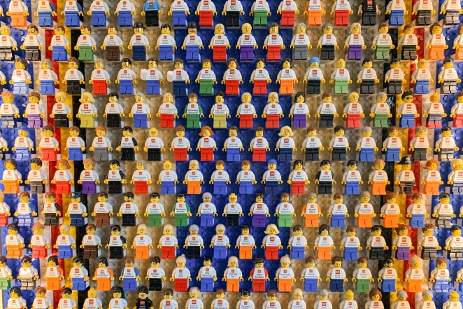
LEGO eventually scaled back the program (only top execs get them now) due to the cost and frenzy it created. Still, the LEGO business card minifigs remain legendary – a fun, memorable calling card that doubled as a toy and sparked instant conversation about the brand. Why hand out a plain card when you can give someone a mini-you? It’s no wonder these have “developed a cult following” among collectors.
Poul Nielsen’s Stretchy Fitness Card
Personal trainer Poul Nielsen took a truly hands-on approach to business cards. His card was made of a durable elastic material and printed with compressed text – you literally have to stretch it to read the contact info. In other words, just getting the details gives your fingers a mini-workout! The design brilliantly ties into the fitness theme: “You can’t read the card unless you stretch the elastic… you’ll see the contact info that will lead you to a bigger workout”.
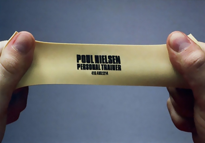
Recipients find themselves tugging on the tough little card like an exercise band, experiencing a playful bit of “experiential advertising” in the process. It’s an unforgettable design that makes you smile and sweat – a perfect reflection of the trainer’s value proposition. In fact, this clever card (created back in 2006) is often cited as an example of how interactive marketing can leave a lasting impression.
Ashfield Printing’s Pop-Up Card
How do you show off your print company’s creativity on a piece of cardstock? Ashfield Printing (Derby, UK) decided to literally pop. They produced a pop-up business card that unfolds into a small three-dimensional form – turning the simple act of opening a card into a delightful surprise. The card’s ingenious die-cuts and folds allow a shape (such as the company’s logo or a miniature paper sculpture) to spring up when opened, showcasing the printer’s craftsmanship. Talk about standing out!
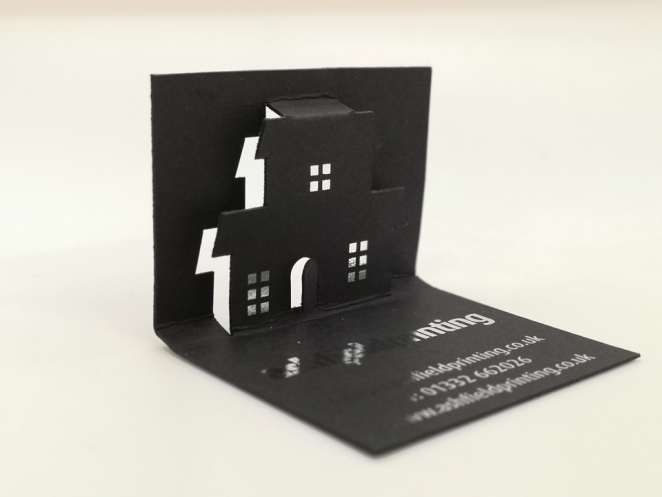
The interactive design practically begs people to play with it, ensuring the company remains memorable. Ashfield even touted how pop-up business cards can help clients “stand out from competitors” and spark conversations. It’s a great reminder that print is far from dead – when done creatively, a business card can become a tiny piece of pop-up art.
Bon Vivant’s Cheese Grater Card
At first glance, this item looks like a mini cheese grater – and that’s exactly what it is. Brazilian cheese shop Bon Vivant, with help from ad agency JWT, created an entirely functional business card that doubles as a cheese grater. It’s made of light metal in the size of a standard card, with grating holes punched through. The concept was to give customers a useful tool that instantly reminds them of Bon Vivant whenever they sprinkle some parmesan. The card even comes with a little protective sleeve so it won’t shred your wallet (or make it smell like cheddar).
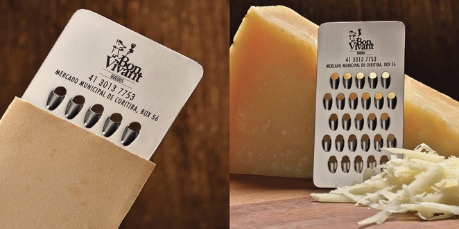
This “Grater Card” perfectly reinforces the brand – it’s simple, functional, and absolutely on-theme for a cheese store. As the creators put it, “everyone who looked at our creation would remember Bon Vivant instantly”. It’s arguably the holy grail of food-related business cards, often cited as an “incredibly useful” and clever design.
TechKeys’ Interactive Keyboard Card
When IT consultant and keyboard enthusiast Brad Agdern hands out his card, he really hands out a gadget. Agdern’s company TechKeys designed what might be the nerdiest business card ever: a printed circuit board that functions as a working mini keyboard. This PCB business card features an onboard reprogrammable microcontroller (ATMEGA16U2) and USB connectivity. With a bit of soldering to attach keys, you can plug the card in and use the pre-programmed keys – one opens TechKeys’ website, another their Facebook, and a third launches an email client. In other words, the card itself is a tech demo.
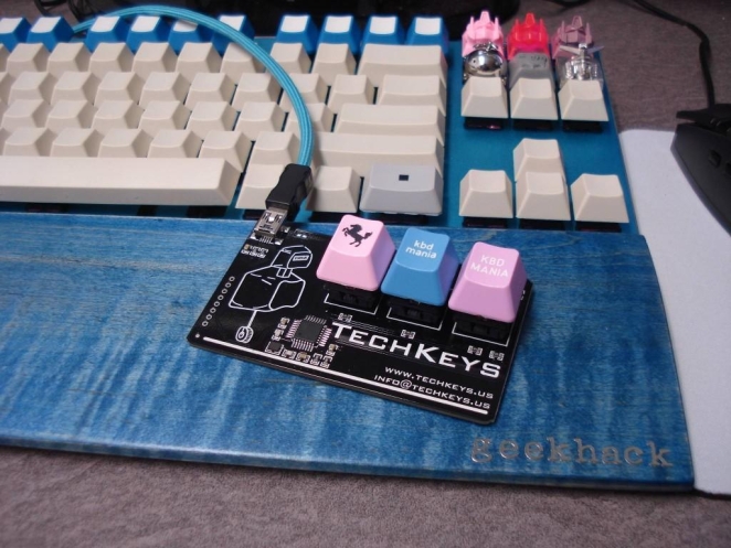
Agdern has made various high-tech cards (including ones with holograms and laser-cut metal), but this hackable keyboard card is his masterpiece. It perfectly reflects TechKeys’ niche – appealing to “hackers, tinkerers, and makers” – and ensures the recipient won’t toss it aside like an ordinary paper card. It’s a brilliant example of going beyond paper to impress fellow geeks. (Bonus points: it only cost about $12 to produce each card in 2014!)
Steve Jobs’ Simple, Priceless Apple Card
Sometimes iconic design comes not from gimmicks, but pure simplicity. Steve Jobs’ business card from the early Apple era is a stuady in sleek minimalism. It featured plenty of white space, a clean italic typeface, and the classic rainbow Apple logo adding a pop of colour. Much like Apple’s products, the card was “simple, sleek, and elegant,” proving that less is more in design. This unassuming card has since become a highly valued piece of tech history. In fact, a Jobs card circa 1983 (signed by him) sold for over $180,000 at auction, making it one of the most valuable business cards ever.
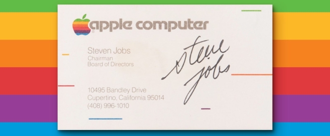
Collectors covet it not for creative graphics, but for the historic weight behind that name and logo. Jobs understood the power of design in branding – even his card made a statement by not trying too hard. Its enduring value (both cultural and monetary) proves that a straightforward, well-crafted card can be truly timeless.
Andy Warhol’s Handwritten Card
Pop art pioneer Andy Warhol turned his business card into a mini canvas of personal expression. Warhol’s card was famously handwritten in his own stylish scrawl, often in two colors on a mint-green background. It listed his name and contact in an artful but clear way, almost like a signed piece of artwork. By throwing out conventions of layout and typography, Warhol made sure his card was as unconventional as he was – “completely original and genuinely attractive,” as one design commentary noted.
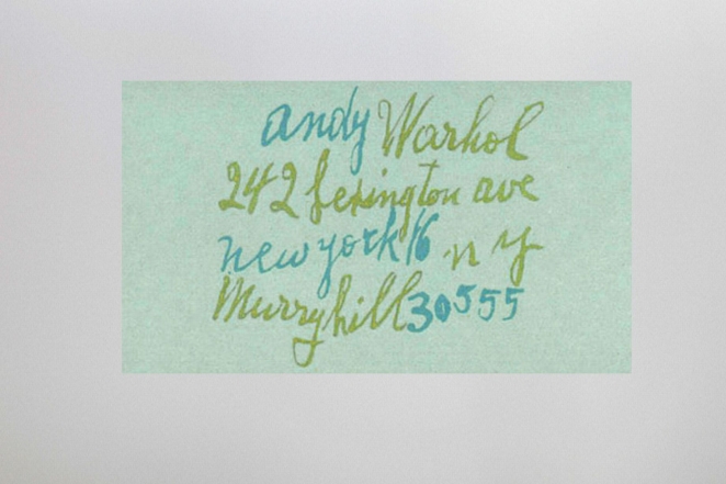
In an era when most professionals stuck to plain text, Warhol’s artsy card stood out immediately. It reflected his philosophy that everything (even a calling card) could be pop art. The design was so striking that it “won’t have gone unnoticed” among the creative circles he traveled. Warhol understood that your business card should be a reflection of who you are – and in his case, that meant bold creativity and disregard for norms. To this day, his card is cited as inspiration for designers to embrace uniqueness.
Bill Gates’ First Microsoft Card
Not many business cards can signify the birth of a tech empire, but Bill Gates’ first Microsoft card comes close. Printed in the mid-1970s when Gates and co-founder Paul Allen were just a pair of young entrepreneurs, this card is charmingly modest. It lists Gates as “President” of Microsoft (then styled as “Micro-Soft”), with an address in Albuquerque, New Mexico – where they originally set up shop to work on software for the Altair 8800 microcomputer. The design is plain, and the Microsoft logo on it is the retro 1970s version, but the historical significance is enormous.
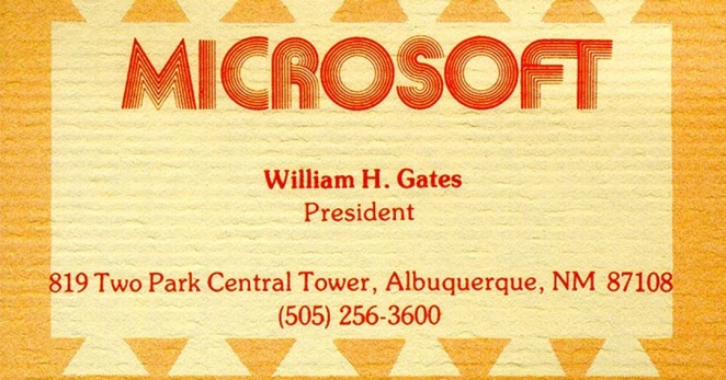
This little piece of cardstock represents the humble beginning of what would become one of the world’s biggest companies. On display at Microsoft’s headquarters museum today, Gates’ first card is a reminder that even the mightiest CEOs started somewhere small. It’s also a fun slice of tech history: note the landline telephone and early email (or rather, pre-email) contacts, and the fact that a Harvard dropout’s card once made a professor lament “what a waste” – not knowing Gates would prove them very wrong. In short, it’s iconic not for its look, but for the legend it represents.
Yaletown Plumbing’s Mini Plunger Card
Yaletown Plumbing, a local Vancouver outfit, found a way to make even a toilet plunger seem cute – and in the process created a business “card” no one will ever forget. Instead of a paper card, they give out tiny blue rubber plungers (a few inches tall) with their contact info printed on the handle. It’s an adorable miniature of the plumber’s trusty tool, instantly conveying what service they offer. As a marketing piece, it’s brilliant: who wouldn’t show off a mini-plunger sitting on their desk? It invariably “sparks a conversation” (and likely some laughs) about the company.
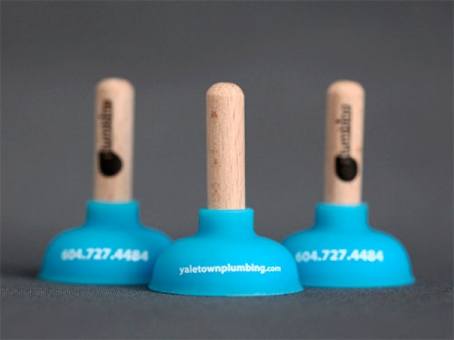
Yaletown’s info (logo, phone number, website) is printed around the plunger, which might even suction-cup to a surface as a whimsical leave-behind. Sure, it won’t fit in a wallet, but it will stick in your memory. As one reviewer noted, the plunger is such an identifiable icon of the trade that it begs the question: “Why then have a card, when you could have a cute-as-a-button mini plunger?”. Yaletown Plumbing’s creative leap shows how a bit of three-dimensional thinking can unclog your marketing and make your brand truly pop.
Walt Disney’s First Calling Card
Even legends like Walt Disney started small – and with a business card that hinted at big dreams. Walt Disney’s first known business card (circa 1921, when he was about 18–20 years old) shows him as a young cartoonist in Kansas City, before Mickey Mouse ever existed. In those early days, Disney had co-founded a short-lived art studio with his friend Ub Iwerks (cheekily named “Iwerks-Disney Commercial Artists”), and was doing freelance cartooning and ads. His card from that era is a window into his ambition: it likely had a playful illustration or lettering (some sources say it featured his own drawings), presenting Walt as an artist-for-hire hungry for work.
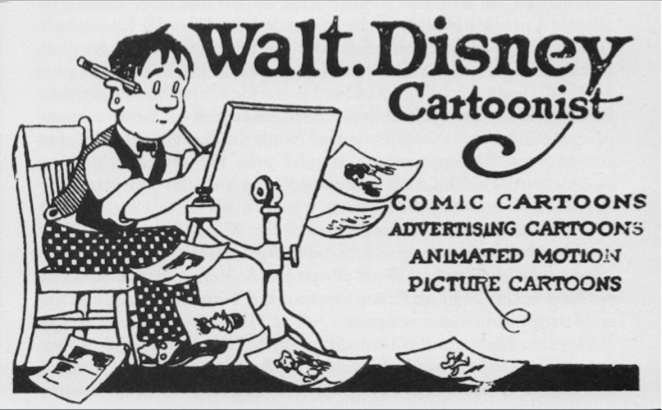
One circulating image of a teenaged Walt’s card shows a whimsical design and lists him as a “producer of cartoons” – evidence that he was branding himself creatively from the start . This artifact has become significant because it encapsulates Walt Disney before fame – an enterprising youth offering “hand-drawn” creativity to anyone who’d have him. It’s a reminder that the founder of the Disney empire once pounded the pavement with a humble card in hand, pitching his talents. In historical context, that little card symbolized the spark of ingenuity that would later ignite the animation industry.
Flow Yoga’s Mini Yoga Mat Card
A great business card instantly communicates your field, and Flow Yoga’s card does it in the roll of a mat. This yoga studio in Vancouver hands out tiny foam yoga mats – complete with texture and a blue hue – that are rolled up and tied like the real thing. Unroll the miniature mat and you’ll find the studio’s name, address, and phone number printed on it. The material is a spongy foam, so it even feels like a yoga mat.
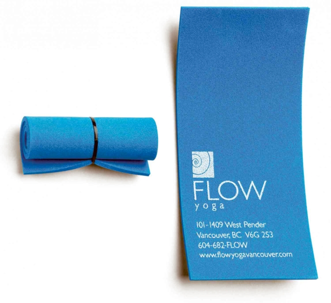
This design is simple but super effective: it directly tells you what they do (yoga) and mirrors the calming, health-conscious vibe of the brand. The interactivity is a bonus; people can’t resist unrolling and rolling the little mat. In an urban market full of yoga studios, Flow Yoga managed to demonstrate its creativity and style on a 3-inch mat. The lesson? A well-thought-out tactile design can align perfectly with your business identity – and maybe even inspire the recipient to start doing sun salutations!
James Mahon’s Tearable Divorce Lawyer Card
Divorce is all about splitting up – and one Canadian lawyer’s card embraced that concept literally. James A.W. Mahon’s business card is printed on a subtle cream stock with his info divided into two halves by a perforation down the middle. When you tug gently, it tears perfectly into two separate cards, each showing the lawyer’s contact details. It’s a witty visual metaphor: the act of tearing the card in half mimics a divorcing couple splitting their assets (and each perhaps taking one half of the card!).
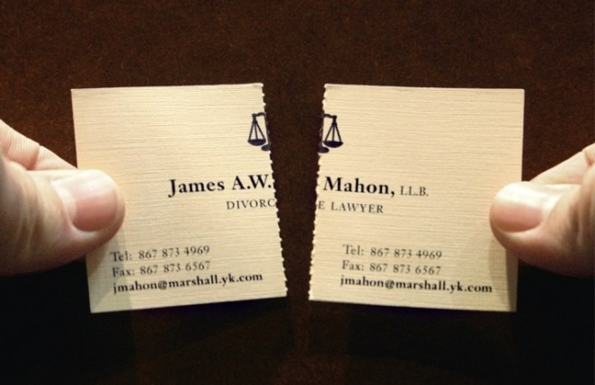
Designed by the creative agency John St., this card is often hailed as the perfect divorce lawyer promo – “so simple yet so smart,” effectively two cards in one. It starts conversations and dark chuckles at the same time. Imagine the lawyer handing it to a client: “One half for you, one for your ex.” The cleverness drives home Mahon’s specialty in a memorable way. Beyond the humor, it also shows a level of empathy – acknowledging the split that clients are going through. No surprise this design went viral in legal and design circles, proving even somber services can use creativity to break the ice.
MOD Hair’s Musical Comb Card
Rock’n’roll hair salon + business card = ? For MOD Hair of Rome, the answer was a musical comb card that strikes a chord – literally. This salon’s clientele loves rock music, so their card was engineered as a tiny plastic comb that, when you drag your fingernail across its “teeth,” plays a few notes of a classic rock anthem. Using the same principle as a music box mechanism, the comb’s teeth of varying lengths produce tones – turning a simple comb into a mini instrument! The black comb-shaped card also functions to straighten your hair in a pinch, of course.
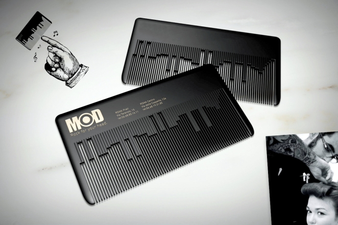
It perfectly fits MOD Hair’s brand: fun, musical, and a bit retro. A recipient not only remembers the salon, they actually hear the salon’s rock spirit. And unlike most cards, this one invites repeated use (people will show their friends the tune it plays). MOD Hair’s musical comb is a fantastic example of incorporating multi-sensory experience into a business card – sound in this case – to make it truly unforgettable.
Myung Dong Optician’s Self-Eye-Test Card
How do you get potential customers to realize they need new glasses? Myung Dong Opticians of South Korea came up with a genius solution: a business card that doubles as an eye exam. The optometrist distributed cards printed with a miniature vision chart and a small hole – allowing recipients (especially elderly folks) to test their reading vision on the spot. If you held it at arm’s length and couldn’t read a certain line, guess what – time to visit Myung Dong Optician!
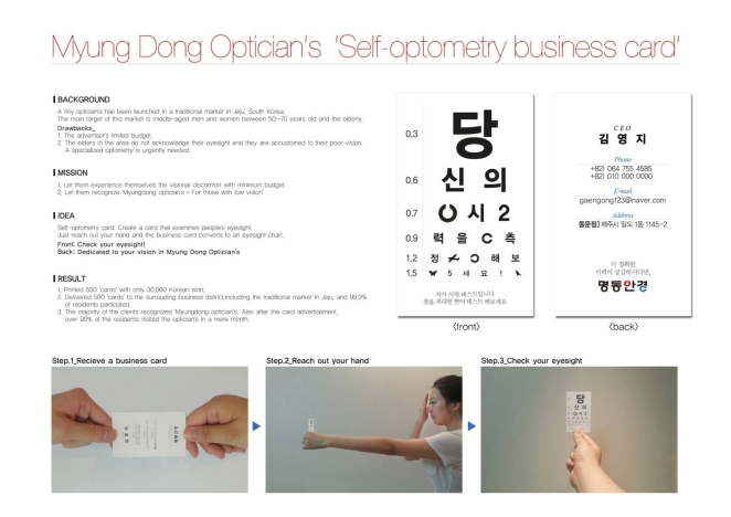
This self-optometry card was an incredibly cheap but effective marketing tool: it demonstrated people’s vision problems instantly, no appointment needed. The result? Within a month of handing these out, over 90% of the town’s residents flocked to the shop for proper eye exams. That’s an astounding conversion rate. The card essentially diagnosed its own audience, creating a sense of urgency and public service at once. It won plenty of praise in advertising circles for its smart design. In a world where many ads tell you to act, this little card actually showed you why you should – a clear vision, in more ways than one.
Franco Caligiuri’s Stock Chart Card
Franco Caligiuri, a financial advisor in Canada, needed a card to convey what he does best: help clients buy low and sell high. His solution was a striking double-sided card shaped like a jagged stock market graph. One side of the card is colored green with the graph trending upward from left to right, labeled “BUY” at the low point; the other side is red with the graph falling, labeled “SELL” at the peak. In essence, the card itself is a miniature stock chart with Franco’s contact info integrated into the design. It visually tells a story: Franco will help you buy at the bottom and sell before the drop.
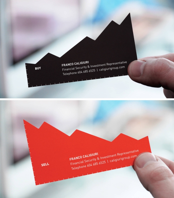
The clever die-cut silhouette of rising and falling angles makes the card stand out physically as well. Created by Rethink Canada agency, this design succinctly communicates Franco’s value proposition with zero extra words needed. It’s a great example of form following function in branding. For clients, it’s almost like a pocket-sized investing tip. No surprise that this card often appears in “best of” design lists – it’s financial advice at a glance, and a perfect conversation starter about market timing.
Jens Lennartsson’s “GI Jens” Action Figure Promo
Swedish photographer Jens Lennartsson took self-promotion to a whole new level – by turning himself into an action figure. He produced 400 boxed action figures, dubbed “GI Jens,” each a detailed miniature of Jens complete with camera in hand, and mailed them out as his “business cards” to potential clients. Inside each figurine’s packaging, along with the toy, were brochures listing Jens’ photography services and contact information. This over-the-top campaign was essentially a 3D portfolio. It grabbed the attention of magazines and agencies in a way no postcard or email ever could. After all, how often do you receive an action figure of the professional you might hire?

Lennartsson reportedly spent months and a good chunk of money on this effort, but it paid off in buzz – it was called “the most epic self-promotion ever made in the history of photography” by admirers. The mini-Jens army illustrates a valuable lesson: in creative fields especially, bold self-expression can be the key to standing out. His toy was not only fun and playful, but it literally put him on art directors’ desks around the world. Next time you think about handing out a resume or a business card, remember GI Jens and ask: how can you make yourself unforgettable?
Honourable Mentions
The fictional cards in American Psycho have become design touchstones.
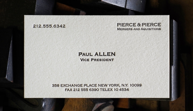 Paul Allen’s “Pierce & Pierce” card triggers Bateman’s envy because it uses refined Copperplate Gothic on smooth off‑white stock with a thick letter‑press impression.
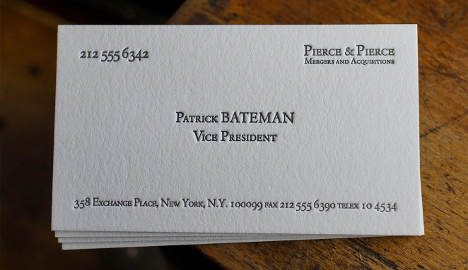
Patrick Bateman’s own card, by contrast, is printed on bone‑colored paper with a Garamond‑style typeface; it is misaligned and even misspells “acquisitions”. These differences, though subtle, illustrate how typography and layout signal power and taste and why this film scene is often referenced in design circles.
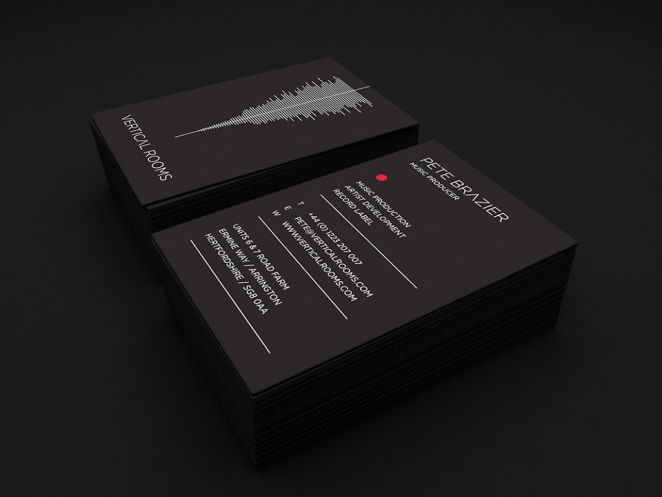
Cambridge-based agency BAO created these elegant business cards for the Vertical Rooms music production studio. The minimal but bold design complete with soundwave logo speak louder than a thousand songs.
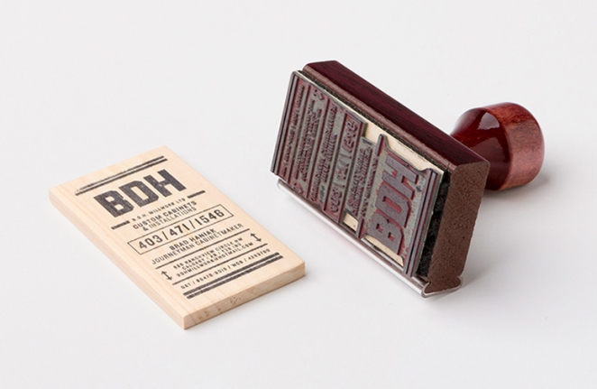
Calgary’s B.D.H. Millwork prints its details on scrap wood using wax and a stamp, turning leftover material into an eco‑friendly card.
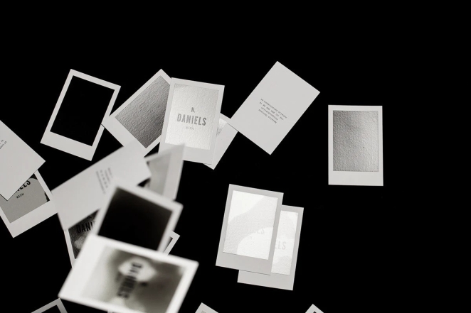
Photographer Natalie Daniels coats her cards in thermo‑sensitive ink so they reveal a white image when touched or kissed, turning each one into a miniature interactive photograph.
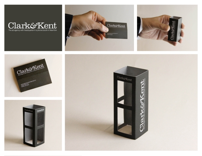
New York advertising firm Clark & Kent plays on the Superman mythos by designing a card that folds into a tiny telephone booth.
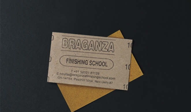
Braganza, a finishing school in India, prints its cards on sandpaper, reflecting the institution’s craft and providing a literal tool for smoothing surfaces.
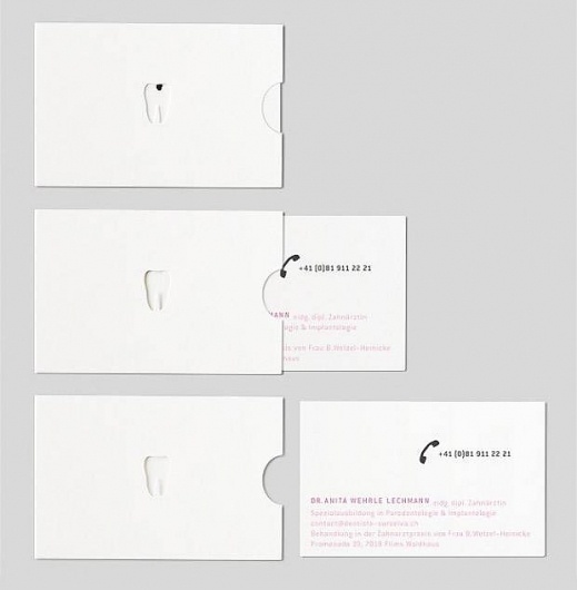
Dentist Anita Lechmann hides her business card inside a small envelope with a die‑cut tooth; pulling the card out makes the cavity in the tooth disappear, cleverly illustrating the dentist’s work.
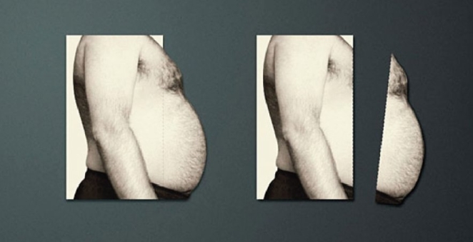
Another fitness trainer, Zohra Mouhetta, prints a protruding belly on her card; tearing off the perforated strip represents the weight loss her clients achieve.
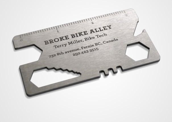
Cyclist Terry Miller’s stainless‑steel card doubles as a multi‑tool for tightening bolts and fixing chains, and the etched contact information ensures recipients keep the card handy.
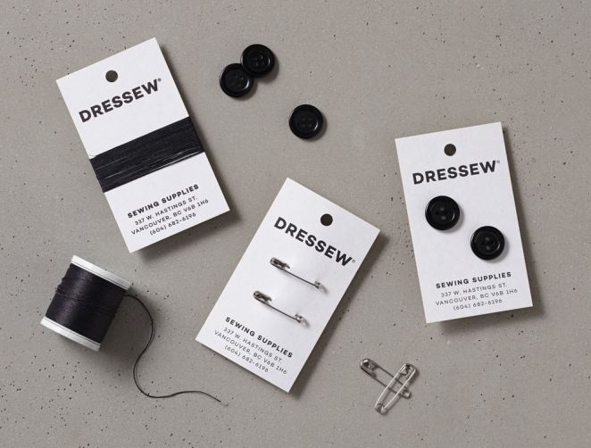
Long‑standing Vancouver fabric store Dressew, meanwhile, pairs its cards with pins, cotton and other sewing supplies, so customers take home both contact information and a small gift.
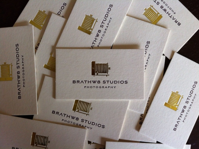
Creative studios often use letterpress printing on soft cotton stock, and some pair vibrant ink with gold foil accents and geometric cut‑outs, as seen in Brathw8 Studios’ cards.

Eco‑conscious companies embed wildflower seeds into the paper so the entire card can be planted and grown. In the most unconventional example, Vancouver’s BC Adventure survival‑training school prints its details on slabs of dried beef jerky, creating edible cards that double as snacks.
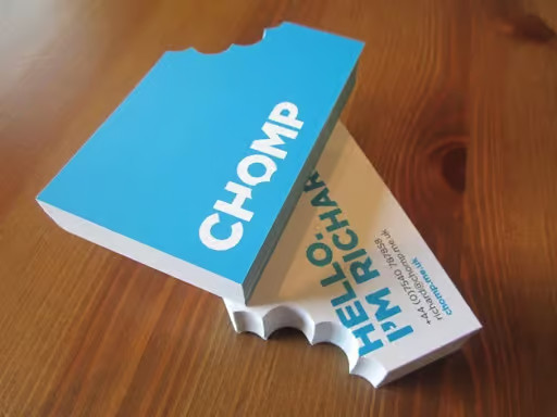
London design studio Chomp cuts a bite‑shaped notch from its card to mirror its toothy logo.
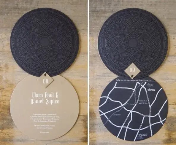
Graphic designers Clara Paul and Daniel Zapico created round cards with a hinge mechanism and multiple pages; the design allows them to show maps, contact information and artwork.
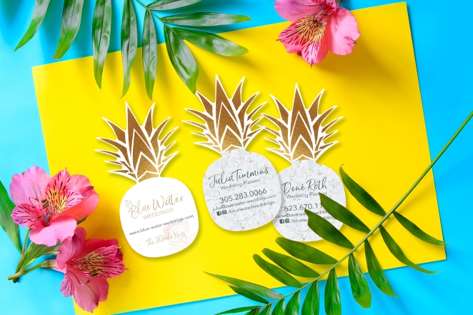
Plastic Printers designed a pineapple‑shaped card for a Florida wedding planning business; its vibrant colours and playful form encourage recipients to keep it.
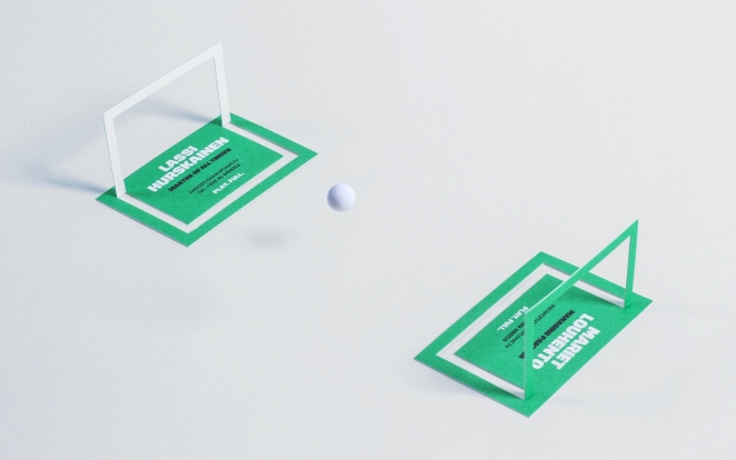
The branded entertainment company Trick & Treat created a card that transforms into a small tabletop football game, aligning perfectly with its playful ethos.
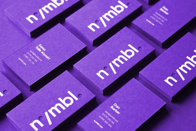
Virtual‑reality studio Nymbl uses paper cut‑outs on royal‑purple stock to evoke the layered, three‑dimensional environments of its projects.
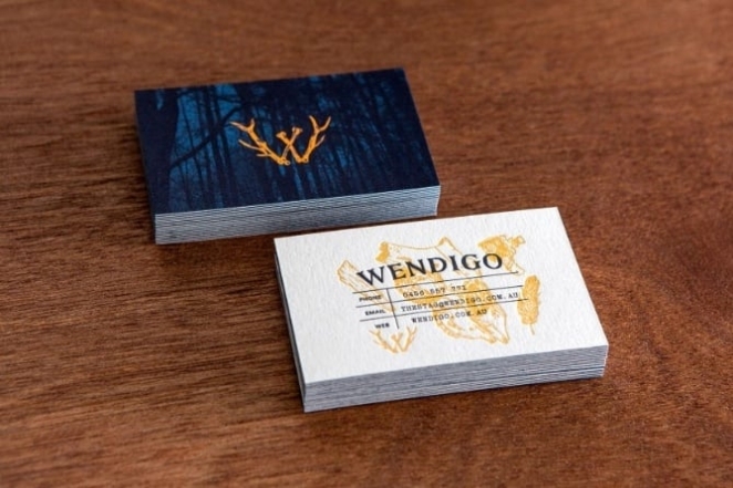
Video‑production house Wendigo features embossed illustrations of feathers, wood and skulls on its cards, while interlocking antlers form the “W” in the company’s name, demonstrating how illustration can support brand storytelling.
What These Cards Have in Common
Each of these examples shows that a well-crafted card can encapsulate a brand’s personality, invite interaction and even become a collectible. What unites the standout designs is less about a singular gimmick and more about the thoughtful interplay of several design-led principles.
First, they reflect brand identity in a clear, immediate way: the colour palette, typography, materials and shape all align with the organisation or individual behind the card. Studies of business-card design stress that keeping a card “on brand” is one of the foundational rules of effective design.
Second, they favour tactile or visual distinction whether through premium paper stocks, interactive features (folds, cuts, pop-ups), or unusual formats. Research shows that cards which feel special or look unique are more likely to be kept rather than discarded.
Third, they manage to keep clarity of information while embracing creativity. Good cards avoid visual clutter, use legible typography and ensure the recipient quickly captures what matters: who you are, what you do, and how to contact you. One guide identifies “include only what’s most important” and “leave white space” as key cards-design rules.
Finally, these designs create a memorable experience or added value, turning a simple networking exchange into something people remember. Whether the card doubles as a collectible object, encourages interaction, or simply delights in its finish and craftsmanship, this ‘extra’ factor separates the memorable from the mundane.
Together, these characteristics form the DNA of what makes a business card not just functional, but exceptional.
Bringing Your Next Business-Card Vision to Life with Creativepool
If these standout business-cards prove anything, it’s that when bold ideas meet masterful execution, the result isn’t just a means of sharing contact details but a tool of lasting brand culture. Whether it’s a luxurious letter-press finish, a sculptural pop-up format or a tactile material that prompts a double-take, the right designer can turn a card into a story, a story into an experience, and that experience into a memorable brand legacy.
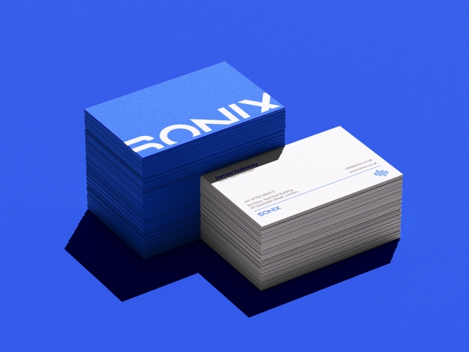
Tahir Mughal
And that’s exactly where Creativepool comes in. Whether you’re hunting for a print-stationery specialist who understands the poetry of paper and ink, a material-innovation designer with a penchant for unusual finishes, or a studio capable of executing a multi-part identity suite (cards, packaging, collateral), you’ll find them here. Creativepool is home to thousands of print designers, brand studios, typographers and materials experts—the people who turn a simple contact card into a crafted artefact, one sheet at a time.
Hiring a Business Card Designer
Here are three simple ways to connect with the sharpest business-card and print-identity talent for your next project:
Search and contact
If you already know what you’re after (for instance, a letter-press business-card specialist or a designer who works with metal-foil embossing) you can dive directly into Creativepool’s talent network. Browse portfolios, case studies and relevant projects using smart filters. Creativepool’s ranking system allows you to identify leading creatives across design categories.
Post a Studiogig
Need a specialist fast? Post a Studiogig asking for business-card design. Your brief is immediately distributed across relevant members in the Creativepool community, and the right freelancers respond directly to you.
Post a job
If you’re building an internal print-identity team (perhaps hiring a print-production manager, a typographic designer, or a junior brand-identity designer) you can list your vacancy. Creativepool promotes all listings and reaches a dedicated Jobs Board where top-tier print and identity specialists are present.
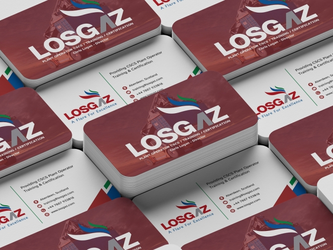
Jamie Rendall
Hiring a Design Studio to Create Your Business Cards
If your brief calls for an end-to-end brand identity (including business cards, stationery suites, ambient materials and packaging) you’ll want a specialist design studio. Creativepool makes it easy to search, shortlist and connect with design agencies who’ve done it all.
Find a studio
Use Creativepool’s studio filter to explore showreels, material approaches, print-production capability and client experience. You can filter by material finishing (emboss, foil, die-cut), by print process, or even by budget band.
Post a brief
Prefer to receive proposals? Simply submit your brief, budget and objectives. Studios that match your creative requirements respond with tailored ideas and experiences.
Need help?
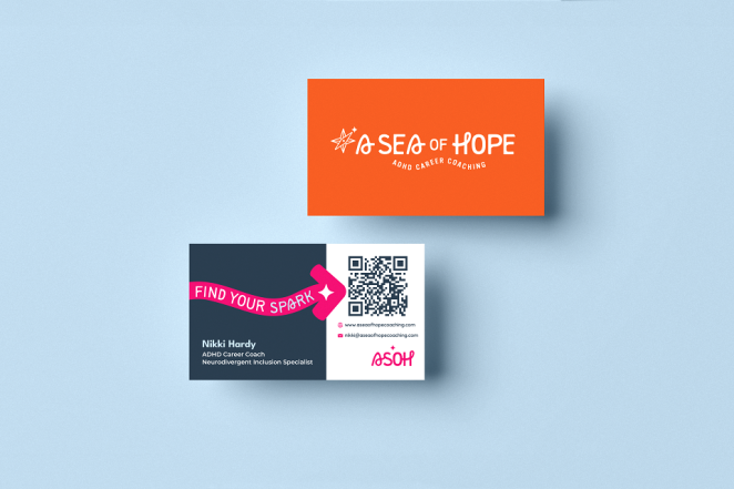
Tasmin Otter-Lunn
Creativepool’s team of industry-experienced staff is on hand to help shape your brief, assist in defining print-tech requirements, or even advise on material and finishing selection. Chat live at the time of posting your gig or contact via the dedicated creative-services page.