

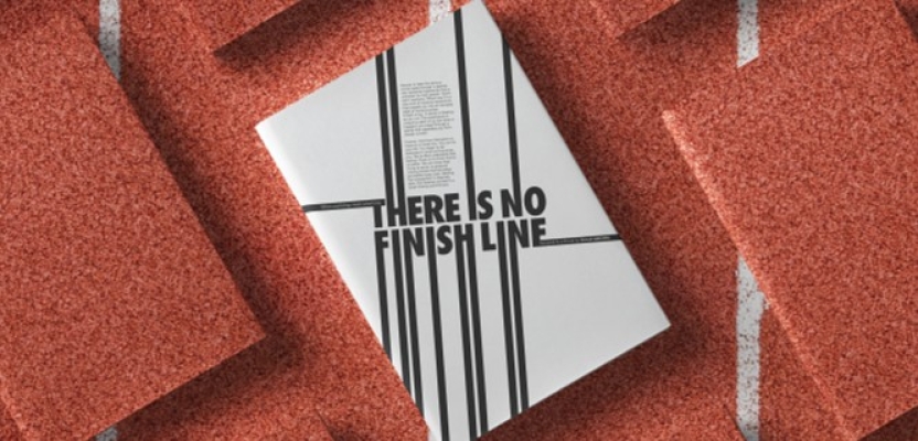

In the world of editorial design and brand storytelling, few projects capture emotion and purpose as powerfully as There Is No Finish Line — a self-initiated book by Danesh Sanjana, Senior Art Director, Editorial Designer, and Founder of moredan type. Inspired by Nike’s legendary 1977 campaign, the project reimagines the brand’s philosophy through design, typography, and narrative. Rather than creating an ad, Danesh Sanjana created an emotional timeline, a printed reflection on how belief, storytelling, and design can merge to express something universal: the endless pursuit of human potential.
This design project is more than a tribute to Nike’s legacy; it’s a study in how branding can be deeply human. Through a blend of research, writing, and design precision, Sanjana crafted a visual narrative that mirrors Nike’s core message: there is no finish line. Using only the Adobe Creative Suite, he explored how typography can breathe, how rhythm can replace grids, and how emotion can shape structure. The result is a book that challenges conventions of advertising and editorial design, turning brand philosophy into visual poetry that inspires both designers and storytellers alike.
What was the brief?
There wasn’t a formal brief — this project started as an obsession. I wanted to understand why Nike’s line “There Is No Finish Line” still feels as alive and relevant as when it was written in 1977. My goal was to translate that spirit into a book that felt like an emotional timeline — a study of how belief, storytelling, and design can merge to create something timeless.
How did the initial pitch/brainstorming phase go?
It began as a notebook full of fragments — words, ads, and sketches. I wasn’t trying to design a book yet; I was trying to find the soul of Nike’s communication. The more I read, the more I realized the brand wasn’t just selling shoes — it was building an emotional relationship with human potential. That became the north star for everything that followed.
What was the process behind ideating the concept?
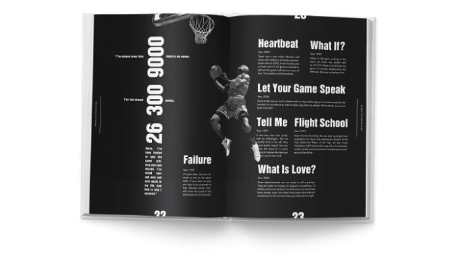
I started by breaking Nike’s history into emotional chapters: belief, heroism, struggle, equality, and inspiration. Every campaign — from Jordan to Livestrong to Equality — fit somewhere in that emotional arc. The book became a narrative of becoming: how a company, through pure conviction, taught the world that greatness is a personal journey, not a finish line.
What was the production process like?
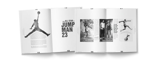
Everything was done within the Adobe ecosystem — InDesign for layout and typography, Photoshop for imagery and retouching, Illustrator for minor vector work. I designed and wrote in parallel — the text informed the layout and vice versa. Each spread was composed like a frame in a film: pauses, tension, motion, release. The intention was to make readers feel Nike’s rhythm — the pulse between words and whitespace.
What was the biggest challenge during production? How did you overcome it?
The hardest part was editing emotion. Nike’s story spans decades of triumphs and failures, and I had to make it coherent without losing its pulse. There were moments when it felt overwhelming — too many campaigns, too much legacy. What helped was focusing on one central belief: there is no finish line. Every page had to echo that philosophy, visually or verbally.
What kit/tools/software were used to create the project?
All of it was created in Adobe InDesign, Photoshop, and Illustrator. No external tools, no fancy workflows — just pure focus and iteration. I wanted the process to feel as analog and deliberate as the final object.
What is one funny or notable thing that happened during production?
When I first read that “Just Do It” came from a murderer’s last words, I thought it was fake. I spent an entire evening fact-checking because I couldn’t believe something so positive came from such darkness. That strange duality — turning tragedy into empowerment — shifted how I approached the whole project. It reminded me that creativity is often about transformation.
What’s the main message of this project and why does it matter?
That branding, when done right, is human. There Is No Finish Line isn’t just about sport; it’s about our shared desire to keep becoming. I wanted to show how advertising can be philosophical — how a brand can make people believe in themselves. It matters because it challenges the idea that marketing is shallow; it proves it can be soulful.
How long did it take from inception to delivery?
Around six months from research to print. I spent the first few months immersed in Nike’s campaigns and archives, and the rest fine-tuning layouts, type hierarchies, and production files until every page felt balanced. Since I was writing the book as well (most parts of the book)
Can you describe the creative spark or inspiration behind the initial concept? Was there a specific moment or insight that ignited the idea?
It came from a single image — that original 1977 Nike ad with the lone runner and the line “There Is No Finish Line.” It was so pure, almost spiritual. I kept thinking: this isn’t advertising; it’s a mantra. That became the starting point — to make a book that feels like meditation through design.
How did you ensure that the concept aligned with the brand's values, goals, and target audience?
Nike’s DNA is about belief in motion. Everything in the book — from structure to tone — respects that. I didn’t analyze from the outside; I wrote from within the mindset of someone who runs, fails, and tries again. The brand’s values of inclusion, equality, and relentless progress guided the editorial rhythm.
Were there any alternative concepts or ideas considered during the ideation phase? If so, what led to the selection of the final concept?
Initially, I thought of making it a digital timeline or interactive microsite. But that felt wrong — Nike’s story deserved paper, weight, and silence. The permanence of print gave it gravity. You can pause with a book in a way you can’t with a screen.
Can you discuss any collaborative or interdisciplinary aspects of the ideation process, such as working with other departments or external partners?
The project was a solo effort, but it required a hybrid mindset — writer, art director, typographer, researcher. In that sense, it was interdisciplinary. I was essentially building an exhibition that just happened to take the form of a book.
What role did consumer research or market analysis play in shaping the concept and its execution?
Not formally. I relied more on cultural and emotional research — understanding how Nike’s messaging has made generations feel seen. The data was human emotion, not numbers.
Can you discuss any unique or unconventional production techniques or approaches used to bring the idea to life?
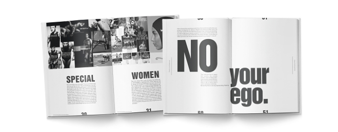
I treated typography like choreography. The letters stretch, breathe, or tighten to mirror the feeling of motion. Instead of following strict grids, I let rhythm guide composition — like a heartbeat rather than a rulebook.
How did you ensure that the concept remained innovative and stood out in a crowded marketplace?
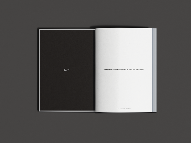
By refusing to make it look like advertising. I wanted it to feel like literature. The blend of narrative writing, art direction, and brand analysis made it part book, part experience. It stands out because it’s emotional without being sentimental.
What do you hope it achieves for the brand?
This project wasn’t made for Nike, but because of Nike. I hope it reminds people that the brand’s real power is its humanity — its ability to turn performance into poetry. And I hope it inspires young designers to look at advertising differently — as philosophy in motion.
Credit list for the work?
Concept, Writing, Research, and Design: Danesh Sanjana