
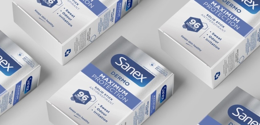

In a dynamic collaboration that bridges cutting-edge innovation and established brand values, bluemarlin’s creative team embarked on a rebrand journey for Sanex Dermo Maximum Protection 96 Hours Solid Stick Antiperspirant. Tasked by Colgate-Palmolive to develop a premium-tier product aimed at consumers dealing with excessive sweating, the agency was challenged to highlight the product's advanced efficacy while preserving Sanex’s commitment to skin health.
We sit down with Gareth Roberts, Associate Creative Director, and Charlie Spiers, Account Director, to uncover how bluemarlin reimagined the Sanex brand identity, balancing technological innovation with trusted care.
What was the brief for the rebrand?
The Colgate-Palmolive team developed a new premium-tier offering for the Sanex brand, aimed at consumers struggling with excessive sweating. bluemarlin was tasked with creating a brand design that resonated with these consumers, highlighting the product’s technological innovation without compromising Sanex’s core values of skin health and safety.
How did the initial pitch/brainstorming phase go?
We began by analysing macro trends affecting the target audience, such as increased anxiety post-pandemic and the growing use of technology to fuel the latest health revolutions. This presented an opportunity to position science as proximate, caring and supportive within the realms of personal care.
To complement this, we conducted a deep-dive into the category and competition, assessing key messaging and visual codes. This informed an opportunity mapping exercise and the strategic decision to elevate the Sanex brand into the scientific space.
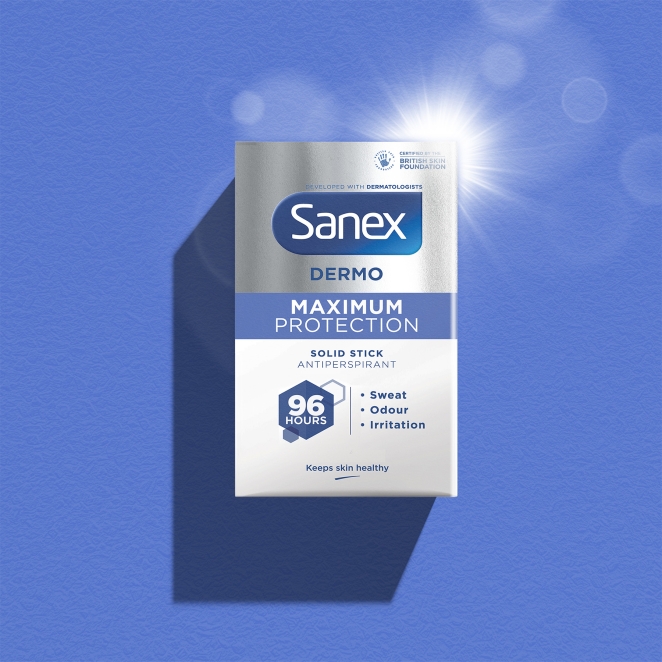
Based on our immersion exercise, we established alternative creative springboards with contrasting focuses, such as ‘Ultra Performance’, ‘Ultimate Protection’ and a more lifestyle orientated ‘Freedom to Be You’, which provided the creative team with broad inspiration.
Describe the purpose of the brand and its target audience
Sanex is renowned for its commitment to skin-friendly, gentle and safe solutions and is a trusted leader in personal care. This groundbreaking new product marks a significant evolution, offering 96 hours of clinical-strength protection within a new premium tier of the Sanex Dermo range.
It targets ‘confident freshness seekers’ aged 35-45, who want reliable solutions for excessive sweating and odour, while maintaining comfort and skin health.
What was your thinking behind the rebranding solution?
The challenge was to convey the product’s exceptional efficacy in a way that felt both reassuring and aligned with Sanex’s established brand identity. We began by exploring Sanex’s brand positioning. Through collaborative workshops with Colgate-Palmolive and insights from research leader Kantar, bluemarlin identified a clear strategic direction: ‘Ultra Performance’. This approach highlighted the product’s focus on extreme effectiveness and scientific innovation.
‘Ultra Performance’ allowed us to reimagine the conventional design of antiperspirants. We integrated elements of biotechnology and performance-focused aesthetics, incorporating meshes, grids, scientific icons and silver – symbols of advanced skin compatibility and protection. This created a visual language that conveyed both efficacy and care. The final design successfully balances Sanex’s reputation for gentle, skin-safe solutions with the need to communicate the product’s intense protection.
What was the biggest challenge? How did you overcome it?
The biggest challenge was balancing the product’s extreme effectiveness and scientific innovation with Sanex’s soft, sensitive brand identity. The task was to incorporate advanced elements such as biotechnology and performance-focused aesthetics into a design that still communicated care and reassurance. We struck the right balance by blending high-performance visuals with Sanex’s core values.
What kit/tools/software were used to create it?
Adobe Illustrator, Photoshop, aftereffects and InDesign and Miro.
What details are you most proud of and why?
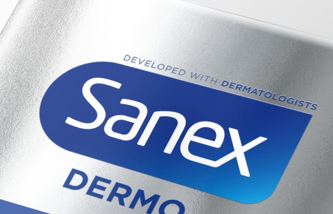
One subtle yet impactful detail is the packaging finish. Until now, the Sanex portfolio hasn’t include boxed products, certainly not in the UAP (ultra antiperspirant) category, so it had never used premium packaging finishes such as metallic silver foils and spot UV varnishes.
By incorporating these elements, we achieved a level of sophistication typically seen in premium fragrance, WBS (wine, beers and spirits) and tech. This approach elegantly communicated the product’s premium quality in a simple and sophisticated way.
What visual influences fuelled your solution?
We conducted an extensive audit of the visual language associated with ‘Ultra Performance’. This exploration directly influenced the final design. We drew inspiration from wearable biotech, high-performance materials like Kevlar and nanocomposites, and advanced technologies.
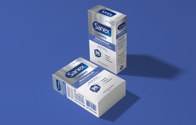
The key was not only to understand the visual equities of these elements but to integrate them thoughtfully, ensuring the design reflected the brand’s core value of care while embracing the boldness of high performance.
What do you hope it achieves for the brand?
We believe Sanex is now poised to redefine the antiperspirant landscape, complementing its already well-respected reputation for gentle and skin-safe formulations.
The innovation reflects Sanex’s commitment to offering advanced solutions while maintaining its focus on skin health. The product assures consumers that they are receiving top-tier protection without sacrificing care.
What role did consumer research or market analysis play in shaping the direction of the rebrand?
Understanding the consumer and meeting a specific set of needs was crucial to the success of the project. For Sanex, offering high-tech antiperspirants illustrates how it adds value to the personal care category through innovation that justifies premium pricing.
Eight different concepts were tested using market research platform Zappi. These ranged from designs that leaned more heavily on brand equity to those that were more scientifically driven, as well as more expressive approaches. The final direction represented a thoughtful balance between scientific and brand-driven elements.
Can you discuss any innovative or unconventional approaches you took in developing the rebranding solution?
The use of Kantar data to identify wider conceptual and visual opportunity areas. We used sales, media, social and behavioural data to develop a clear, targeted story. While not unconventional, it’s an approach that’s not often used in practice.
Were there any unexpected insights or discoveries about the brand that emerged during the rebranding process?
The strength of the Sanex brand, with its strong association with gentle skincare solutions, was not to be underestimated. When efforts were made to incorporate highly scientific or futuristic concepts, they conflicted with the brand’s core values.
The challenge was to strike a delicate balance between high performance and care, while clearly conveying a premium tier. The concepts that resonated most were those that introduced a stronger sense of humanity.
How did you ensure that the new brand identity resonated with the brand's existing audience while also attracting new ones?
Consumers are already seeking trusted, branded products and are increasingly unwilling to compromise on quality. Sanex already has a strong reputation for quality and trust in the antiperspirant and personal care markets.
By introducing this premium offering, we tapped into a new consumer base that values functional, high-performing products. Packaging that effectively communicates the product’s added value plays a critical role in appealing to both existing and new consumers.
For many shoppers, the appeal of a product goes beyond just its effectiveness – packaging that telegraphs and delivers on the promise also plays a critical role in meeting their expectations.
Can you share any behind-the-scenes anecdotes or memorable moments from the rebranding project?
Collaborating with the highly experienced and visually literate brand team at Colgate-Palmolive was a rewarding experience. With team members spread across three countries and different time zones, it was essential to maintain a strong connection during the conceptual stages.
We ensured that our broad range of concepts addressed various aspects of the brief before narrowing our focus. We used online Miro boards to workshop designs in real time, sharing raw, unfiltered ideas and receiving immediate feedback.
This process allowed us to think big and share our ideas, warts and all, while receiving immediate feedback. It’s not for the faint of heart, but it reflects the creative bravery we champion at bluemarlin.
What would you do differently if you could do it over again?
We wouldn’t change a thing! Time will tell, but we’re confident in the solution we arrived at. Our creative exploration was essential to delivering a design we believe will resonate with consumers.
Credit list for the work
Gareth Roberts – Associate Creative Director
Jo Pittard - Senior Designer
Lucia Wells - Designer
Charlie Spiers – Account Director
Sarah McDougall – Account Manager
Steve Gordon - Artwork/Production