
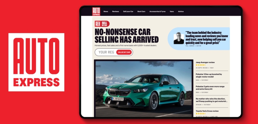

In an automotive landscape constantly evolving, the task of rebranding a trusted name like Auto Express was no small feat. As Head of Creative, Katie McLurg spearheaded a bold reimagining of the brand—its first major overhaul in over 30 years. Charged with modernizing the brand while maintaining the trust of its loyal audience, Katie and her team embraced a future-focused, digital-first approach, all while staying true to Auto Express’s heritage as "the people’s automotive champion."

Katie McLurg
In this interview, Katie shares the creative process behind the rebrand, the challenges faced, and the innovative solutions that led to Auto Express’s refreshed identity.
What was the brief for the rebrand?
To take what was core to the Auto Express brand and bring it up to date. As this was the first time the brand had had a significant update in over 30 years, it was key to keeping the trust of our (very loyal) existing audience while appealing to the next generation.
This is a new phase for Auto Express as it moves beyond solely editorial news and reviews. It needed a brand fitting of its position as “the people’s automotive champion”, but that could house commercial products, like helping people to sell their car with the experts.
How did the initial pitch/brainstorming phase go?
We handled the entire thing in-house. The parameters of the brand license had to be considered which gave us some guardrails. Within those we explored anything and everything.
Starting with a bit of an MOT where we cleaned up the basics, then a route inspired by our retro 80s press, right through to a classic timeless option which formed the basis of what you now see out in the wild.
Describe the purpose of the brand and its target audience
Auto Express is the absolute source for automotive news and reviews. In an industry brimming with bold claims, bogus deals and buyer uncertainty, we are a voice for drivers. As car insiders we guide drivers from start to finish in their car buying (and selling) journey, right down to the detail of the best products and services to use on their car.
Our audience is anyone who wants to know more about cars; whether a complete novice, or someone who reads our weekly mag and could give our editor a run for his money!
What was your thinking behind the rebranding solution?
Increasingly people use online platforms for researching and making purchases, and automotive is no different. This shift had outstripped the logo and visual identity that Auto Express was using, particularly in the digital space. Accessibility was a problem, as well as looking dated and overlooked.
The strength of brand trust, expert knowledge and no-nonsense advice that Auto Express has in spades wasn’t evident from looking at the outside. We needed to align the bold spirit of the brand with what it looked and sounded like. This resulted in an evolution of the existing brand tone and identity, giving it a unifying voice and look and feel which could last for the next 30 years.
Did you learn anything new during the project?
More than I thought was possible. For example, I didn’t realise there were so many stages to a car launch (Auto Express’ specialty), it turns out car brands love to tease!
In one of about eight stages involved in bringing a car to market they wrap it in black and white vinyl so you can’t tell exactly how it looks while they test it. Our team photographs them (spy shots) and sometimes render what they think the car looks like underneath.
What was the biggest challenge? How did you overcome it?
Auto Express is a much-loved brand, with many of the audience subscribing for decades, not months. Staying true to what mattered to the fans of the brand while updating it enough to appeal more broadly was a tricky balance.
To overcome it, we did what Carwow Group does best and we spoke to the people we were making it for. There were some very honest opinions in the mix that were a helpful guiding light for what was up for grabs to change, and what needed to stay.
What kit/tools/software were used to create it?
Adobe Illustrator for the logo and InDesign for layout tests (we are in a print magazine world, after all!) Plus, all the usual suspects - Figma, Photoshop and AfterEffects - for support with stress testing and roll out.
What details are you most proud of and why?
The custom type we designed for ‘Auto’ in the logo, which feels fitting to both the no-nonsense attitude that’s core to the brand, as well as the automotive category it sits in. It gives the brand some character without anchoring it to a specific audience or era.
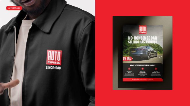
I also love the bravery of the limited colour palette (the primary palette is red, black and a shade of white). It took a while to get our hands around it, but now feels distinctly Auto Express in its boldness.
What visual influences fuelled your solution?
As Auto Express is “the absolute source for automotive news and reviews”, it was a no-brainer to use the visually rich world of journalism.
We wanted the brand to represent the confident voice of our editorial team and hold the authority of the newsroom even as we built out the commercial products. This led us to choose a heavy condensed typeface, simple palette and to layer type and image.
It was also important to us that it looked timeless in a way that could withstand passing trends, so we drew some inspo from the Bauhaus movement where the interest in modern but functional design felt like a good fit for what we wanted to achieve.
Lastly, the thing heritage brands often overlook is what they’ve done well before, so we headed to the Auto Express archives to pull type treatment, colours and ideas for layouts.
What do you hope it achieves for the brand?
Accessibility for the next generation of motorists. Auto Express is a treasure trove of expert advice no matter how much car knowledge you have.
By updating the brand to work as well online as it does in print should help more people to find the help they need with their car researching, buying and selling, blowing wide that expert advice while keeping the fundamentals the readers love firmly in place.
How do you ensure consistency in brand messaging and visual identity across various channels and touchpoints?
A combination of a brand book and cross-team collaboration. The brand is new to us all and was made on a pretty rapid timeline, so we expect there to be challenges we need to solve for as we go.
For now, our brand team is close knit and the Auto Express Creative Director was a big part of the process, completely re-templating the magazine from contents page to back cover, so we keep an open dialogue and align it all as we build.
What role did consumer research or market analysis play in shaping the direction of the rebrand?
We have an in-house research team who recruited and ran focus groups for us across three routes. As I mentioned earlier there were some pretty vocal participants who gave us a great indication on what would and wouldn’t resonate with the audience.
One of the options was a retro route which went down like a lead balloon. It was surprising because we quite liked the route, but on reflection I realised it probably felt to the audience the way I feel about Gen Z trying to bring back low-rise jeans…
Were there any unexpected insights or discoveries about the brand that emerged during the rebranding process?
I loved hearing the stories from the team about the punk journalist spirit of the brand. I can’t divulge all the secrets, but Auto Express did some pretty bold things back in the day to nab world exclusives on Bentley, Ford and Mini without the manufacturers’ knowledge.
How did you ensure that the new brand identity resonated with the brand's existing audience while also attracting new ones?
We kept the brand’s core expertise and trusted authority at the forefront. The refreshed look and feel modernised the brand without sacrificing the decades of news and reviews our readers value.
By maintaining our expert advice and consumer advocacy, we kept our loyal customers engaged and by taking a digital-first approach we are able to engage with a younger audience, ensuring we appeal to both traditional car enthusiasts and the next generation of drivers.
Can you share any behind-the-scenes anecdotes or memorable moments from the rebranding project?
It was all quite memorable, but two moments stick out clearly. The first was Darren (Auto Express’ Creative Director) showing us the re-templated mag for the first time, and the feeling of excitement that the visual system was working as well for editorial as it had on brand comms and the digital product.
The second was launch day, (where our usually blue office was covered in red) seeing the logo burned into the top of the brioche buns for breakfast. What a time to be alive!
What would you do differently if you could do it over again?
Make the brand book earlier! Based on the timelines and the pace of the project we had to start making stuff pretty much as soon as we had signed off the logo and notional applications, as a result I kicked the can down the road a couple of weeks too long.
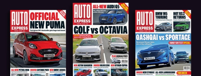
Everyone did a great job working from WIP Figma and InDesign files but I think the brand book brought much needed structure to the outputs.
Credit list for the work?
Ben Carter (CMO, Carwow Group), Meghan Sinclair (Brand Director, Carwow Group), Katie McLurg (Head of Creative, Carwow Group), Darren Wilson (Creative Director Auto Express) and an extra thanks to Auto Bild for letting us develop this amazing brand.