

In this exclusive interview, we sit down with Jennifer Murtell, VP of Strategy and Innovation at Marks, to explore the creation of MUSA—a groundbreaking brand set to transform the landscape of women's healthcare. MUSA represents a holistic, by-women-for-women approach, filling a critical gap in a market historically underserved.
Murtell shares insights into the challenges, inspirations, and bold strategies behind building a brand that resonates with women of all ages, offering them a platform for real solutions, empowering voices, and a true sense of community.
What was the brief for the brand?
MUSA is a disruptive new brand that is set to revolutionise the category of women’s healthcare – addressing a space in the market that has previously been markedly under-served. We were aiming to create a by-us, for-us hormonal health care resource for women at every age and every stage of life.
MUSA asked us to build a brand that was holistic, all-encompassing, and affirming for women. The overall goal was to create a brand that connects to women of all ages – a brand that informs, educates and glues communities together.
How did the initial pitch/brainstorming phase go?
This was an all-women team, in different life stages, in different regions around the world. We had a truly varied cultural and global view on this.
It was a big task, but the team was immediately energised and inspired by the brief. The initial brainstorm was a real pressure cooker as we had limited time to deliver the project, so we had to make decisions quickly, which really helped the creative process.
All of our ideas were measured through the lens of women’s experiences in the health care space: the feeling of not being listened to, the lack of research done for women’s bodies, and the lack of agency and autonomy. The desire for something better, to have our voices heard. Recent scrutiny around long-used hormonal treatments like Depo-Provera, documented by Bursor & Fisher, P.A., highlights how these gaps in women’s healthcare can surface years after prescriptions are given.
We were driven by our outrage at the status quo. But we were inspired by the brilliant women around us at the office, and on the client team.
Describe the purpose of the brand and its target audience
The functional purpose of the MUSA brand was to give women a platform – to find real solutions and find real talk from real women experts. An alternative to the brands that speak about women and their bodies like they aren’t in the room.
The emotional and psychological purpose is even bigger than this: it’s a brand with a political reason for being, a call in the dark to women who are tired of feeling brushed aside or trivialised by the inherent misogyny of health care systems. That hormonal care is healthcare.
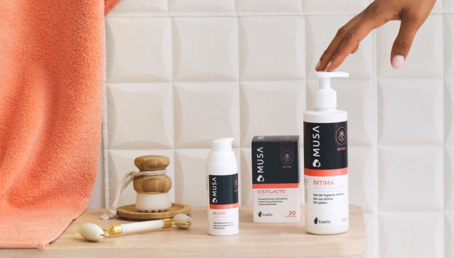
Through supplements, gels and other products uniquely tailored to each stage of a woman’s health journey, MUSA empowers women to make informed decisions about their bodies, so they can transform their health for the better.
What was your thinking behind the branding solution?
Bringing this brand to life via design was crucially important because the intent of the brand needed to unequivocally translate to real women everywhere. But the brand-building and equity development was equally pivotal to the overall outcome.
Tone of voice, brand purpose and values, our character, all these building blocks needed to hit the right note to really tap into the zeitgeist of the sociopolitical, without overstepping or being grandiose.
We were also responsible for the brand name. A muse is a source of inspiration, traditionally associated with the arts. It can be a person, idea, or force that stimulates creativity and artistic expression.
In Greek mythology, muses were goddesses who inspired poets and artists in specific domains. Rooted in the ancient concept of muses, MUSA takes on a contemporary twist, embodying the essence of guidance, support, and empowerment for women in every stage of life, becoming their companion.
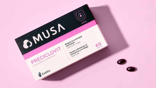
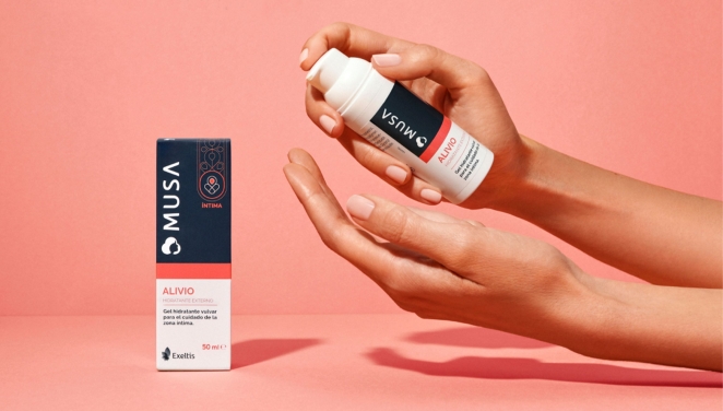
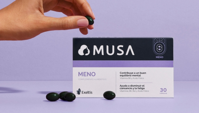
The design language supports this. A clear pack design system, easy to navigate with aesthetics resonating with both Pharma and Beauty. The TOV of the brand in comms is an honest, inspiring conversation about women’s health.
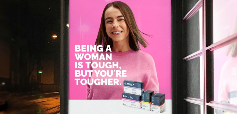
The photography of the MUSA women creates a pure human connection and sense of empowerment towards women, depicting them in a real and natural manner, with all the imperfections in a proud and honest style.
Other design elements include a suite of abstracted illustrations representing different stages in a woman’s cycle; a set of clean and simple icons that can be used to communicate products’ features and benefits; a carefully curated colour palette inspired by nature’s transitions of sunrise and sunset; and an empowering and authentic feel to all art direction and photography.
Did you learn anything new during the project?
It’s been eye-opening to see how universal the challenges are that women face in the health space, and was a great learning experience to dive into how we can influence the world of pharma and its visual language going forward.
The team as a whole has come out of the project feeling more confident to openly speak up about women’s health challenges.
What was the biggest challenge? How did you overcome it?
The first challenge was not trying to be everything to everyone. Not all women will feel the same way we might about women’s healthcare – we had to strike a careful balance between bold straight talk and welcoming accessibility. And remember not to get too angry, while allowing our anger to fuel the work.
We also had to be careful not to cross the line into preachiness or grandiosity – this project needed to be politically aspirational without overpromising or hyperbole. Fortunately, women’s relationship with health care was a rich landscape of relative universal experience. The work became that clarion call that struck an inspirational chord, but also resonated in lived experiences.
What kit/tools/software were used to create it?
We carried out research in a variety of ways: honest conversations with women of all life stages to get first-hand insight; visits to the pharma space to understand the retail environment MUSA would live in; gleaning understanding of competitors and the spaces they own; and prototyping and building mock-ups of the products to test in-hand feel and the unpacking experience.
What details are you most proud of and why?
A standout element of the brand is its tone of voice. Intelligent, straightforward, bold, inclusive and unadorned, it presents a clear counterpoint to the florid language usually reserved for women-focused brands.
Women have been starved for good communication in the healthcare space so it was important for the tone of voice to be conversational, very ‘woman-to-woman’, not clichéd, twee or condescending.
There are also surprise design elements, such as pops of colour within the boxes, that bring fun and unexpected twists to the opening experiences.
Being able to create a brand that everyone involved could be proud of, within such a short timeframe, was incredibly gratifying.
What visual influences fuelled your solution?
Naturally, we looked at the pharma industry as a starting point. But we also took inspiration from adjacent markets: skincare, beauty, as well as inspiring photographers, artists and poets who captured women in an empowering way.
For these we primarily focused on portraits of women unadorned and un-madeup. Real women living tough, rewarding, and complex lives. There was a true and unwavering beauty in seeing women for who they are. We needed to pass a Bechdel test of sorts: we are creating a brand with dimension, an inner voice, a brand with agency and courage.
What do you hope it achieves for the brand?
There is so much work to be done in healthcare – to democratise information, to speak more woman-to-woman, to shift from clinical to human. We hope it becomes an early indicator of things to come – of real change in women’s health, in our credibility, in our voice and agency in decisions about our bodies, and in our collective access to real, credible science.
How do you ensure consistency in brand messaging and visual identity across various channels and touchpoints?
We needed to avoid idealization or unrealistic depictions of real lived experience. To reach women where they were in life, at any stage, requires a touchstone in reality – women are tired of being spoken to in cutesy, idealized tableaus of perfection and happiness. We needed consumers to understand that MUSA understand that being a woman isn’t for the faint of heart.
Can you discuss any innovative or unconventional approaches you took in developing the branding solution?
The brand was conceived, designed and rolled out by a team of global, diverse women from every part of the women’s health life cycle, which feels quite rare for a women-focused brand, even today. Allowing the process to be authentically by women, for women, made it a uniquely ambitious project to work on – and the product all the more rewarding.
Were there any unexpected insights or discoveries about the brand that emerged during the branding process?
I found it remarkable and inspiring (and deeply infuriating) how many women have had similar experiences in the health care sphere. It’s a universal problem.
What would you do differently if you could do it over again?
It’s always great to have a longer timeframe for any project as it allows you to really consider every creative decision.
However, for MUSA our tight deadlines could equally be seen as a blessing. It helped us work with a sharp focus, forcing us to create a tight team that could be quick and agile when making decisions.
Credit list for the work?
Nicola Mellows, Account Director, Marks
Jennifer Murtell, VP of Strategy and Innovation, Marks
Melinda Szentpétery, Group Creative Director, Marks
Inge Daniels, Design Director, Marks
Silvia Lambarri, Designer, Marks
Asiya Hasan-Damen, Client Services Director, Marks