

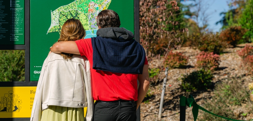

As the Planting Fields Foundation sets its sights on becoming a beacon of cultural and ecological significance, brand and business consultancy Wiedemann Lampe stepped in to cultivate a brand identity that resonates as deeply with its storied past as it does with its global aspirations.
In a conversation with Wiedemann Lampe Co-Founder and Strategy & Innovation Director, Alex Lampe, and Executive Design Director, Ryan Jones, we delve into the thoughtful process behind redefining a cherished Olmsted Brothers landscape.
From on-site exploration and historical research to clever zoning strategies and bespoke signage systems, their approach weaves together narrative, nature, and design—transforming Planting Fields into a richer, more accessible destination for generations to come.
What was the brief for the rebrand?
Alex: The original brief was: “To conduct an in-depth review of the existing Planting Fields Foundation wayfinding and develop a clear and welcoming strategy, messaging and design approach to communicate the onsite offers, directional and information signage for visitors.”
To do that effectively, we needed to fundamentally understand the foundation’s audiences, all the visitor journeys, and create a strategic wrapper that articulated its central purpose and narrative to those audiences. We often find that to achieve a cohesive experience and tackle a given brief, we need to go wide and take a much higher viewpoint.
How did the initial pitch/brainstorming phase go?
Alex: To kick projects off, we follow a strategic process that allows us to understand our client’s challenge holistically. With Planting Fields, we ran a series of workshops to understand their offer, understand their audiences, the visitor experience, the space, the benchmarks.
Out of all that information, we then created the opportunities that informed the eventual strategy and design. So, it wasn’t quite a brainstorm, but more a process that allowed us to quickly unlock our understanding of what they do as an organisation.
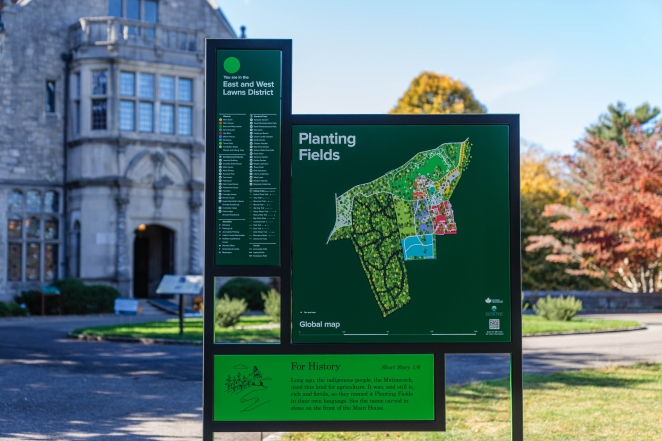
Once we were appointed, we also went to visit the site. This was so important, as you need to get a feel for a space. We explored the site with a horticulturalist and Gina Wouters, President and CEO of the foundation, to really understand the significance of this being a heritage site, a landscape designed by the iconic Olmsted Brothers.
Describe the purpose of the brand and its target audience
Alex: Planting Fields is the largest extant residential commission of the Olmsted Brothers, the sons of Frederick Law Olmsted. Olmsted, known as the ‘Father of Landscape Architecture in the United States’, created the iconic design of New York City’s Central Park. Like Central Park, Planting Fields is a place of natural beauty and significance, featuring historic structures, world class art and horticultural collections as well as woodlands and six miles of nature trails.
The purpose of the Planting Fields Foundation is the preservation of this Olmsted Brothers landscape and to keep it alive for everybody to enjoy as a publicly accessible park. The foundation is at an exciting time. It’s trying to position the site not just as a place that exists for the local community, but as a destination of national and even international significance and value.
What was your thinking behind the rebranding solution?
Alex: We needed to help the foundation articulate what it stands for as an organisation, and the visitor experience was central to that. After all, it was the visitor experience that was going to communicate and allow the brand to be felt by existing and new audiences alike.
The solution we came up with was very much based on understanding those audiences – that people were either coming to learn, to explore and experience something new, to connect with each or to enhance their wellbeing.
This understanding allowed us to distil the foundation’s mission into three organisational pillars, ‘For Nature. For History. For Life’. This brand framework summed up everything we needed to deliver on, also providing consistency of messaging and narrative – something that all staff and visitors could get behind.
Did you learn anything new during the project?
Alex: It was fascinating to learn about the Olmsted Brothers and their importance in American landscape architecture and the public realm. We created our own set of design principles based on the Olmsteds’ landscaping principles and tried to apply it in a way that would inform the wayfinding design.
Their original principles were all about creating space away from the fast-paced life of the city, to allow people to switch off. If we hadn’t done our job properly, if the wayfinding was confusing, people got lost or we didn’t communicate things probably, it would get in the way of that goal.
What was the biggest challenge? How did you overcome it?
Ryan: On a practical level, the fact that the United States still uses inches as units of measurement is always a challenge with a project of this scale, where you are dealing with international manufacturers and need to ensure that all dimensions get translated accurately.
I found it helpful to base all thinking behind the designs on the 12-inch record. Having an instinctive sense of the size of a 12 x 12-inch square helped me visualise during the design process.
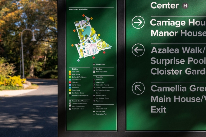
Another big challenge was plotting where the signs were going to be positioned. Understanding the flow of people, the busy spaces and the more open areas, and getting the balance between them right, was quite complex. We are proud to say that we discovered we had been pretty accurate when it came to our final on-site snagging.
What kit/tools/software were used to create it?
Alex: We do all our workshopping with our proprietary collaboration tool, Lemonade. For example, we built a workshop specifically for this project, as we knew the mobile phone reception can be sketchy across the site.
It allowed us to use Google Maps and image placeholders to plot different markers as we moved around the landscape. We were able to record and highlight important points, from the potential bottlenecks to the most picturesque locations.
We were literally still building it on the plane as we flew over to meet the clients for the first time, but it worked really well.
What details are you most proud of and why?
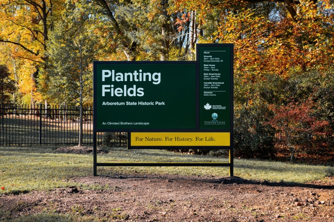
Ryan: We are very proud of the whole concept for the signage. We wanted to build something that had the flexibility to create several different forms – a system of signs that are diverse but feel as one.
So the final design was based around a garden trellis, giving us a flexible grid system that allowed every sign to have its specific purpose (whether that’s pointing the way, providing information and telling a story), but very much as part of a family.
There are 11 types of signs, every one with a specific purpose. They all look very individual, but they come from the same seed.
Alex: Another feature we love is the colour edging that denotes the different districts of the site. This design element was quite radical because everything had to adhere to the New York State Parks guidelines of white on green backgrounds. But having this splash of colour is really distinctive.
Ryan: As a client, the Planting Fields Foundation was very open and brave. The fact that Gina and the team wanted to go out there and do something very leftfield was very satisfying – and to see very modern looking signs in this historic park and the juxtaposition of the two.
The Planting Fields Foundation has very big ambitions to go global, and they really wanted to push the boundaries and show that they were forward-thinking. The design definitely matches their ambitions.
What visual influences fuelled your solution?
Ryan: Because Planting Fields is part of New York State Parks and needs to adhere to the wider organisation’s brand guidelines, two things we couldn’t shift on was the green background and the use of the Proxima Nova typeface, so we had to incorporate those into our designs.
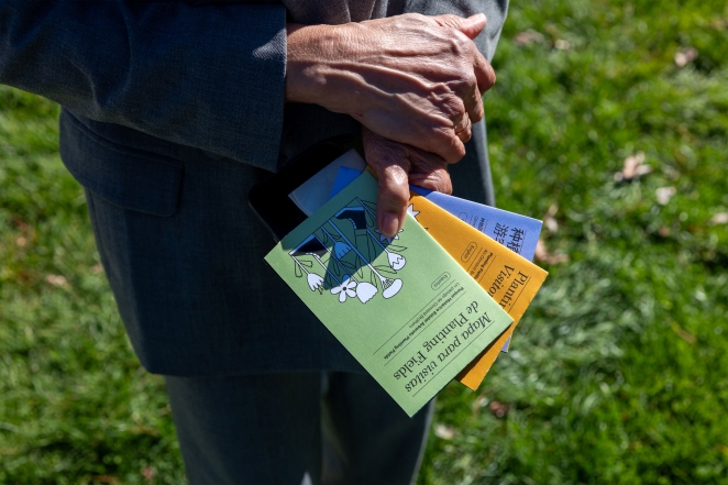
However, we did introduce a secondary, serif typeface – in a way it became the voice of Planting Fields. We chose Century Schoolbook, a typeface that was designed 50 miles away from Planting Fields in Jersey City, around the time of the Olmsted Brothers at the beginning of the 20th century; it was great to be able to add that element of heritage.
For the illustrations we worked with Mike Hall – he got involved at early stage to help with the segmentation and zoning. Then we also commissioned Christopher DeLorenzo to illustrate the stories on the signage’s interpretation panels.
What do you hope it achieves for the brand?
Alex: We would love for the project to set a best practice use case for the other parks in the region. It was all built from the New York State Parks guidelines but injects a layer of authenticity and narrative that is particular to Planting Fields. It would be great if it became a framework to learn from that sets the standard for future projects.
How do you ensure consistency in brand messaging and visual identity across various channels and touchpoints?
Alex: Our strategic platform of ‘For Nature. For History. For Life’ is a great lens to apply to all messaging – it helps determine what we’re communicating, for whom and how.
We also made sure that all the messaging on the signage was all ‘Tweet-sized’. Everything is kept digestible and fun and doesn’t detract from the enjoyment of the park, and ensures it can be rolled out across a variety of touchpoints.
Were there any unexpected insights or discoveries about the brand that emerged during the rebranding process?
Alex: We based the new zoning for the master map on historical Planting Fields landscape reports. Everything we did was deductive, rooted in the historical landscape and the principles it was based on.
How did you ensure that the new brand identity resonated with the brand's existing audience while also attracting new ones?
Alex: By nature of the project, it was also going to resonate with the existing audiences, as it’s designed to heighten their experience, allowing them to discover new things across the site.
By profiling the different types of audiences right from the start, we were able to tailor the messaging that was going to connect with each of those types of people. There are so many different facts and stories that are associated with specific sites or moments – and those will resonate with audiences both new and existing.
Can you share any behind-the-scenes anecdotes or memorable moments from the rebranding project?
Ryan: The walking and hiking trails in the woodland areas range from easy to challenging. When we were plotting the location of the signs, we realised that the trails were all based on archive maps, which turned out to be outdated – we actually hit a number of dead ends.
Apparently over previous years there have always been occasions where people managed to get lost and a search party had to be sent out. It will be interesting to see if that number diminishes over the coming months.
What would you do differently if you could do it over again?
We all stand proud with what we created – we wouldn’t change a thing.
Credit list for the work?
Map illustration: Mike Hall
Illustration: Christopher DeLorenzo
Production: Principle Global