

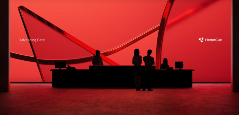

When leading diagnostic pioneer HemoCue found its growth stalling, it was time for a radical rebrand that could convey both rigorous expertise and genuine care. Enter Designit—a nimble team of strategists and designers tasked with forging a new visual identity that merges Scandinavian simplicity and global relevance.
In this interview, they reveal how they transformed a product-focused logo into a compelling “Caring Expert” persona, aligning the brand with HemoCue’s ambitious vision to improve worldwide healthcare, test by test.
What was the brief for the rebrand?
Global healthcare company HemoCue (owned by Danaher) produces and markets medical diagnostic products for point-of-care testing, primarily used to test for conditions like anaemia, diabetes and infections around the globe.
While it had been delivering consistent profits, HemoCue’s growth had hit a ceiling. The brand needed a shot in the arm, and essentially, that was the brief. Designit was brought on board to ready the HemoCue brand for the next stage in the company’s new period of growth and innovation, and find the right way to articulate its ambition to improve global health.
How did the initial pitch/brainstorming phase go?
The key talking point of our brainstorming session was how we were going to marry up the new creative vision for the brand with HemoCue’s plan for growth. This was going to be complicated - HemoCue was trying to do a lot of things at once: establish a new brand purpose, define their market position, and create a new platform and visual identity.

All with the aim of building awareness and driving growth. If all these different elements were to come together, we knew that a consistent and coherent visual identity for the brand was of the utmost importance.
Describe the purpose of the brand and its target audience
We spent a great deal of time trying to distil exactly what the HemoCue brand represented, and what it ought to be. Communicating its expertise effectively was vital - HemoCue’s knowledge and solutions had to remain a core part of the brand’s identity. But, this couldn’t be the brand’s USP. In a field like healthcare, having expertise isn’t going to make you stand out - if anything, it’s the bare minimum!
Instead, we chose to lean into the ‘caring’ aspect of healthcare. We brainstormed the concept of ‘The Caring Expert’, something that the HemoCue brand could embody. Because the medical industry has to deal with heavy subjects, brands in this field can tend to talk about themselves in a way that comes across as quite cut and dry, and clinical, both in how they communicate their identity and their approach to business.
It’s the nature of the beast - you need to be seen as knowledgeable because your products’ functionality can be a matter of life and death. That said, the need to be seen as caring and reassuring can get overlooked as a result. Therefore, the ‘The Caring expert’ persona perfectly articulates how HemoCue is more than a supplier of medical blood-testing and diagnostic devices, which is important because their core customers are hospitals, clinics and primary care practitioners - all of whom are on the front line of patient care.
The revitalised HemoCue brand had to communicate an understanding not just of patient needs, but more broadly that the best medical treatment is about providing great care, in order to speak pertinently to its target audience.
What was your thinking behind the rebranding solution?
Contrary to what you might expect, approaching a rebrand in this field isn’t so different from any other. Obviously there are a few more legal boxes to tick, but the fundamental considerations when it comes to good visual communication for a healthcare brand remain similar to those in other industries: the typeface, colour, and image style. I suppose what separates healthcare from other fields when it comes to these considerations is the need to communicate expertise, to lace visual cues with the idea that the brand is truly expert at what it does.
We know that other large pharmaceutical companies are investing more in their branding as well, so we wanted to ensure that HemoCue’s identity translated well on different platforms, to maximise the number of effective touchpoints.
But, in essence, the thinking we applied to the HemoCue project is not a million miles away from the way we would have approached a rebrand for a global business grocery, or retail, for example. It’s all about finding ways to stand out from the crowd - which is why a striking and consistent visual identity was so important to get right.
Did you learn anything new during the project?
It wasn’t so much a new learning as it was a timely reminder, that completely overhauling a brand isn’t necessary - consistency and alignment with the company’s overall goals is what really counts.
What was the biggest challenge? How did you overcome it?
A unique challenge for brands in healthcare is that their visual communication needs to be quite abstract in order to remain engaging. It’s counterintuitive, but brands in this space often use very aesthetically pleasing visuals without providing much in the way of detail - largely, because their products and services are too complicated to communicate visually in a simple way.

The challenge is, while relying on the abstract can result in design that looks very pretty, it doesn’t lend itself to clearly conveying core business characteristics. Finding the balance between the abstract and aesthetically pleasing, with the need to be concise and clear is the key to providing a holistic and cohesive brand experience in this field. A challenge for sure, but one we overcame.
What kit/tools/software were used to create it?
We used a lot of different tools, but a few were particularly key: the graphics were mostly Illustrator and Figma. Animation and video editing was done in After Effects and Premiere, and the 3D elements were created in Cinema 4D.
What details are you most proud of and why?
As is often the case with projects we work on, the details themselves are what really get us as designers excited! In this case, it was the slight change in the shade of red. It’s subtle, but it’s enough of a move away from the original design to symbolise a marked shift in the company’s positioning, away from a logo that was more product-focused.
These small changes in isolation mean very little, but with our understanding of the profound cumulative impact they can have, in some cases, completely transforming how a brand is perceived, it’s hard not to get excited about them.
What visual influences fuelled your solution?
We wanted an expression that embodied both the ‘caring’ and the ‘expert’. The typography we chose took care of the latter. We decided on a Swiss modern way of arranging type and space.
It was important to capture the Scandinavian essence of the brand but give it an international twist - so the visuals had to be well-crafted, simple, and inspired by imagery from all around the globe. The result speaks both to Hemocue’s Swedish heritage and the brand’s global reach.
What do you hope it achieves for the brand?
We hope HemoCue’s brand identity is not just clearer, but more consistent with its business objectives. We want this new design to be both visually striking, and a cogent representation of HemoCue’s core characteristics as a business.
How do you ensure consistency in brand messaging and visual identity across various channels and touchpoints?
Identifying ‘The Caring Expert’ persona was central to us when creating consistent messaging. Ensuring everything we did was linked to the new brand purpose of “Advancing care, test by test, everywhere.” also helped.
Once you have the guidelines - that come from knowing what the brand truly represents - being consistent with the messaging becomes much easier, even across different platforms. That’s a testament to HemoCue’s senior management and global team, who totally bought into our vision for the strategy and new brand platform. Being given the creative freedom and licence to play around with what HemoCue’s revitalised brand values could look like made our jobs much easier.
What role did consumer research or market analysis play in shaping the direction of the rebrand?
We spoke to all parts of the value chain, from health and care professionals more broadly as well as employees within HemoCue, all with the aim of understanding their existing relationship with the brand. This ensured that the result we ended up with would be authentic, true to both what employees had come to expect from the brand, but also that our efforts addressed the areas where they felt it was lacking.
Away from Hemocue itself, we looked at the market to ensure that our re-design would stand out to competitors in a meaningful way. These insights gave us a better understanding of what the brand represented in its current form, and provided the guidance we needed to understand what exactly we needed to focus our efforts on in the re-design.
Were there any unexpected insights or discoveries about the brand that emerged during the rebranding process?
Getting to see the world through our client’s eyes is always fascinating and often enlightening - we always end up learning something new. In this case we learned how a portable blood sampler can be used to detect diseases like anaemia - the variety of people and companies we get to work with as designers is what makes this job so great.
How did you ensure that the new brand identity resonated with the brand's existing audience while also attracting new ones?
We talked to a lot of stakeholders both within HemoCue and outside to hear how they perceived the brand. Internally, there was a great pride in the cuvette (the bespoke sampler) whereas the feedback we got from outside the company was mainly the brand’s association with the colour red.
Both of these things remained cornerstones of the brand’s identity as we worked on the rebrand - keeping the cuvette in the logo and tweaking the red colour - and made sure they fit with the new direction HemoCue wanted to take and the brand’s purpose.
Can you share any behind-the-scenes anecdotes or memorable moments from the rebranding project?
When we first visited HemoCue’s headquarters we got a tour of their facilities. It ended in a room where we had blood samples taken and tested in their products. Certainly one of the more unusual places we’ve had a client meeting, but it gave us a great understanding of what HemoCue represents and how amazing its products are.
What would you do differently if you could do it over again?
Nothing comes to mind really. All in all, it was a great project with a close and trustful collaboration with HemoCue. We thoroughly enjoyed working with them, and we are really proud of the result.
Credit list for the work?
Mikkel Lemvig, Creative Director
Marcus Mahecha, Senior Brand Designer
Tea Grønnemose, Brand Designer
Anna Olsen, Brand Designer
Mikkel Hendeliowitz, Senior Digital Desinger
Gustav Høite, Junior Digital Designer
Jakob Chrøis, Senior 3D Designer
Anne-Sofie Voss, Lead Strategist
Markus Kilsgaard, Brand Stragist
Emilie Østergaard Jakobsen, Brand Strategist
Frederik Aaltonen, Account Manager
Frida Setterberg, Head of Studio
Jakob Voldum, Strategy Director
David Ramskov, Client Service Director