

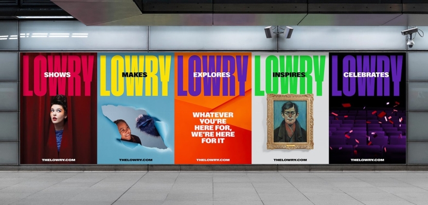

As Lowry, Salford’s beloved arts centre, approached its 25th anniversary, it sought a refreshed brand identity to capture its essence as more than just a theatre and assert its role as a cultural powerhouse across Greater Manchester.
Enter Karen Hughes, Creative Director at EDIT, and Khadija Kapacee, Managing Director, who led a dynamic rebranding effort to amplify Lowry's mission. From bold typography to a vibrant color palette inspired by the building’s architecture, the rebrand celebrates Lowry’s inclusive, creative spirit and its vital place in the region’s cultural scene. In this interview, Karen and Khadija share the journey behind transforming Lowry into a brand that truly resonates with and reflects its community.
What was the brief for the rebrand?
Ahead of its 25th anniversary, Lowry – Salford’s much-loved arts centre – needed a new brand and campaign to celebrate its diverse offer and reinforce its position as a catalyst for creativity and force for good across Greater Manchester and beyond.
Since many saw Lowry as ‘just’ a theatre, the brand needed to raise awareness of its galleries, learning and engagement programme and commercial offer. It also wanted to re-establish its place in the growing cultural scene across Greater Manchester and beyond.
How did the initial pitch/brainstorming phase go?
We were appointed following a competitive pitch process that involved submitting a proposal and an interview with Lowry’s project team. Following a few technical issues that resulted in six of us huddling around a small laptop screen, our interview was successful, and Lowry felt that ‘we really got them’ and the challenges they faced.
Describe the purpose of the brand and its target audience
The target audience was first and foremost the people of Salford. Despite Lowry being widely recognised within the sector as a force for good within the region, awareness and understanding of its wider cultural offer was still relatively low even amongst local communities. Therefore, the core purpose of the brand was to get Lowry on people’s radar and communicate exactly who they are, why they exist and what they can offer.
What was your thinking behind the rebranding solution?
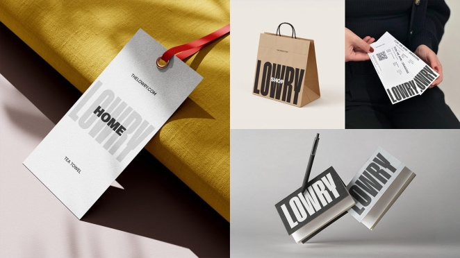
We identified a disconnect between Lowry’s corporate-style identity and the warm and creative spirit that is evident inside its bright-coloured maximalist building. Taking inspiration from the iconic architecture and interiors, our design solution involved bringing the ‘inside out’ with bold, industrial-era typography, a vibrant colour palette and tiled grid effect, echoing the building’s confident and eclectic visual style.
Did you learn anything new during the project?
For most, arts and culture can feel elitist and intimidating, but from our very first visit we learned that this was not a problem for Lowry.
From that point we knew our job was to create a brand that captured the huge, warm, Salford welcome that you get as you step into Lowry’s iconic Salford Quays home.
What was the biggest challenge? How did you overcome it?
Unifying Lowry’s wide and varied offer, and its many programmes, activities and food and retail offers under one core identity was our biggest challenge. The key was in simplifying the complexity by implementing a monolithic brand approach that put Lowry’s name front and centre, but offers flexibility to adapt and signpost to all the different areas of the organisation.
What details are you most proud of any why?
For an organisation that should be hugely proud of the positive role they play in people’s lives, we felt their current brand presentation was far too humble and we are proud to have created an unapologetically bold and impossible-to-ignore identity, deserving of an organisation that has so much to shout about.
What visual influences fuelled your solution?
See previous answer about our rebrand solution.
What do you hope it achieves for the brand?
Our hope is that Lowry’s new brand will help it to reach more people and help them to feel that Lowry is a place where they can experience and enjoy creativity.
How do you ensure consistency in brand messaging and visual identity across various channels and touchpoints?
A key output of the brand project was a set of brand guidelines, including all Lowry’s new visual and verbal brand assets. The rules set in the guidelines are there to help anyone who uses the brand, to apply it consistently and coherently, across a variety of print, digital and physical formats.
What role did consumer research or market analysis play in shaping the direction of the rebrand?
Through an extensive consultation process after the pandemic, Lowry realised that they needed to realign their brand position to be much clearer and bolder, which we took into account during the rebranding process.
Can you discuss any innovative or unconventional approaches you took in developing the rebranding solution?
Embracing the breadth and diversity of Lowry’s programming, a quirky and playful photography style and art direction was created in collaboration with Manchester-based photography team Shaw&Shaw, in a bid to further reassure visitors that everyone is welcome here.
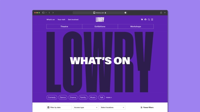
Taking cues from the building's distinctive tiled walls, we also designed a shifting and rotating modular motion style to showcase the endless ways for people to experience the joy of creativity at Lowry.
Were there any unexpected insights or discoveries about the brand that emerged during the rebranding process?
The process revealed the importance of Lowry’s mission – helping people from all backgrounds to experience culture on their own terms. This mission, which is summed up by the strapline ‘Whatever you’re here for, we’re here for it’, positions Lowry as a safe, non-judgemental space, where you can see anything from opera to The Gruffalo and visit the galleries and learning spaces.
How did you ensure that the new brand identity resonated with the brand's existing audience while also attracting new ones?
The new brand was designed specifically to reflect and adapt to Lowry’s wide and diverse audiences - old and new. Its broad range of colours and eclectic photography style allows the brand to represent and hopefully attract a wide range of people.
Credit list for the work?
EDIT Brand Studio
Reed Words
Shaw & Shaw