
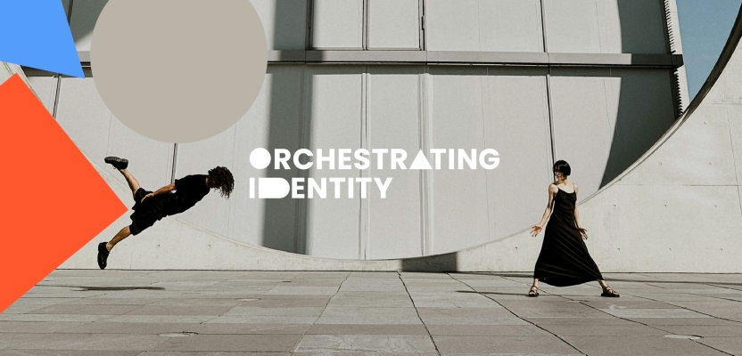

When identity verification became tangled in complexity, Orchestrating Identity offered a bold solution: simplicity. Tasked with creating a brand that could cut through the noise of a crowded, jargon-heavy market, the team approached the challenge with a clear vision—design a system so intuitive it could be understood at a glance.
Built around the idea of “square pegs in square holes, round pegs in round holes,” the final identity is approachable, confident, and powerful. In this interview, the creative team at Garden shares how they turned a struggling project into a striking brand that stands out in a world where trust and clarity are more critical than ever.
What was the brief?
Orchestrating Identity is a cutting-edge, user-centric cloud-based identification and verification solution, thoughtfully designed with simplicity at its core. In an increasingly complex world where establishing and verifying identity is more challenging than ever, building trust has become essential.
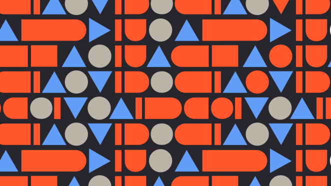
To reflect the clarity and ease of use built into the service, a straightforward, cohesive brand was needed—one that communicates the product’s inherent simplicity in an otherwise complicated landscape.
How did the initial pitch/brainstorming phase go?
The project was awarded without any need for a pitch, in fact the client came to us in real need for help as they had been working on the project for a number of months and couldn’t crack the brief, so time had run out, budgets had been exhausted, and they were at a lose end. We had worked with the client before and agreed to help out.
What was the process behind ideating the concept?
As a branding agency that is technology and social network aware, we understand that identification and verification can be complex—how they work and what benefits clarity in this world brings.
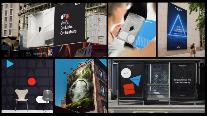
That’s why we set out to create a brand that was the opposite of the typical ‘man in a hoodie’ security tech identity. This brand needed to feel approachable, simple, and powerful.
What was the biggest challenge during production? How did you overcome it?
The project had two challenges, making something that was complex for customers to understand, as well as a split demographic and different technology solutions. The target audience is split in two, eKYc (Know Your Customer) and Age Assurance, and as such we created two sub brands, both of which borrow and reflect the core brand.
COMPOSER
e-KYC solution provides seamless and secure identity verification, enabling you to onboard users quickly and confidently. With customisable workflows, real-time document validation, and tailored, robust identity checks.
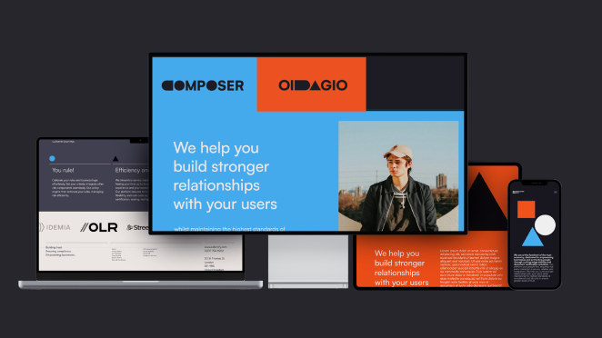
OIDAGIO
Age Assurance solution is designed to help protect vulnerable users and comply with age-related regulations effortlessly. Whether you need to verify the age of users for age-restricted content, services, or products, our platform provides accurate and reliable age validation. With advanced biometric checks, customisable PII retention periods, and a secure, user-friendly interface, we ensure that your business can confidently meet its legal obligations while protecting your users.
What kit/tools/software were used to create the project?
The project used Adobe’s Illustrator, Photoshop as well as Cinema 4D.
What’s the main message of this project and why does it matter?
The brand needed to embody simplicity, strength, confidence, honesty, and approachability. This was particularly important given the dual audience it serves: CTOs and technical decision-makers responsible for purchasing the software, as well as end users interacting with the system through online platforms and mobile apps.
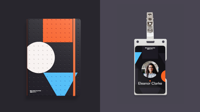
As such, the brand had to resonate with distinctly different user groups, each with unique needs and expectations, while maintaining a consistent and cohesive identity.
How long did it take from inception to delivery?
3 months
Can you describe the creative spark or inspiration behind the initial concept? Was there a specific moment or insight that ignited the idea?
The creative direction was built on disruptive simplicity—so simple even a baby could understand it. The concept was inspired by a universally understood idea: square pegs in square holes, round pegs in round holes. That clarity shaped everything.
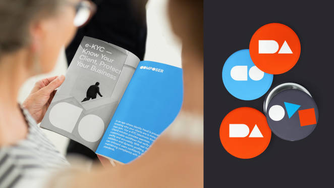
From the logo and visual identity to the communications strategy and tone of voice, our work ensured simplicity was the thread tying everything together. It’s this kind of clarity that allows brands to cut through the noise and connect instantly.
Were there any alternative concepts or ideas considered during the ideation phase? If so, what led to the selection of the final concept?
As is normal in our creative process, we presented several creative routes, but this one stood out and was a clear winner.
How did you ensure that the concept remained innovative and stood out in a crowded marketplace?
Identification and verification are inherently complex—both in how they function and in communicating their value. We also wanted to move away from the clichéd “man in a hoodie” aesthetic often seen in this space. Instead, the brand needed to feel approachable, clear, and impactful.
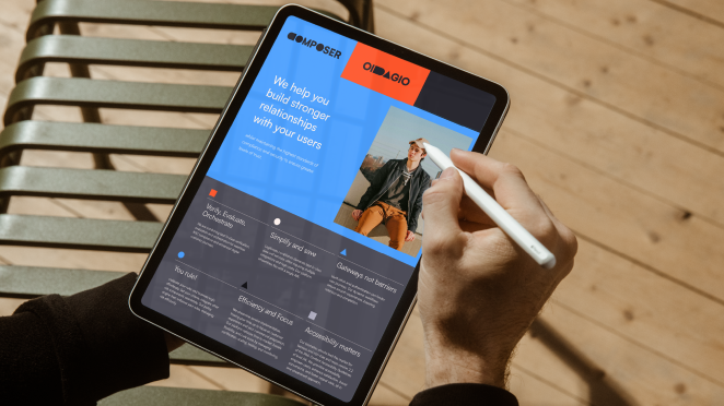
We anchored the creative direction around a core principle: disruptive simplicity. Few things are more universally understood than the idea of “square pegs in square holes, round pegs in round holes”—a concept so intuitive even a child can grasp it. This clarity became the foundation of the project and informed every aspect of the brand—from the logo and visual language to communications and tone of voice.
What do you hope it achieves for the brand?
Above all, clear stand-out amongst the crowd and a memorable and recognisable brand identity.
Credit list for the work?
Joe Hedges – Creative Director
Jack White – Designer
Kelly Ho – Motion Graphics