
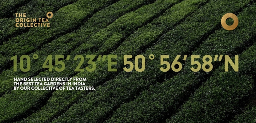

In the bustling tea markets of India, a new player is making waves by redefining authenticity and quality. The Origin Tea Collective, an ambitious startup, is on a mission to deliver high-quality tea directly from plantation to cup, emphasizing its rich origins.
At the helm of this transformative journey is Joe Hedges, CEO and Creative Director at Branding by Garden, whose vision has been instrumental in crafting a brand that resonates with both tradition and modernity.
In this exclusive interview, we delve into the creative process behind The Origin Tea Collective's branding, exploring the challenges and inspirations that shaped its unique identity.
What was the brief?
Creating a new brand from the ground up is always an exciting challenge, and working with The Origin Tea Collective was no exception. This ambitious startup tea brand, based in India, is dedicated to delivering high-quality tea straight from plantation to cup, with a strong emphasis on location and authenticity. Collaborating with such a visionary client made this an incredibly rewarding project.
How did the initial pitch/brainstorming phase go?
The Origin Tea Collective approached us direct, so there was no pitch involved. We’ve worked with several tea brands over the years, and they loved the work we’d done, so that was half the battle over.
As with all our projects, we followed a rigorous methodology starting with brand audit and sector research to understand the market gaps and opportunities, followed by a client workshop to ensure we have a solid base of knowledge to formalise a brand strategy to take us into the design concepting stage.
What was the process behind ideating the concept?
One of the key challenges was creating a simple yet powerful identity that visually connected the brand to its origins. Our solution? A circular emblem representing geolocation coordinates, symbolizing the precise location of the tea’s origin.
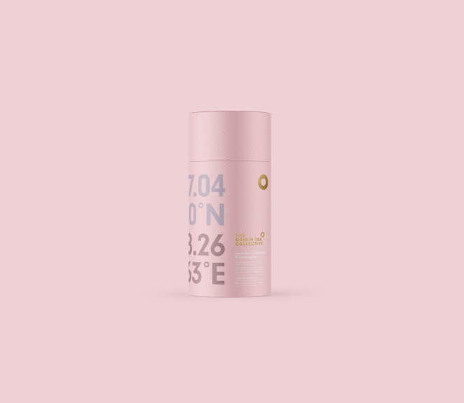
For the premium range, we incorporated the exact geolocation data on the packaging, reinforcing the tea’s authenticity and high quality.
This branding strategy led to the creation of two distinct yet cohesive tea brands:
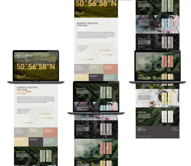
The Origin Tea Collective – A premium tea brand that highlights the geolocation of each tea, reinforcing its commitment to exceptional quality. We also added maps and circled the exact location for each tea, again emphasizing the authenticity of the product.
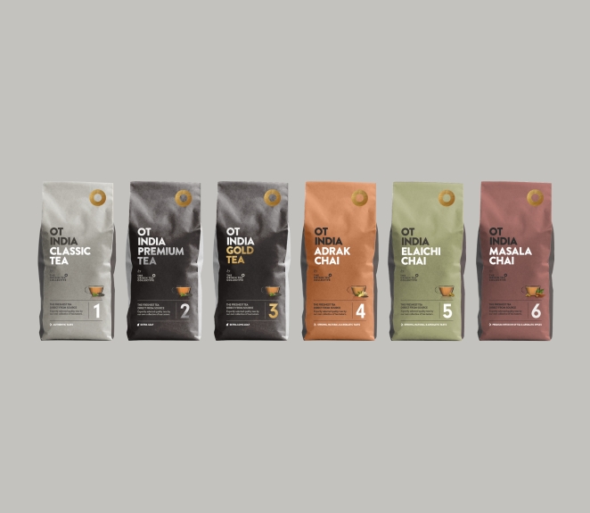
OT India – A more accessible, affordable tea range, maintaining the same core brand identity but with a simpler, stylish execution.
What’s the main message of this project and why does it matter?
By incorporating authenticity, elegance, and simplicity into the brand identity, we successfully positioned The Origin Tea Collective and OT India within their respective markets. The visual branding strategy not only differentiates the two product tiers but also enhances consumer engagement.
The main message was really that tea is a quality product, why compromise.
EXPERTLY SELECTED FINE TEAS. DIRECT FROM SOURCE.
How long did it take from inception to delivery?
The project took approximately 6 months, 3 months for brand strategy and brand creation, and a further 3 months to create all the different pack variants (SKU’s). In total there are approximately 16x SKU’s across 3 pack types (gussets and pillow variations) for OT India, and there were approximately 30+ for The Origin Collective range.
Can you describe the creative spark or inspiration behind the initial concept? Was there a specific moment or insight that ignited the idea?
We spent a lot of time trying to think of different ways of expressing the authenticity of the brand, and therefore whatever the direction we took, we wanted to make sure we leaned into this idea as much as possible, while at the same time allowing us to distinguish when the location was primary, or less so when the tea was less premium and so slightly reduce the location of the tea’s origin on the pack.
By removing all the bells and whistles and being loyal to the proposition, we created a brand and packaging range that feels authentic.
How did you ensure that the concept aligned with the brand's values, goals, and target audience?
There were several ways we targeted the audience, through organic colours, matte material finish with spot UV’s and simple typographical style, providing a simple but elegant design that cuts through what is typically over designed with illustrations and flamboyant type and colours, we kept loyal to simple values while pushing forward the product benefit. The result is that it cuts through the visual noise of typical tea brands.
How did you ensure that the concept remained innovative and stood out in a crowded marketplace?
In a world where tea is nearly always over designed for what is expected to be the mass market expectation, we simply pulled all that back and told the clear benefit of product origination, this simple clarity connects with people, people want authenticity.
What other brand touch points did you design?
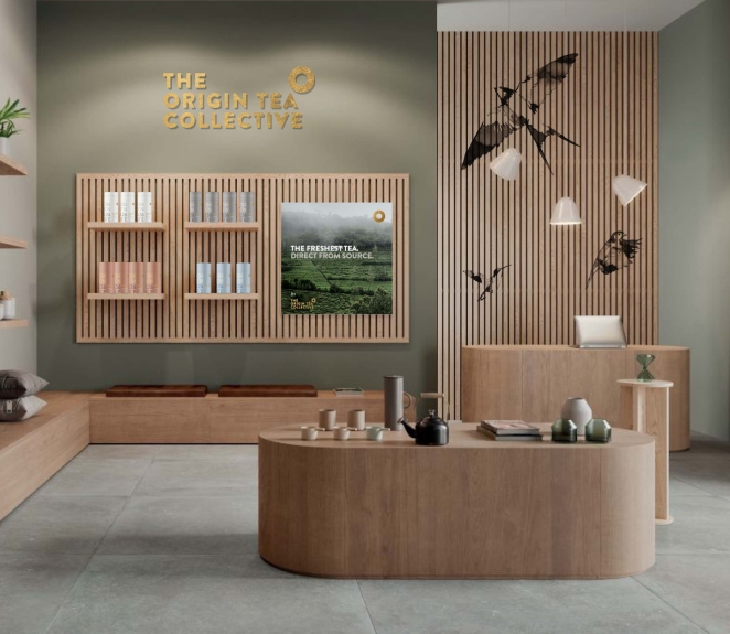
We also designed other items such as tote bags, stationery, website, gift boxes, t-shirts, advertising styles and interior approach, plus brand and pack guidelines for both ranges.
Branding by Garden March 28th, 2025, in the morning
Thank you Creativepool for the recognition of this project, we are very proud of it.