

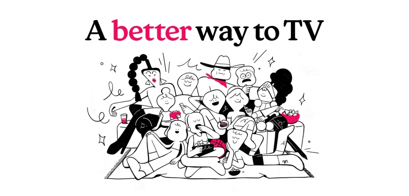

In a landscape saturated with streaming platforms vying for attention, Philo stands apart as a brand that prioritises simplicity, accessibility, and joy. To amplify its unique value and meet the challenges of a rapidly evolving industry, Philo partnered with Sibling Rivalry to undertake a transformative rebrand.
From developing a streamlined visual identity to crafting an audience-focused campaign, this collaboration was rooted in a shared passion for bringing the magic of TV back to its viewers. In this exclusive Behind the Brand interview, Sibling Rivarly’s Lauren Hartstone, ECD, Bo Bishop, Executive Director of Creative Strategy, and Maggie Tsao, Creative Director, share the creative journey behind reimagining Philo as “a better way to TV.”
What was the brief for the rebrand? (Lauren Hartstone)
Philo recognizes that today’s streaming landscape is more complicated than ever: there are countless streaming options, confusing bundles, and rising costs leaving viewers frustrated. Philo needed to have a strong brand identity that not only expressed their offering, but who they are as a company—an affordable, simple, accessible service making TV better for everyone.
The rebrand also marks a super exciting time for Philo: their ultra audience-centric focus has driven the platform into new territories, including the rapid expansion of FAST channels and premium services, now all under one roof.
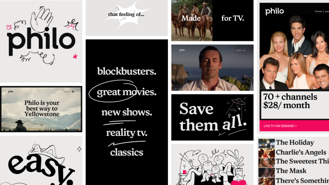
We partnered with Philo to imagine an entirely new visual identity, brand strategy, tagline, brand voice, and brand campaign, complete with a suite of illustrations. This transformation enables the brand to stand out in an increasingly crowded market, highlight its audience-first mantra, and confidently position the platform for its next phase of growth.
How did the initial pitch/brainstorming phase go? (Bo Bishop)
The pitch was really fun. This was a dream project for us because it spans pretty much everything we do at Sibling—from the initial brand positioning all the way through to production and execution of the brand campaign.
We were really excited about the brand from the start and got hooked on the central idea of Philo as ‘TV as it should be’ early on. We all love TV and want our streaming experience to be great, so we knew it had to center around this idea of bringing back the joy and magic of TV.
It was a joy to work on this project because the clients had the same energy. The pitch came together pretty quickly around that central idea and ultimately ended up being the core notion that powered the entire year-long collaboration.
Describe the purpose of the brand and its target audience (Bo Bishop)
As consumers face more choices and a more complicated media ecosystem, Philo provides the ideal solution for affordable, free and premium content without the complexity and hassles of the modern streaming universe that have become all too commonplace.
With the return of juggernaut series like Yellowstone and other fan-favorite shows this fall, our rebrand for Philo comes at the perfect time to introduce the newest iteration of the streamer to large audiences.
What was your thinking behind the rebranding solution? (Bo Bishop)
Leaning into a streamlined brand identity and customer-obsessed ethos, we looked to position the platform as an antidote to the complexity of a tumultuous market. Our goal was to clarify and amplify what makes Philo so special, setting the stage for the company’s continued growth as an entertainment brand.
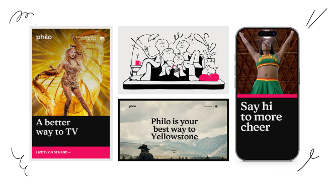
We found during the rigorous strategy process that it was challenging for consumers to understand exactly what Philo offers — a mix of live TV, on-demand content, and free channels. We realized that the complexity of offering multiple options to different people could actually be leveraged as a core strength, enabling Philo users to customize packages and combine all the best ways “to TV” in one service.
The advantage here was very clear to us. Philo is the only service offering all these convenient, intuitive ways to watch what you love, so it made sense to really lean into the simplicity and joy of TV.
And so, this single, compelling idea, representing Philo’s overarching brand purpose, informed all creative decisions throughout the rebrand project and led to the creation of a new memorable, directional tagline, ‘A better way to TV’, which positions Philo as a better means to access great entertainment.
What kit/tools/software were used to create it? (Maggie Tsao)
Figma played a significant role in our workflow and was our project hub. Everything was done there: design, presentations, web, product, etc. Since it was such a collaborative project, sharing files with Philo was seamless.
Being able to comment and view in real time with people based all over the world helped fast-track feedback so we could spend our time focusing on creative and execution.
What details are you most proud of and why? (Lauren Hartstone)
Working with Philo was particularly enjoyable because the partnership began in the early days of brand strategy and continued all the way through to visual identity, campaign development, and production. That depth of collaboration and investment was incredible as we were able to seamlessly showcase Philo’s new personality through all its touchpoints.
A highlight was definitely the campaign. The :60 hero spot is such a fun mix of whimsy and charm—portraying the Philo viewer’s journey away from the hassles of modern streaming and towards the magic of infinite entertainment possibilities and endless stories.
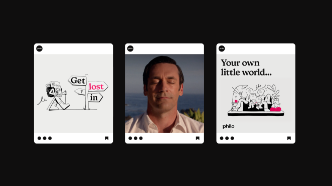
For the campaign, we leveraged cel animation to bring the expressive illustration style used throughout the visual identity to life, creating a joyful celebration of Philo’s evolution—and an exciting signal of where the brand is headed.
What visual influences fuelled your solution? (Maggie Tsao)
It was so fun to dig through black-and-white linework illustration styles. We knew early on that we wanted it to be simple but visually striking. Humor also played a large role in defining our illustrative and graphic design languages.
What do you hope it achieves for the brand? (Bo Bishop)
With most streamers these days opting for a pared-back, corporate tone, look, and feel, Philo’s brand and campaign couldn’t be more opposite. By putting its loyal audience first and matching their fandom with wit and whimsy, the new brand sets Philo up to build lasting emotional connections with audiences as it embarks on its next chapter—simplifying and improving the future of TV for everyone.
What role did consumer research or market analysis play in shaping the direction of the rebrand? (Bo Bishop)
People who know Philo, really know Philo and love it. We found that the brand just had an awareness issue with wider audiences.
Sometimes when we’re working with a brand on a strategic level, we realize that they actually need to shift what they’re doing or what they’re offering because it's just not working. But with Philo, what they were doing worked really well—the audience that they had was hyper passionate—we just needed to bring their story to more people.
Philo was the best kept secret in streaming in many ways, and we needed to let more people in on that secret. As soon as you learn about Philo, you love it. So we knew early on we didn’t need to radically change what Philo was doing, we just needed to welcome more people into the fold and give them a bigger sandbox to play in.
Can you discuss any innovative or unconventional approaches you took in developing the rebranding solution? (Lauren Hartstone)
I'm not sure it's unconventional, but I do think there can be resistance to embracing personality in a big way. We wanted to emphasize Philo’s brand voice with an attitude that’s confident, sophisticated and witty. Philo now talks directly to audiences in a tone that’s refreshingly personal and conversational, standing out from the more corporate, straight-laced approach of big-box streamers.
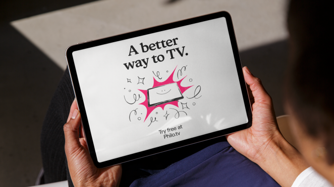
We also built on the organic, playful linework of illustrations by Camille Hogan, Brand Designer at Philo, to design an ownable, hand-drawn illustration suite for Philo. This gestural and whimsical illustration style is pretty unique for the sector and isn’t really present anywhere across streaming.
It gives an automatic friendly feel and distinctive charm, infusing humor and personality into the identity with its elegant, single-stroke black linework on a clean white background. These illustrations can be used together or individually, offering flexibility and scalability for various applications.
How did you ensure that the new brand identity resonated with the brand's existing audience while also attracting new ones? (Lauren Hartstone)
A core element of our brief was to reinvent the brand in a way that would resonate with Philo’s existing audience while clearly communicating its unique position as a simpler, more affordable alternative to traditional cable providers.
A key way we communicated this was through the brand language. This had to be clean, direct, and conversational – making Philo feel like a TV fan talking to other TV fans. Where traditional streaming can have a technical, dry feel, we wanted Philo to feel like a brand that gets you, with a little bit of humor and fun.
How do you ensure consistency in brand messaging and visual identity across various channels and touchpoints? (Bo Bishop)
We ensured consistency because everything was designed to be super simple. We didn’t want to detract from the content of Philo—great TV—because that’s what people are ultimately there for.
The brand needed to be a facilitator for Philo’s content and experience, so consistency was delivered through giving Philo the essential tools and elements they need, and making sure those elements stand out from the increasingly crowded landscape of big box streamers.
Credit list for the work?
Client: Philo
CEO: Andrew McCollum
CMO: Nii Addy
Head of Brand & Creative Strategy: Matt Stein
Director of Programming & Brand Strategy: Emily Mosbacher
Head of Design: Sandy Micone
Design Director: Rafael Cuevas
Lead Motion Designer/Editor: Monica Rodriguez
Brand Designer: Camille Hogan
Brand Vis ID: Sibling Rivalry
Co-Founder, CEO: Mikon van Gastel
Co-Founder, CCO: Joe Wright
Partner, Executive Creative Director: Lauren Hartstone
Partner, Managing Director: Joanna Fillie
Executive Director of Creative Strategy: Bo Bishop
Creative Director: Maggie Tsao
Creative Director: Frances Yeoland
Design Director: Pat King
Designer: Miro Sisma, Lucie Shahinian
Assoc. Motion Director: Luke Barker
2D Animators: Hoon Han, Cyp Sadlon
Toolkit: Dave Murray
Copywriter: Nathan Lackie
Head of Production: Lindsay McQueen
Sr. Producer: Eric Goldrich
Producer: Amber Park
Production Coordinator: Mia Figueroa
Campaign: Sibling Rivalry
Co-Founder, CEO: Mikon van Gastel
Co-Founder, CCO: Joe Wright
Partner, Executive Creative Director: Lauren Hartstone
Partner, Managing Director: Joanna Fillie
Executive Director of Creative Strategy: Bo Bishop
Creative Director: JP Rooney
Creative Director, Writer: Dave Abel
Art Director/Motion Lead: Alex Bernas
Designer/Animator Lead: Leah Evans
Storyboards: Khylin Woodrow, Fede Etchegaray
Design: Olivia Blanc, Abi Goh, Gunnar Petersen, Nico Piccirilli, Victoria Lu
Cel Animators: Olivia Blanc, Khylin Woodrow, Oliver Wee, Aly Tain, Matthias Cuciniello, Nico Piccirilli
2D Animators: Aly Tain, Josh Galindo, Scott Jonsson, Madison Kelly
Editor: Ryan Brown
Assistant Editor: Brian D’Augustine, Dee White
Copywriters: Nathan Lackie, Katrina Day
Head of Production: Lindsay McQueen
Sr. Producer: Eric Goldrich
Production Coordinator: Mia Figueroa
Original music + Sound Design/Mix: Tiny Lion