


Packaging has a funny habit of being treated as the supporting act in stories where it was often the star all along. People talk about the product, the branding, the campaign, the founder myth, the big creative leap. Then the packaging gets mentioned somewhere near the end, as if it was simply the thing wrapped around the real idea. But the history of packaging and innovation tells a different story.
Again and again, the biggest commercial shifts have come from innovation in packaging design that changed how products were protected, shipped, recognised, trusted, opened, displayed and remembered. Long before the latest packaging design trends started talking about sustainability, QR codes and unboxing, the smartest creative packaging ideas were already changing the way entire industries worked.
Really innovative packaging isn’t just new but changes behaviour
That’s what makes packaging such a fascinating discipline. It sits in the middle of everything. It’s brand and logistics, design and engineering, psychology and regulation, commerce and culture. A truly great pack doesn’t just look good on a shelf. It can reduce spoilage, make self-service retail possible, improve safety, cut waste, speed up checkout, reshape a category or make a product feel iconic before anyone’s even used it.
The really innovative packaging isn’t just new. It changes behaviour. It makes something easier, clearer, safer, sharper or more desirable, and in doing so it changes the expectations around the product itself. That’s when packaging stops being decoration and starts becoming strategy.
What Innovation in Packaging Design Really Means
Mad River
There’s a temptation to think innovation in packaging design means novelty. A strange shape. A new material. A clever opening mechanism. A box that unfolds in a way that makes people on LinkedIn write the word “delightful” five times in one post. Sometimes that stuff matters. But real packaging innovation usually runs deeper than that. It changes a system, not just a silhouette.
Take the barcode. In visual terms, it’s hardly a masterpiece. But once standardised retail packaging became machine-readable, checkout sped up, stock control got smarter and the entire logic of modern retail changed with it. The barcode is something that fundamentally transformed the way we shop, and that’s not marketing fluff either. It’s a fair description of a packaging addition that rewired commerce.
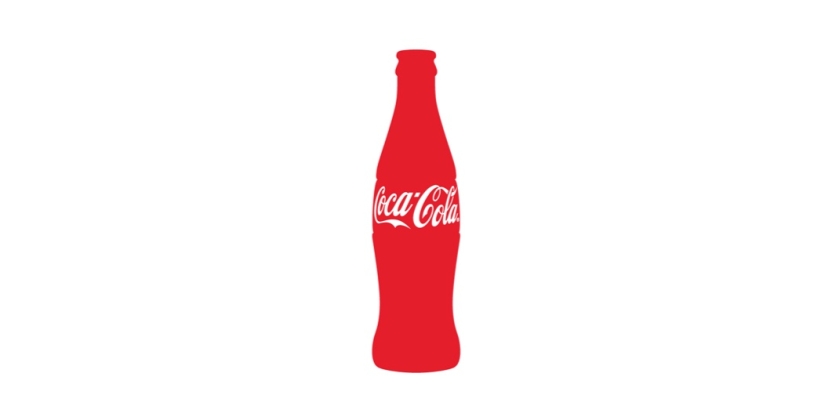
Or take the Coca-Cola contour bottle. It didn’t become iconic because somebody wanted a prettier bottle. It came from a commercial problem: imitation. Coca-Cola wanted a pack so distinctive it could be recognised by touch alone and identified even when shattered on the ground. That’s a brilliant brief. The answer turned packaging into brand protection, memory structure and cultural symbol all at once. It’s one of the cleanest examples of form doing work that many brands still try to force through messaging.
A packaging innovation becomes game-changing when it does more than decorate the product
That’s usually the test. A packaging innovation becomes game-changing when it does more than decorate the product. It alters behaviour for consumers, retailers, manufacturers or all three. It can change how something is stored, how it travels, how it’s opened, how long it lasts, how safe it is, how easy it is to identify, or how emotionally loaded it feels. In that sense, packaging innovation has never really been about embellishment. It’s been about leverage.
That’s also why the best packaging ideas tend to feel obvious in hindsight. Once the idea lands, it can look almost embarrassingly simple. Of course, the bottle should be recognisable in the dark. Of course, the pack should be easy to open. Of course, the product should survive shipping intact. Of course, the structure itself should reinforce the brand. But “of course” usually arrives after someone has done the hard thinking. That’s where the real work is.
For anyone working in the space now, that’s still the useful benchmark. Not “is it eye-catching?” but “what problem does it solve that ordinary branding can’t?” That’s where the most commercially serious work tends to begin.
Why Packaging Innovation Has Changed the Industry
Wunderman Thompson Argentina
To understand how packaging design innovations changed product marketing, it helps to remember how much of modern commerce depends on packaging doing invisible work. Self-service retail depends on packs selling without a salesperson standing beside them. Large-scale distribution depends on packs surviving transport and stacking efficiently.
Pharmacy safety depends on packaging helping users dose correctly and keep products secure. E-commerce depends on packs surviving the journey while not making the customer feel like they’re entering combat with a box cutter.
This is why packaging and innovation have always been more closely tied than people admit. The pack is one of the few brand assets that has to perform under real physical pressure.
It has to protect the thing, explain the thing, sell the thing, survive transit, satisfy regulations, fit supply chains, support sustainability goals and still somehow make the product feel worth buying. That’s a ridiculous amount to ask of any single design object, which is perhaps why the best examples stand out so much when they get it right.
Packaging innovation changed the industry in two especially important ways
The first is that it turned packaging into a more explicit part of the brand promise. When a Tiffany Blue Box arrives, the emotional experience starts before the jewellery is even seen. Tiffany traces that distinctive blue back to Charles Lewis Tiffany’s choice of colour in 1845, long before “signature colour” became branding gospel. The box became ritual, and ritual became equity. The same basic principle shows up in different ways elsewhere too.
Absolut’s bottle didn’t just hold vodka; it became the centre of the brand’s visual world. Coca-Cola’s contour bottle didn’t just contain a drink; it became shorthand for the drink itself. Packaging, at its best, doesn’t support the message. It is the message.
The second is that packaging became a lever for operational advantage. Tetra Pak’s rectangular aseptic carton mattered because it wasn’t merely elegant. It was light, strong, easy to handle, distribution-friendly and designed to fit pallet standards. More importantly, it helped transform how long-life liquid foods could be stored and transported. That’s a whole supply-chain shift hiding inside a carton.
The same is true of the folding carton and corrugated box, which helped industrialise the movement of goods and made branded packaged products more scalable. Some of the most important packaging innovations in history aren’t glamorous. They’re infrastructural.
That’s why packaging design trends are never just a design story. They’re a commercial one. A change in pack format can affect breakage, display, shipping cost, waste, safety, convenience, recall procedures and brand perception all at once. That’s not styling. That’s leverage.
The Most Influential Packaging Design Innovations
The Folding Carton
The folding carton is one of those innovations so embedded in everyday life that it barely looks like innovation anymore. That is usually a good sign. Once an idea has properly changed the game, it tends to stop looking radical and start looking normal.
The Smithsonian’s Lemelson Center traces the folding carton to Robert Gair in Brooklyn, after he realised paperboard could be cut and creased in a single machine process. That breakthrough turned cartons from a laborious packaging extra into something industrial, scalable and cheap enough to reshape retail.
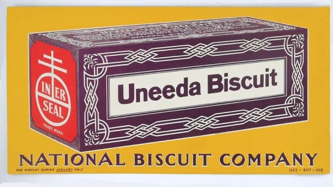
A useful example here is the Uneeda Biscuit box, introduced by the National Biscuit Company in 1899. Places Journal notes that in 1898 National Biscuit ordered two million Gair boxes, while packaging historian Diana Twede identifies the Uneeda pack as a landmark consumer package that helped shift food retail toward branded, shelf-stable goods sold in their own printed packaging.
In simple terms, the folding carton made branded packaged goods easier to manufacture, easier to ship and easier to sell. That is not a bad legacy for something now so ordinary most people barely notice it.
The Cardboard Box
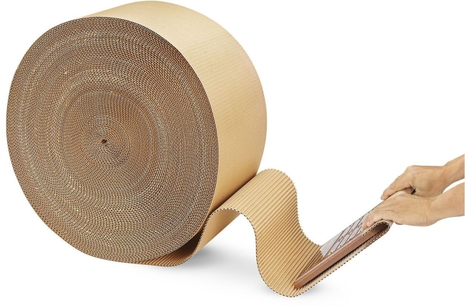
The cardboard box might be the least glamorous revolutionary object in commerce, which is probably part of why it gets overlooked. Its significance is not visual theatre. It is utility at scale.
A useful example here is the early corrugated protective wrap patented by Albert Jones in 1871, which was designed to cushion fragile goods such as bottles and glass lantern chimneys. That was then improved in 1874 when Oliver Longadded liner sheets, creating the sturdier corrugated board that became the basis of the modern cardboard shipping box. By the 1870s corrugated cardboard was already cushioning delicate glassware, and that Robert Gair later helped make cardboard boxes truly efficient at industrial scale.
Once corrugated formats became widely established, they changed how goods moved through increasingly complex supply chains. They offered lightweight protection, stackability and a practical physical infrastructure for modern retail and, much later, e-commerce. The box is one of those objects whose brilliance lies in how much commercial stress it can absorb without demanding applause.
Whole empires of convenience have effectively been built on printed board and corrugated fibre. That is not poetic, exactly, but it is true.
The Coca-Cola Contour Bottle
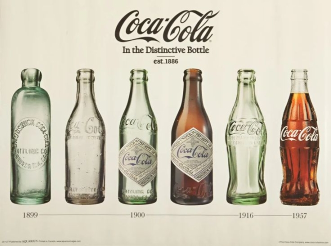
The Coca-Cola contour bottle remains one of the greatest examples of packaging structure becoming a commercial moat. Coca-Cola’s own history makes clear that the brief was to create a bottle so distinctive it could be recognised by touch alone and identified even when shattered on the ground. That is a wonderfully specific brief, and much better than the kind of vague “make it iconic” nonsense that too many brands still hand out now.
The obvious example here is the 1915 contour bottle designed for Coca-Cola by the Root Glass Company in Terre Haute, Indiana. Coca-Cola says the patent was registered under Alexander Samuelson’s name and granted on 16 November 1915. It is an ideal image candidate because it is one of the rare packs where the historical object, the patent drawing and the modern brand asset are all recognisably the same thing. Even broken or silhouetted, it still reads instantly as Coca-Cola.
The result was not just a bottle but one of the most famous shapes in branding. It turned the act of holding the product into part of the brand experience. It solved imitation, built memory and created a structure so powerful it became shorthand for the drink itself.
This is what great packaging does at its highest level. It solves a real commercial problem while also producing a cultural asset.
Tetra Pak’s Aseptic Carton
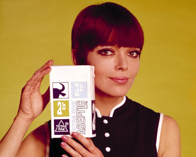
Tetra Pak changed an entirely different set of rules. According to the company’s heritage materials, the Tetra Brik Aseptic pack launched in 1969 as a light, strong, easy-to-handle and distribution-friendly format designed to work neatly with new pallet-loading standards.
That makes the best example here very straightforward: the original 1969 Tetra Brik Aseptic milk carton, developed by Tetra Pak under the company built by Ruben Rausing and his team. It is a useful image because it looks plain by design. That plainness is the point. What matters is the rectangular format, the transport logic and the way the pack represents sterile long-life distribution rather than shelf theatrics.
The innovation here was not merely the carton’s appearance. It was the system around it. Aseptic technology allowed product and packaging to be sterilised separately and sealed under sterile conditions, helping transform the distribution of long-life liquid foods. What looks like a fairly plain carton is actually a supply-chain intervention dressed as packaging.
That is one of the recurring truths in packaging history: some of the most commercially important breakthroughs are not glamorous at all. They are infrastructural.
The Pringles Can
Jackson Cleatus
The Pringles Can is a triumph of lateral engineering
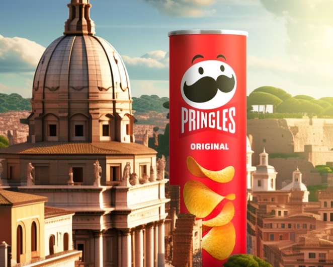
Pringles deserves a place in this conversation not because it looked quirky, though it certainly did, but because it solved a whole collection of annoyingly familiar problems in one go. Pringles says Fredric Baur started working on the concept in the mid-1950s as an alternative to potato chips that were often greasy, stale and broken. The tubular can and stackable chip shape answered that mess with a kind of cheerful engineering logic.
Simon Manchipp, Founder at SomeOne, puts it better than most: “The Pringles Can. Everyone else was selling bags of air and broken dreams; Fredric Baur gave us a tennis ball tube for salty snacks. It’s a triumph of lateral engineering. It solved the shipping problem, the freshness problem, and the ‘crushed chip’ problem in one fell swoop. It turned a snack into a stackable geometric marvel. Branding through structural rigidity—genius.”
He’s right. The Pringles can feels slightly ridiculous and completely brilliant, which is often how good packaging innovation works. It turned protection into identity. It made structure memorable. And it proved that one of the smartest creative packaging ideas and most innovative packaging ideas of the modern supermarket era wasn’t decorative at all. It was brutally practical.
The Pull-Tab and Stay-Tab Can
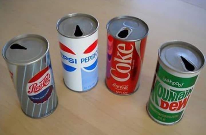
Some packaging innovations matter because they improve the big picture. Others matter because they remove one irritating moment of friction from everyday life. The pull-tab and later stay-tab can belong to that second category, and that does not make them minor.
The clearest example is the pull-tab beverage can invented by Ermal Fraze, developed after he found himself without a can opener at a picnic in 1959. Fraze later received a patent for the idea, and ring-pull cans were in commercial use by 1962. A second useful example is the stay-on tab, patented by Daniel F. Cudzik in the mid-1970s for Reynolds Metals, which kept the tab attached and reduced both litter and injuries. For images, this section almost illustrates itself: an early detachable ring-pull can beside a later stay-on-tab can gives the whole story in one glance.
Packaging lives or dies on those little moments of use. If opening the thing is awkward, inconvenient or faintly humiliating, the design has already failed one of its most basic tests. Easy-open can innovations made drinks and canned products more convenient to use and helped reinforce the idea that convenience itself is part of value.
That may sound obvious, but packaging history is full of brands underestimating just how much consumer affection can be won by reducing unnecessary hassle.
The Barcode
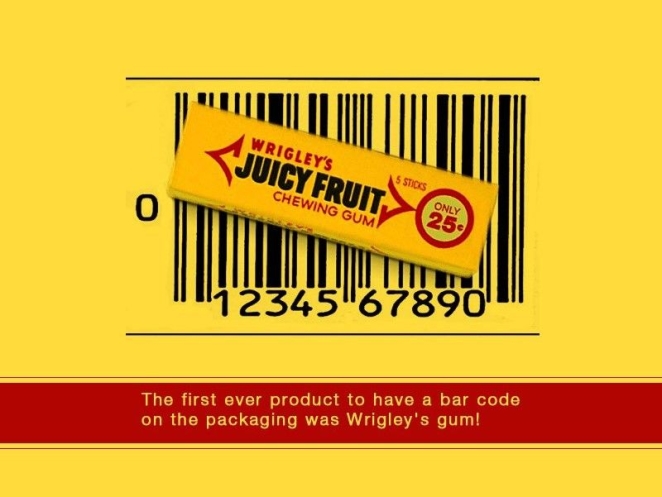
In visual terms, the barcode is not exactly thrilling. No one is pinning it to a mood board and calling it emotionally rich. But as a packaging addition, it is one of the most consequential innovations in modern commerce.
GS1 UK notes that the first barcode scan took place on 26 June 1974 at a Marsh supermarket in Ohio, while IBM credits George Laurer and his team with developing the UPC design that transformed checkout and inventory systems.
The most useful example here is the famous first scanned item: a pack of Wrigley’s Juicy Fruit chewing gum. That is a very good image lead because it lets the article move from abstract system talk to a specific, historic object. A pack of gum with a new machine-readable code on it is a far more tangible way of showing how packaging started to connect physical goods to digital retail infrastructure.
Once retail packaging became machine-readable, checkout sped up, inventory management became more intelligent and the wider retail system became far more efficient. The barcode connected the physical pack to a digital identity and, in doing so, changed how products moved through commerce.
Plenty of packaging ideas improve one brand or one category. The barcode improved the machine around all of them.
Blister Packs
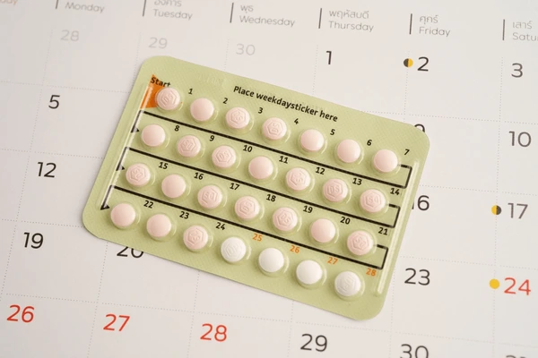
Blister packs are a useful reminder that packaging innovation does not need glamour to be important. Sometimes its value is clearest precisely because the consequences are so practical.
FDA guidance is unusually direct on the point. It says thoughtful use of blister packs or calendar packs may help reduce medication errors, that blister packs may improve patient adherence and minimise accidental exposure, and that they can keep critical information with the medication throughout intended use.
A useful example here is the calendar-style prescription blister pack, the sort of layout that groups doses by day or sequence. FDA guidance does not single out one commercial brand as the definitive example, but it explicitly discusses blister sheets arranged for a particular duration of therapy, which is enough to make the image choice easy: a multi-dose pharmaceutical blister card with printed day sequencing or intact unit cells. That is more useful than a generic close-up because it shows exactly how the format supports adherence and safety.
In this case, packaging is not mainly performing brand theatre. It is helping make medicine safer, easier to manage and harder to misuse. That is packaging design doing real-world work with very little fanfare.
Child-Resistant Closures
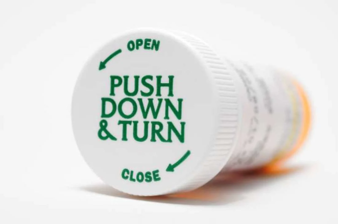
Child-resistant closures are one of the starkest examples of packaging design doing life-saving work. The U.S. Consumer Product Safety Commission states that the Poison Prevention Packaging Act was enacted in 1970 and requires certain household substances to be sold in packaging designed to be significantly difficult for children under five to open, while not being difficult for normal adults to use properly.
A good example here is the classic push-down-and-turn medicine bottle cap, which became a defining form of child-resistant packaging in the decades after the Act. The legislation itself is the key historical introduction point rather than a single glamorous branded object. For image purposes, that is actually helpful: a standard amber prescription bottle with a child-resistant closure instantly communicates the category and the function.
It is hard to think of a clearer example of packaging innovation changing the terms of everyday life. This is not about shelf impact or emotional branding. It is about whether dangerous substances are harder for children to access.
That matters because it broadens the conversation. Packaging does not only change industries by boosting sales or building memory. Sometimes it changes them by reducing harm.
Amazon Frustration-Free Packaging
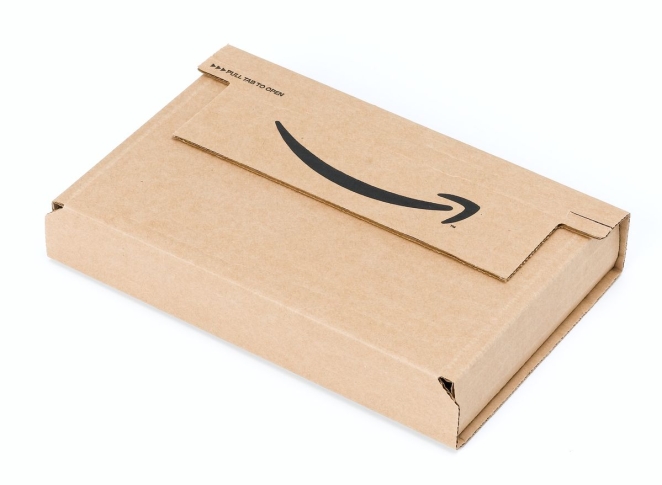
Amazon’s Frustration-Free Packaging belongs on this list for what it says about the e-commerce era. When Amazon launched the initiative in 2008, it described it as a way to make products easier to open while reducing hard plastic clamshells and plastic-coated wire ties. The whole programme was positioned against “wrap rage,” which tells the story nicely on its own.
The easiest example here is one of the programme’s early toy or electronics shipments in a plain recyclable corrugated box, replacing the usual impossible clamshell packaging. Amazon said the first phase focused on exactly those kinds of items. Visually, that gives a very clear before-and-after choice: hostile retail clamshell versus simple easy-open brown ship-ready box.
That may sound modest until it is remembered that in e-commerce the package often is the first physical experience of the brand. If it is absurdly hard to open, wasteful or needlessly aggressive, that is not just a packaging issue. It is a customer-experience issue.
Amazon understood that the box is part of the service. That was the real innovation
2D Codes and Connected Packaging
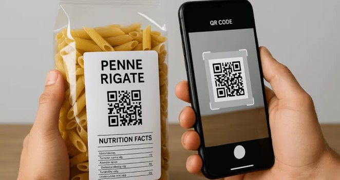
The industry is now in another shift with 2D codes and connected packaging. GS1 UK’s Sunrise 2027 guidance makes clear that the point is not for traditional barcodes to vanish overnight, but for retail systems to be able to scan 2D barcodes at point of sale by the end of 2027. GS1’s wider technical guidance frames this as the next stage in retail-ready barcode standards.
A useful example here is a QR code powered by GS1 on a food or beauty pack, linking shoppers to provenance, ingredients, recycling instructions, expiry information or authentication data. This is a particularly image-friendly section because the code itself is visible on pack, while a second image or inset can show the linked mobile experience. That makes the “pack as interface” idea much easier to understand.
That matters because it pushes packaging beyond containment and identification into richer information exchange. A pack can now become a bridge to provenance data, expiry information, authentication, recycling guidance and consumer-facing content. In other words, the package starts to behave more like an interface.
That feels contemporary, but the logic is old. Packaging has always mattered most when it changes the experience around the product, not just the appearance of it.
Tiffany & Co.
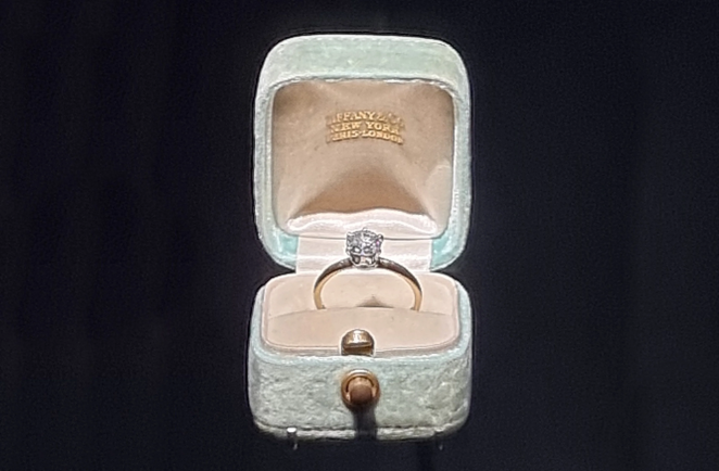
Tiffany & Co. offers a different kind of packaging masterclass. The Tiffany Blue Box did not transform global logistics or invent a whole new structural system, but it achieved something many brands would kill for: it turned packaging into part of the emotional event.
Tiffany says Charles Lewis Tiffany selected the house’s distinctive blue in 1845 for the cover of the Blue Book, and that the first Tiffany Blue Box later accompanied the Tiffany Setting engagement ring in 1886.
That makes the obvious example here the first Tiffany Blue Box used with the 1886 Tiffany Setting ring. It is an excellent image choice because the box functions as ritual object rather than mere packaging. The robin’s-egg blue colour, white ribbon and jewellery reveal are all part of the emotional grammar of the brand.
That is what happens when packaging stops being wrapper and starts becoming ceremony.
Absolut
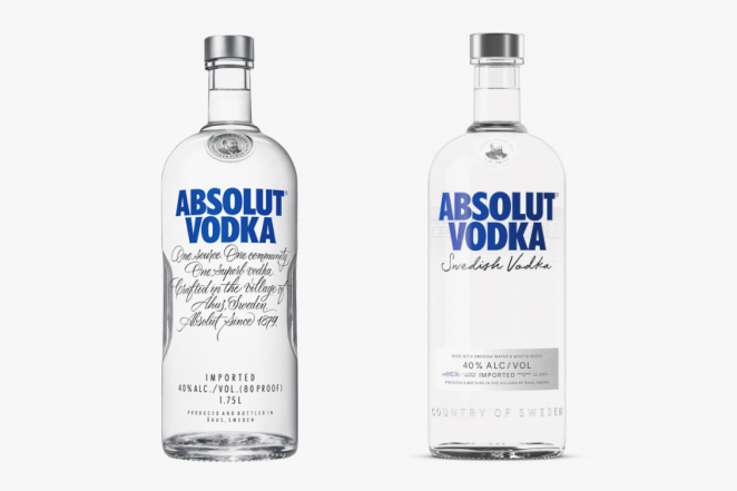
Absolut shows what happens when packaging becomes the entire visual grammar of a brand. Absolut has consistently described its bottle as being inspired by an eighteenth-century apothecary bottle, and that unusual silhouette became central not just to shelf presence but to how the vodka was advertised, remembered and culturally repurposed.
The best example here is the original Absolut bottle launched with the brand in 1979, whose medicine-bottle influence gave the brand a stripped-back, distinctive shape unlike the taller, more ornate spirits bottles around it. For imagery, that means the bottle alone is often enough. There is no need for elaborate context because the silhouette is the advertising system.
In this case, the pack did not support marketing. It gave marketing its leading character. That distinction matters because it is what separates packaging that is merely attractive from packaging that becomes strategically indispensable.
Heinz
Africa
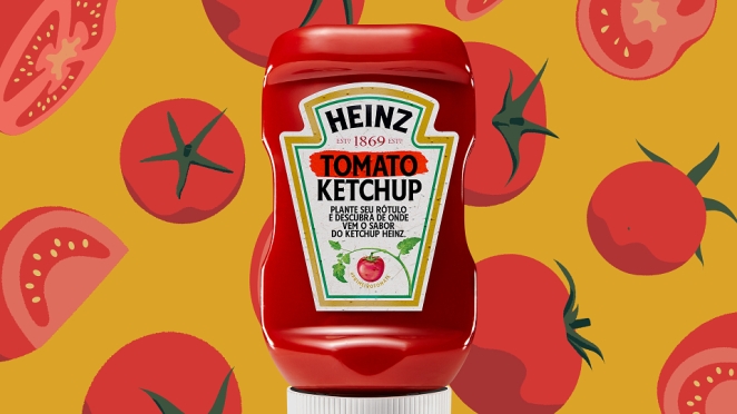
Heinz’s upside-down bottle is a smaller, funnier and in some ways more relatable story than the grand classics above, but that is part of its charm. It did not become famous because it was poetic. It became famous because ketchup is annoying when gravity gets involved and people are surprisingly willing to love the thing that removes a low-level daily nuisance.
The clearest example is the Heinz upside-down ketchup bottle launched in 2002, built around a silicone dome valvethat let the bottle stand cap-down and dispense more easily. That gives a very easy image route: old glass Heinz bottle versus the 2002 upside-down squeeze bottle. Even without explanation, the comparison instantly communicates the behavioural fix.
It is a useful reminder that consumer affection is often won not through grandeur but through the removal of nonsense.
If useful, the next step could be turning this into a version with light-touch image notes under each heading so it is ready to hand straight to layout.
Common Patterns Behind Successful Packaging Innovation
The Collaborators
Once you line up the examples, a few patterns show up pretty quickly.
First, the best packaging innovation starts with a real friction, not a mood board. Coca-Cola needed distinctiveness. Pringles needed to stop crisps arriving as oily rubble. Heinz needed to make dispensing less annoying. Amazon needed to reduce wrap rage. Child-resistant packaging needed to stop children getting into dangerous substances. Blister packs needed to help medication stay safer and easier to manage. The common factor is not visual novelty. It’s a problem worth solving.
Second, the best ideas solve more than one thing at once. Tetra Pak improved storage, transport and shelf life. The barcode improved checkout and inventory. The contour bottle improved recognition and brand defensibility. Pringles improved freshness, protection and distinctiveness. Compound value is usually what separates the genuinely game-changing from the merely interesting.
The best packaging innovations feel easier than what came before
Third, recognisability matters. Distinctive packaging does not just help a product look attractive. It helps memory do its job faster. The contour bottle, the Tiffany Blue Box and the Absolut bottle all became powerful because they were hard to confuse with anything else. In crowded categories, that’s not aesthetic icing. That’s commercial muscle.
Fourth, the best packaging innovations feel easier than what came before. Easier to identify. Easier to open. Easier to store. Easier to dose. Easier to ship. Easier to trust. The user may never describe those gains in the language of design, but they feel them all the same. And repeated feeling is what becomes habit.
Finally, great packaging tends to arrive when the surrounding system is ready for it. Folding cartons rose with industrial production. Barcodes rose with retail automation. Frustration-Free Packaging rose with e-commerce. 2D codes are rising with demands for traceability, richer product information and more connected consumer experiences. Timing doesn’t create innovation on its own, but it does help decide whether an idea stays clever or becomes consequential.
How Packaging Innovation Impacts Branding and Consumer Behavior
Creative 23
Packaging affects behaviour because it changes what people notice, trust, understand and tolerate. It can create anticipation, reassurance, frustration, delight, clarity or confusion. That’s a lot of power for an object some organisations still treat as the bit that happens after the “big idea”.
On the emotional side, packaging can make a product feel ceremonial or culturally loaded. Tiffany does that through ritual and symbolism. Absolut does it through distinctiveness and artistic adaptability. Coca-Cola does it through familiarity so deep the silhouette itself has become a brand language. In all three cases, the packaging carries meaning before the consumer has fully engaged with the product. It narrows the gap between recognition and desire.
On the practical side, packaging can quietly shape behaviour by reducing effort or risk. Blister packs can improve adherence. Child-resistant packaging can help reduce accidental poisonings. Easier-to-open e-commerce packaging can reduce frustration and waste. The upside-down Heinz bottle can make a small daily moment less messy. None of that sounds especially romantic, but it is exactly how products earn affection in the real world. Consumers don’t always fall in love with the brand promise. Quite often, they fall in love with the absence of hassle.
This is also where current packaging design trends become more interesting than the trend reports sometimes make them sound. Sustainability, traceability and connected packaging aren’t just fashionable talking points. They’re reflections of a broader shift in what people now expect packaging to do.
Packaging design has moved from containment to communication to participation
A pack is no longer judged only by protection and shelf impact. It’s also judged by whether it feels excessive, recyclable, useful, informative and in step with how consumers think brands ought to behave. 2D codes and QR formats point towards a future where the pack can carry much richer information, linking the physical object to authentication, recycling guidance, provenance and all sorts of post-purchase utility.
That’s the bigger answer to the question of how packaging innovation has evolved over time. It has moved from containment to communication to participation. Early breakthroughs industrialised transport and storage. Later ones improved recognition, convenience and safety. The newest wave is turning packaging into an interface between product, consumer and data. Different eras, same core principle: the pack matters most when it changes the experience around the product, not just the appearance of it.
For brands and creatives, that’s the useful lesson. Don’t begin with “how do we make this look more innovative?” Begin with “what tension in the product experience could packaging solve better than anything else?” That’s where innovation in packaging design gets serious. That’s where packaging and innovation stop sounding like conference-panel wallpaper and start becoming commercial advantage.
And that’s why the most enduring packaging design trends, the smartest creative packaging ideas and the genuinely innovative packaging that lasts all tend to share the same trait: they didn’t just improve the container. They changed the conditions around it.
How Creativepool Can Help You Find the Right Packaging Design Partner
Salad
The best packaging innovations rarely start with a prettier box. They start with a problem. A product is hard to recognise. A pack is awkward to open. A category feels identical on shelf. An e-commerce experience creates too much waste. A sustainability claim needs to become more than a badge. A brand has a strong product, but no distinctive packaging system to help people remember it.
That’s where Creativepool can be a useful place to begin. For businesses looking to rethink packaging, Creativepool’s company directory can help identify branding agencies, packaging design studios, structural designers, creative consultancies and production partners with experience across consumer goods, retail, food and drink, beauty, healthcare, luxury, FMCG and e-commerce.
A startup might need a packaging partner who can help it stand out on shelf without overcomplicating production. A heritage brand may need a redesign that modernises the pack while protecting hard-earned recognition. A challenger brand might need a more distinctive structure, tone of voice or visual system to compete against category leaders. An e-commerce business may need packaging that reduces waste, survives delivery and still creates a satisfying unboxing moment. In each case, the brief is different, but the principle is the same: packaging has to work commercially, physically and emotionally.
Creativepool can also help brands find individual specialists through its creative talent network. That might mean a packaging designer, illustrator, copywriter, art director, strategist, 3D visualiser, sustainability specialist or creative technologist who can help turn a packaging idea into something people notice, understand and want to use.
For businesses still shaping the brief, browsing Creativepool Awards and packaging case studies can also help clarify what strong packaging design looks like in practice. The most effective work is rarely just visually attractive. It solves a meaningful tension in the product experience. It might improve recognition, simplify use, reduce friction, support traceability, make disposal clearer or turn a routine purchase into something more memorable.
That matters because packaging is often the moment where brand promise becomes physical reality. A logo can say premium, but the box has to feel premium. A sustainability statement can sound responsible, but the pack has to behave responsibly. A product can claim convenience, but the opening, dosing, storage and disposal experience have to prove it.
For agencies and designers, Creativepool also offers a place to showcase packaging work in a way that helps clients understand the thinking behind it. Strong profiles and case studies can show the challenge, the structural decisions, the material choices, the shelf context, the production constraints and the commercial outcome. That kind of detail matters because great packaging design is rarely just a surface exercise. It’s a system.
The lesson from the most influential packaging innovations is that the pack often does far more than contain the product. It can protect, persuade, guide, reassure, delight and create memory. Creativepool helps brands find the people and companies capable of designing packaging that does exactly that: packaging that doesn’t just look new, but changes how the product is seen, used, shipped, trusted and remembered.
Graham McGrath April 28th, around noon
The shape of a Pringles crisp is called a "hyperbolic paraboloid" - it's a piece of geometric genius.