



A logo launch is the bit everyone photographs. The real brand rollout is the bit everyone feels.
That’s the uncomfortable truth lurking beneath a lot of rebrands. The strategy gets signed off, the design system arrives in a beautiful deck, the leadership team congratulates itself for being bold, and then comes the moment that separates serious brand work from expensive theatre: implementation.
Not the reveal. Not the hero film. Not the LinkedIn post. The implementation. The awkward, sprawling, operational, political, culture-shaping process of making the new brand appear coherent across the website, the sales deck, the support scripts, the product UI, the packaging, the invoices, the careers page, the investor presentation, the reception signage, the social channels, the internal language, the recruitment messaging, and every other place a business accidentally tells the truth about itself.
That’s why a proper branding rollout plan matters. It’s the bridge between design approval and market belief. It’s what turns a visual identity into a usable system. It’s also what exposes whether the organisation ever understood branding in the first place. Because if the new identity only changes what the company looks like, rather than how it speaks, behaves, prioritises and delivers, then the rollout hasn’t really happened at all. It has merely been announced.
Rollout needs a business case, defined objectives, stakeholder alignment, touchpoint mapping and a phased implementation plan, because the launch is only one moment inside a much larger change programme.
Simon Manchipp puts it more memorably than most. As the SomeOne founder says: “A logo is not a brand... it’s a flag. Launching it is the easy part. The ‘Rollout’ is actually a cultural takeover. If your employees don't believe the change, your customers won't either. Don't just slap the new mark on a tote bag and call it a day. Every touchpoint... from the invoice to the hold music... must scream the new intent. If it doesn't change the way you behave, it's just a very expensive coat of paint.”
For brands, agencies and creative leaders, that distinction matters more than ever. Companies rarely commission brand change because they’ve simply grown tired of the old logo. Something else is usually happening underneath: a repositioning, a merger, a product shift, a new audience, a move upmarket, a change in business model, a need for simplification, a need for coherence, or a dawning realisation that the company now behaves like one thing and presents itself like another.
The rollout is the moment where all that strategic intent either becomes visible and credible, or collapses into decorative surface change. A brand launch can generate attention. A brand rollout has to generate proof.
Why most brand launches feel bigger than they really are

IMA
One of the recurring problems with modern branding is that launch moments are easy to mistake for finished work. They’re theatrical by design. A new identity arrives with a neat narrative, a few polished mockups, a short statement from leadership about the future, and maybe a flurry of earned media if the business is prominent enough. The whole thing can create the illusion of completion.
But a launch event isn’t the same thing as a rollout. It’s one expression of the rollout. In many cases, it’s not even the hardest part. The harder part is the slower part: replacing fragmented assets, updating systems, training teams, sequencing change across channels, managing exceptions, resolving internal disagreements, pressure-testing guidelines, and making sure the business can actually live inside the brand it has just unveiled.
That’s why the best rebrand guidance tends to sound less like creative mythology and more like programme management. That shouldn’t depress anyone though. It should sharpen the brief. Because once a team accepts that the brand rollout is not a decorative afterthought but an operational phase in its own right, the questions improve immediately.
Not “How do we reveal this?” but “How do we make this believable?” Not “Where do we debut the new logo?” but “Where does the old brand currently create confusion?” Not “How do we get applause?” but “What has to change in the day-to-day experience for this to feel true?”
That’s a much more useful conversation.
A branding rollout plan begins with business intent, not brand assets
The District
The strongest rollouts don’t begin in Figma. They begin in the reason for change.
This is where some branding discussions still get lost in the fog of aesthetic language. The business says it wants to look more modern, more digital, more premium, more global, more human, more dynamic, more future-facing. Some of that may be valid. But none of it, on its own, is a strategic objective. It’s descriptive mood. A rollout can’t be built on mood alone.
The question that has to be answered first is brutally simple: what is this brand change supposed to do?
Is the new system meant to unify multiple offers under one masterbrand? Signal a strategic shift to investors and clients? Fix inconsistency across customer touchpoints? Support expansion into new markets? Justify a pricing move? Improve recognition in crowded digital environments? Attract different talent? Create internal clarity in a fast-growing business? If nobody can answer that in plain language, the rollout is already wobbling.
This matters because rollout priorities change depending on the underlying job. If the change is about simplification, architecture and messaging matter enormously. If it’s about premium perception, product experience, packaging, environment, imagery and service choreography become central. If it’s about joining up a house of fragmented products, then naming, navigation, UX consistency and internal understanding are likely to matter more than a launch film. If it’s about shifting culture, then leadership communication and employee behaviour may be the most important channels of all.
In other words, a rebrand launch strategy that treats every branding project the same is usually a sign that nobody has properly defined the business problem.
Internal rollout comes first, whether leadership likes it or not

The Space Creative
This is the point that brand people keep repeating because businesses keep proving it necessary.
A company can spend a fortune on a new identity and still sabotage the whole thing internally by treating staff as an afterthought. The external audience gets the polished story. Employees get a rushed email, a town hall, a downloadable zip file and the vague instruction to “live the brand”. Then everyone acts surprised when the customer-facing experience feels uncertain, inconsistent or faintly unbelieving.
Making sure staff are informed, supportive and engaged is critical to external adoption. Companies also gain customer and employee engagement, trust and revenue when employees are clear on expectations and held accountable for brand behaviours.
That’s not just a morale point. It’s a credibility point.
If customer support doesn’t understand the new tone, the rollout isn’t working. If sales is still telling the old story, the rollout isn’t working. If hiring managers and recruiters sound like a different company from the website, the rollout isn’t working. If product teams regard the rebrand as “a marketing thing”, the rollout isn’t working. If leaders keep behaving in ways that contradict the new promise, no amount of beautiful brand design will save it.
A serious branding rollout plan therefore treats internal activation as part of the launch, not as a rehearsal for it. That means explaining the strategic rationale before asking for compliance. It means giving people the narrative before drowning them in assets. It means showing different teams what the brand asks of them in their own context. It means training, examples, templates, FAQs, office hours, governance and a clear route for questions. It means involving internal stakeholders before reveal day wherever possible, because participation is often the shortest route to belief.
This is the bit that distinguishes cultural change from visual change. If staff don’t believe the company has changed, customers usually notice.
Every touchpoint must carry the same intent

The Creative Branch
Manchipp’s point about the invoice and the hold music is funny because it’s true. It also happens to be one of the clearest tests of whether a rollout has depth.
Weak rollouts concentrate on the glamorous surfaces first. Social avatars. Hero films. Event stands. Branded totes. Maybe a refreshed homepage. Strong rollouts deal with those too, but they don’t stop there. They go after the places where businesses accidentally reveal their real priorities: proposal templates, onboarding flows, help-centre language, error messages, customer service scripts, email signatures, invoices, retail receipts, packaging inserts, chatbot prompts, recruitment pages, procurement documents, signage systems, internal decks, auto-responses and all the mundane operational artefacts that shape how a brand is actually experienced.
There’s a commercial reason this matters too. Brand-consistency research has found that a majority of brands considered consistency important for lead generation and communication with existing customers, and many believed better consistency would contribute to meaningful revenue growth. The precise impact will vary by category and business model, but the broader conclusion is difficult to dispute: inconsistency confuses people, and confused people are rarely the most commercially generous audience.
That means a brand launch plan has to be rooted in a touchpoint audit. Not a superficial list of visible assets, but a proper map of the places where the old brand currently appears and the new one will need to show up. Which of those touchpoints are high-visibility? Which are high-risk? Which are legally sensitive? Which drive revenue? Which are staff-facing but commercially significant? Which can be replaced in phases? Which must change on day one to avoid contradiction?
This is where rollout becomes real work rather than presentation work. And it’s exactly why so many businesses underestimate it.
Prioritisation is the difference between a smart rollout and a fantasy

Lloyds Banking Group
No serious business updates everything at once. Nor should it.
One of the most childish ideas in branding is that a rollout is somehow only legitimate if every asset flips instantly, perfectly and universally. In reality, large-scale brand implementation is almost always phased. The challenge isn’t to avoid phasing. The challenge is to phase intelligently.
A practical branding rollout plan usually needs three broad layers of priority.
The first is immediate and visible. This includes the main website, core social channels, key external communications, essential product surfaces, major sales materials, investor-facing assets, primary leadership templates and any high-traffic customer journeys where the old brand would instantly undermine the new story.
The second is operational and cross-functional. This includes CRM templates, internal documents, training materials, recruitment assets, partnership assets, packaging details, environmental design, HR communications, support systems and lower-level product or service touchpoints that still matter but don’t all need to flip at once.
The third is long-tail and cyclical. Legacy materials, archive systems, minor collateral, lower-traffic pages, niche templates, slower physical replacements and other assets that can be updated on their natural cycle without creating major contradiction.
The point is not that every brand should use the exact same three buckets. The point is that brand rollout depends on deliberate sequencing. Customers and employees can tolerate phased change if the new system still feels intentional. They are much less forgiving of a half-updated mess that appears random or neglected.
The best rollouts test in use before they announce perfection

Saddington Baynes
A lot of brand systems look coherent in a keynote and fall apart in the wild.
That isn’t necessarily because the work is bad. Sometimes it’s because nobody properly tested it under real conditions. Tone of voice that sounds sharp in a manifesto may become annoying in product microcopy. Typography that looks elegant in campaign mockups may become hard to use in operational templates.
Colour systems may create accessibility issues. Navigation architecture may confuse existing users. Guidelines may make sense to the design team but not to everyone else. Co-branding rules may not survive partnerships. Localisation may expose verbal problems the original team never anticipated.
That’s why pressure-testing matters.
Atlassian’s recent rollout work offers a useful lesson here. When introducing its new navigation, the company didn’t simply unveil the finished change and hope for the best. It introduced the update internally first, then launched an Early Access Program with selected customer and developer sites, and later widened rollout with sandbox testing and staged availability by plan.
That’s a product example, but it applies beautifully to branding. Pilot first. Stress-test the system with people who weren’t in the project room. Let actual teams use the templates. Watch where they get confused. Test the language in support flows and onboarding sequences. Trial the design in high-volume operational contexts, not just polished campaign surfaces. Put the system under accessibility, localisation and governance pressure before telling the world how transformative it is.
A rollout earns trust when it has clearly been used before it has been celebrated.
Guidelines are useless if only specialists can understand them
Boo Agency
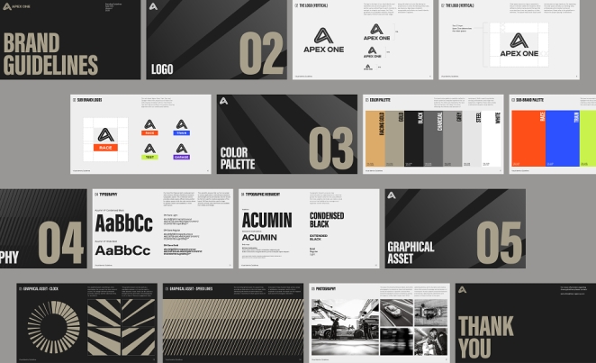
Every rebrand ends with guidelines. Not every rebrand ends with usable guidelines.
This is a surprisingly common point of failure. Businesses invest heavily in brand thinking, naming, design and motion, then package the rules in a format that only the core creative team can interpret. Everyone else gets a document full of beautiful principle and not enough practical instruction. Predictably, local teams improvise. Sales makes up its own version. Product adapts selectively. External partners get mixed answers. Six months later, leadership starts complaining about inconsistency as though inconsistency simply floated in through an open window.
Useful brand guidelines are not sacred tablets. They are operational tools.
That means they need enough specificity to make daily work easier. They should show not only what the brand looks like in theory, but how it behaves in the contexts people actually work in: presentations, social, product screens, email, co-branded materials, recruitment comms, sales collateral, events, internal comms, motion, audio, accessibility, copy hierarchy, naming, partnerships and exceptions.
The simplest test is this: if someone outside the brand team has to make something tomorrow, can they get it right without begging for help?
If the answer is no, the rollout has not been fully prepared.
What case studies really show about rollout
The Ninety-Niners
Case studies are often treated as proof that a rebrand “worked”, but the more useful question is what exactly was rolled out and why it felt convincing.
Burger King’s 2021 rebrand is still one of the cleaner examples of broad implementation. The identity change didn’t stop at a logo redraw. The new system extended across packaging, social media, uniforms and menu boards, and was rolled out across the company’s global restaurant network.
JKR framed the project around the idea that Burger King had transformed its business standards around food quality, sustainability and restaurant experience, while the previous identity still looked visually disconnected from that shift. That’s what made the rollout persuasive: the design had a larger operational and strategic narrative to attach itself to.
Then there is Jaguar, whose November 2024 reimagined brand identity arrived with maximal visibility and equally maximal debate. Jaguar’s own announcement framed it as the beginning of “a new era”, tied to a broader philosophy of “Exuberant Modernism” and a transformation of the brand rather than a cosmetic refresh. Whether audiences loved or hated every aspect of the work is almost secondary.
The deeper lesson is that dramatic identity change invites dramatic scrutiny. The bigger the visual leap, the more tightly the business, product, behaviour and culture have to support it. If those elements don’t line up, people sense the gap immediately.
That’s the thing many rollout discussions miss. People do not react only to the mark. They react to the implied truth behind it.
Rollout is operational, but it is also political

McCann London
Brand change shifts ownership. That’s one reason it so often gets messy.
Who approves assets now? Which teams gain control? Which teams lose local variation? How much flexibility do markets keep? Who decides what counts as “on-brand”? What happens when the new tone conflicts with old habits? Which leaders privately preferred the old identity? Which functions feel the rebrand is being imposed on them? Which teams are expected to change behaviour without being given the support to do it?
These are not side issues. They are rollout issues.
A mature branding rollout plan has to recognise that implementation is partly a governance problem and partly a persuasion problem. Teams need clarity on ownership, but they also need a convincing reason to change. Internal belief does not emerge from a ZIP file full of assets. It emerges from understanding, relevance, leadership behaviour and usable support.
This is where a lot of brand work either becomes durable or starts quietly unravelling. If the new identity is used to impose control without building understanding, teams resist it. If it offers only lofty narrative without practical rules, teams interpret it differently. If it asks for consistency without respecting operational realities, teams work around it.
The solution is neither chaos nor authoritarianism. It is structured flexibility: enough clarity for coherence, enough support for adoption, enough governance to manage exceptions, and enough humanity to recognise that organisations do not change all at once simply because the design files are ready.
What a complete branding rollout plan should actually include

TOAD
By this point it should be clear that a complete plan is not just a checklist called “launch”.
At minimum, it should include the strategic rationale for the change, the business outcomes it is meant to support, a touchpoint audit, a prioritised implementation sequence, ownership by function, internal communications planning, training needs, external launch timing, asset production schedules, governance rules, approval routes, testing phases, legal checks, migration milestones, measurement criteria and a realistic post-launch support model.
It should also be measured. Not in the childish sense of trying to reduce every brand outcome to one vanity metric, but in the grown-up sense of deciding what success will look like and how adoption will be tracked. That may include employee understanding, asset adoption, consistency across priority channels, migration of templates, reduction in customer confusion, changes in conversion on key journeys, sales confidence, support-ticket themes, recruitment response or broader brand perception over time.
And yes, it should include the so-called boring bits. The invoice. The email footer. The call-centre language. The hold music. The proposal deck. The careers page. The onboarding flow. The terms PDF. The partner lockups. The templates nobody talks about in the launch presentation.
Because that is where brands either become systems or remain slogans.
The rollout is where the brand proves it means anything

BBD Perfect Storm
This is the point hidden inside Manchipp’s quote, and it’s the point most worth keeping.
“A logo is not a brand... it’s a flag.” Exactly. A flag is useful because it signals allegiance, territory, intent. But a flag is not the nation. A logo can signify change. It cannot, by itself, complete it. The rollout is where the organisation has to show that the symbol stands for something lived.
That’s why the best brand rollout work never feels like pure decoration. It feels like alignment. The visual system sharpens because the strategy beneath it is clear. The messaging improves because the business knows what it’s trying to say. The customer experience tightens because teams understand what the promise now demands. The culture gets less confused because leadership has decided what the company is and what it isn’t. The touchpoints start to feel connected because someone has done the thankless work of making them connected.
A logo launch can be loud. A proper branding rollout plan is usually quieter, slower and far more revealing. It shows whether the new identity can survive operations. It shows whether the company has the discipline to replace contradiction with coherence. It shows whether employees have been invited into the change or merely instructed to copy and paste it. It shows whether the business wants a new look or a new level of clarity.
And that, really, is the difference between a rebrand that makes headlines and a rebrand that makes sense. The launch is the moment the world notices. The rollout is the moment the company decides whether it actually believes its own story.
If it doesn’t change the way the business behaves, then yes, it probably is just a very expensive coat of paint.