Amber Frisenda
VFX Artist
ABOUT
Branding Identity
Personal Project
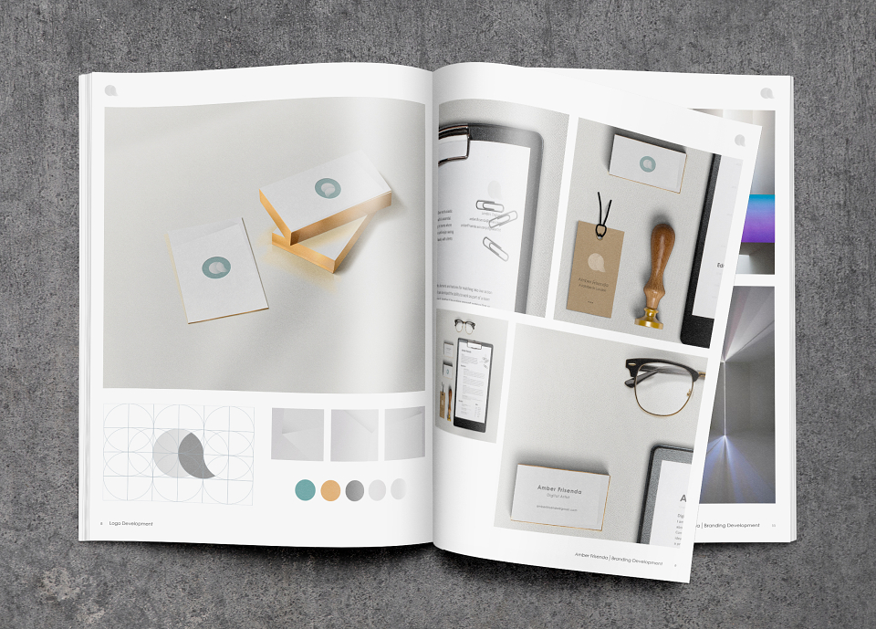
To begin my identity I chose to base by theme around the idea of light and how it reacts in geometrical ways. Finding abstract images I took on the idea of the gradient fall off and used this to represent the hard and soft edges.
The logo itself has a simple two tone gradient taken from this idea. Using a gridded technique I developed the logo with two circles to create the A.
Selecting a simple palette that I felt represented myself and that complemented each other, with the gold again reflecting the the light.