AlphaSights Ltd
London
ABOUT
AlphaSights is the global leader in knowledge on-demand within the information services industry. We connect investment and business leaders with a dynamic network of industry professionals whose unique perspectives help our clients make superior investment and business decisions.
In 2021 the company underwent a global rebrand to reflect its rapid growth, value alignment and need to stand out in an increasingly competitive marketplace. The transformation included a new corporate strategy, narrative, tone of voice, visual Identity, and is the first major overhaul of the brand since the company launched in 2008.
KEY OBJECTIVES:
- To better convey the company's personality, by adopting a more vibrant, modern and techy visual style
- Appeal more to graduate hires by showing that AlphaSights is an exciting and dynamic place to work
- Unify all brand touch-points through a cohesive, core idea and developing a modular toolkit of bespoke assets, so the visual identity could flex as the company continues to grow
- Indicate our evolution by dynamically showcasing that we’re now a knowledge-on-demand company
STRATEGY:
- To visualise that we offer an end-to-end service spectrum that consists of more than just phone calls
- Intuitively suggest we’re a people first organisation, underpinned by cutting-edge tech & data science
- Highlight that we’re already an established, trusted and professional organisation
THE BIG IDEA:
We realised early on that the new brand required a 'core idea' that everything else could ultimately be built around and eventually hit upon the ‘Alpha Wave’ - a visual representation of AlphaSights’ proprietary software, which our customer service teams use to source the best knowledge and insights for their clients. This knowledge is acquired from specialist experts around the world and curated to form the 'AlphaGraph', a database of experts that is constantly growing and evolving to meet client demands. What better way to represent this fluidity than with a wave?
To ensure our underpinning technology was also more strongly hinted at, we decided to make the wave out of digital nodes, which not only gave it a more techy look, but also worked as a perfect representation of individually curated pieces of knowledge. Together all the nodes make up the Alpha Wave.
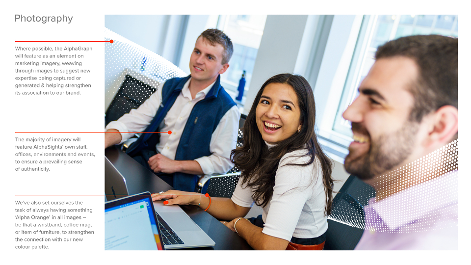
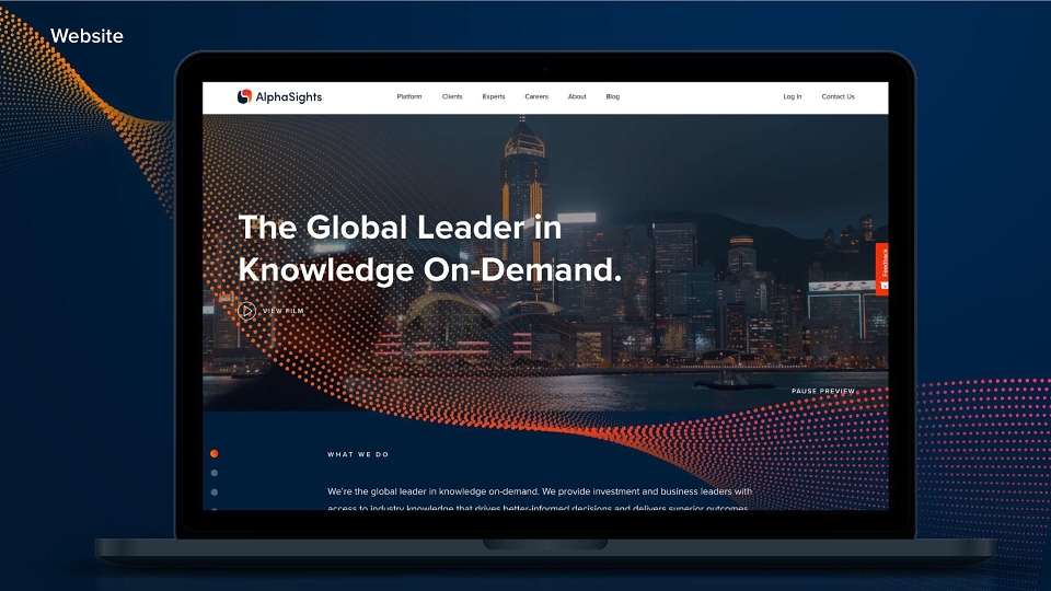
Design played a crucial part in helping to elevate the brand and feel more reflective of its personality. The use of a brighter, more contemporary colour palette has helped evolve the feel of the organisation from being overly dry and corporate, to much more modern and tech-savvy. We made our people the focus of the new collateral through an extensive new photography and video library, while new graphical elements like the Alpha Wave and icon library provide a much-needed visual interpretation of how our business model works. Cohesion across all touchpoints has also helped enhance our image as an established and trustworthy brand. All in all, over 5,000 assets were redesigned, including logos, website, photography, a bespoke icon library, internal templates, videos, animations and office interiors.
IMPACT & PERFORMANCE SINCE LAUNCHING:
- 300+ new hires made worldwide
- 30% increase in traffic to the new website
- 11k new social media followers
- 153 new YouTube subscribers, 20k new views, and 476 new likes
- Glassdoor increase from 3.5 to 4.0
MADEIT CREDITS
-

Bee HindochaCommunications Director -
Steph CookGraphic Designer -
The Charles GroupWebsite Developers -

AlphaSights Ltd -

Emma YouellMotion Graphic Designer -

Grant BarrattBrand Design Director -

Lora RiehlJr Graphic Designer -

Megan HayesDigital Marketing Manager -

Joe SimpsonAnimator -

Gabriela HenaultCMO -
Adena PoorSenior Designer & Studio Manager -
Reuben AllonbyWebsite Design Manager -
Mike TowersPhotographer
Annual 2022 ShortlistAlphaSights RebrandBranding
Annual 2022 ShortlistAlphaSights RebrandGraphic
Annual 2022 ShortlistAlphaSights RebrandIntegrated
Project featured: on 23rd June 2022
Contributor:
Invite
x3
AlphaSights Ltd has been a Contributor since 25th November 2015.