
Ragged Edge – Whirli
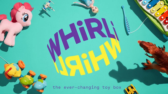
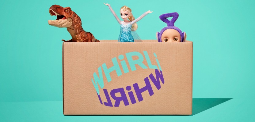
New toy subscription brand Whirli has been created to show that life’s more fun when we share. From strategy and naming, through to identity and launch, branding agency Ragged Edge worked with entrepreneur Nigel Phan to build an exciting proposition for adults and kids alike – a toy subscription service offering a whole new way to play, centred around swapping for toys instead of shopping for toys. Before Whirli even had a name, its founder approached Ragged Edge with an idea to transform playtime. The concept of a shareable toy box was an untapped opportunity: today, people share just about everything. Cars, bikes, homes, even dogs. But when it comes to toys, parents still favour something shiny and new, only for it to be cast aside and gathering dust a few months (or days) later. And that’s if it isn’t already en route to landfill.
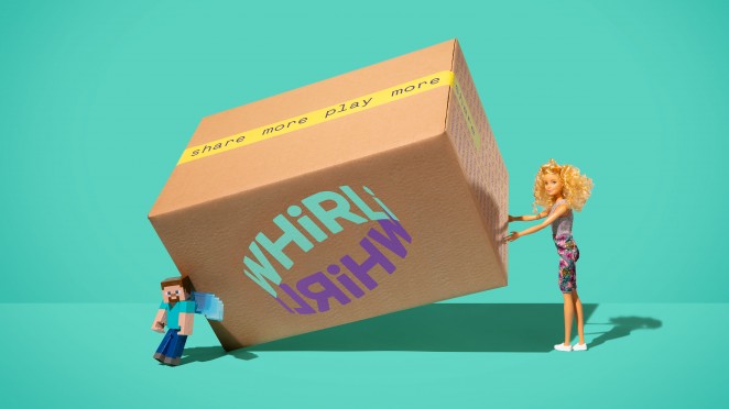
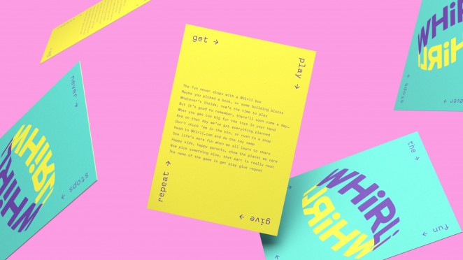
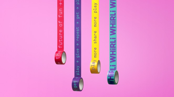
Whirli represents a better value, more sustainable approach to buying toys for parents, while offering children a toy box that can grow and change with them. Ragged Edge put sharing right at the heart of the brand. The brand idea (“Share the joy”) shaped every element of the project, from naming onwards. From bright, bursting colours and character gifs to never-ending copy, the future of fun now has a bold and contemporary identity unlike any other toy brand out there. With the identity complete, Ragged Edge helped the Whirli team launch the brand to the world. The agency worked across a range of touch-points – from packaging through to a ‘how it works’ film – and collaborated with Hex Digital to create a playful digital presence.
Red Bee – Telemundo
Red Bee, the creative and branding agency, has announced the launch of broadcaster Telemundo’s refreshed brand design. As the leading Spanish-language broadcaster in the United States, Telemundo is recognised for redefining Hispanic media and content. Red Bee was tasked with leading the rebrand and campaign launch. The agency’s work encompassed; devising the creative strategy that became the ethos of “Together Unstoppable,” driving and delivering the consumer brand campaign that launched during the 2018 FIFA World Cup, and developing the brand redesign, including a new network logo. The key objective of the brand refresh is to continually drive attribution back to the master brand. To achieve this, Red Bee shifted the network towards a tighter branded house model, aligning all sub-brands, genre brands and show logos under the hero Telemundo “T” icon and developing a consistent logo position to lock into show titles. The result is a stronger, more consistent presence across all platforms – TV, digital and out of home.
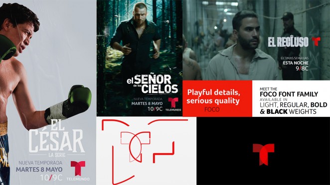
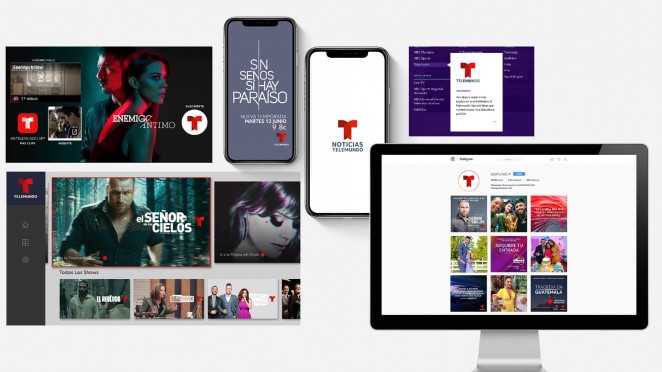
The Red Bee team took inspiration from the original Telemundo logo concept that shows “two worlds coming together” which reflects the audience’s shared American and Hispanic identities, and gave the marque a simple, clean look that creates a greater immpact in multiscreen environments than the previous iteration. The team also introduced a new logotype and brand font, Foco, for use across all elements of the brand identity, as well as a refined colour palette that makes much stronger use of the brand’s heritage red. The new brand visuals were developed to embody the brand’s strong sense of movement and dynamism, with an active identity that doesn’t sit still and which works across all platforms where the brand is seen by its audience. Red Bee also created specially-shot idents that burst with energy and movement, starring Telemundo talent, and which give the brand increased prominence on-air.
B&B Studio – Genius Gluten Free
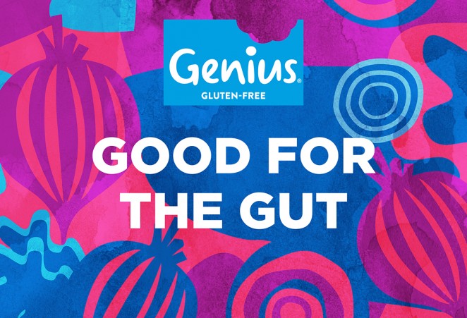
Free-From bakery category leader Genius Gluten Free has unveiled two wraps as part of a new “Good for the Gut” range of six products due to roll out this year, with design from London-based B&B studio. The first products to launch are the Genius Fibre Fest Beetroot Wraps and Genius Fibre Fest Kale Wraps. In line with the Genius core range, “Good for the Gut” products are entirely gluten and dairy free but with the addition of a natural prebiotic to appeal to the gut-conscious consumer. Each product in the range also has a stand out nutritional benefit: wraps that are 3 x fibre of regular wraps; pasta that’s 2 x protein and 3 x fibre of regular pasta; bread crisps with 2 x protein and ½ the carbs of regular crisp breads. Moving away from the scientific-led design codes often adopted by brands in the Free-From and benefit-led category, B&B studio has introduced a bold, eye-catching colour palette for the new Good for the Gut range, delivering a dynamic identity incorporating bespoke graphics and illustrations.
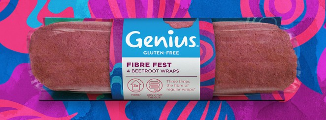
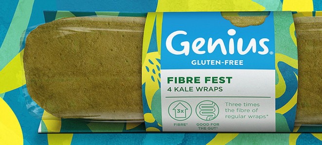
Focusing on depth of taste and flavour, B&B studio has created a range of original patterns in-house that take inspiration from the product ingredients, including layers of beetroot and swirls of kale leaves. These designs are presented on brightly-coloured backgrounds, providing differentiation for the new range and standout on-shelf. Building on the new brand identity for Genius Gluten Free delivered by B&B studio in October 2017, this vibrant brand extension incorporates the strong blue hue and instantly recognisable Genius logo, complete with a thought bubble or bitemark to express the imagination, creativity and tastiness of the Genius brand. By incorporating these familiar brand elements into the identity for the Good for the Gut range, B&B studio was able to retain the consistency of the brand whilst enabling more creative freedom across the wider design. Innovative structural packaging solutions ensure that the new products are not only aesthetically pleasing, but also convenient for the consumer.
Nomad – The Women's FA
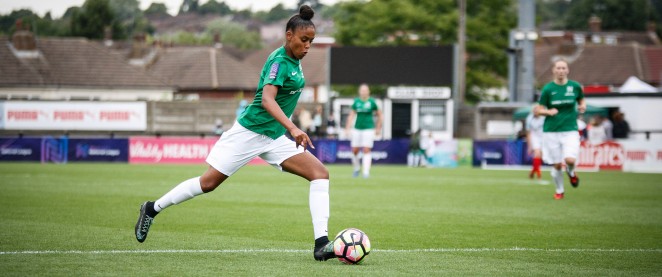

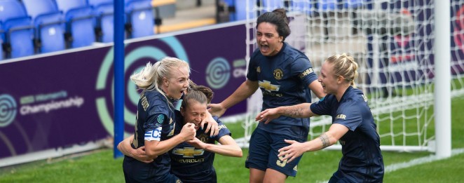
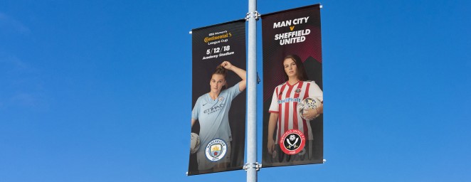
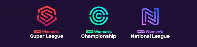
As the new women’s football season starts, a new visual identity for the sport designed by Nomad studio is being rolled out. The studio has rebranded the top three tiers of Football Association (FA) women’s football, including the FA Women’s Super League which kicked off last Saturday, as well as the league cup competition. The rebrand was part of an FA initiative to get more people watching and participating in women’s football, as well as unifying the women’s game, according to Nomad. This includes aiming to “double attendance figures” to Women’s Super League games by 2020. The studio has created three new logos for the FA Women’s Super League, FA Women’s Championship and the FA Women’s National League, as well as the FA Women’s Continental Tyres Cup. Nomad held several research sessions among the core target audience of girls aged seven to 15, to see which designs would appeal to them and the tastes they found were far more mature than they expected.
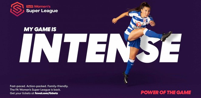
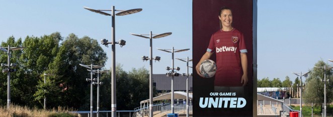
The vision was to create a halo brand and then give each one an individual character, so the three logos were designed in tandem. Each logo is a single letter made of multiple lines, using a changing gradient of colour tones. The Super League logo is an “S” made up of red lines, reminiscent of a “superhero” symbol, as the studio was keen for the top league of the football pyramid to have “superman” or “superwoman” connotations. A hexagonal shape with a single point at the top was chosen to represent that this is the “pinnacle of the league.” The Championship logo is made of blue-green concentric circles around the letter “C.” The shape imitates a “springboard,” as the league is often seen as the “gateway into professional football.” The Nation’s league logo is a blue-purple “N” with two interlocking sides representing the “community spirit goes through the league.” The colour palette aims to form a “family” of colours, but also be different enough from each other to help with wayfinding and communications. They generally appear against purple backgrounds which feature textured patterns. Nomad also designed new branding for the FA Women’s Continental Tyres League Cup centred around the lead sponsor Continental’s logo and colours, but with “typographic constructs” following the other three designs.
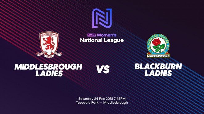
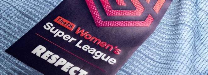
The rebrand comes at a time when “more and more eyes are on the game,” as it coincides with the start of the new women’s football season with BT Sport showing more games, the BBC airing a round-up show, and some matches being streamed on Facebook. The logo will appear on sleeve badges on team kits across the three tiers, across marketing and communications, on social media and online, and across merchandise. The different leagues’ branding also appears in animated form, as part of a broadcast package that TV channels “can take and make their own.” Photographs were also taken of players from Super League and Championship teams as part of the campaign, by photographer Stephanie Sian-Smith, who plays football herself.