Martins Brand House
Adelaide
ABOUT
THE CHALLENGE
Located in Woolgoolga on the Mid North Coast of New South Wales, Australia, Swell Village is a new residential neighbourhood positioned close to some of the country’s most iconic surf beaches.
The challenge was that the project was not directly on the beachfront.
While residents could easily walk or cycle to the coast, the campaign needed to authentically communicate a coastal lifestyle without relying on predictable beach imagery or creating a false promise.
In a highly saturated coastal property market filled with clichés, we needed an outdoor campaign that could immediately differentiate the project and emotionally connect with audiences in only a few seconds of viewing time.
THE INSIGHT
Coastal living is not only defined by living on the beach.
It is defined by the connection between nature and surf culture.
Swell Village uniquely combined both: a peaceful leafy sanctuary with immediate access to the coastline and surf lifestyle of Woolgoolga.
THE CREATIVE IDEA
We created the headline “Sanctuary to Surf.” as the brand positioning idea.
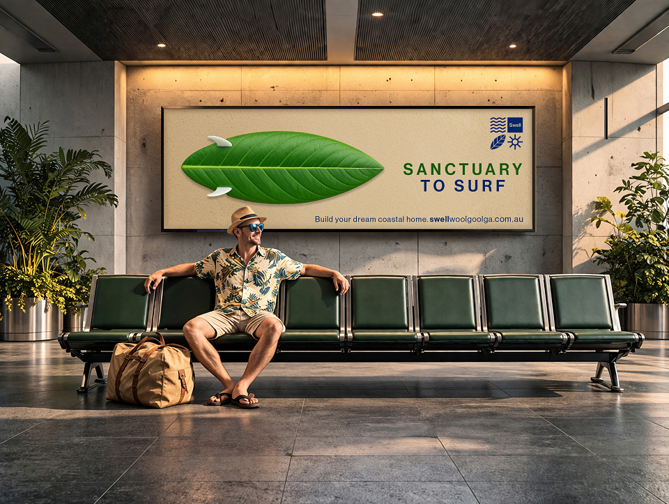
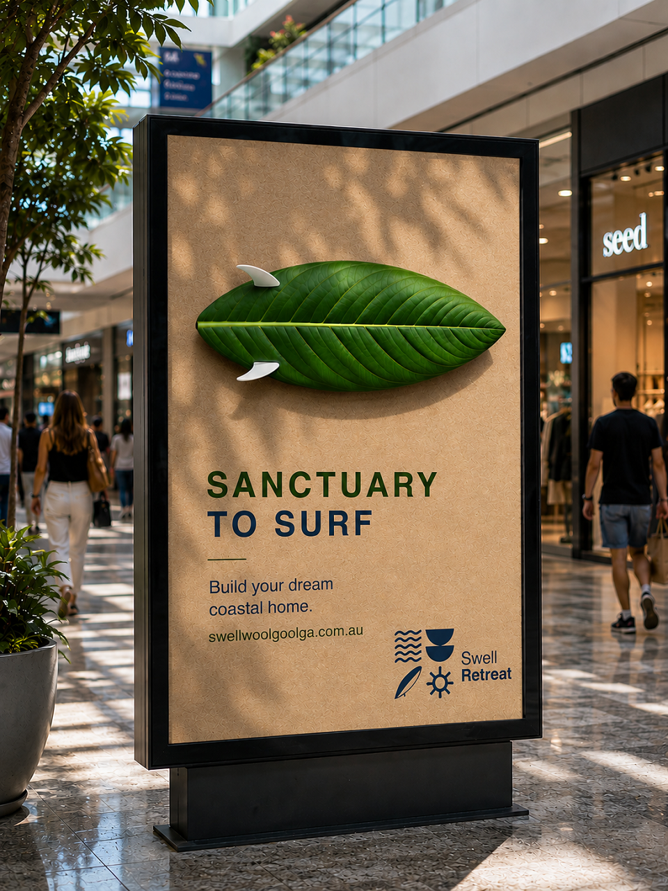
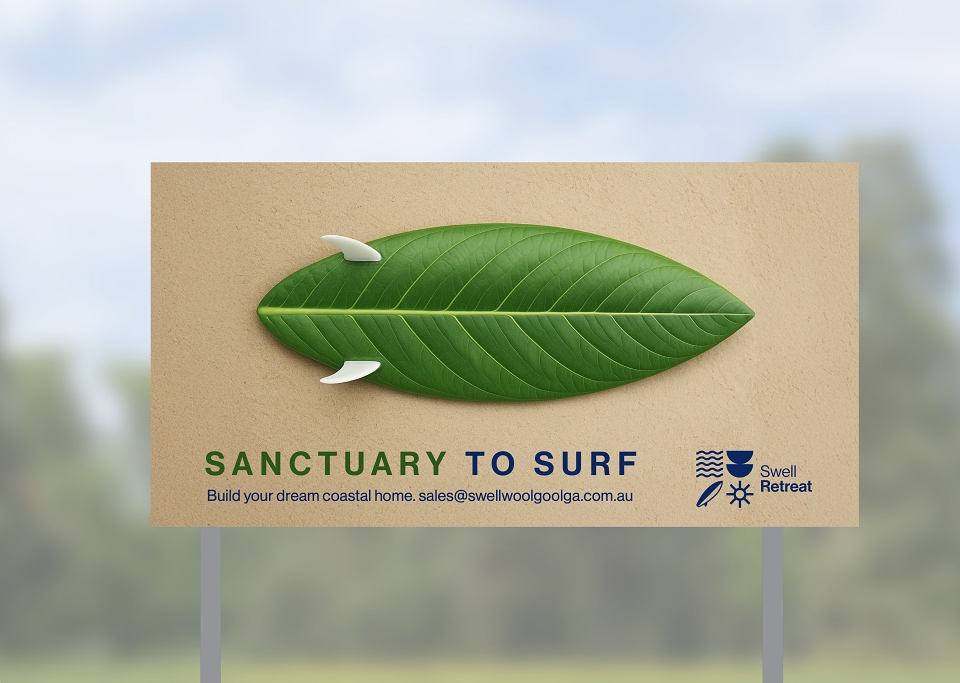
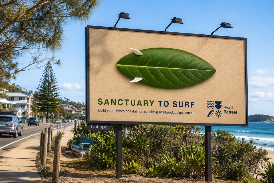
This simple but highly visual outdoor campaign platform that distilled the project’s entire positioning into a single striking image.
Rather than using literal beach photography or conventional real estate advertising, we created a visual metaphor that merged a surfboard and a native green leaf into one recognisable object.
The execution instantly communicated the project’s dual identity: green meets blue.
The minimal copy line “Sanctuary to Surf” reinforced the idea with only three words, allowing the campaign to work effectively at billboard scale.
The result was a distinctive outdoor campaign that stopped audiences through curiosity, simplicity and immediate visual storytelling.
THE OUTCOME
The campaign created a highly memorable and ownable visual identity within a crowded coastal property market.
By avoiding expected real estate tropes and reducing the message to a single compelling visual idea, the work achieved strong stand-out and instant comprehension in outdoor environments.
The campaign transformed a potential weakness of not being directly beachfront into the project’s defining strength: offering a natural sanctuary seamlessly connected to the surf lifestyle of the New South Wales coast.
Swell Village has subsequently launched with great momentum flowing through to sales, with the billboard campaign being the primary driver.
The Swell Village name and logo design was also created by Martins Brand House.
MADEIT CREDITS
-

Jim HilleryClient
-

Martins Brand House -

Kent O'HalloranSenior Art Director/Creative
Annual 2026 ShortlistSWELL VILLAGE — “SANCTUARY TO SURF”OOH