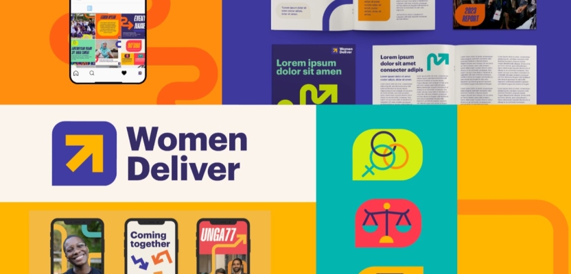
In March this year, “positive impact” agency Shape rebranded Women Deliver, a global advocacy organization. To learn more, we spoke to Geli Luna, Associate Design Director, and Ayesha Gardiner, Associate Strategy Director at Shape.
What was the brief for the rebrand?
Under new leadership, Women Deliver underwent a comprehensive overhaul to operate equitably and productively, aligning with the expectations of modern iNGOs. Shape History was tasked with rebranding a visual identity to meet new organisational goals and strategies, matching Women Deliver's internal work to become an anti-racist, feminist, and global NGO.
How did the initial pitch/brainstorming phase go?
We knew Women Deliver going into the pitch process, having built strong partnerships with many of their peers in the gender equality sector across our brand and communications services such as SheDecides, Grassroots International and Fondation Botnar. Women Deliver is renowned for its global conferences and sought to broaden their recognition with the new brand.
The aim was to clarify the organisation's work beyond conferences and understand its strategic ambitions for the next 10 years. During the pitch process, we compared these goals with how they were communicating, conducting an audit of their visuals, and examining their social media presence, website, and internal branding collateral.
We found that their branding wasn’t being used consistently and there was a lack of cohesiveness in the materials being produced. Clearly, the corporate look limited their internal teams and feel and lack of visual elements. We recommended a shift towards a more human, warmer, and emotive approach.
The previous branding leaned towards stiffness and corporate tones, which didn't reflect the diverse youth engagement initiatives and work. Hence, the new brand needed to feel more approachable and resonate with broader demographics while maintaining credibility. The new brand was launched at the end of March 2024.
Describe the purpose of the brand and its target audience
Led by and representing feminist movements and youth advocates in the majority of the world, Women Deliver plays a pivotal role in global collective action for gender equality. They recognise that the fundamental obstacle to gender equality is the persistent lack of bodily autonomy and integrity for girls and women.
Their mission is to ensure that every self-identifying girl and woman has full control over their body and life, focusing on safeguarding and advancing bodily autonomy and their sexual and reproductive health and rights (SRHR).
Women Deliver recognises that their sector is deeply embedded in colonial and racist power structures and practices and they, themselves, have benefitted from and perpetuated. Their work commits to practise their feminist and anti-racist values while actively contributing to dismantle the systems that oppress girls and women.
Their target audience involves a global network of young and traditionally ignored voices and leaders, feminist movements, grantmakers and philanthropies, government bodies and policymakers.
What was your thinking behind the rebranding solution?
Our approach was to evolve the brand to meet where Women Deliver is now without covering up their past. This rebrand needed not to be interpreted as a way to mask past controversies surrounding previous leadership but instead, acknowledge the journey it took for the organisation to continue moving forward and commit to change.
The core organising idea of the brand: Recent setbacks that girls and women globally have faced in terms of their health and rights demonstrate how fragile progress is and how easily it can be reversed.
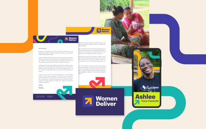
We developed an identity that tells the story of evolution and roadblocks involved in the work to achieve gender equality.
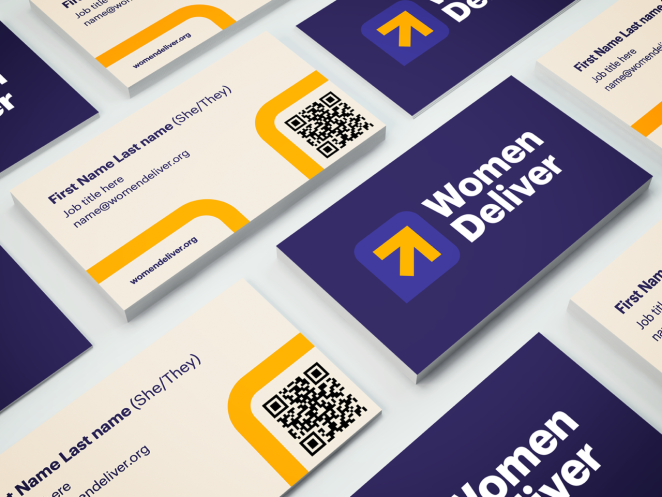
- We retained the most recognisable element of Women Deliver’s visual identity - the yellow arrow in their logo - and literally extended it in winding paths that go up, down, left, and right, but always ending to point forward and up, representing that progress isn’t always a straight path.
- The refreshed brand needed to echo the organisation’s commitment to inclusivity. We scrapped the entire brand’s colour palette and replaced it with colours that accommodated accessible colour pairings compliant with Web Content Accessibility Guidelines (WCAG). The new colour scheme dropped the cold shades of green and replaced them with vibrant purples, yellows, and oranges for a warmer, welcoming feel. The expanded colour palette represents Women Deliver’s commitment to centering diverse voices.
- Fluidity and flexibility are demonstrated in the winding lines seen in most visuals, showcasing lines that go left, right, up, and down but always with an arrowhead pointing forward and upward.
- To reflect Women Deliver’s core work with young people, adolescent girls and traditionally ignored voices, we intentionally refreshed the quite a corporate brand to one that speaks to their work with global youth voices.
Did you learn anything new during the project?
One thing we admired about Women Deliver’s mindset throughout this rebrand was their refusal to hide from past mistakes. Instead, they chose to acknowledge them, own up to them, and utilise their learnings to progress.
While it's tempting to use a rebrand as a cover-up for errors and reshape brand reputation, Women Deliver understood the necessity of deliberate and sincere reflection, facilitating this evolution.
During the verbal identity process, we aimed to pinpoint what made Women Deliver distinctive. However, it became evident that their emphasis was not on differentiation or operating in isolation, but on closely collaborating with various charities and organisations.
What was the biggest challenge? How did you overcome it?
The biggest challenge revolved around updating the brand's visuals to align with their newfound emphasis on inclusivity and diversity without compromising brand recognition. We conducted both internal and external stakeholder interviews, revealing that the most recognisable element of the brand was the yellow arrow in the logo. This discovery allowed us to refresh the logo while maintaining brand familiarity.
Initially, Women Deliver hesitated to part with certain elements of their old brand, such as the greens in their colour palette, for fear of alienating stakeholders. However, after presenting our initial creative directions that prioritised inclusivity and accessibility, their enthusiasm for new colours and visuals became evident.
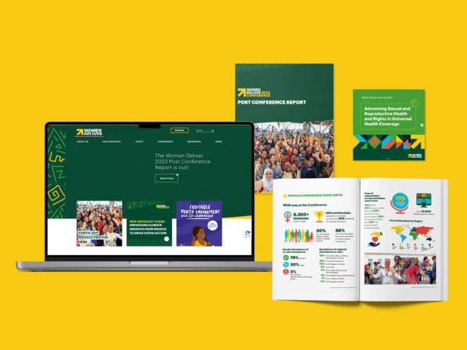
Our approach was grounded in aligning creative decisions with their new strategy, highlighting issues such as the lack of accessibility in their old colour scheme. By prioritising inclusivity, we emphasised the need for colours that were both flexible and accessible from a technical standpoint. The need to introduce colours that allow flexibility but also accessibility from a technical perspective.
What details are you most proud of and why?
Visually, the concept is simple and easy, and we think that’s the beauty of it. It might just look like colourful, curvy lines with arrowheads. Still, we rae proud that we’ve used an uncomplicated visual execution to sum up Women Deliver’s goals and journey so far. It tells the story of where they are now and how they got here - winding paths and all - to get to where they’re going, which is ultimately working towards progress.
What visual influences fuelled your solution?
Visuals that appealed to young people but didn’t alienate the other side of their network (philanthropies, global decision-makers, feminist organisations). The aesthetic needed to balance the UN and young, global, activist audiences. So, it had to have the right vibrancy while still fitting into more corporate spaces. We avoided aesthetics that were too trend-based and went for more timeless visuals but with bold colours to enliven the brand.
What do you hope it achieves for the brand?
We hope the new brand will better communicate Women Deliever's activities beyond the global conference and resonate with younger networks, while reaching new audiences. Initial feedback suggests that the new brand is easier for Women Deliver's internal staff to use and be creative with, contrasting with the limitations imposed by the previous brand's stiffness. We hope this continues.
What would you do differently if you could do it over again?
Honestly, nothing. The whole process was smooth, and it was a very enjoyable project. Women Deliver were receptive to all our ideas and embraced the changes we presented. We are proud to see our work out in the real world and making strides.
Credit list for the work?
- Geli Luna - Associate Design Director
- Antoinette Orr - Planning Lead
- Ayesha Gardiner - Associate Strategy Director
- Naomi Gennery - Midweight Designer

