Zero Three Two Creative
London
ABOUT
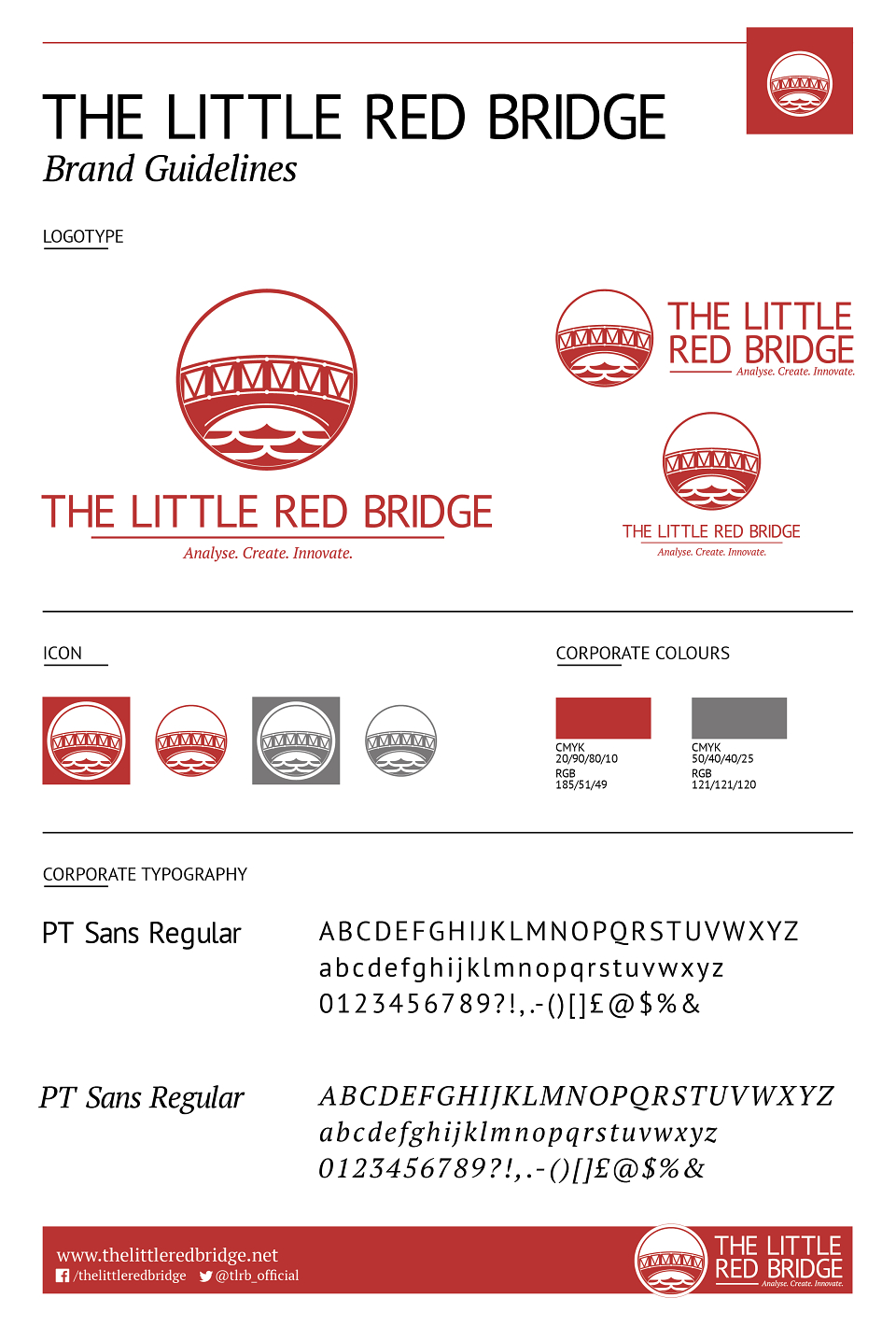
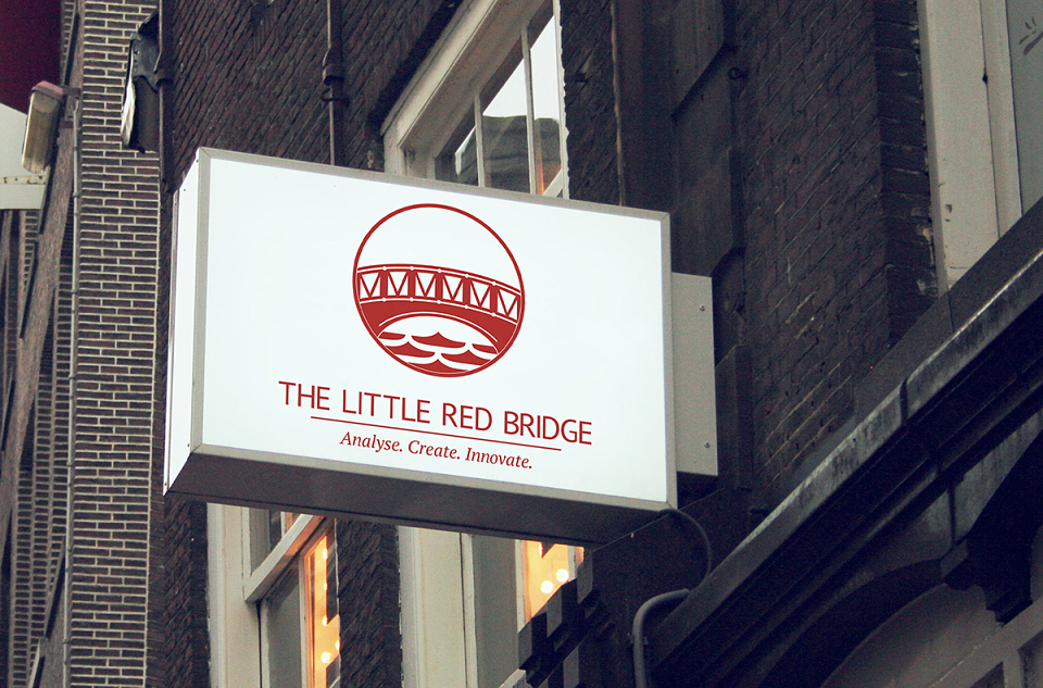
The Little Red Bridge is an independent bespoke software development consultancy specialising in business solutions delivered through the web. In 2018 I was tasked with coming up with a fresh new-look for the company. The initial brief was to give the company a new modern feel while keeping the core company slogan and ensuring that the new icon contained a bridge motif.
After some initial sketches of ideas I was able to focus on the key icon which would be doing the heavy work in terms of brand identity. The concept I came up with was to use text that a company like The Little Red Bridge would use in coding and create a logo from those while keeping it as simple as possible. For example the bridge itself is made from customised '(' brackets with '/' and '\' icons while the water effect were also custom '{' brackets. The main logo is red and white, but alternative options were created for varying uses online and in print.
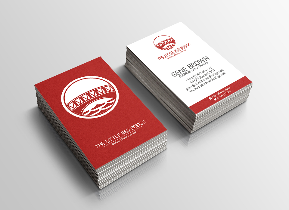
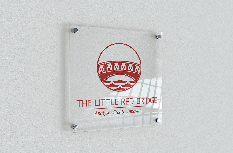
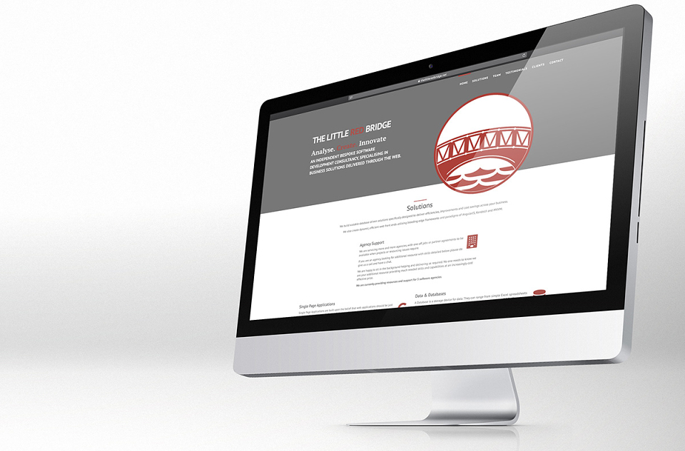
In addition I was also asked to create business cards for the company which can be found below as well as example brand guidelines and it's potential uses in a real world environment.
MADEIT CREDITS
-

The Little Red BridgeClient
-

Zero Three Two CreativeCreative Director -

Lewis-Jon SomerscalesCreative Director