Tony Musso
Founder & Packaging Designer
ABOUT
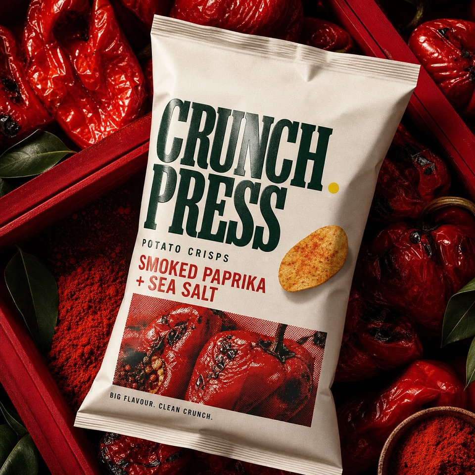
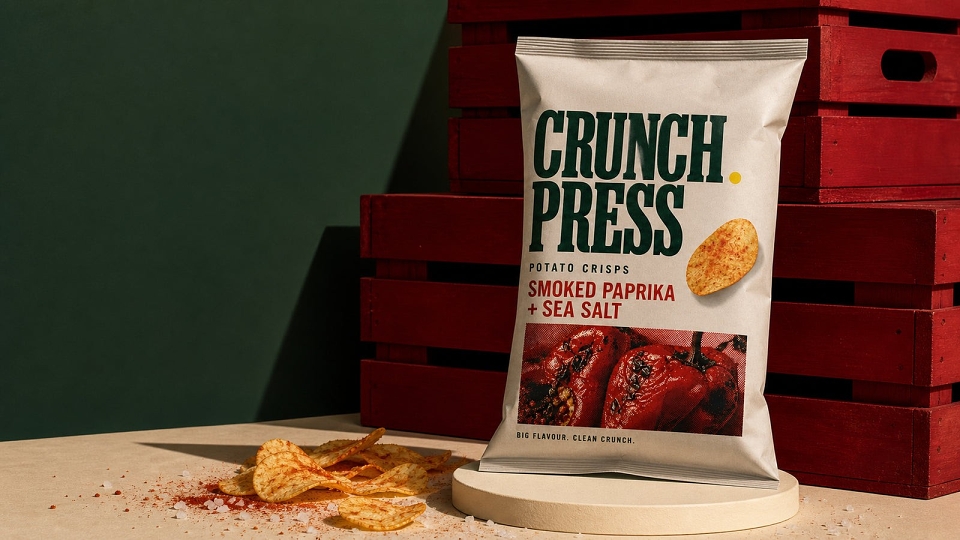
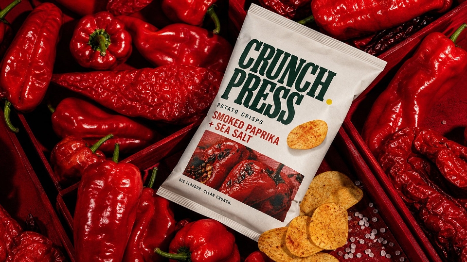
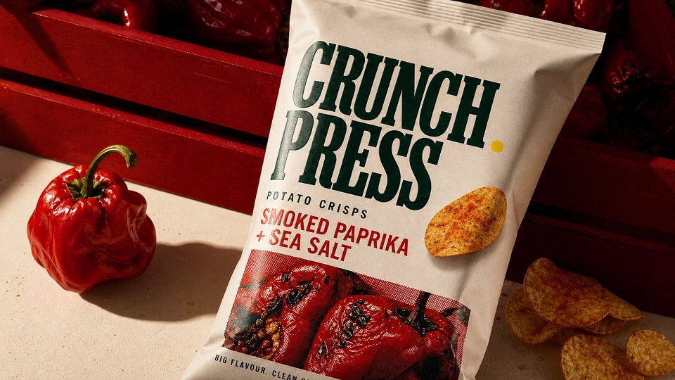
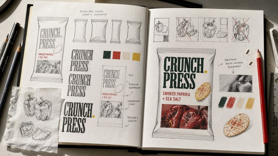
CRUNCH PRESS is a self-initiated packaging concept for a crisp brand. I designed the brand identity, crisp bag artwork and editorial product visuals.
CONCEPT
Give brand, product type and flavour their own clear levels within one bag, and build a system that can carry across future flavours.
EXECUTION
A bold green serif wordmark contrasts with a warm cream bag, while a vivid red-orange flavour panel gives Smoked Paprika and Sea Salt an immediate visual marker. Peppers, sea salt and crisps form a tightly cropped still life with strong colour and tactile detail, and clean typography with generous spacing keeps the buying information clear.
RESULTS
The cream brand block can stay fixed across future flavours while the photographic crop, accent colour and ingredient styling change. Packshots, material close-ups and overhead food compositions show the system working from shelf and e-commerce to editorial campaign imagery.
MADEIT CREDITS
-

Tony MussoPackaging & Brand Designer