Yasmine Wong
Creative Director
ABOUT
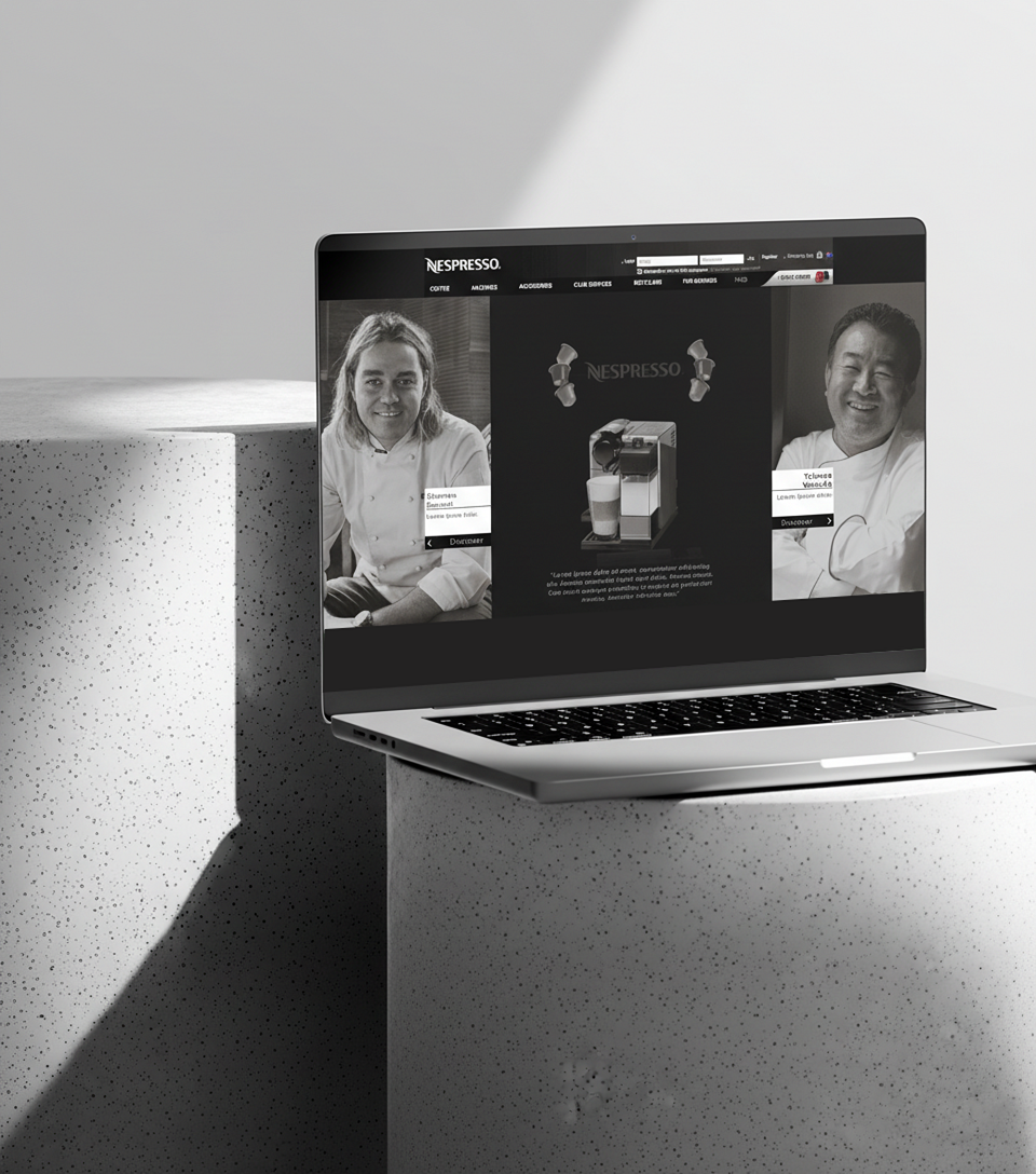
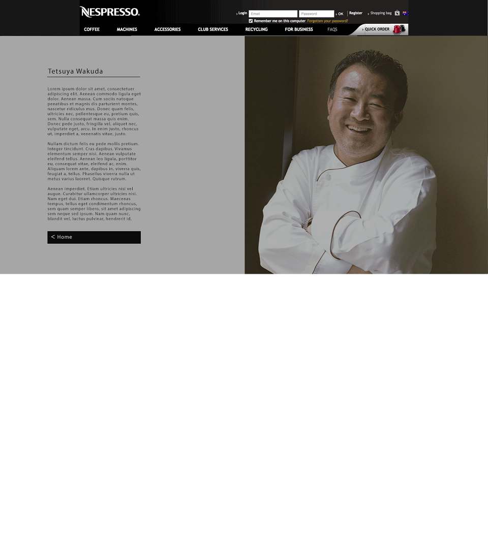
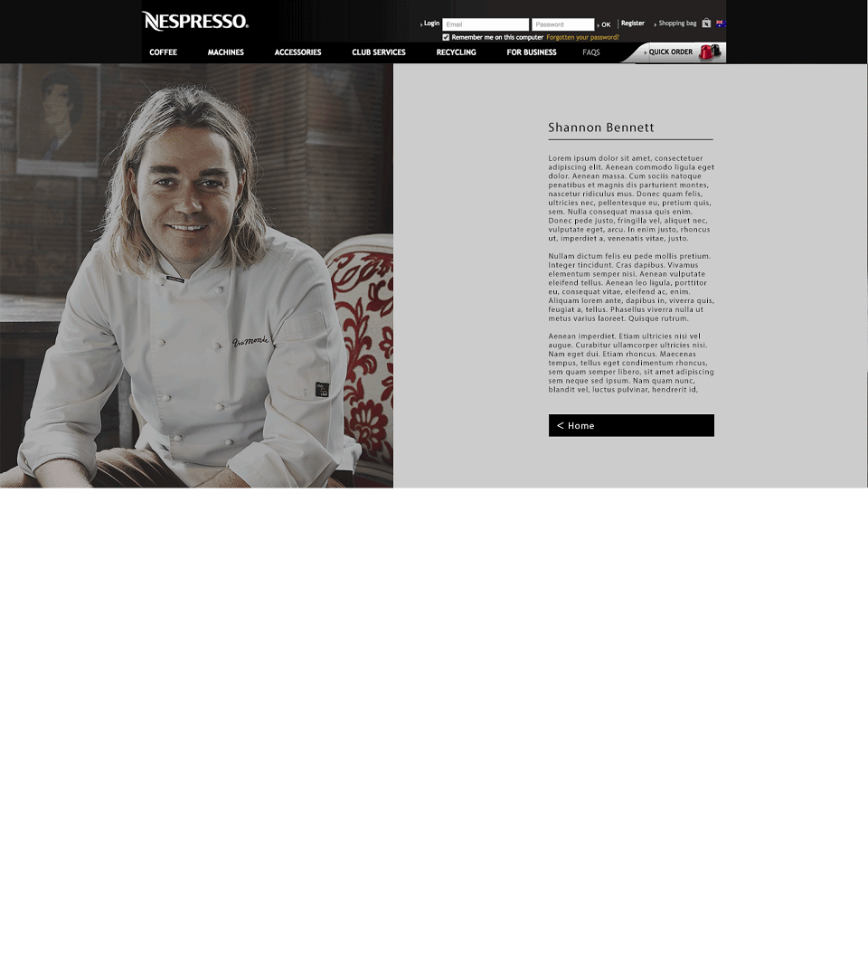
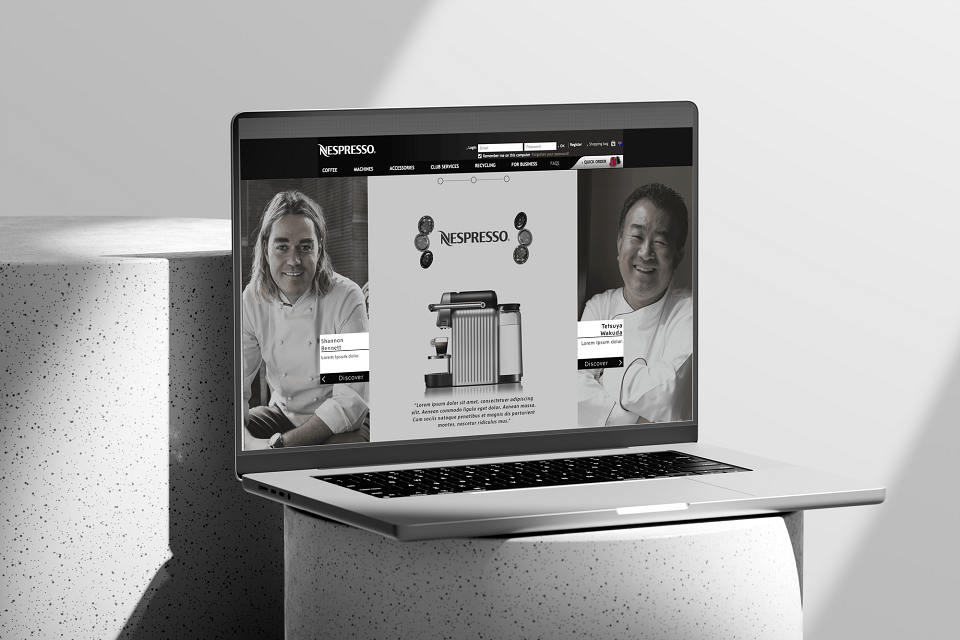
Following on from Nespresso's branding, positioning and guidelines, this project suited my design style and capabilities of designing for minimalism and luxury. Opting for a sleek and premium look so we can use the focal point of 1) the Nespresso Machines 2) Shannon Bennett and Testuya Wakuda, keeping the wireframes and nav bar simple and clean to help the secondary function of driving customers and businesses towards purchasing and or add ons ie. Accessories and coffee flavours/capsules.
Using a lot of black and white to play on the edge of clean sophistication with reference to restaurant Chef uniform culture, what that represents but also honouring the colours of the machines, tied in nicely. Both colours also representing different machines and states (NSW and VIC), Chef Jackets - representing professionalism at the helm. Both colours represent a premium look and feel for the brand, customers and chefs involved. I was quite pleased with the overall outcome.