Wezley Stephens
Art Editor
ABOUT
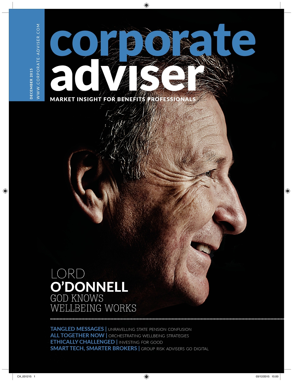
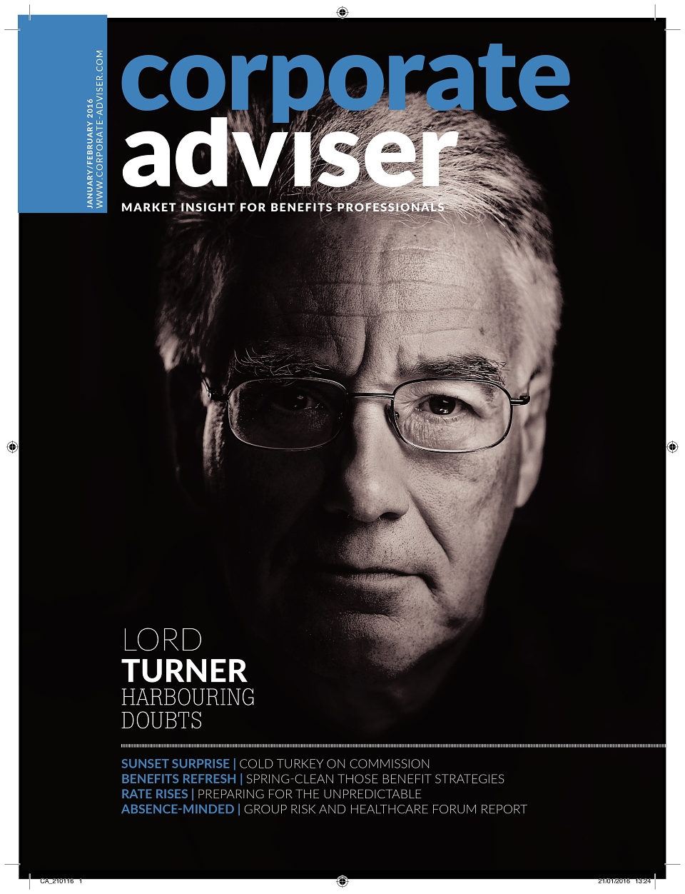
This was another design project commissioned within the company round about the same time as the Mortgage Strategy review. The brief was to take a 10 year old, text heavy, out of touch design and bring it into the 21st century. The brief included a new logo, new fonts and an entirely new direction for the magazine and the website. Our concept was for a 'smart corporate suit' which could be worn at any time and with minimum fuss. We elected for a black background, mono photos treated in Photoshop, heavier stock paper and modern typography that would sit well with the website.
Execution was carried out over two weeks and involved mock ups at every stage of the redesign which had to be approved and signed off at board level. First order of business was the logo, this was followed by new 13-col grids and a revamped brief to the photographer asking for shots that were grainier, close up and provided in high contrast black and white and colour modes.
The end result was a classy, feel good magazine that the editor said 'renewed his enthusiasm for the job'. It was executed in time, was brought in on budget and resulted in a website that carried through the new design ethos.
AWARDS
Highly commended