WMP Creative
Oxford
ABOUT
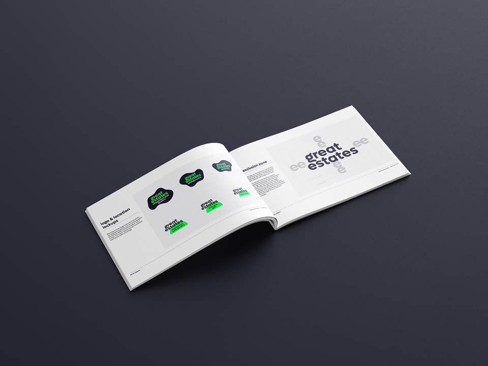
Against the background of some of the UK’s most beautiful stately homes, Great Estates offers a first step into the world of trail running. As a new series, Great Estates needed a brand identity that would both appeal to entry-level runners and speak to the historic setting of each run.
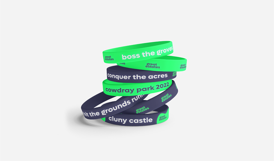
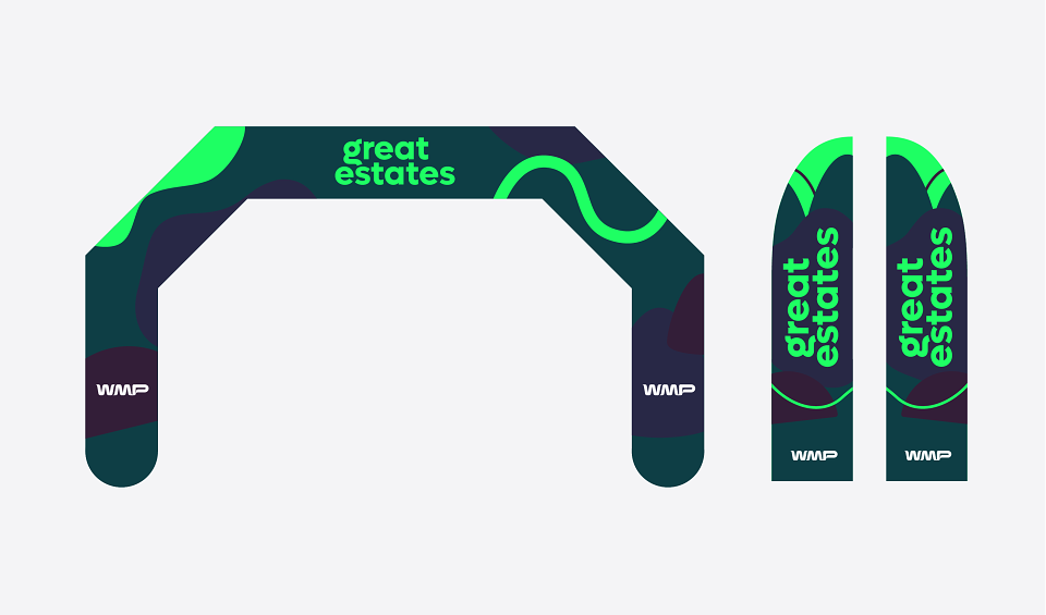
Our brief was to create a visual identity that would be recognisable and embody the values of the series: family-friendly, sustainable and technologically advanced. The brand needed to be flexible enough to grow with the series and adapt for each event.
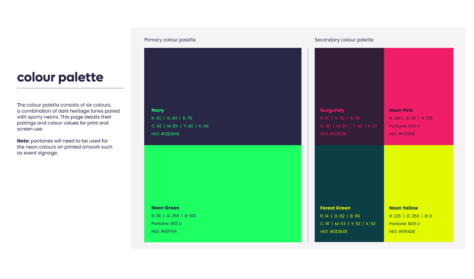
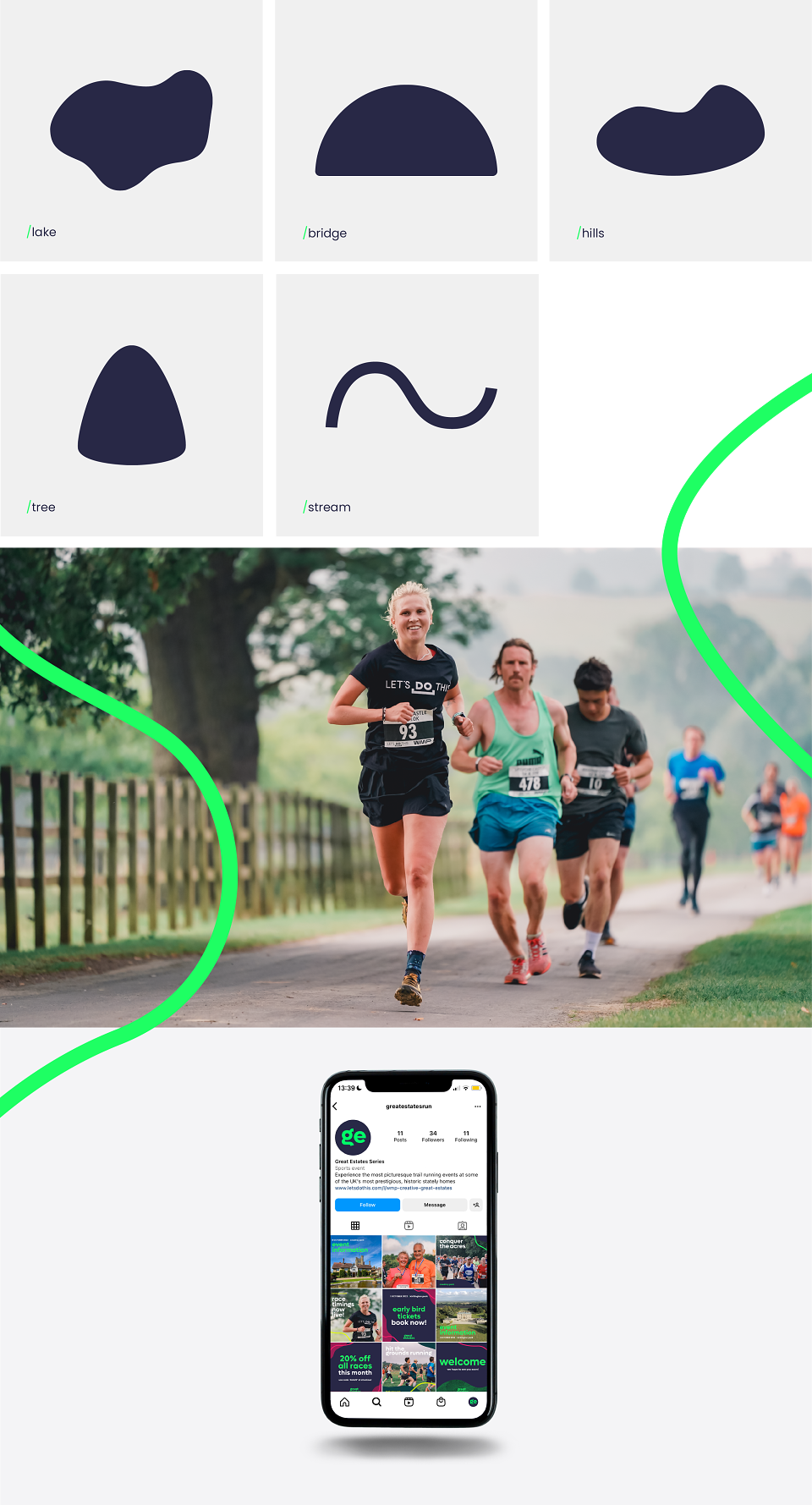
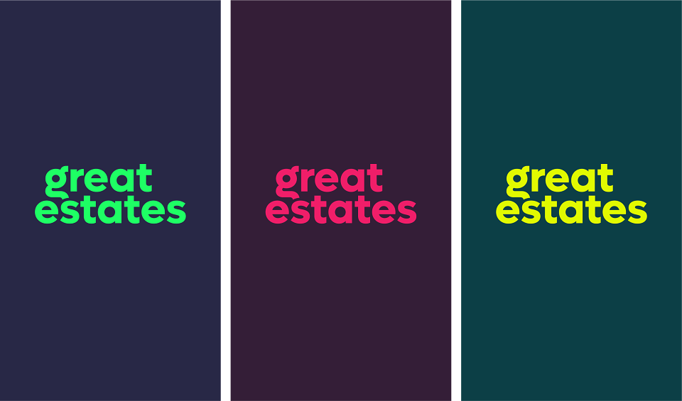
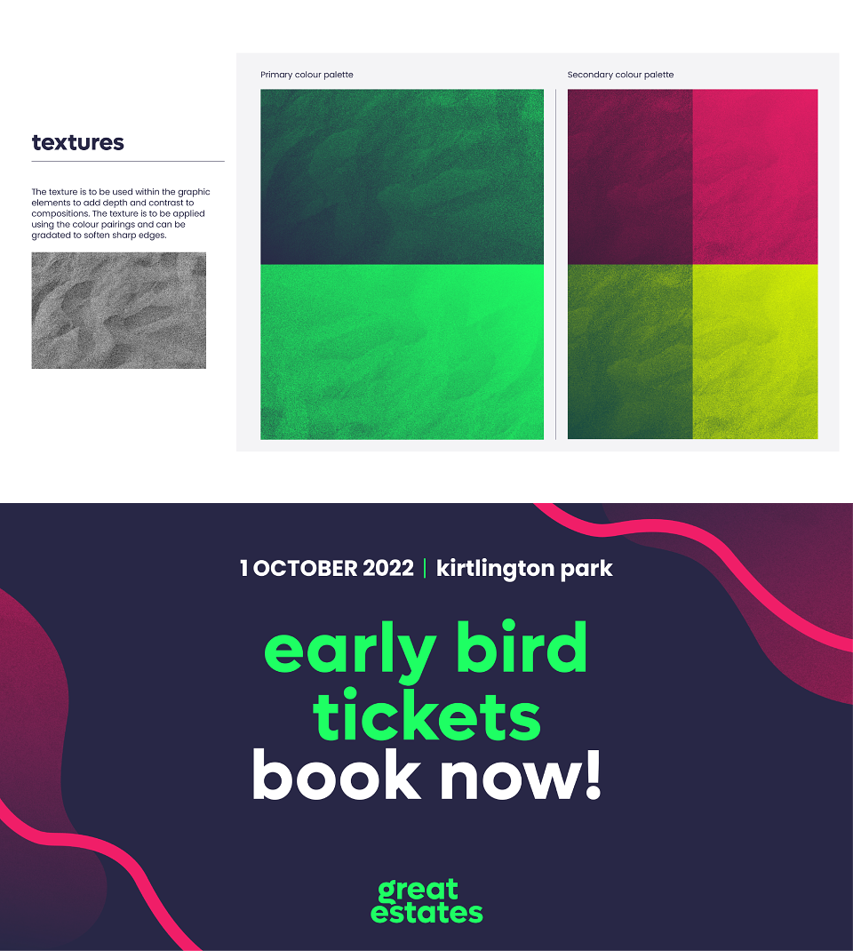
With the stately setting for each run in mind, we wanted to create a colour palette that combined heritage colours with bright neons for the modern runner. The geometric, sans-serif font was chosen for its contemporary feel and also the way the letter forms are reminiscent of elements of a running route. Secondary branding like graphic elements and textures are also used to recall the landscape around the estates where the runs take place.