

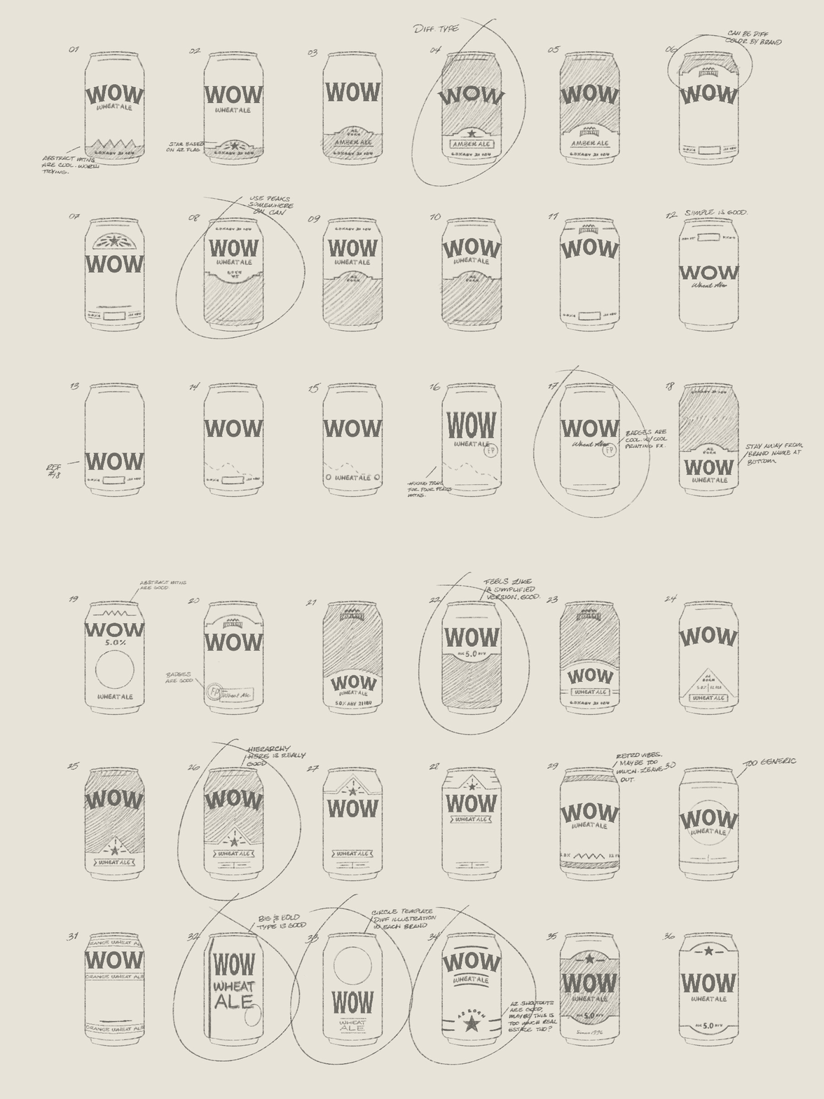


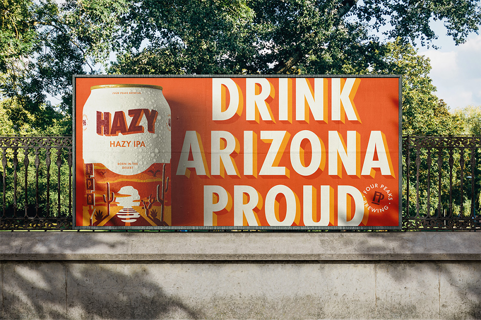
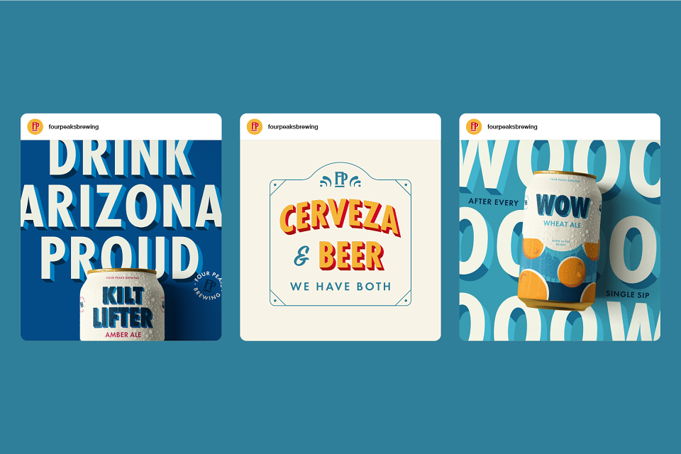
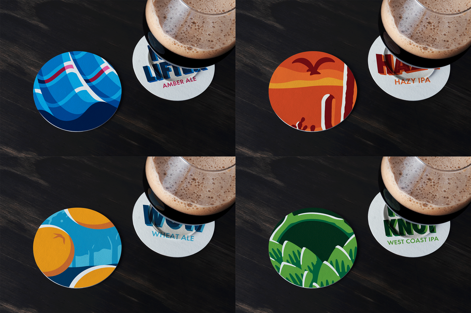

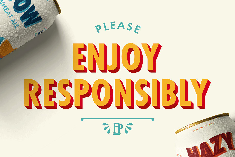

With nearly a 25% share of Arizona’s craft beer market, Four Peaks Brewing Co. has long been a local favorite. But as younger drinkers flocked to newer, more visually dynamic competitors, the brand’s dated identity began to lose relevance. To re-engage the next generation while honoring the brand’s legacy, we set out to refresh Four Peaks’ core beer packaging—bridging the gap between heritage and modernity.
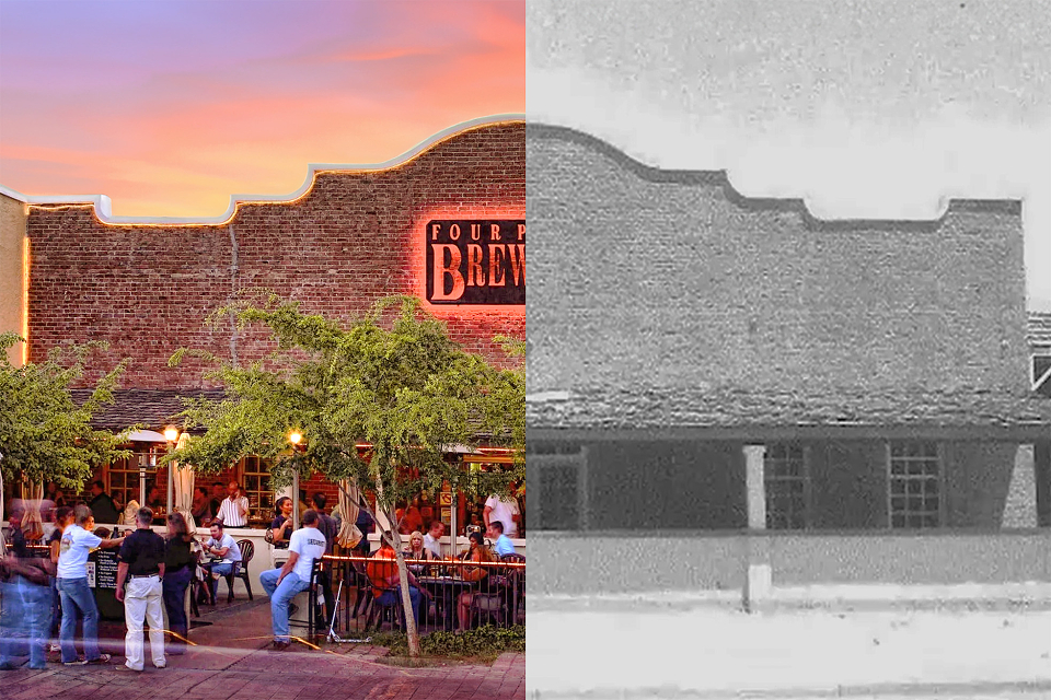
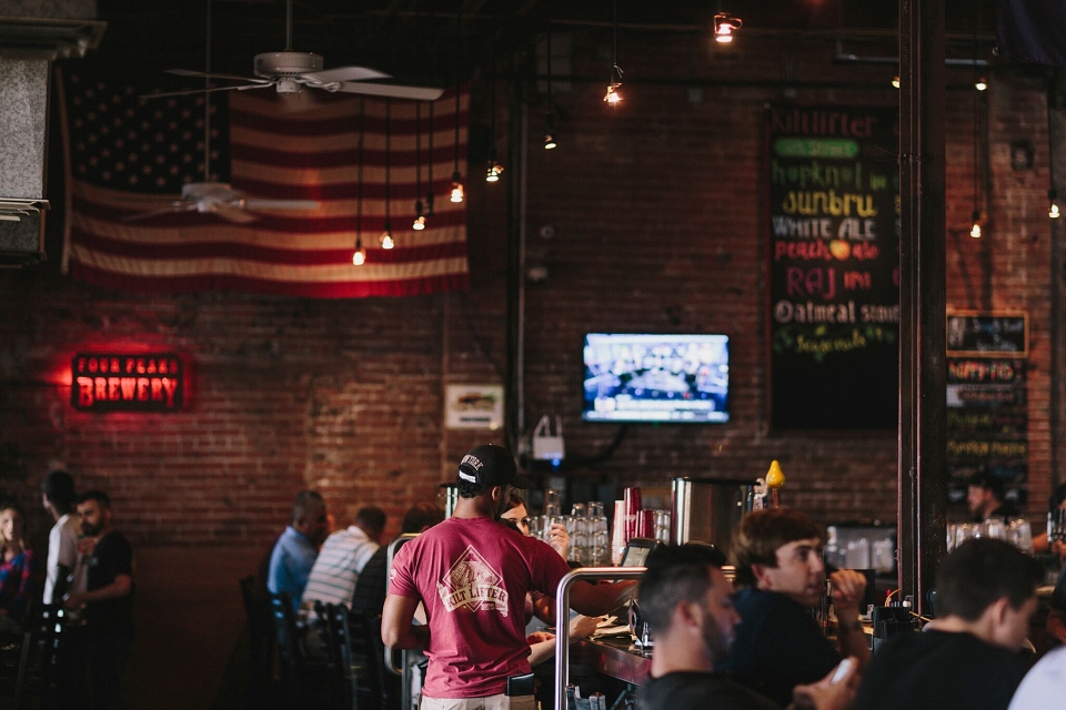
We reimagined the identity around what makes Four Peaks truly unique: its historic, community-driven brewpub. Housed in a mission-revival building from 1882, the pub is central to the Four Peaks story—but was largely invisible in the brand’s packaging. We brought it forward, both literally and symbolically.
Key elements include:
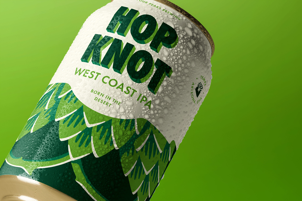
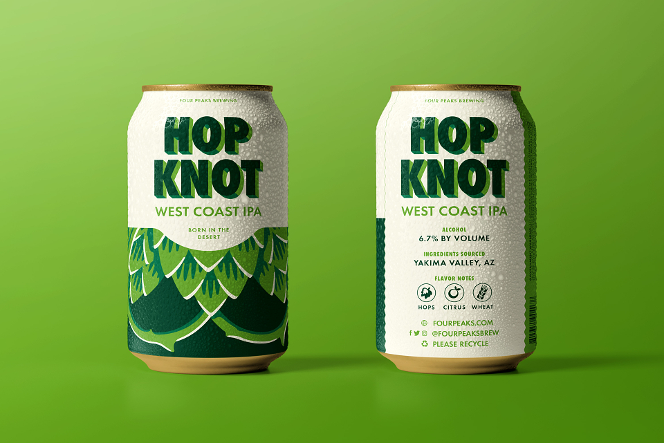
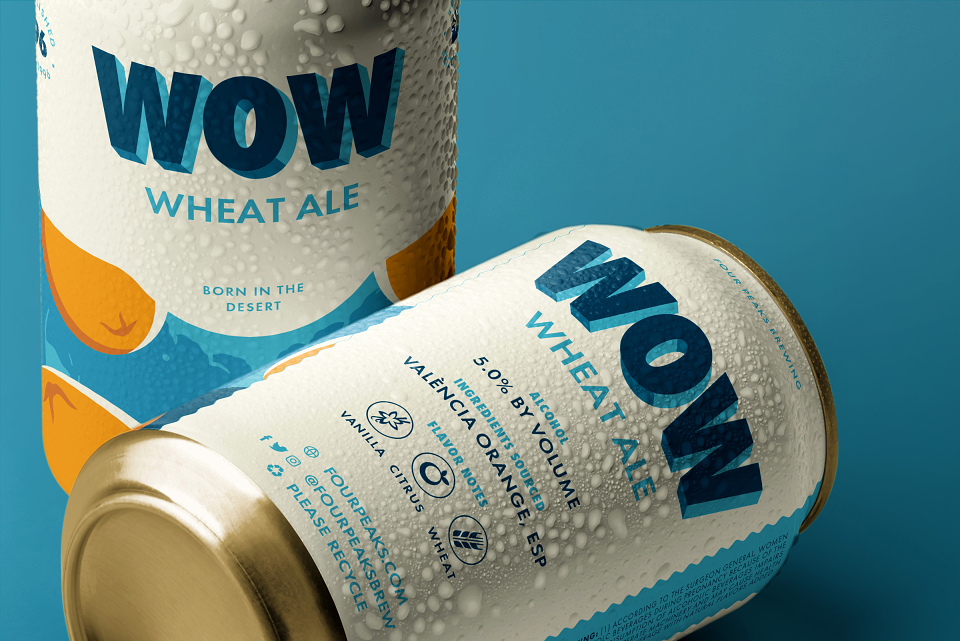
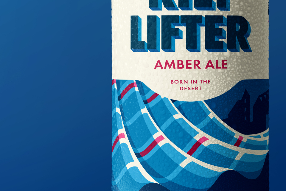
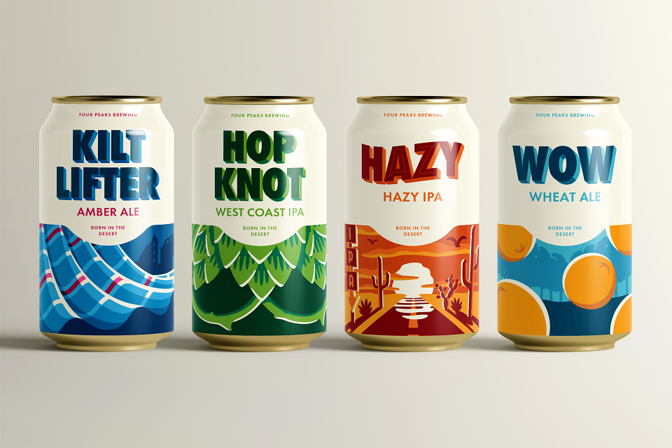
- A bold pub-arch motif framing each can’s key beer details, inspired by the brewery’s architecture
- Typography influenced by rotulismo mexicano, injecting warmth, character, and cultural relevance
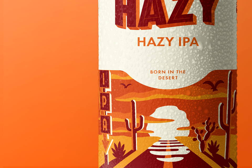
- Bright, modern illustrations that evolve the brand’s illustrative heritage while standing out on shelf
- Side panels featuring brewery context, with back panels highlighting each beer’s origin story
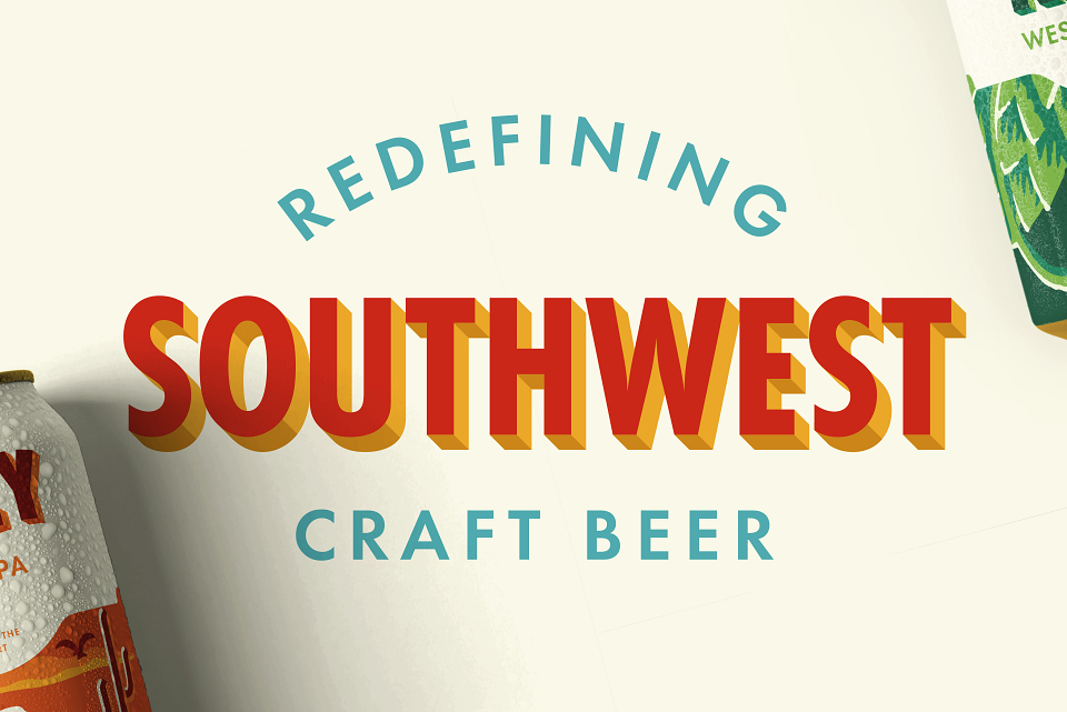
The new system unifies the core lineup with energy, storytelling, and visual clarity—celebrating Four Peaks' local roots while appealing to a design-savvy, younger audience.
The redesigned identity was met with enthusiasm internally and was positioned for a strong launch. However, the project was paused prior to market release. While early feedback was positive, full commercial impact is yet to be realized. The system remains ready to reintroduce Four Peaks to a new generation—revitalizing a regional icon with boldness and heart.