

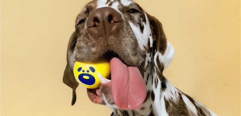

Each month, a member of the Whistlejacket team picks a piece of work they have seen that's nothing to do with either themselves or the agency, but they really wish it did. Because they love it so much. This month, Project Manager Alex Davidson has picked the new brand launch for Digs Dog Care from Saint Urbain.
Can you dig it?
It’s no secret here at Whistlejacket that we love our furry friends.So it only feels right to shout out one of the best brand launches we’ve seen recently – Digs Dog Care, a national dog care network spanning over 15 US states and built, but it’s not your typical dog care…
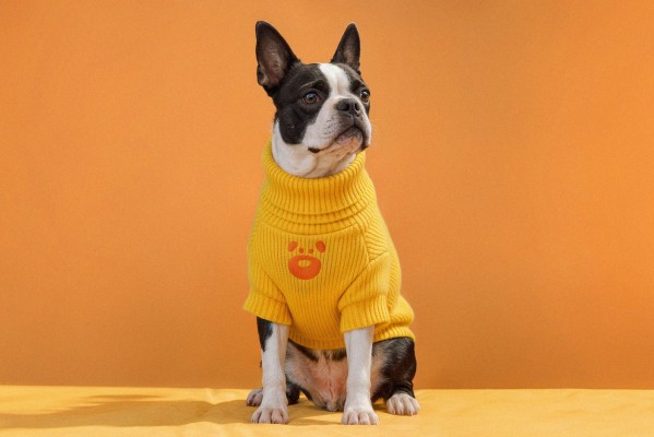
There’s something incredibly satisfying about a brand that understands its category so completely, it can reframe it altogether. That’s exactly what Digs Dog Care does so brilliantly. It takes the often chaotic, over-sentimental world of dog care branding and instead filters it through the logic of hospitality design. The result feels less like a kennel or daycare and more like a beautifully considered hotel group that just happens to cater to dogs.
What makes the identity so compelling is its restraint. Most pet brands default to visual noise — paw prints, bright primaries, jokey typography, overexcited messaging. Digs goes the opposite direction. The branding feels composed, assured and spatially aware. There’s a confidence to the system that comes from borrowing cues from boutique hospitality, wellness brands and premium retail rather than traditional pet care.
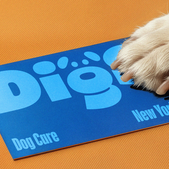
And crucially, the identity understands the emotional transaction at the centre of dog care. Owners are not buying grooming or daycare. They are buying reassurance, routine and trust. The same emotional architecture that underpins great hotel brands. Digs understands this instinctively and builds a visual language around comfort rather than cuteness.
The typography does a lot of heavy lifting. Condensed sans-serif headlines give the brand a kind of metropolitan confidence — almost editorial in tone — while the softer supporting elements stop it drifting into cold minimalism. Even the logo mark is handled with unusual discipline. The subtle dog nose embedded into the “g” is clever without becoming self-consciously clever. It’s the kind of detail that feels discovered rather than announced.
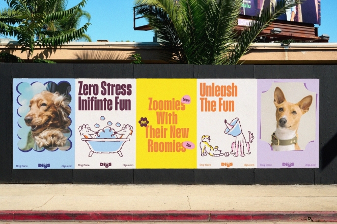
What’s particularly impressive is how scalable the whole system feels. This isn’t branding designed for one flagship location and a few posts. It’s clearly been built as a full operational identity system: signage, packaging, merchandise, uniforms, digital touchpoints, environmental graphics, wayfinding. Every component feels connected to the same world. That’s where the hotel-chain comparison feels strongest. Great hospitality branding succeeds because it creates consistency across dozens of touchpoints without becoming repetitive. Digs does exactly that.
There’s also a tonal balance here that’s very difficult to get right. The brand feels premium, but never luxury in the exclusionary sense. Stylish, but not self-important. Friendly, but never childish. That middle ground is incredibly hard to occupy, particularly in pet branding where companies often swing wildly between clinical vet aesthetics and cartoon chaos.
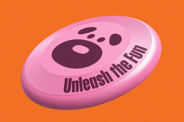
The photography and art direction help enormously too. Dogs are treated almost like guests rather than mascots. Spaces are framed architecturally. Even the colour palette behaves more like interior branding than consumer packaging — muted, grounded, flexible, grown-up.
Ultimately, the genius of Digs is that it understands people as much as pets. The branding recognises that contemporary dog ownership has become deeply tied to lifestyle, identity and standards of experience. So instead of designing a dog brand, they designed a hospitality brand for people who love dogs.
Amazing work from Saint Urbain and Digs Dog Care , two paws up from us!