Wes Trumble
Design Director/Owner
ABOUT
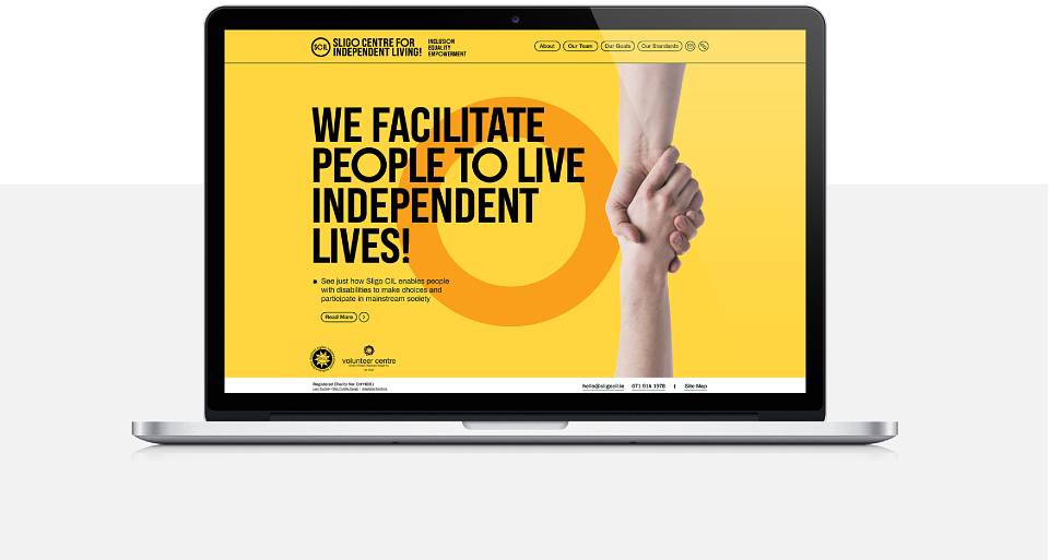
The Brief: To rebrand and reposition Sligo Centre for Independent Living as they see themselves: progressive, young, vibrant and fun. A safe space for disabled adults.
The Solution: Initially looking to update the logo, a blue and yellow sun device common to all CIL’s; we began by asking questions to greater understand the business.
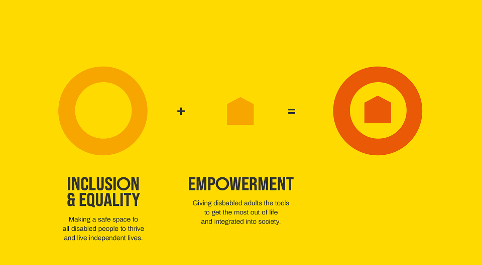
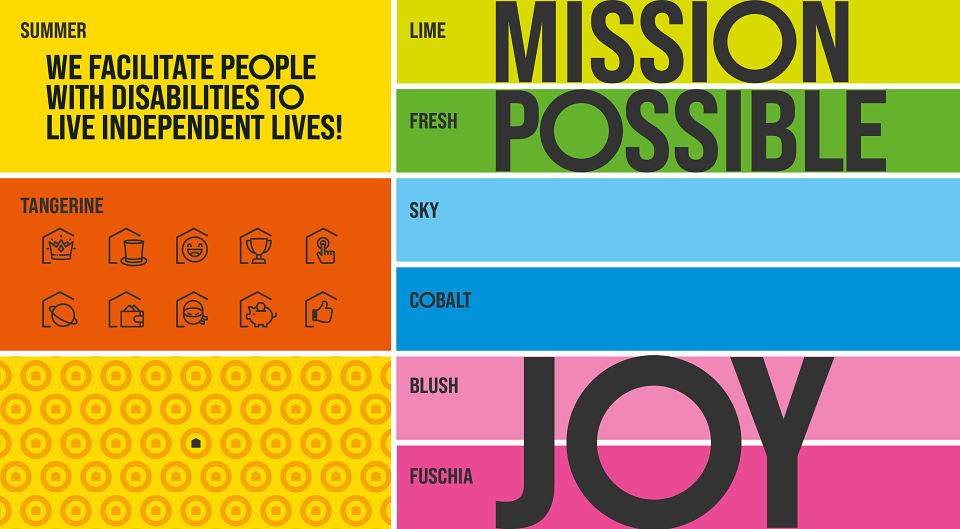
We took the sun device as the starting point, our solution leaning strongly towards a simple circle to represent the sun as an iconic, abstract device. This simplicity helped drive the visual landscape for the brand with an adapted typeface, poppy colour palette and icon set that highlighted the teams individual skillsets and personalities.
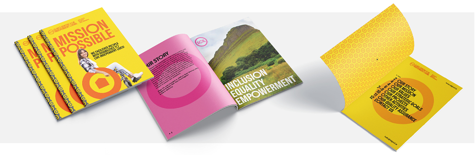
The design was well received and was rolled out across brochures, internal documents and the website.
MADEIT CREDITS
-

Sligo Centre for Independent LivingClient
-
Liam TrumbleGraphic Designer -

Wes TrumbleGraphic Designer