innovision
London
ABOUT
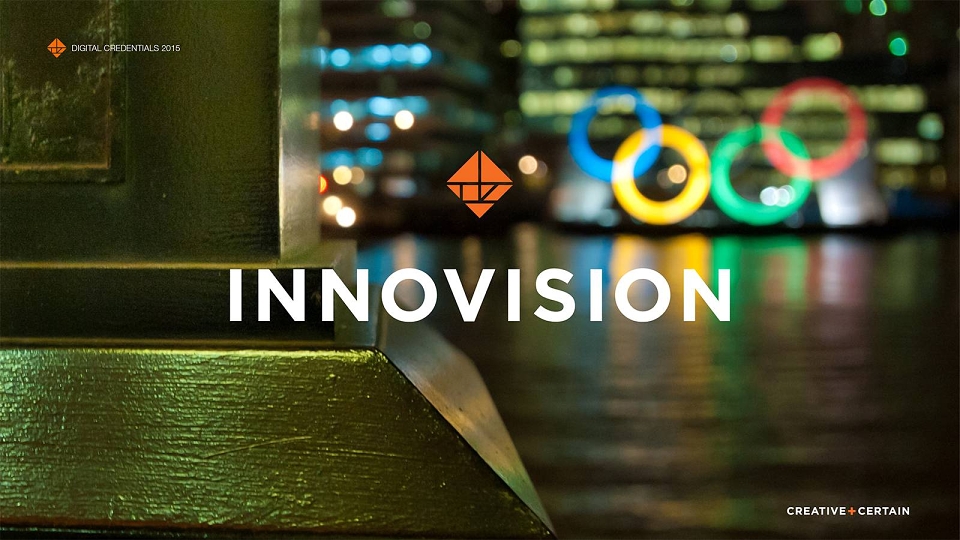
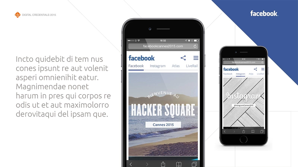
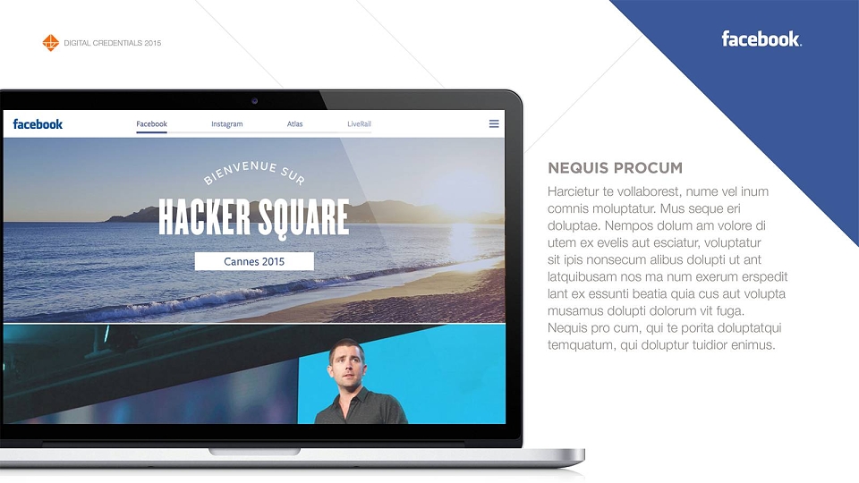
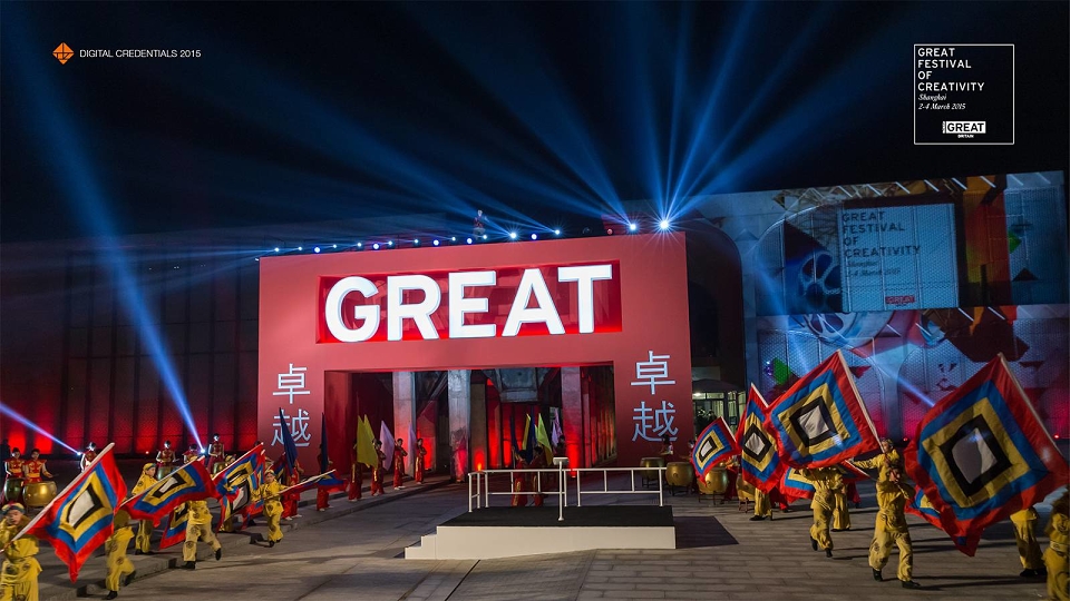
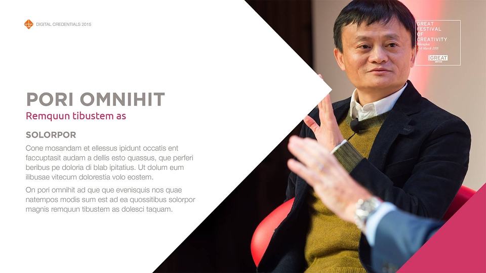
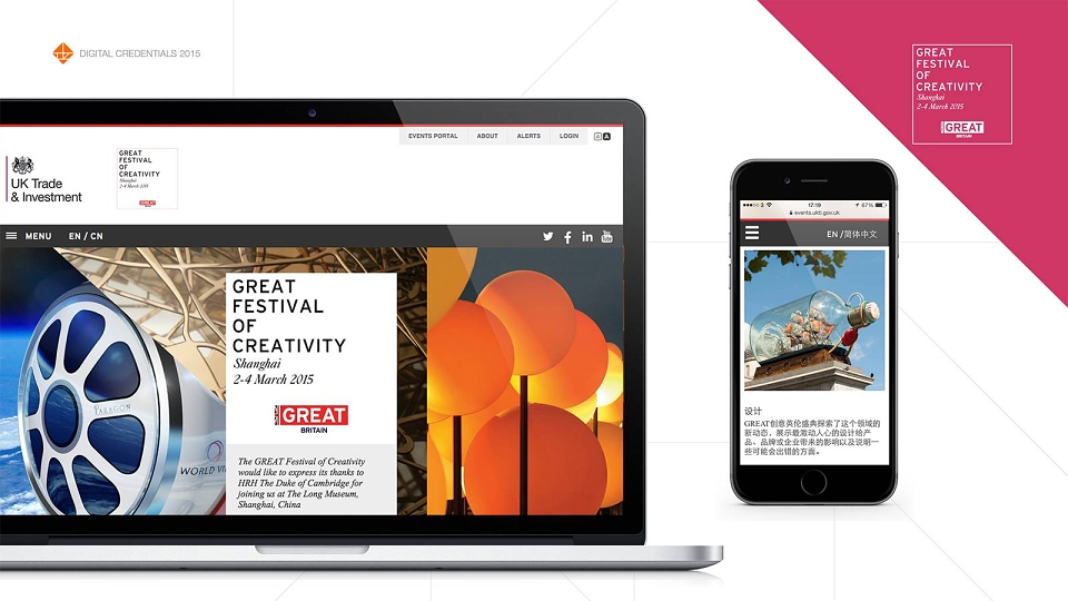
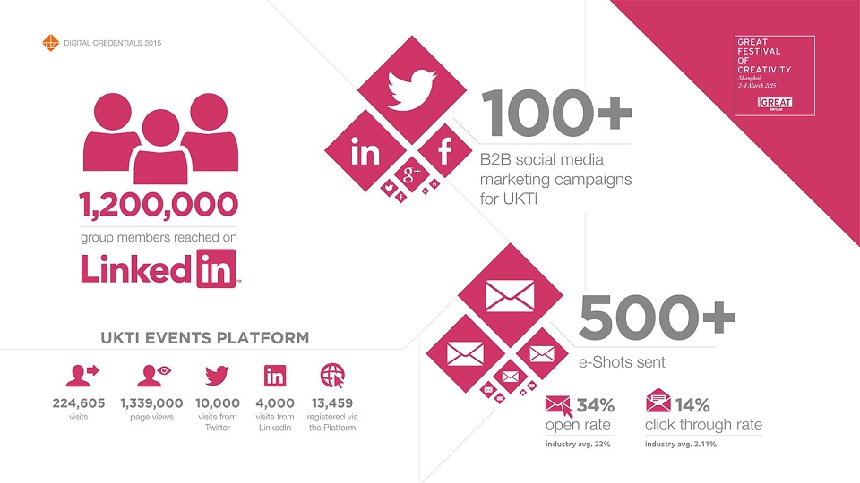
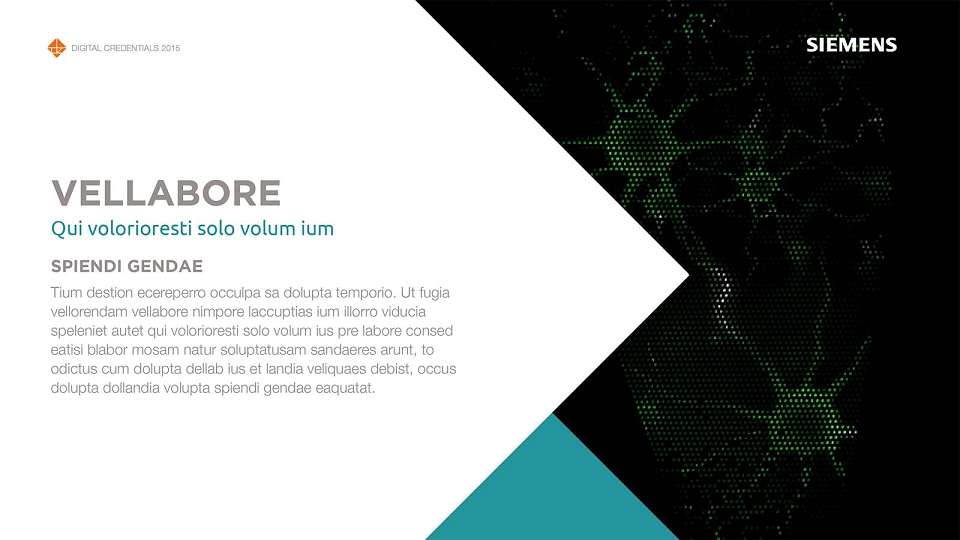
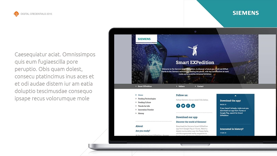
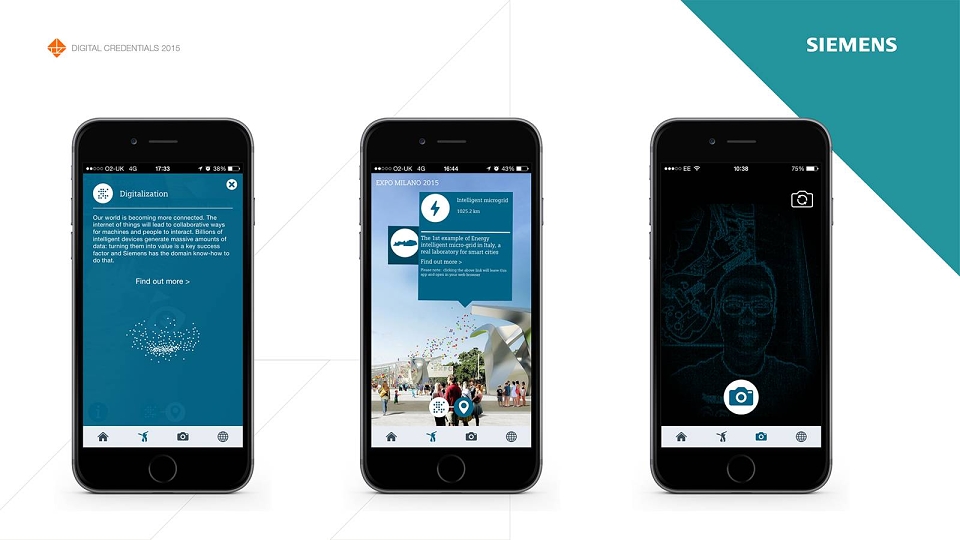
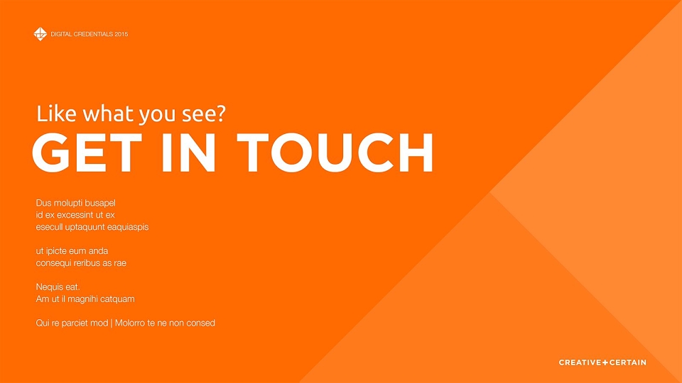
A digital credentials document for events agency, Innovision. The design brief asked for a modern, striking and energetic look and feel, providing a strong framework to present the company’s digital case studies.
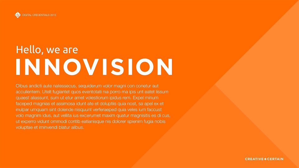
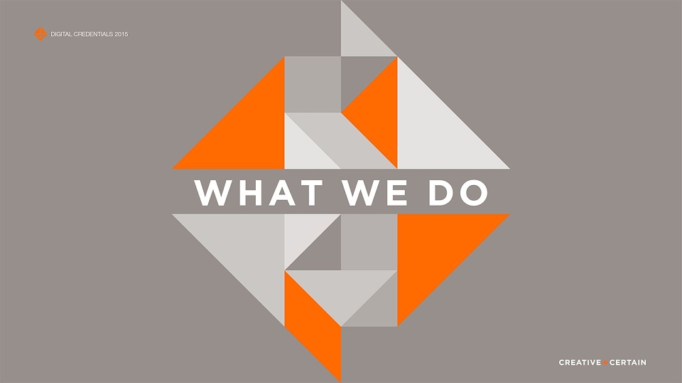
The design drew inspiration from the geometric shapes of the tangram that makes up the emblem within the Innovision logo. Initial experimentation with the possible shape combinations of the tangram were developed into striking chapter dividers e.g. “What we do”, as well as forming a dynamic yet flexible layout grid for the document. The angular shapes of the grid create interesting crops on the imagery, as well as provide depth and energy to full colour pages. The grid was also used to create the interesting networks of grey lines that form the white backdrops of the case study section. The lines add a subtle energy and a feeling of connectivity to the pages, suggesting the digital nature of the images.