VMV.STUDIO
London
ABOUT
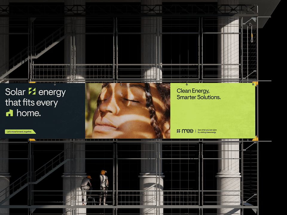
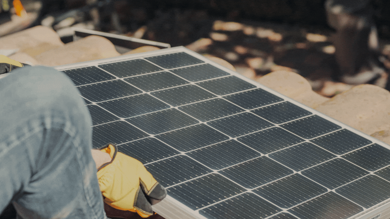
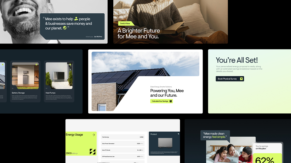
Mee Energy is a renewable energy company focused on making the transition to cleaner energy feel clearer, more accessible, and genuinely achievable. The brief was to reimagine the brand as Mee evolved beyond a solar installation business into a broader energy company spanning solar, EV, heat, and home energy technologies.
The challenge was to remove friction from a category often weighed down by complexity and jargon. Mee needed a brand that felt modern and credible, while remaining human and approachable. The ambition was clarity over noise, building trust through simplicity rather than exaggeration.
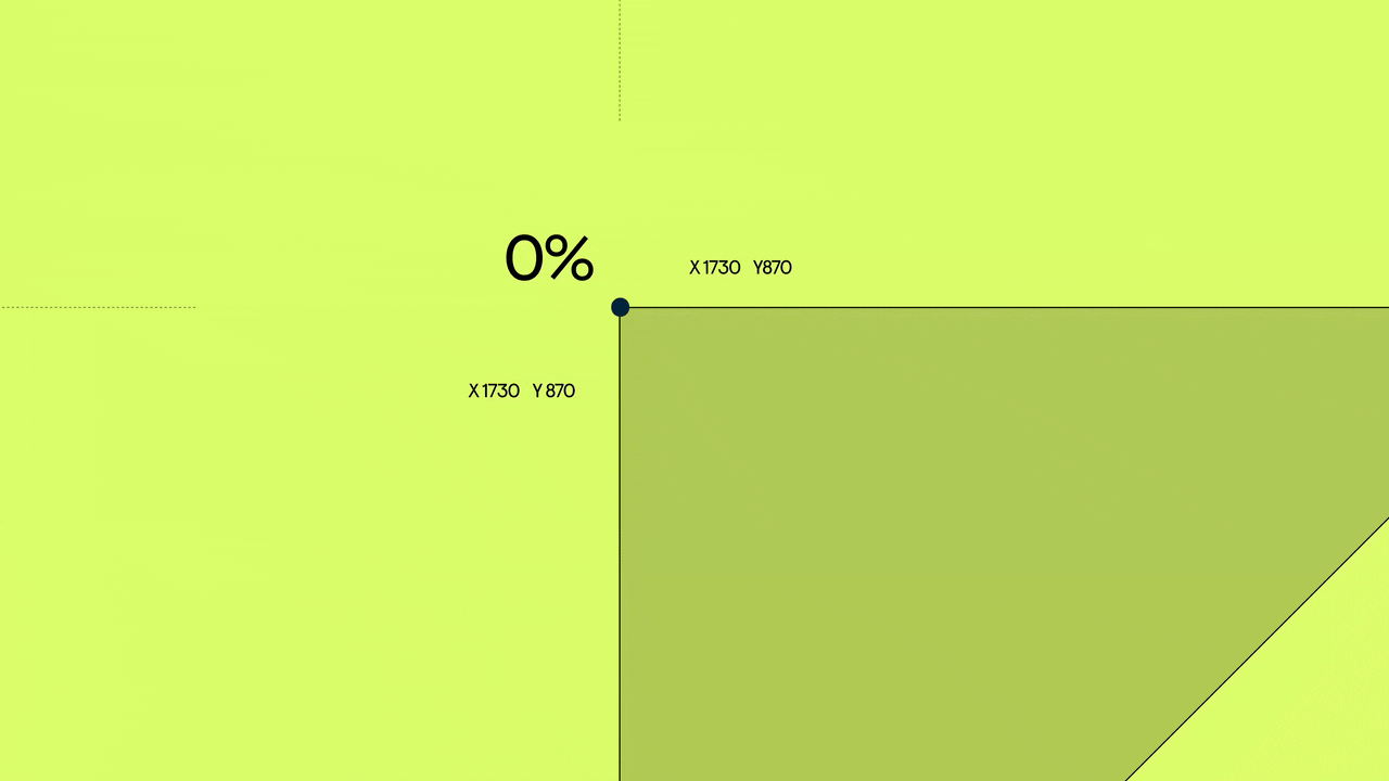
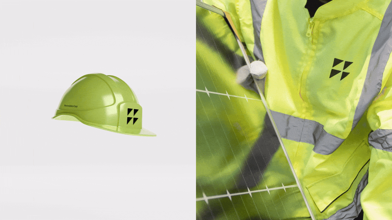
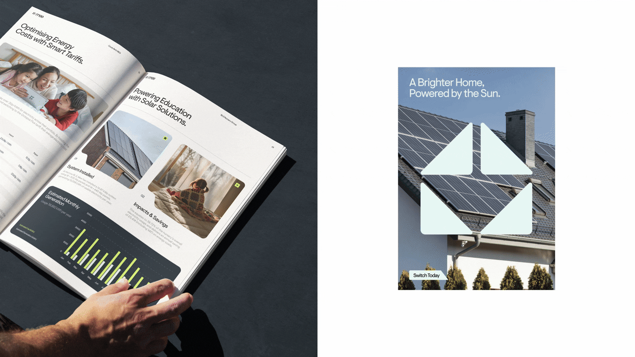
At the centre of the identity is a simple geometric idea. The Mee logo is constructed from four triangles, using negative space to subtly reference sunlight hitting a solar panel. These shapes became the foundation of the entire brand system, extending beyond the logo into icons, grid structures, UI components, layouts, and motion behaviour. The same geometry is echoed through masked letterforms in the wordmark, softening the system and introducing a sense of continuity.
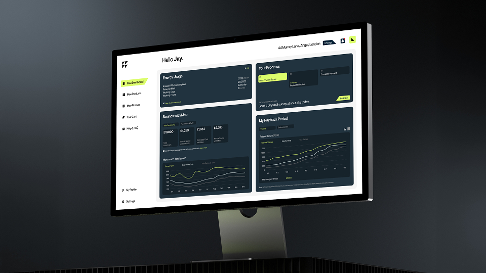
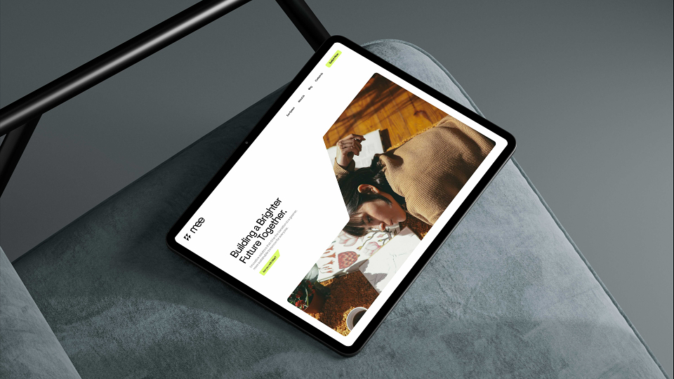
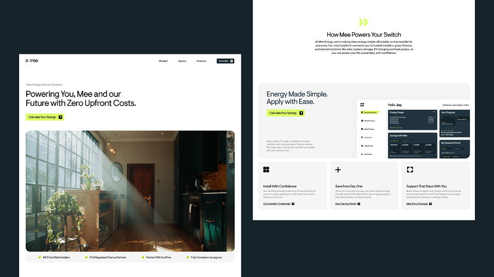
VMV developed a modular visual language designed to scale across digital platforms and future technologies. Colour, typography, layout, and motion work together to create a structured but flexible system that balances precision with warmth, avoiding the cold, technical aesthetic typical of the energy sector.
This thinking was carried through into the design and build of Mee’s website and digital ecosystem, where clarity, legibility, and flow were prioritised. Every element of the system works together to help Mee communicate simply, confidently, and consistently as the business continues to grow.