Vipin Babu
Graphic Designer
ABOUT
The challenge
Aster Canada faces challenges in standing out in a competitive healthcare staffing market, where many brands appear generic. As a growing company, building trust and credibility with clients can be difficult. Additionally, the website’s usability might be an issue, with visitors potentially struggling to quickly find key information.
The solution
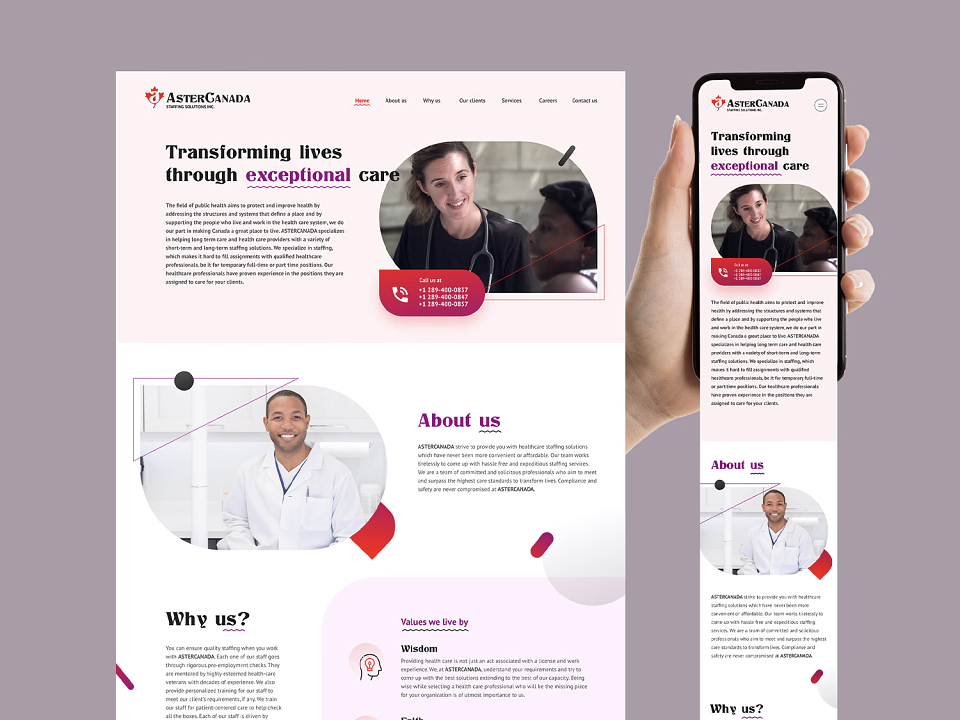
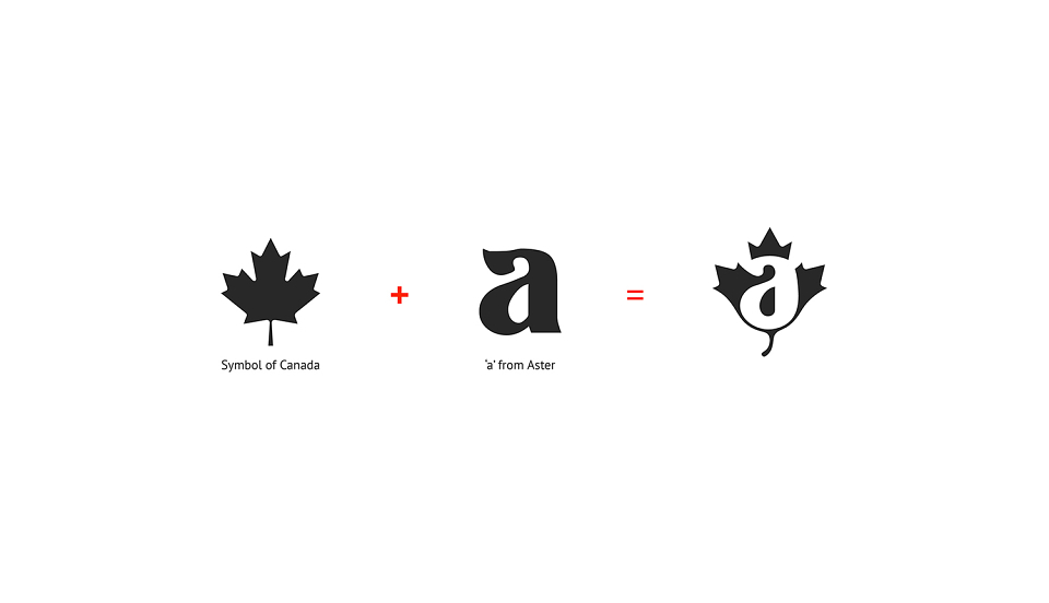
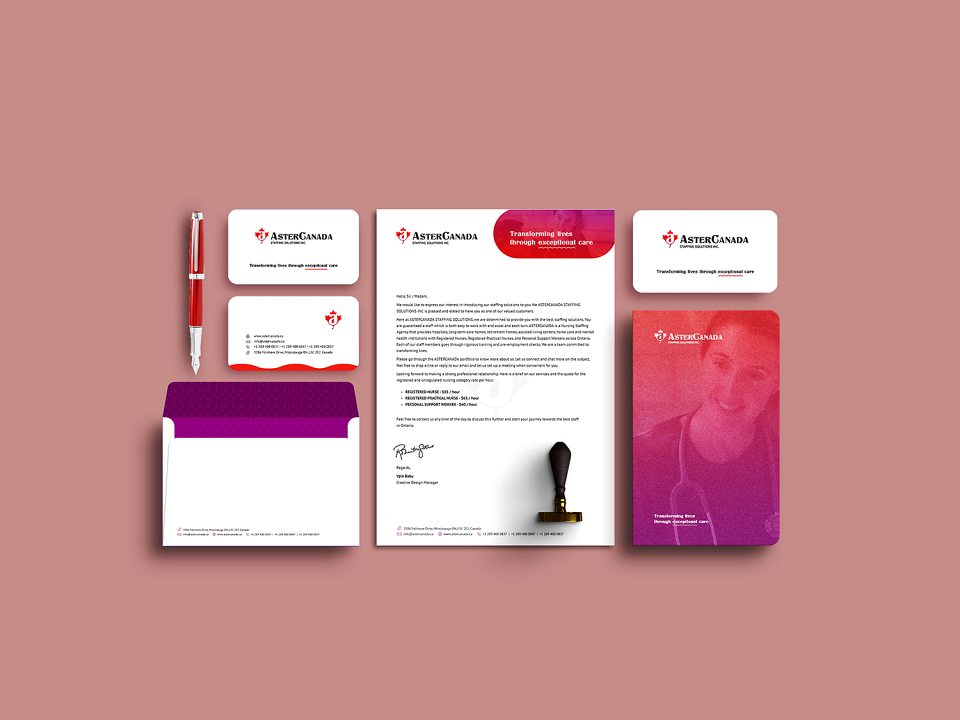
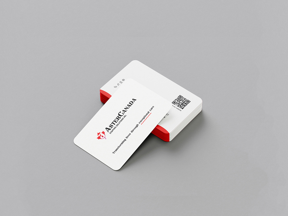
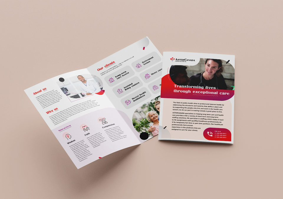
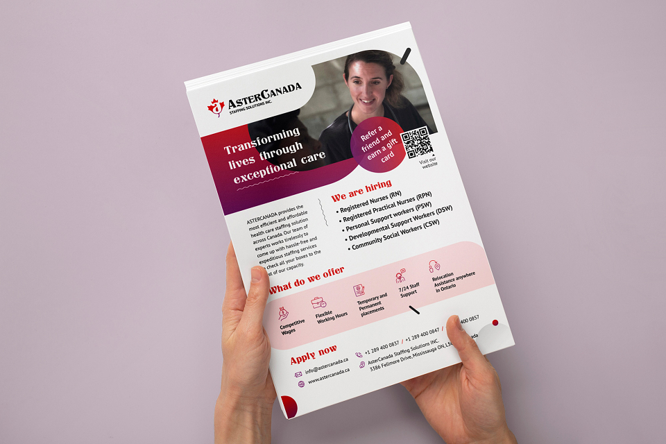
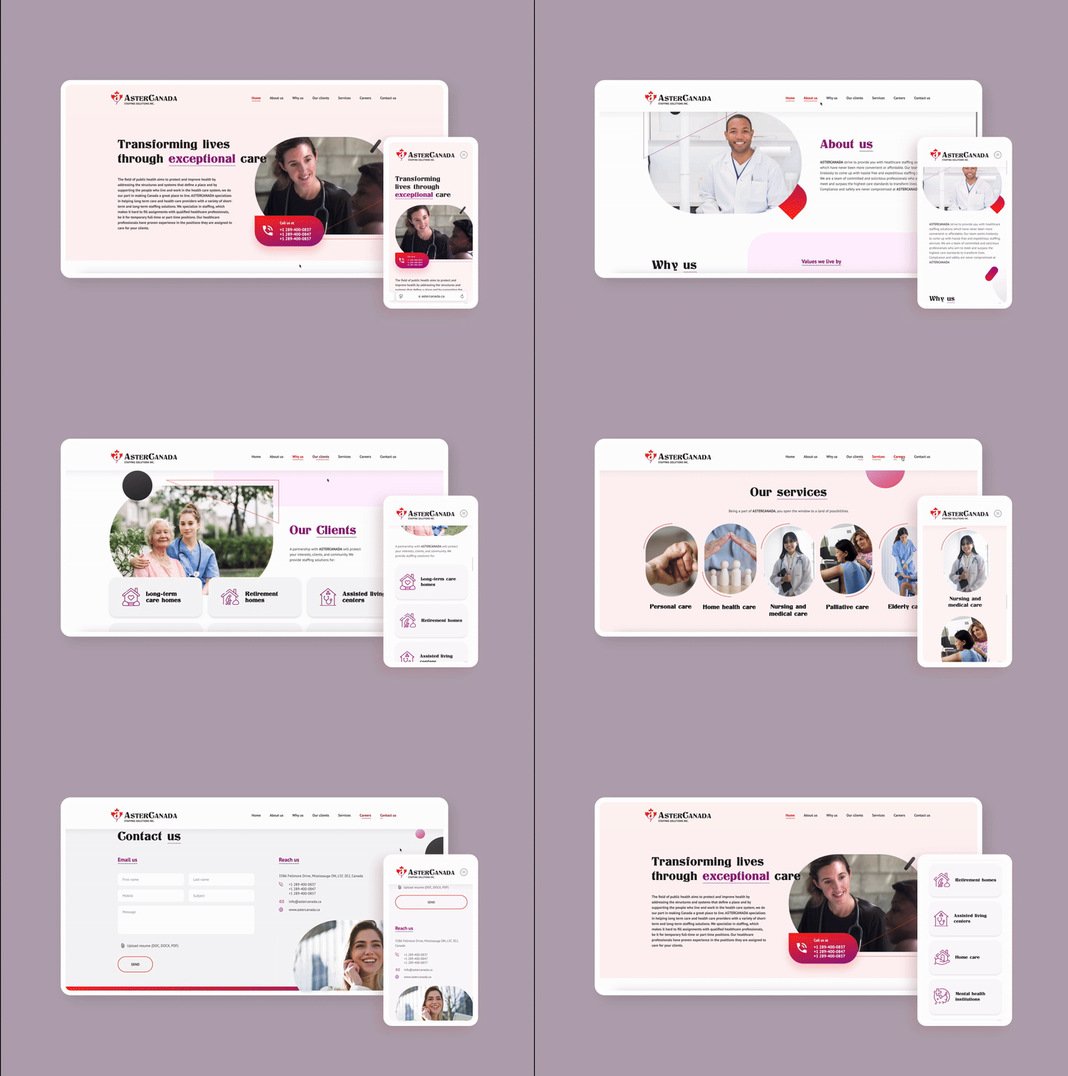
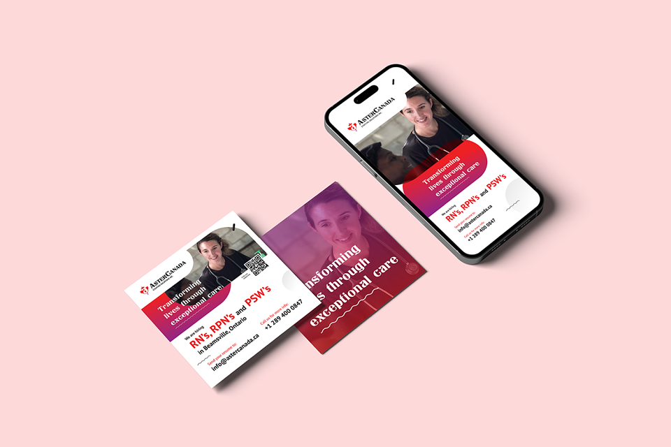
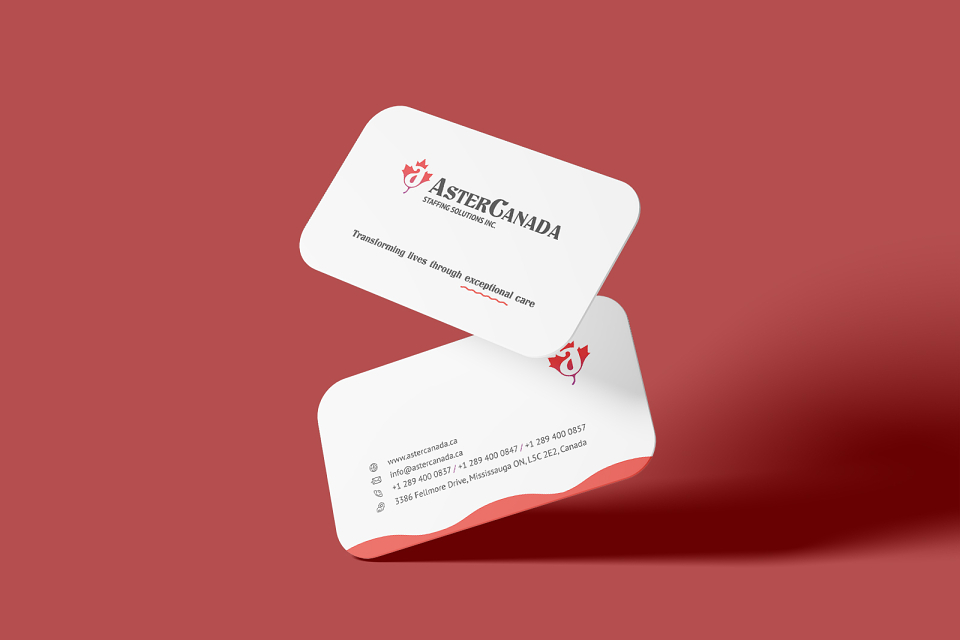
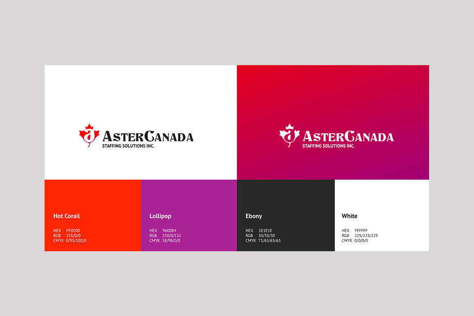
The unique branding, featuring the Canadian maple leaf and the letter "A," helps Aster Canada differentiate itself while instilling trust. The modern, clean design builds credibility, and the user-friendly, one-page website simplifies navigation, making it easy for clients to access essential information.
MADEIT CREDITS
-

Vipin BabuLogo Design, Branding, Art Direction, Website De