Victoria Charles
Graphic Designer
ABOUT
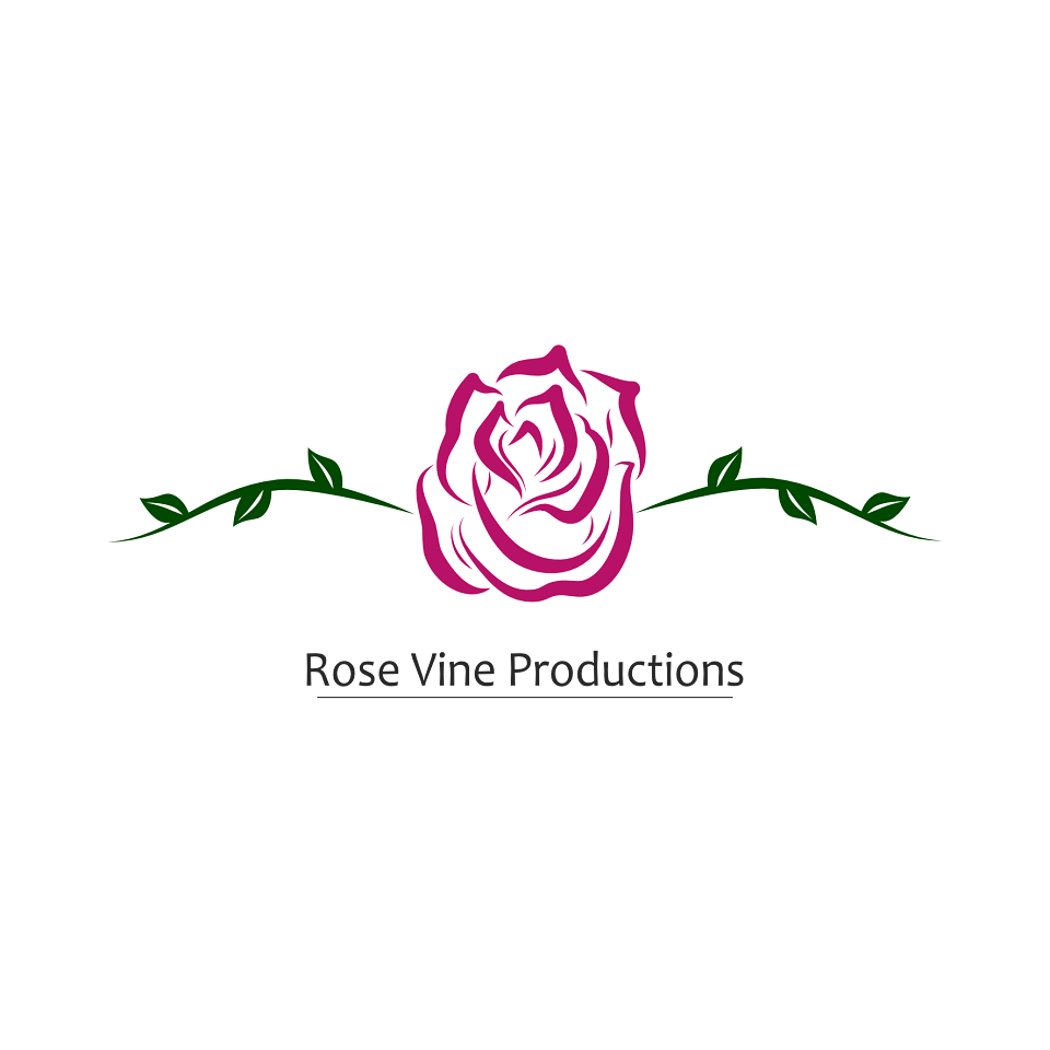
The first meeting with Rose Vine Production we talked about their ideas for the logo, they had a firm idea of what they wanted for the logo. They even had a rough sketch of the layout; a rose with vines either side.
I sketched several different styles of roses till I found a style that matched the companies values/images. I then transferred the drawing on to the computer and simplified the style of rose till it was suitable for a logo. Logos needs a high level of clarity, so they are easily recognised when small or far away so they can't be overly complicated.
Next was the colours, a shade of red/pink was necessary as otherwise, it wasn't clear it was a rose. However, red gave the company a romantic vibe which wasn't what they were going for, so we leaned towards dark pink and a complementary green for the vines.
When I showed Rose Vine Productions the final version, they gave it the all-clear, just asked to a slight change with the text placement!
MADEIT CREDITS
-

Victoria CharlesOwner & Graphic Designer