Victoria Charles
Graphic Designer
ABOUT
The streamer The Adapting approached, asking for some branding design. We chatted about what assets they would need and about their channel, their audience, plus where they want to take the channel in the future. The designs they commissioned me for were;
• Branding Package
• The logo and a variant of the logo, both with a version for light and dark backgrounds
• Colour palette
• Fonts selection
• Watermark
• Signature
• Personalised font
• Banners for;
• Twitch
• YouTube
• Twitter
• Store on Teespring
• Camera overlay
• Sub badges
• Banners for Twitch's About page
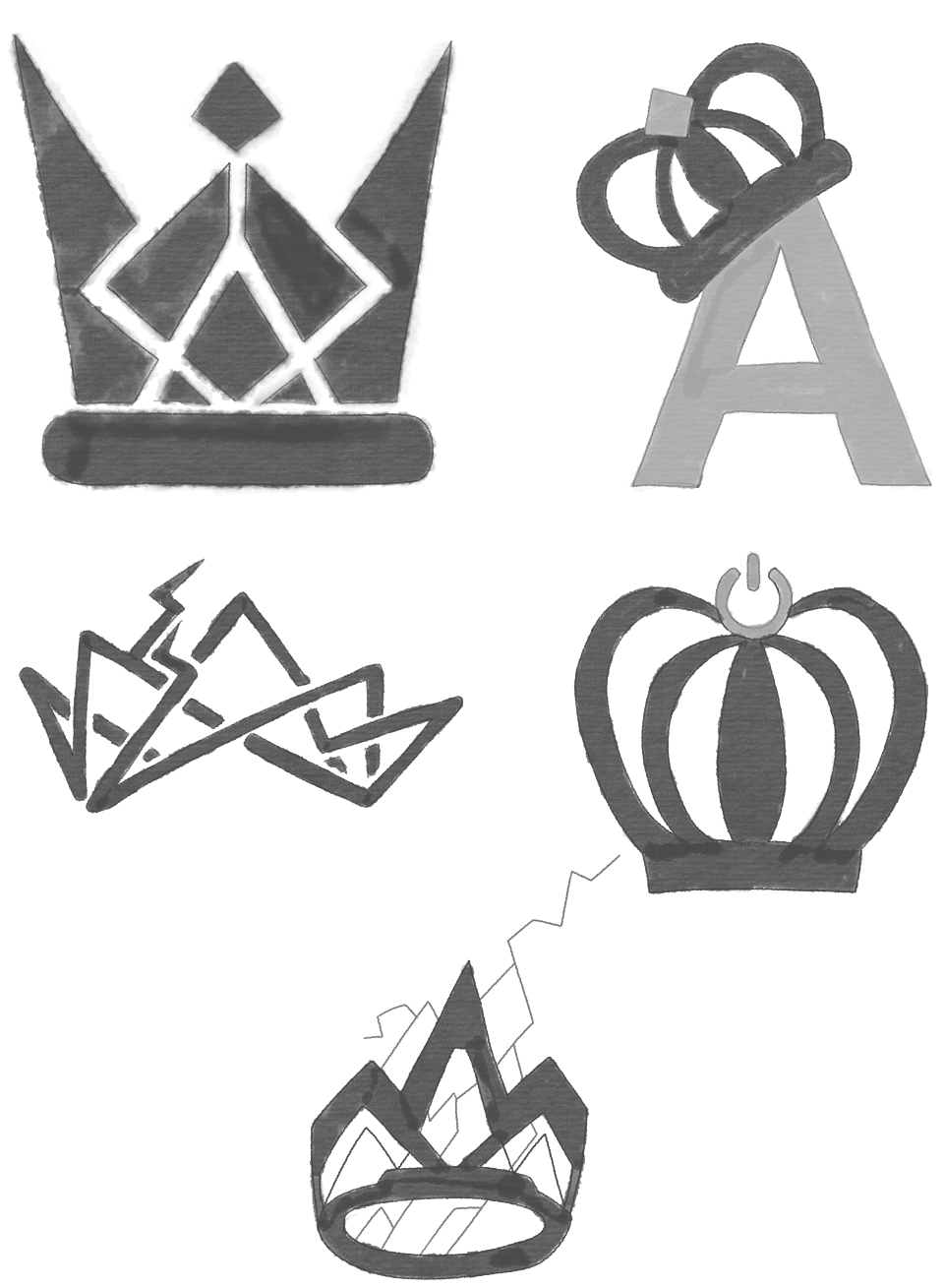
To start off with, I did my own research on the channel and their competitors to better understand the industry. Then it was off to brainstorm ideas for the logo design. The Adapting said they wanted a crown to be the centre of the logo. This was the only form of branding already in place. Next, I wrote down other ideas based on the channel. The starting point was that they called their Discord server called the Kingdom, which was already a theme throughout their channel. They primarily play Smite, usually as Thor or Fenrir (both from Nordic mythology), so I took inspiration from the characters' designs and their shared mythology.
When sketching the ideas down, I focused on making the crown stand out and not just any old crown. Mixing in Thor and Fenrir's lighting in the game in a couple of the designs, one took inspiration directly from Thor's armour. After talking with The Adapting about the concepts, they had a clear favourite. They suggested a few alterations to try out for further developing the idea.
I created a black and white version of the design to focus on the design before adding the colour. Then I made several versions with different alterations; we chatted about the various adjustments in the next meeting. I shared my screen so we could experiment with ideas in the chat. By the end of the conversation, we were all happy with the design. Now it was time to start thinking about colours.
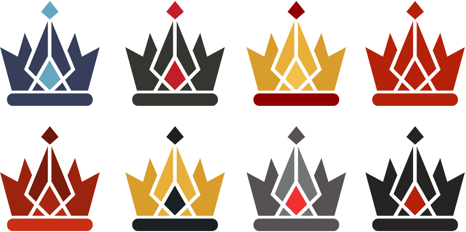
For the colours, The Adapting mentioned that they liked the idea of black and red. I also played with gold as it's a crown and blue as both are linked with Thor's design. I also experimented with giving the crown a shine while it still being a flat vector. For the following chat, I got ready several colour options for the logo and complementary colour palettes. Again, we discussed the different options, and again I had my screen shared so we could try out other combinations. Their favourite was the off-black and red gem; we also agreed on a colour palette.
The next step was the text. I experimented with some Google Fonts for the branding, which they could easily use throughout their branding. In the end, we went with the fonts Play and Jura, which both give a bit of an old game vibe. However, the Adapting had an idea for the logo's typography that couldn't be achieved with easily accessible fonts. So I decided to make a font for the logo itself that could also be used for The Adaptings' branding.
To start off with the font, I designed the individual characters to make a unique font. Then, after some tweaking, I got the green light with the designs; I used Font Forge to turn the designs into a working font.
The watermark was a case of the logo with opacity at 70%, so the content behind it could be seen. The signature was done by hand on my drawing tablet. It took a few attempts till we were happy with it. Once They were delighted with everything in the Branding Package, it was exported in PNG, SVG, PDF and PSD. So they could start on creating their shop content which I carried on with the branding.
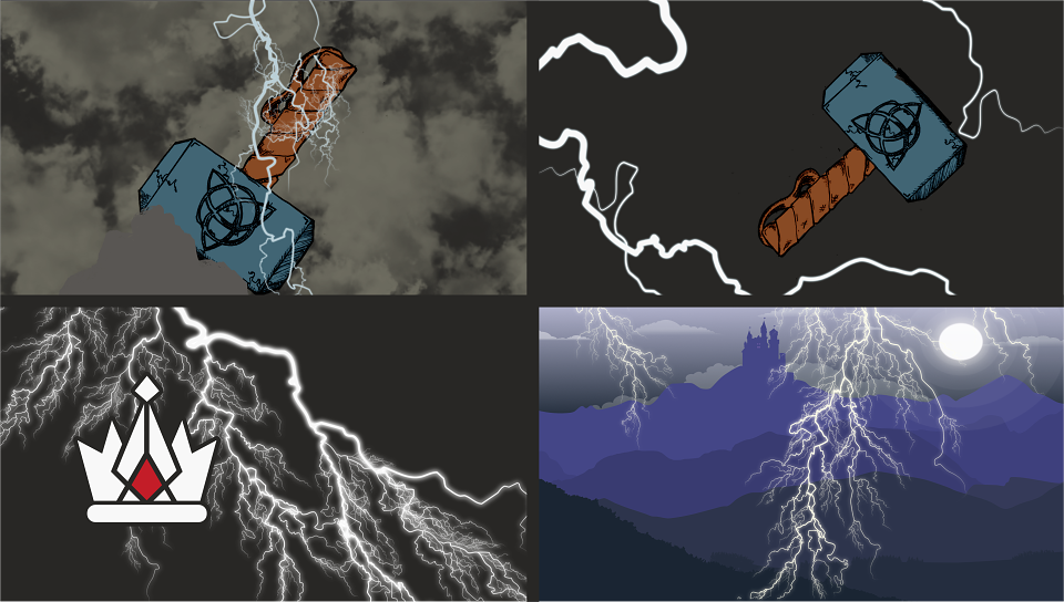
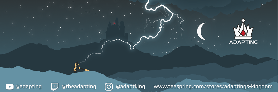
The next thing to design was the banners, which after some discussion, they decided to have the same design for each platform, but with different text on each. So I went away to put together a few rough concepts in a range of styles. While looking over the images, we chatted about the ideas. They loved the landscape design idea, so we talked about developing the concept further. Finally, we agreed on how to do the lighting bolt effect and add a glowing gem to the castle resembling the jewel on the logo. The only thing we weren't sure about was the colours.
I created the banner's design in greyscale on the largest banner size (YouTube), made the design a symbol, and put it on an artboard for each banner size. This was so that any changes I made to the design happened, affecting all of them, and I could see how they looked in each size quickly. So I could tweak the image till I was happy with the layout before I added the colour. I made three colour alterations using the colour palette, which I showed The Adapting. They loved the one that resembled night-time
I made a few extra alterations for the shop banner, as the banner size was extremely narrow. To prevent the banner from being overly cluttered, I removed the clouds and lighting.
Along with the plain versions of the banners, variants with text was also designed. For these, Adapting's social media tags were added along with the shop's website and logo. The shop had a different version with "sale now" in their custom font. For the text and logo, the stars underneath and close by were removed to declutter that section. When the designs were ready had received the all-clear, they were exported in PSD and PNG formats.
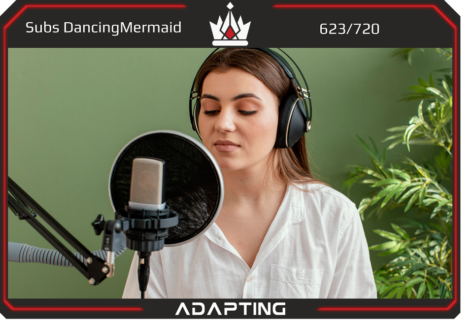
The next task was the camera overlay for Adapting's streams. I first required the camera video size and which information they wanted on screen: the Sub Goals, the latest Sub, logo, and their name. Next, I started out making a stream mock-up to get an idea of how the overlay would look when used. When that was done, I created three different overlays, keeping a close eye on how much of the screen it covered unnecessarily. Finally, I got these designs ready for the next meeting to discuss which elements they liked from each version, along with any other ideas. From this, I was able to create the final overlay.
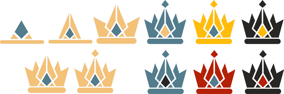
For the Sub badges, first, I needed to know how many badges they wanted and for what. They wanted five-month badges and six-year badges. The idea for the badges to build-up to the logo was discussed; perceived exceptionally well. So I experimented with it and figured out I could make it work for the month badges. Then have the colours change for each of the year badges. Having followed a pattern of the primary colour of the last badge being the gem's colour until the final badge was the logo. Adapting thought this was a great idea, and I went on the fine-tuning the details and exporting.
The last thing I created for The Adapting was banners for their about page on Twitch. I started off with a simple design of primarily focusing on the layout using the font I made and icons that suited the brand. I decided to use the blue from the branding as it seemed the colour that would work best with both Twitch's light and dark modes.
However, the background still looked like it was missing something, so I added the logo onto the background, making sure it didn't take away from the text. Then I added depth with subtle gradients on the background and a glowing effect on the icons and text to make it pop out. Finally, when I was happy with it, I showed it to The Adapting, and they liked the designs a lot.