Vicki
Design Director
ABOUT
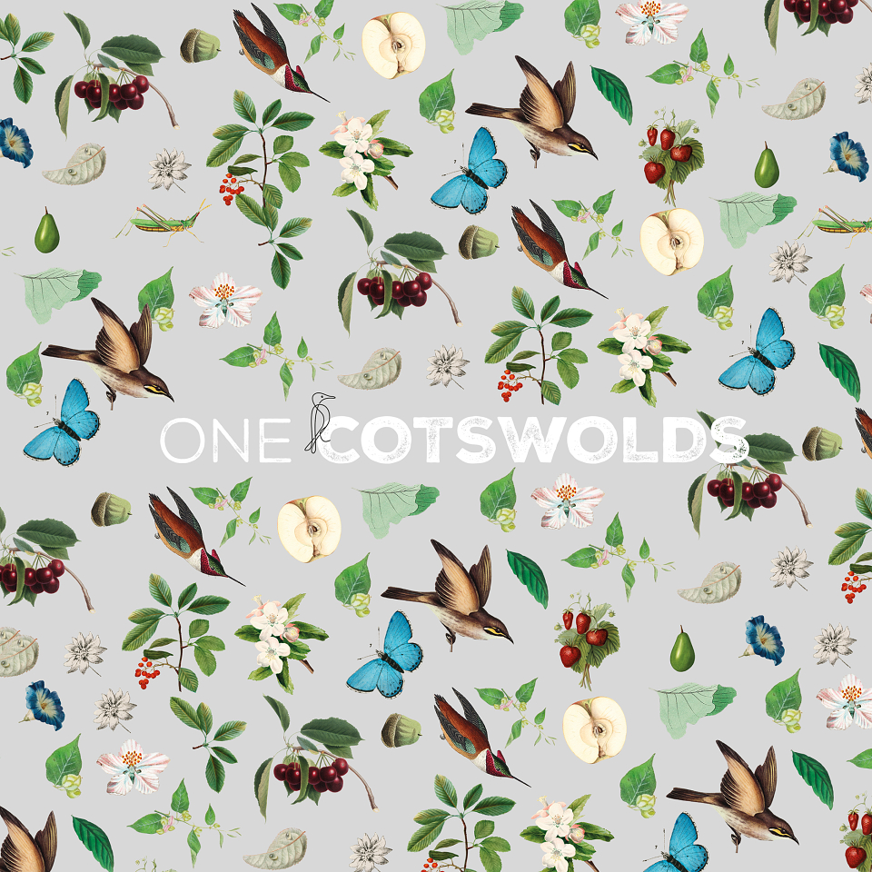
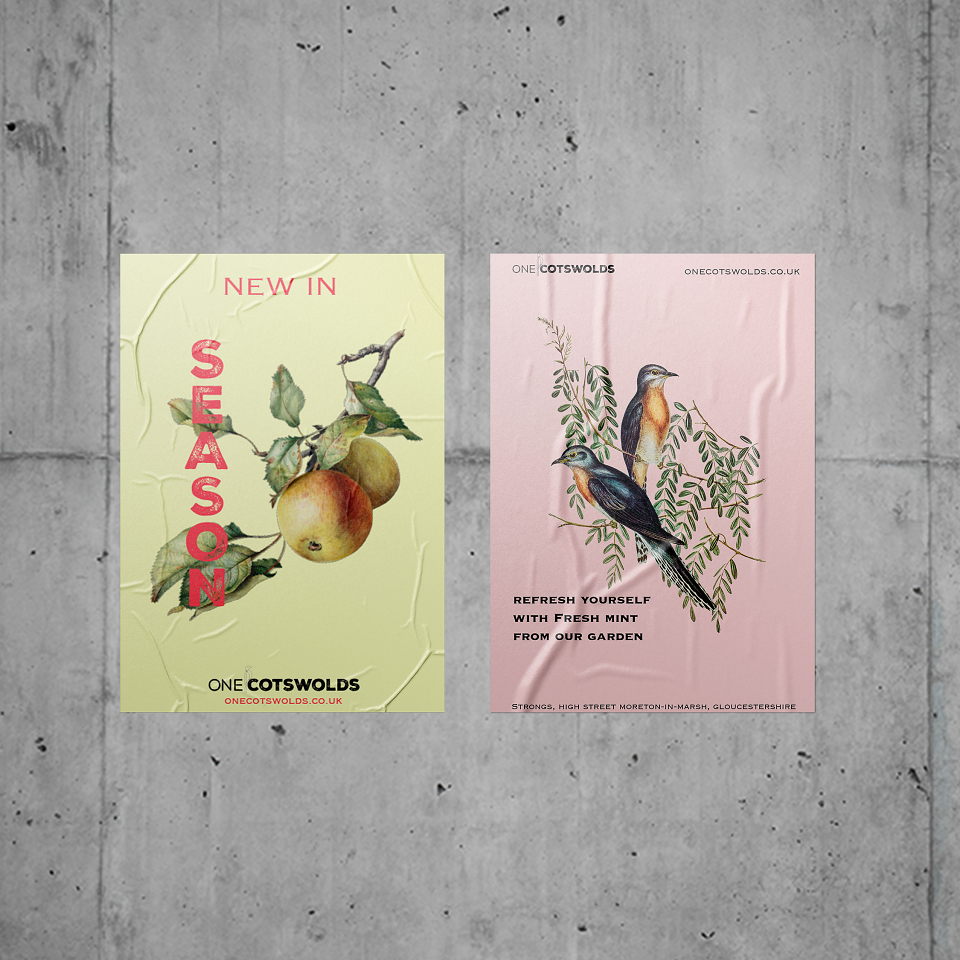
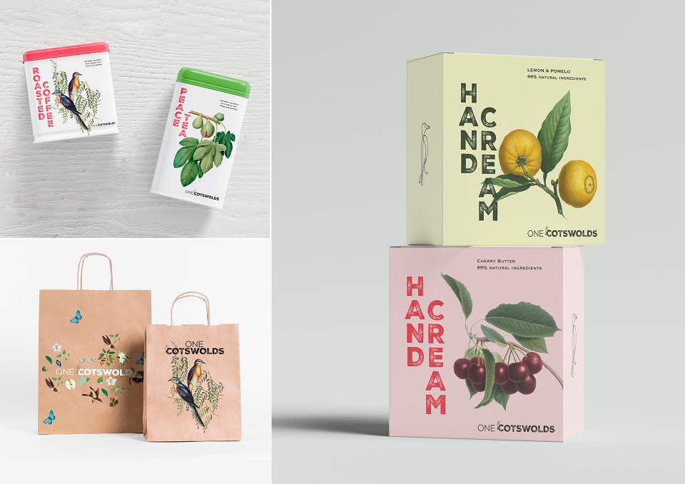
Brand identity for a new cafe based in the Cotswolds. A cohesive visual language was created based upon a quintessentially English, modern-vintage style.
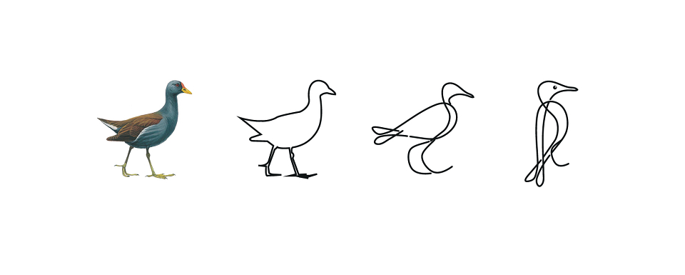
Print from wooden produce pallets informed the logotype development and the Moorhen was referenced in the identity for its local and historical significance. Typography, illustration and iconography were brought together to create a contemporary, and stylish but affordable feel for printed wrap and packaging.