Turner Duckworth
San francisco
ABOUT
CHALLENGE
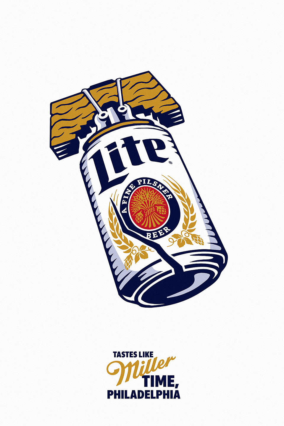
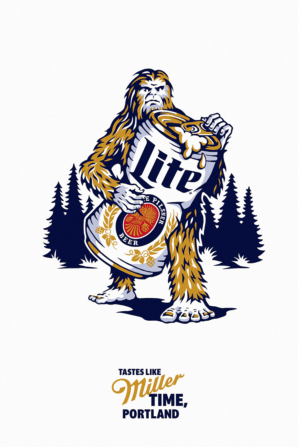
Miller Lite partners closely with their local markets to help inspire brand love. Our task was to develop a design approach with the flexibility to celebrate local markets and empower field marketing managers and distributors to rally behind the new Visual Identity.
SOLUTION
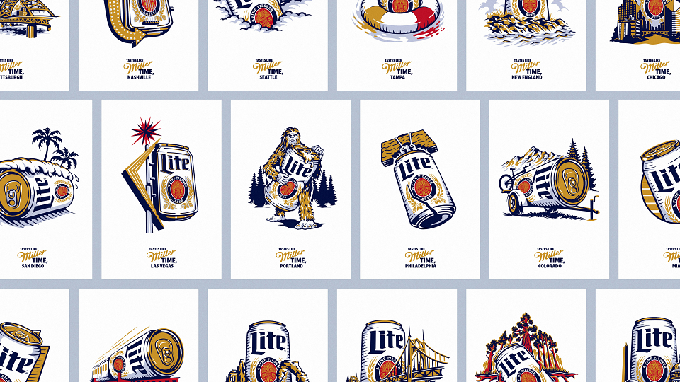
We created a suite of over 25 market-specific illustrations to playfully combine two beloved icons — the Miller Lite can and symbols of local pride. The can is always activated in a different way across the system, like being cracked to resemble the Liberty Bell, transformed into a camper trailer, or crushed by everyone’s favorite Sasquatch. The approach demonstrates the self-aware, playful nature of the brand as well as how Miller Lite is truly in tune with local culture.
RESULTS: Local teams have truly embraced this system and it has now grown to support 55+ illustrations, seen across 40+ markets.
MADEIT CREDITS


Annual 2023 ShortlistMiller Localization Poster SeriesIllustration
Project featured: on 9th July 2023
Contributor:
Invite
x3
Turner Duckworth has been a Contributor since 25th November 2015.