Turner Duckworth
San francisco
ABOUT
McDonald’s was faced with fast approaching deadlines in many markets to update packaging to meet new sustainability standards. This required the need to rethink the design of the McFlurry cup, and presented the perfect opportunity to also update the look and feel - ultimately, building a unified, global identity for McFlurry for the first time in product history.
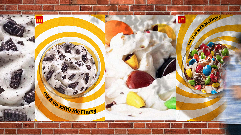
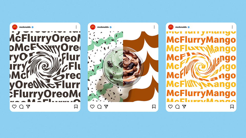
Guided by the brand promise, “A frozen treat, swirled with flavor and texture, that invites playful moments,” we created a system that balances the personality of McFlurry with an ever-changing world of partner brands. Inspired by the product, we developed a flexible photography style that celebrates the delicious textures and playful mix-ins of a McFlurry. To supplement photography, a set of patterns and illustrations were designed to further showcase each flavor’s unique personality. A McFlurry twist was introduced to our brand font, Speedee, to add playfulness to messaging. Finally, we brought the system to life with a range of animations inspired by the McFlurry mixing experience. The sizzle reel teases the new look for McFlurry and invites viewers to explore the identity system on the McDonald’s Design Hub.